

| Intersoft ClientUI 8 > ClientUI Controls > Control Library > Ribbon Controls Overview > UXRibbonBar |
UXRibbonBar is a sophisticated command bar that organizes program's features into a series of tabs at the top of a window. The ribbon user interface increases discoverability of features and functions which enables quicker learning of the program as a whole, and makes users feel more in control of their experience with the program. A ribbon can replace both the traditional menu bar and toolbars. UXRibbonBar supports unified API for both Silverlight and WPF application development.
The following figure demonstrates the UXRibbonBar control in a word processing application.
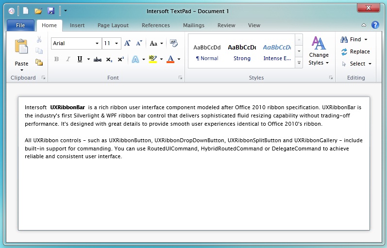
This topic discusses the UXRibbonBar user interface concepts and features, and explains how to use the ribbon control in your application.
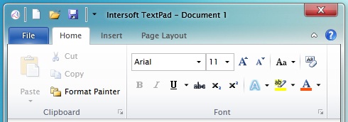
Commands in UXRibbonBar can be grouped into several tabs. In each tab, commands can be further categorized into several groups. It gives you the flexibility to control the grouping of your application commands which allow users to quickly learn the functionality available in your application. In addition, you can specify most frequently accessed commands in ApplicationMenu and QuickAccessToolbar.
The following code shows how to create a simple UXRibbonBar with commands in application menu, backstage menu, quick access toolbar, three tabs and two groups in the first tab.
| XAML |
Copy Code
|
|---|---|
<Intersoft:UXRibbonBar Intersoft:UXRibbonKeyTipService.EnableKeyTips="True" MinRibbonBarHeight="106"> <Intersoft:UXRibbonBar.ApplicationMenu> <Intersoft:UXRibbonApplicationMenu Content="File"> <Intersoft:UXRibbonApplicationMenuItem Header="Save" Icon="/assets/icons/save.png" /> <Intersoft:UXRibbonApplicationMenuItem Header="Save As" Icon="/assets/icons/wordother.png" /> <Intersoft:UXRibbonApplicationMenuItem Header="Open" Icon="/assets/icons/open_folder.png" /> <Intersoft:UXRibbonApplicationBackstageMenuItem Header="Info" Margin="0,3,0,1"> <UserControl:MenuInfo /> </Intersoft:UXRibbonApplicationBackstageMenuItem> <Intersoft:UXRibbonApplicationBackstageMenuItem Header="Recent"> <UserControl:MenuRecent /> </Intersoft:UXRibbonApplicationBackstageMenuItem> <Intersoft:UXRibbonApplicationBackstageMenuItem Header="Help" Margin="0,1,0,3"> <UserControl:MenuHelp /> </Intersoft:UXRibbonApplicationBackstageMenuItem> <Intersoft:UXRibbonApplicationMenuItem Header="Options" Icon="/assets/icons/options.png" /> <Intersoft:UXRibbonApplicationMenuItem Header="Exit" Command="Intersoft:WindowCommands.Close" Icon="/assets/icons/close.png" /> </Intersoft:UXRibbonApplicationMenu> </Intersoft:UXRibbonBar.ApplicationMenu> <Intersoft:UXRibbonBar.QuickAccessToolBar> <Intersoft:UXRibbonQuickAccessToolBar> <Intersoft:UXRibbonToolBarButton DisplayMode="Image" Content="New" Icon="/assets/icons/new.png" /> <Intersoft:UXRibbonToolBarButton DisplayMode="Image" Content="Open" Icon="/assets/icons/open_folder.png" /> <Intersoft:UXRibbonToolBarButton DisplayMode="Image" Content="Save" Icon="/assets/icons/save.png" /> </Intersoft:UXRibbonQuickAccessToolBar> </Intersoft:UXRibbonBar.QuickAccessToolBar> <Intersoft:UXRibbonTab Header="Home" ResizeOrder="desktopgroup1, desktopgroup2, desktopgroup2"> <Intersoft:UXRibbonTabGroup x:Name="desktopgroup1" Header="Clipboard" MinimumSize="Small" MaximumSize="Medium" Size="Medium" IsCollapsible="False"> <Intersoft:UXRibbonSplitButton Content="Paste" LargeIcon="/assets/icons/paste.png" MinimumSize="Large" MaximumSize="Large" Command="local:EditingCommands.Paste" /> <Intersoft:UXRibbonButton Content="Cut" Icon="/assets/icons/cut.png" MaximumSize="Medium" Command="local:EditingCommands.Cut" /> <Intersoft:UXRibbonButton Content="Copy" Icon="/assets/icons/copy.png" MaximumSize="Medium" Command="local:EditingCommands.Copy" /> <Intersoft:UXRibbonButton Content="Format Painter" Icon="/assets/icons/copy_folder.png" MaximumSize="Medium" Command="{Binding TriggerCommand}" CommandParameter="Format Painter" /> </Intersoft:UXRibbonTabGroup> <Intersoft:UXRibbonTabOrderedGroup x:Name="desktopgroup2" Header="Font" Icon="/assets/icons/font.png"> <Intersoft:UXRibbonComboBox Width="105" SelectedIndex="0" /> <Intersoft:UXRibbonComboBox Size="Small" Width="40" SelectedIndex="0" /> <Intersoft:UXRibbonButton Icon="/assets/icons/font_increasesize.png" /> <Intersoft:UXRibbonButton Icon="/assets/icons/font_decreasesize.png" /> <Intersoft:UXRibbonSeparator Height="24" Margin="2,0" Intersoft:UXRibbonOrderedPanel.IsMovable="True" /> <Intersoft:UXRibbonDropDownButton Icon="/assets/icons/change_case.png" Intersoft:UXRibbonOrderedPanel.IsMovable="True" /> <Intersoft:UXRibbonSeparator Height="24" Margin="2,0" Intersoft:UXRibbonOrderedPanel.IsMovable="True" /> <Intersoft:UXRibbonButton Icon="/assets/icons/clear_formatting.png" Intersoft:UXRibbonOrderedPanel.IsMovable="True" /> <Intersoft:UXRibbonToggleButton Icon="/assets/icons/bold.png" Intersoft:UXRibbonOrderedPanel.IsAlternateRow="True" Command="local:EditingCommands.Bold"/> <Intersoft:UXRibbonToggleButton Icon="/assets/icons/italic.png" Intersoft:UXRibbonOrderedPanel.IsAlternateRow="True" Command="local:EditingCommands.Italic"/> <Intersoft:UXRibbonSplitButton Icon="/assets/icons/underline.png" Intersoft:UXRibbonOrderedPanel.IsAlternateRow="True" IsToggleButton="True" GalleryItemWidth="180" ContentWidth="200" GalleryItemHeight="25" /> <Intersoft:UXRibbonButton Icon="/assets/icons/strikethrough.png" Intersoft:UXRibbonOrderedPanel.IsAlternateRow="True" /> <Intersoft:UXRibbonButton Icon="/assets/icons/subscript.png" Intersoft:UXRibbonOrderedPanel.IsAlternateRow="True" /> <Intersoft:UXRibbonButton Icon="/assets/icons/superscript.png" Intersoft:UXRibbonOrderedPanel.IsAlternateRow="True" /> <Intersoft:UXRibbonSeparator Height="24" Margin="2,0" Intersoft:UXRibbonOrderedPanel.IsAlternateRow="True" Intersoft:UXRibbonOrderedPanel.IsMovable="True"/> <Intersoft:UXRibbonDropDownButton Icon="/assets/icons/texteffects.png" ContentWidth="250" Intersoft:UXRibbonOrderedPanel.IsAlternateRow="True" Intersoft:UXRibbonOrderedPanel.IsMovable="True" /> <Intersoft:UXRibbonSplitButton Icon="/assets/icons/highlight.png" Intersoft:UXRibbonOrderedPanel.IsAlternateRow="True" Intersoft:UXRibbonOrderedPanel.IsMovable="True" ContentWidth="150" GalleryItemHeight="25" GalleryItemWidth="25" /> <Intersoft:UXRibbonSplitButton Icon="/assets/icons/font_color.png" Intersoft:UXRibbonOrderedPanel.IsAlternateRow="True" Intersoft:UXRibbonOrderedPanel.IsMovable="True" GalleryItemHeight="16" GalleryItemWidth="16" ContentWidth="176" /> </Intersoft:UXRibbonTabOrderedGroup> </Intersoft:UXRibbonTab> <Intersoft:UXRibbonTab Header="Insert" /> <Intersoft:UXRibbonTab Header="Page Layout" /> </Intersoft:UXRibbonBar> |
|
The following figure shows the results of the example above.
 |
There are two types of group that you can choose from. Each group type has different behaviors and configurations which will be covered in the latter section of this topic. |
To quickly create ClientUI ribbon applications, please refer to the following topics:
UXRibbonBar implements the ribbon user interface according to the latest Office ribbon specifications, which was designed to increase the discoverability of the features and functions of an application, and minimizes the learning curve of the program as a whole. It also makes users feel more in control of their experience with the program. A ribbon can replace both the traditional menu bar and toolbars. To achieve these capabilities, UXRibbonBar comes with rich user interface elements that consisted of UXRibbonQuickAccessToolBar, UXRibbonApplicationMenu, UXRibbonTab, UXRibbonTabGroup and other ribbon-friendly controls.
The following figure illustrates the main layout and user interface elements of the UXRibbonBar control.

One of the key features in UXRibbonBar is the fluent resizing behavior, also known as adaptive layout, which arranges commands in the ribbon to dynamically adapt its size, format, and position based on the space available to the ribbon control.
There are numerous aspects that you can customize related to the resizing behaviors, for examples, determining the order of the resized groups. You can control the group resizing in exact ordering through the ResizeOrder property. If the ResizeOrder property is not set, it will automatically resize the group starting from the last to the first group of the current visible tab.
The following example shows how to specify the ResizeOrder property in the ribbon control. When the ribbon has insufficient space to display all commands, the groups will be resized in the following order: WindowGroup, ArrangementGroup and then CurrentViewGroup.
| XAML |
Copy Code
|
|---|---|
<Intersoft:UXRibbonTab Header="View" Intersoft:UXRibbonKeyTipService.AccessText="V" ResizeOrder="WindowGroup,ArrangementGroup,CurrentViewGroup"> <Intersoft:UXRibbonTabGroup x:Name="CurrentViewGroup" Header="Current View" Icon="/assets/icons/current_view.png"> <Intersoft:UXRibbonButton Content="Change View" LargeIcon="/assets/icons/change_view.png" Icon="/assets/icons/change_view.png" /> <Intersoft:UXRibbonButton Content="View Setting" LargeIcon="/assets/icons/view_settings.png" Icon="/assets/icons/view_settings.png" /> <Intersoft:UXRibbonButton Content="Reset View" LargeIcon="/assets/icons/reset_view.png" Icon="/assets/icons/reset_view.png" /> </Intersoft:UXRibbonTabGroup> <Intersoft:UXRibbonTabGroup x:Name="ArrangementGroup" Header="Arrangement" MaximumSize="Medium" Icon="/assets/icons/arrangement.png"> <Intersoft:UXRibbonButton MaximumSize="Medium" Content="Reverse Sort" Icon="/assets/icons/reverse_sort.png" /> <Intersoft:UXRibbonButton MaximumSize="Medium" Content="Add Columns" Icon="/assets/icons/add_columns.png" /> </Intersoft:UXRibbonTabGroup> <Intersoft:UXRibbonTabGroup x:Name="WindowGroup" Header="Window" Icon="/assets/icons/window.png"> <Intersoft:UXRibbonButton Content="Reminder Window" LargeIcon="/assets/icons/reminders.png" Icon="/assets/icons/reminders.png" /> <Intersoft:UXRibbonButton Content="Open In New Window" MaxLargeButtonWidth="100" LargeIcon="/assets/icons/open_in_new_window.png" Icon="/assets/icons/open_in_new_window.png" /> <Intersoft:UXRibbonButton Content="Close All Items" LargeIcon="/assets/icons/close_all_items.png" Icon="/assets/icons/close_all_items.png" /> </Intersoft:UXRibbonTabGroup> </Intersoft:UXRibbonTab> |
|
You can also specify the ResizeOrder property with un-patterned order such as shown in the following code example.
| XAML |
Copy Code
|
|---|---|
<Intersoft:UXRibbonTab Header="Home" ResizeOrder="DeleteGroup,RespondGroup,RespondGroup,NewGroup,DeleteGroup,RespondGroup"> <Intersoft:UXRibbonTabGroup Name="NewGroup" MaximumSize="Small" Header="New"> <Intersoft:UXRibbonButton Content="New E-mail" MinimumSize="Large" LargeIcon="/assets/icons/new_email.png" Icon="/assets/icons/new_email.png" /> <Intersoft:UXRibbonButton Content="New Items" MinimumSize="Large" LargeIcon="/assets/icons/new_items.png" Icon="/assets/icons/new_items.png"> </Intersoft:UXRibbonButton> </Intersoft:UXRibbonTabGroup> <Intersoft:UXRibbonTabGroup Name="DeleteGroup" MaximumSize="Medium" Header="Delete"> <Intersoft:UXRibbonButton Content="Ignore" MaximumSize="Medium" Icon="/assets/icons/ignore.png" /> <Intersoft:UXRibbonButton Content="Clean Up" MaximumSize="Medium" Icon="/assets/icons/clean_up.png" /> <Intersoft:UXRibbonButton Content="Junk" MaximumSize="Medium" Icon="/assets/icons/junk.png" /> <Intersoft:UXRibbonButton Content="Delete" MinimumSize="Large" LargeIcon="/assets/icons/delete.png" /> </Intersoft:UXRibbonTabGroup> <Intersoft:UXRibbonTabGroup Name="RespondGroup" Header="Respond"> <Intersoft:UXRibbonButton Content="Reply" MinimumSize="Medium" LargeIcon="/assets/icons/reply.png" Icon="/assets/icons/reply.png" /> <Intersoft:UXRibbonButton Content="Reply All" MinimumSize="Medium" LargeIcon="/assets/icons/reply_all.png" Icon="/assets/icons/reply_all.png" /> <Intersoft:UXRibbonButton Content="Forward" MinimumSize="Medium" LargeIcon="/assets/icons/forward.png" Icon="/assets/icons/forward.png" /> <Intersoft:UXRibbonButton Content="Meeting" MaximumSize="Medium" Icon="/assets/icons/meeting2.png" /> <Intersoft:UXRibbonDropDownButton Content="IM" MaximumSize="Medium" Icon="/assets/icons/IM.png" /> <Intersoft:UXRibbonDropDownButton Content="More" MaximumSize="Medium" Icon="/assets/icons/more.png" /> </Intersoft:UXRibbonTabGroup> </Intersoft:UXRibbonTab> |
|
To learn more about resizing behaviors supported in UXRibbonBar, see Customizing Fluent Resizing Behaviors in UXRibbonBar.
UXRibbonTab is inherited from ISHeaderedItemsControl which means this control has a header and collection of items that represent the control. There are two types of item that you can declare in UXRibbonTab which are UXRibbonTabGroup and UXRibbonTabOrderedGroup. Each group has different behaviors and configurations that you can use to organize your commands.
The following code shows how to define simple ribbon tabs.
| XAML |
Copy Code
|
|---|---|
<Intersoft:UXRibbonTab Header="Home" HeaderImage="/assets/icons/new_email.png" HeaderDisplayMode="ContentAndImage" HeaderImageStretch="Uniform"> </Intersoft:UXRibbonTab> <Intersoft:UXRibbonTab Header="Opportunities" /> <Intersoft:UXRibbonTab Header="View" /> |
|

As mentioned in the section above, UXRibbonTab supports two type of group which are UXRibbonTabGroup and UXRibbonTabOrderedGroup. Both groups arrange the items differently when the space available to UXRibbonBar changes.
UXRibbonTabGroup is the default tab group that arranges all commands in a row. When resized, it will arrange and reposition the commands to adapt the size of the ribbon control based on the resizing properties such as MinimumSize and MaximumSize.
The following code shows how to configure UXRibbonTabGroup with the default MinimumSize and MaximumSize.
| XAML |
Copy Code
|
|---|---|
<Intersoft:UXRibbonTabGroup x:Name="TabGroup" Header="Illustrations"> <Intersoft:UXRibbonButton Content="Picture" MinimumSize="Large" LargeIcon="/assets/icons/picture.png" /> <Intersoft:UXRibbonButton Content="Clip Art" MinimumSize="Large" LargeIcon="/assets/icons/ClipArt.png"/> <Intersoft:UXRibbonDropDownButton Content="Shapes" MinimumSize="Large" LargeIcon="/assets/icons/shapes.png" /> <Intersoft:UXRibbonButton Content="SmartArt" Icon="/assets/icons/SmartArt.png" LargeIcon="/assets/icons/SmartArt.png"/> <Intersoft:UXRibbonButton Content="Chart" Icon="/assets/icons/chart.png" LargeIcon="/assets/icons/chart.png" /> <Intersoft:UXRibbonDropDownButton Content="Screenshot" Icon="/assets/icons/screenshot.png" LargeIcon="/assets/icons/screenshot.png"/> </Intersoft:UXRibbonTabGroup> |
|
The result looks like the following figure.

When the size state of commands are set to either Small or Medium size, they will be automatically arranged into a three-row column. A new column will be created when it finds a Large command, or when the commands cannot fit in the existing column. These arrangement behaviors are the default implementation in UXRibbonTabGroup.
In addition, UXRibbonTab also supports a specialized tab group with patterned ordering mechanism called UXRibbonTabOrderedGroup. By default, it arranges the commands in two rows. You can determine whether a command should be placed in the first row or second row by specifying the IsAlternateRow attached property.
The following code shows how to configure UXRibbonTabOrderedGroup.
| XAML |
Copy Code
|
|---|---|
<Intersoft:UXRibbonTabOrderedGroup x:Name="desktopgroup2" Header="Font" Icon="/assets/icons/font.png"> <Intersoft:UXRibbonComboBox Width="105" SelectedIndex="0" /> <Intersoft:UXRibbonComboBox Size="Small" Width="40" SelectedIndex="0" /> <Intersoft:UXRibbonButton Icon="/assets/icons/font_increasesize.png" /> <Intersoft:UXRibbonButton Icon="/assets/icons/font_decreasesize.png" /> <Intersoft:UXRibbonSeparator Height="24" Margin="2,0" Intersoft:UXRibbonOrderedPanel.IsMovable="True" /> <Intersoft:UXRibbonDropDownButton Icon="/assets/icons/change_case.png" Intersoft:UXRibbonOrderedPanel.IsMovable="True" /> <Intersoft:UXRibbonSeparator Height="24" Margin="2,0" Intersoft:UXRibbonOrderedPanel.IsMovable="True" /> <Intersoft:UXRibbonButton Icon="/assets/icons/clear_formatting.png" Intersoft:UXRibbonOrderedPanel.IsMovable="True" /> <Intersoft:UXRibbonToggleButton Icon="/assets/icons/bold.png" Intersoft:UXRibbonOrderedPanel.IsAlternateRow="True" Command="local:EditingCommands.Bold"/> <Intersoft:UXRibbonToggleButton Icon="/assets/icons/italic.png" Intersoft:UXRibbonOrderedPanel.IsAlternateRow="True" Command="local:EditingCommands.Italic"/> <Intersoft:UXRibbonSplitButton Icon="/assets/icons/underline.png" Intersoft:UXRibbonOrderedPanel.IsAlternateRow="True" IsToggleButton="True" /> <Intersoft:UXRibbonButton Icon="/assets/icons/strikethrough.png" Intersoft:UXRibbonOrderedPanel.IsAlternateRow="True" /> <Intersoft:UXRibbonButton Icon="/assets/icons/subscript.png" Intersoft:UXRibbonOrderedPanel.IsAlternateRow="True" /> <Intersoft:UXRibbonButton Icon="/assets/icons/superscript.png" Intersoft:UXRibbonOrderedPanel.IsAlternateRow="True" /> <Intersoft:UXRibbonSeparator Height="24" Margin="2,0" Intersoft:UXRibbonOrderedPanel.IsAlternateRow="True" Intersoft:UXRibbonOrderedPanel.IsMovable="True"/> <Intersoft:UXRibbonDropDownButton Icon="/assets/icons/texteffects.png" Intersoft:UXRibbonOrderedPanel.IsAlternateRow="True" Intersoft:UXRibbonOrderedPanel.IsMovable="True" /> <Intersoft:UXRibbonSplitButton Icon="/highlight.png" Intersoft:UXRibbonOrderedPanel.IsAlternateRow="True" Intersoft:UXRibbonOrderedPanel.IsMovable="True" /> <Intersoft:UXRibbonSplitButton Icon="/font_color.png" Intersoft:UXRibbonOrderedPanel.IsAlternateRow="True" Intersoft:UXRibbonOrderedPanel.IsMovable="True" /> </Intersoft:UXRibbonTabOrderedGroup> |
|
The result looks like the following figure.
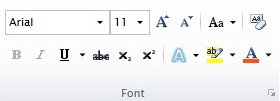
When the group is resized due to insufficient space, it will find all commands which IsMoveable attached property is set to true, and move them to the third row. It will also remove the commands with IsRemoveable attached property from the group.
To learn more about group resizing behaviors, see Customizing Fluent Resizing Behaviors in UXRibbonBar.
Application menu is a control that can be accessed from the top left corner of the ribbon. There are two types of item that you can define in UXRibbonApplicationMenu which are UXRibbonApplicationMenuItem and UXRibbonApplicationBackstageMenuItem.
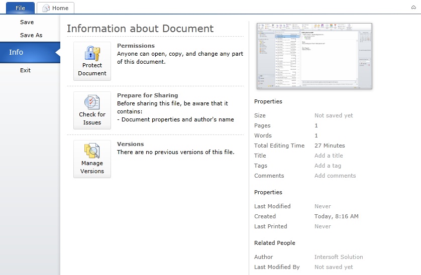
UXRibbonApplicationMenuItem is a command control which behaves similar to UXMenuItem. To learn more about UXMenuItem, see UXDropDownButton Overview. On the other hands, UXRibbonApplicationBackstageMenuItem is a more sophisticated control that displays custom content when the menu item is active.
The following code shows how to define three UXRibbonApplicationMenuItem and one UXRibbonApplicationBackstageMenuItem. Notice that the "Exit" menu item has a command assigned.
| XAML |
Copy Code
|
|---|---|
<Intersoft:UXRibbonBar> <Intersoft:UXRibbonBar.ApplicationMenu> <Intersoft:UXRibbonApplicationMenu Content="File"> <Intersoft:UXRibbonApplicationMenuItem Header="Save" /> <Intersoft:UXRibbonApplicationMenuItem Header="Save As" /> <Intersoft:UXRibbonApplicationBackstageMenuItem Header="Info"> <UserControl:MenuInfo /> </Intersoft:UXRibbonApplicationBackstageMenuItem> <Intersoft:UXRibbonApplicationMenuItem Header="Exit" Command="Intersoft:WindowCommands.Close" /> </Intersoft:UXRibbonApplicationMenu> </Intersoft:UXRibbonBar.ApplicationMenu> </Intersoft:UXRibbonBar> |
|
The following figure shows the application menu when a backstage menu item is active.
The following example shows how to assign a command to a UXRibbonApplicationMenuItem which will be executed when the item is clicked.
| XAML |
Copy Code
|
|---|---|
<Intersoft:UXRibbonApplicationMenuItem Header="Add new task" Command="{Binding AddNewTaskCommand}" /> |
|
For more information about the basics of commanding concept, see Commanding Overview.
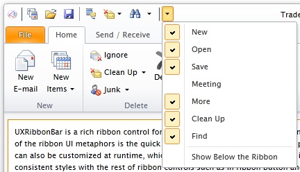
UXRibbonQuickAccessToolbar is a ribbon-friendly control that provides quick access to frequently accessed commands such as New, Open, Save and Print. You can hide the commands initially by setting the Visibility property to Collapsed. At runtime, users can show the hidden commands through the dropdown menu in the quick access toolbar.
By default, the position of UXRibbonQuickAccessToolbar is set to the top of UXRibbonBar. If you prefer, you can set the position to the bottom by setting the ToolBarPosition property to Bottom.
UXRibbonQuickAccessToolbar derives from UXToolbar which is an advanced, rich-featured toolbar control with elegant built-in styles and built-in support for various button types such as described below.
Represents a standard command button.
Represents a button that displays dropdown menu when clicked, which can contain a collection of menu items and nested menu items similar to UXContextMenu.
Represents a combination of command button and a dropdown menu. This type of button typically provides users with a default command that executed when the command part of the button is clicked, while at the same time allowing users to choose alternative commands through the dropdown arrow. Similar to the DropdownButton, you can also define a collection of menu items and nested menu items as in UXContextMenu.
Represents a custom button that can be used to contain any UIElement or controls. With this type, the default layout properties such as margin and padding as well as the UI behaviors would be disabled. Consequently, this type is ideal to host custom controls such as text box, combo box, date picker and others.
The following code shows how to add UXRibbonQuickAccessToolbar to the ribbon control with several buttons using different button type.
| XAML |
Copy Code
|
|---|---|
<Intersoft:UXRibbonBar.QuickAccessToolBar> <Intersoft:UXRibbonQuickAccessToolBar> <Intersoft:UXRibbonToolBarButton DisplayMode="Image" Content="New" Icon="/assets/icons/new.png" /> <Intersoft:UXRibbonToolBarButton DisplayMode="Image" Content="Open" Icon="/assets/icons/openfolder.png" /> <Intersoft:UXRibbonToolBarButton DisplayMode="Image" Content="Save" Icon="/assets/icons/save.png" /> <Intersoft:UXSeparator /> <Intersoft:UXRibbonToolBarButton Visibility="Collapsed" DisplayMode="Image" Content="Meeting" Icon="/assets/icons/meeting.png" IsToggleButton="True" /> <Intersoft:UXRibbonToolBarButton DisplayMode="Image" Content="More" Icon="/assets/icons/more.png" /> <Intersoft:UXRibbonToolBarButton ButtonType="DropdownButton" DisplayMode="Image" Content="Clean Up" Icon="/assets/icons/clean_up.png"> <Intersoft:UXRibbonMenuItem Header="Clean Up Conversation" /> <Intersoft:UXRibbonMenuItem Header="Clean Up Folder" /> <Intersoft:UXRibbonMenuItem Header="Clean Up Folder & Subfolders" /> </Intersoft:UXRibbonToolBarButton> <Intersoft:UXRibbonToolBarButton ButtonType="SplitButton" DisplayMode="Image" Content="Find" Icon="/assets/icons/find.png"> <Intersoft:UXRibbonMenuItem Header="Find" Icon="/assets/icons/find.png" /> <Intersoft:UXRibbonMenuItem Header="Advanced Find..." Icon="/assets/icons/find.png" /> <Intersoft:UXRibbonMenuItem Header="Go To..." /> </Intersoft:UXRibbonToolBarButton> </Intersoft:UXRibbonQuickAccessToolBar> </Intersoft:UXRibbonBar.QuickAccessToolBar> |
|
The result looks like the following figure.
The following example shows how to assign a command to a UXRibbonToolBarButton which will be executed when the item is pressed.
| XAML |
Copy Code
|
|---|---|
<Intersoft:UXRibbonToolBarButton Content="Add new task" Command="{Binding AddNewTaskCommand}" /> |
|
For more information about the basics of commanding concept, see Commanding Overview.
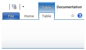
Contextual tab is a unique ribbon concept that defines the tab's visibility based on a specific context. The contextual tab is useful to hide application commands that are irrelevant unless certain context is available. For example, you can design the ribbon to show the search related commands when the search textbox is focused, such as shown in the illustration below.

To use contextual tab in UXRibbonBar, you need to configure several things as follows:
The following code shows how to configure the contextual tabs and set the active contextual tab initially.
| XAML |
Copy Code
|
|---|---|
<Intersoft:UXRibbonBar RibbonTitle="Documentation" ActiveContextualTabs="TableContextualTabGroup"> ... <Intersoft:UXRibbonBar.ContextualTabGroups> <Intersoft:UXRibbonContextualTabGroup x:Name="TableContextualTabGroup" Content="Table" IndicatorBackground="#FF5BA4F2" Background="#FF0759A5" AutoSelectMode="Always" /> </Intersoft:UXRibbonBar.ContextualTabGroups> <Intersoft:UXRibbonTab Header="Home" /> <Intersoft:UXRibbonTab Header="Table" ContextualTabGroupName="TableContextualTabGroup" /> </Intersoft:UXRibbonBar> |
|
The result looks like the following figure.
When the contextual tab group is activated, you can customize the AutoSelectMode behavior to further enhance the user experience.
When the contextual tab group is active, the first tab in the collection will be selected by default.
Automatic tab selection is disabled.
When the contextual tab group is active, the previously selected tab will be reselected by default.
UXRibbonGallery is an items control that displays a list of items in horizontal direction. Unlike common items control, the gallery control provides a unique way to present user options graphically on the ribbon. You can use UXRibbonGallery as a standalone control, or embed it as an item of other controls such as UXRibbonDropDownButton and UXRibbonSplitButton.
UXRibbonGalleryList is a rich UI control that displays a collection of related items or commands in the ribbon. It is particularly useful to display a list of preview items which allow users to intuitively recognize the results of a command or a selection before it is applied. If there are too many items in the gallery, an expand arrow is provided to display the rest of the collection in a floating, resizable popup.
UXRibbonGalleryList provides VisibileItemCount property which is used to determine the initial number of items to display in the gallery list. You can also set CollapsedItemCount, SmallItemCount, MediumItemCount and LargeItemCount properties which determine the number of items to display according to the size state of the gallery. As a ribbon-friendly control, UXRibbonGalleryList participates with the fluent resizing mechanism of the ribbon and updates the visible item count accordingly.
To learn more about UXRibbonGallery, see UXRibbonGallery Overview.
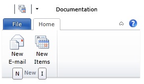
KeyTip is one of the accessibility features in ribbon user interface metaphor. KeyTip replaces the access key (or also known as mnemonic key) in the traditional menu bar control, which enables users to easily locate a command through a series of key strokes. Furthermore, KeyTip supports multi-level key association on certain controls such as dropdown button, split button, and menu item.
To enable KeyTip in UXRibbonBar, set the UXRibbonKeyTipService.EnableKeyTips attached property of UXRibbonBar to true.
At runtime, users can activate the KeyTip through the following modifier keys:
When a valid KeyTip is selected, the ribbon control will raise a specific action associated to the item such as opening a menu, navigating to a page, or executing a command.
To specify the access text of the KeyTip, set the UXRibbonKeyTipService.AccessText attached property on the controls that support KeyTip. The following list describes the built-in controls that support KeyTip.
You can also specify KeyTip to a dialog launcher in UXRibbonTabGroup by specifying the UXRibbonKeyTipService.AlternateText attached property.
In addition, KeyTip supports multiple characters for the access text, which is particularly useful for applications with a large number of commands. For instance, you can assign "FP" as the KeyTip for "Format Painter" command which makes more sense to users.
Furthermore, KeyTip with multiple characters enables you to create some sort of grouping. When users type a character, it will filter out the other key tips that do not start with the typed character. Users can also cancel the last typed characters by pressing the Escape key.
The following example shows how to configure KeyTip in the ribbon control.
| XAML |
Copy Code
|
|---|---|
<Intersoft:UXRibbonBar RibbonTitle="Documentation" Intersoft:UXRibbonKeyTipService.EnableKeyTips="True"> ... <Intersoft:UXRibbonTab Header="Home" ResizeOrder="NewGroup" Intersoft:UXRibbonKeyTipService.AccessText="H"> <Intersoft:UXRibbonTabGroup Name="NewGroup" MaximumSize="Small" Header="New"> <Intersoft:UXRibbonButton Content="New E-mail" MinimumSize="Large" Intersoft:UXRibbonKeyTipService.AccessText="N" LargeIcon="/assets/icons/new_email.png" Icon="/assets/icons/new_email.png" /> <Intersoft:UXRibbonButton Content="New Items" MinimumSize="Large" Intersoft:UXRibbonKeyTipService.AccessText="I" LargeIcon="/assets/icons/new_items.png" Icon="/assets/icons/new_items.png" /> </Intersoft:UXRibbonTabGroup> </Intersoft:UXRibbonTab> ... </Intersoft:UXRibbonBar> |
|
The result looks like the following figure.
Ribbon tooltip is an enhanced tooltip that supports four predefined content: header, body, image and footer. You can set the ribbon tooltip by specifying the UXRibbonToolTipService attached property on the desired controls. In addition to the ribbon-aware controls, the ribbon tooltip can also be set on any other controls that derive from Control class. When specified on ribbon-aware controls which are contained in a tab group, the tooltip will be automatically positioned under the ribbon.
The following list describes the properties that you can customize in the ribbon tooltip.
The following example shows how to configure the ribbon tooltip.
| XAML |
Copy Code
|
|---|---|
<Intersoft:UXRibbonButton Content="Cover Page" MinimumSize="Medium" Icon="/assets/icons/cover_page.png" LargeIcon="/assets/icons/cover_page.png" Intersoft:UXRibbonToolTipService.Header="Cover Page" Intersoft:UXRibbonToolTipService.Content="Insert a fully formatted cover page. You fill in the title, author, date, and other information." Intersoft:UXRibbonToolTipService.ImageSource="/Intersoft.ClientUI.Samples.UXRibbon;component/Assets/Images/Doc/Item/insert_cover tooltip.png" > <Intersoft:UXRibbonToolTipService.Footer> <StackPanel Orientation="Vertical"> <Intersoft:UXSeparator /> <StackPanel Orientation="Horizontal" Margin="0,4,0,2"> <Image Source="/assets/icons/help.png" Width="16" Height="16" /> <TextBlock Text="Press F1 for more help." Margin="2,0" VerticalAlignment="Center" /> </StackPanel> </StackPanel> </Intersoft:UXRibbonToolTipService.Footer> </Intersoft:UXRibbonButton> |
|
The result looks like the following figure.
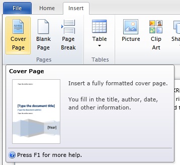
Notice that the ribbon tooltip is automatically displayed under the ribbon bar which conforms to the Office ribbon specifications.
To participate with fluent resizing behaviors in UXRibbonBar, the control defined in UXRibbonBar must implement IRibbonControl except UXRibbonGalleryList which contains its own implementation. Ribbon-friendly controls support various size state such as Small, Medium and Large, as well as comprehensive resizing control through the MinimumSize and MaximumSize properties. The following sections explain the built-in controls supported in UXRibbonBar.
Derived from UXButton, UXRibbonButton is a command button which represents an action that will be executed when the button is clicked. To learn more about UXButton, see UXButton Overview.
| XAML |
Copy Code
|
|---|---|
<Intersoft:UXRibbonTabGroup Name="NewGroup" Header="New"> <Intersoft:UXRibbonButton Content="New E-mail" MinimumSize="Large" LargeIcon="/assets/icons/new_email.png" Icon="/assets/icons/new_email.png" /> <Intersoft:UXRibbonButton Content="New Items" MaximumSize="Medium" LargeIcon="/assets/icons/new_items.png" Icon="/assets/icons/new_items.png"> </Intersoft:UXRibbonButton> <Intersoft:UXRibbonButton Content="Junk" MaximumSize="Medium" LargeIcon="/assets/icons/junk.png" Icon="/assets/icons/junk.png" /> </Intersoft:UXRibbonTabGroup> |
|
The result looks like the following figure.

Derived from UXDropDownButton, UXRibbonDropDownButton is an advanced button control that represents one or more commands in the form of dropdown menu. This dropdown menu is created using UXContextMenu control which uses UXPopup as its fundamental architecture. To learn more about UXDropDownButton, see UXDropDownButton Overview.
| XAML |
Copy Code
|
|---|---|
<Intersoft:UXRibbonTabGroup Name="NewGroup" Header="New"> <Intersoft:UXRibbonDropDownButton Content="Paste" MinimumSize="Large" LargeIcon="/assets/icons/paste.png" Icon="/assets/icons/paste.png"> <Intersoft:UXRibbonMenuItem Header="Paste Special..." /> <Intersoft:UXRibbonMenuItem Header="Set Default Paste..." /> </Intersoft:UXRibbonDropDownButton> <Intersoft:UXRibbonDropDownButton Content="New Items" MaximumSize="Medium" LargeIcon="/assets/icons/new_items.png" Icon="/assets/icons/new_items.png"> </Intersoft:UXRibbonDropDownButton> <Intersoft:UXRibbonDropDownButton Content="Junk" MaximumSize="Medium" LargeIcon="/assets/icons/junk.png" Icon="/assets/icons/junk.png" /> </Intersoft:UXRibbonTabGroup> |
|
The result looks like the following figure.
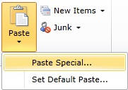
Derived from UXSplitButton, UXRibbonSplitButton is an advanced button control that represents one or more commands in the form of dropdown menu. This dropdown menu is created using UXContextMenu control which uses UXPopup as its fundamental architecture. To learn more about UXSplitButton, see UXSplitButton Overview.
| XAML |
Copy Code
|
|---|---|
<Intersoft:UXRibbonTabGroup Name="NewGroup" Header="New"> <Intersoft:UXRibbonSplitButton Content="Paste" MinimumSize="Large" LargeIcon="/RibbonSample;component/Assets/Images/Doc/paste.png" Icon="/RibbonSample;component/Assets/Images/Doc/paste.png"> <Intersoft:UXRibbonMenuItem Header="Paste Special..." /> <Intersoft:UXRibbonMenuItem Header="Set Default Paste..." /> </Intersoft:UXRibbonSplitButton> <Intersoft:UXRibbonSplitButton Content="New Items" MaximumSize="Medium" LargeIcon="/RibbonSample;component/Assets/Images/Outlook/new_items.png" Icon="/RibbonSample;component/Assets/Images/Outlook/new_items.png"> </Intersoft:UXRibbonSplitButton> <Intersoft:UXRibbonSplitButton Content="Junk" MaximumSize="Medium" LargeIcon="/RibbonSample;component/Assets/Images/Outlook/junk.png" Icon="/RibbonSample;component/Assets/Images/Outlook/junk.png" /> </Intersoft:UXRibbonTabGroup> |
|
The result looks like the following figure.
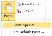
Inherited from UXToggleButton, UXRibbonToggleButton exposes many of the features available in UXToggleButton such as ImageContent presentation model, default and cancel button, dialog result, commanding, navigation, and more. To learn more about UXToggleButton, see UXToggleButton Overview.
| XAML |
Copy Code
|
|---|---|
<Intersoft:UXRibbonTabGroup Name="NewGroup" Header="New"> <Intersoft:UXRibbonToggleButton Content="Paste" MinimumSize="Large" LargeIcon="/RibbonSample;component/Assets/Images/Outlook/new_email.png" Icon="/RibbonSample;component/Assets/Images/Outlook/new_email.png" /> <Intersoft:UXRibbonToggleButton Content="New Items" MaximumSize="Medium" LargeIcon="/RibbonSample;component/Assets/Images/Outlook/new_items.png" Icon="/RibbonSample;component/Assets/Images/Outlook/new_items.png" /> <Intersoft:UXRibbonToggleButton Content="Junk" MaximumSize="Medium" LargeIcon="/RibbonSample;component/Assets/Images/Outlook/junk.png" Icon="/RibbonSample;component/Assets/Images/Outlook/junk.png" /> </Intersoft:UXRibbonTabGroup> |
|
The result looks like the following figure.

UXRibbonGalleryList is a rich UI control that displays a collection of related items or commands in the ribbon. It is particularly useful to display a list of preview items that allow users to intuitively recognize the results of a command or a selection before it is applied. If there are too many items in the gallery, an expand arrow is provided to display the rest of the items in a floating, resizable popup.
To learn more about UXRibbonGallery, see UXRibbonGallery Overview.
XAML The result looks like the following figure.
Derived from UXComboBox, UXRibbonComboBox exposes many of the features available in UXComboBox, such as selection control with built-in text search support, editable mode and also it fully support MVVM model. To learn more about UXComboBox, see UXComboBox Overview.
| XAML |
Copy Code
|
|---|---|
<Intersoft:UXRibbonComboBox Width="105" SelectedIndex="0" Intersoft:UXRibbonKeyTipService.AccessText="FF"> <Intersoft:UXComboBoxItem Content="Arial" FontFamily="Arial" /> <Intersoft:UXComboBoxItem Content="Arial Black" FontFamily="Arial Black" /> <Intersoft:UXComboBoxItem Content="Comic Sans MS" FontFamily="Comic Sans MS" /> <Intersoft:UXComboBoxItem Content="Courier New" FontFamily="Courier New" /> <Intersoft:UXComboBoxItem Content="Georgia" FontFamily="Georgia" /> </Intersoft:UXRibbonComboBox> |
|
The result looks like the following figure.

Derived from UXCheckBox, UXRibbonCheckBox shares several features in common such as three state selection, selection routed events and more. This means that you can use UXRibbonCheckBox to obtain data input which accepts Checked, Unchecked and Indeterminate state. You enable the three state mode by setting the IsThreeState property to true, then get or set the selection state through the CheckedState property. For more information, see UXCheckBox Overview.
| XAML |
Copy Code
|
|---|---|
<Intersoft:UXRibbonCheckBox Content="Delete" Icon="/assets/icons/delete.png" /> |
|
The result looks like the following figure.

Derived from UXRadioButton, UXRibbonRadioButton exposes many of the features available in UXRadioButton such as ImageContent presentation model, default and cancel button, dialog result, commanding, navigation, and more. To learn about the common features of the button, see UXRadioButton Overview.
| XAML |
Copy Code
|
|---|---|
<Intersoft:UXRibbonRadioButton Content="Share" Icon="/assets/icons/share.png" /> |
|
The result looks like the following figure.

Derived from FieldLabel, UXRibbonFieldLabel represents a data field that typically consists of a label and an input control. The label of a FieldLabel can be customized through the Header property, while the input control is defined in the Content property. Beside input controls, you can actually use any kind of controls as the content such as check box, radio button, combo box and so on. For more information, see FieldLabel Overview.
| XAML |
Copy Code
|
|---|---|
<Intersoft:UXRibbonFieldLabel MaximumSize="Medium" MinimumSize="Medium" Header="Import :" LargeIcon="/assets/icons/import.png" Icon="/assets/icons/import.png"> <Intersoft:UXTextBox Width="80" WatermarkText="Import Name" WatermarkTextVisibility="Visible" /> </Intersoft:UXRibbonFieldLabel> |
|
The result looks like the following figure.

UXRibbonBar supports commanding for controls that implement ICommandSource such as UXRibbonButton, UXRibbonDropDownButton and more.
The following list describes the built-in ribbon controls that implement ICommandSource:
The following code shows how to assign a command in UXRibbonButton.
| XAML |
Copy Code
|
|---|---|
<Intersoft:UXRibbonButton Content="Copy" Command="local:EditingCommands.Copy" /> |
|
For more information on how to implement routed command in your application, see How-to: Implement a RoutedCommand. For more information about the basics of commanding concept, see Commanding Overview.
In addition to rich feature sets, UXRibbonBar also comes with numerous built-in UX features such as explained in the following.
This time-saving feature automatically persist the last focus after users finished interacting with the ribbon control, for instances, when a button is clicked, or when users press the Escape key during modal input. With the consistent focus implementation, you can create rich MVVM applications without concerning the usability aspects of the View controls. See the following figure for a better illustration.
When you click on UXRibbonDropDownButton or other buttons that implement a popup, it will automatically activate modal input. This means that when the popup is shown, the other controls behind the popup will not respond to the user interactions.
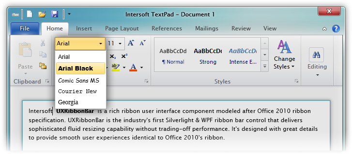
This feature allows you to set two or more words to the control's content without causing layout issues such as distorted or clipped text. The specified text will be automatically wrapped to two-line layout whenever applicable.

In the UXRibbonDropDownButton case, notice that the text is automatically wrapped and joined with the arrow side-by-side resulting to a pixel-perfect layout.
When you resize the application's window, sometimes the ribbon could be too small to display all tabs. In such case, a tab scroller will automatically appear to provide complete accessibility to the user.

When there is an active contextual tab, the ribbon title will evaluate if it has sufficient space to display the caption in the right-side space. It will automatically reposition the caption to the right or left of the contextual tab based on the best available space. See the following illustration.

Minimized Ribbon Behavior
You can also minimize the ribbon bar by clicking on the arrow button in the top-right side of the ribbon, or double click on the active tab. You can also set the IsExpanded property to expand or minimize the ribbon bar. See the following illustration.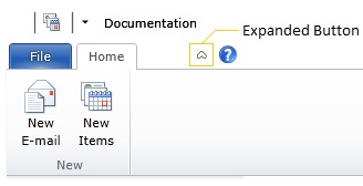
To learn more about UXRibbonBar, please refer to the following topics: