
| Intersoft ClientUI 8 > ClientUI Controls > Control Library > Button Controls Overview > UXToggleButton |
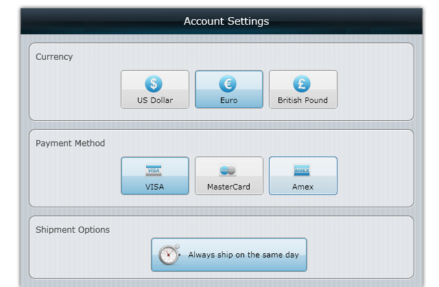
UXToggleButton is a rich, Aero-style button with toggle functionality supporting self and group-toggle feature. Similar to UXButton, UXToggleButton also includes full support for standards-compliance usability such as keyboard navigation and focus visual.

UXToggleButton derives from UXButton, which means it exposes many of the features available in UXButton, such as ImageContent presentation model, default and cancel button, dialog result, commanding, navigation, and more. To learn about the common features of button, see UXButton Overview.
UXToggleButton extends UXButton with several features related to toggle button functionality such as discussed in the following sections.
Unlike command button, UXToggleButton supports three state toggle mode: Checked, Unchecked and Indeterminate, which can be enabled through IsThreeState property. Consequently, you use the CheckedState property which implement nullable boolean type to get or set the checked state of the toggle button.
The following example shows how to setup the UXToggleButton to use three state checked mode, and set the initial state to Indeterminate by setting the CheckedState property to {x:Null}.
| XAML |
Copy Code
|
|---|---|
<Intersoft:UXToggleButton Content="Always ship on the same day" IsThreeState="true" CheckedState="{x:Null}" /> |
|
UXToggleButton provides four events that are raised when the value of the CheckedState property is changed such as described below:
The events described above are bubbling routed events which can be handled from any nodes in the parent visual tree. To learn how to handle a routed event, see How to: Handle a Routed Event. To learn more about the routed event concept, see Routed Events Overview.
By default, UXToggleButton includes a number of predefined visual states such as Checked and Unchecked. However, the visual state for Indeterminate was not predefined thus you will not see any effect when the button is currently in Indeterminate mode.
To show a different style when the toggle button is in Indeterminate mode, you edit the control's template and then add a new visual state named Indeterminate under the CommonStates visual state group. To learn more how to customize the template and visual states, see Styles and Template Overview.
For the list of ClientUI walkthroughs, see Walkthroughs and How-to Topics.
For the list of ClientUI samples available in local installation, see Locating the Samples in Local Installation.