
| Intersoft ClientUI 8 > ClientUI Controls > Control Library > UI Controls Overview > FieldLabel |
FieldLabel lets you put any arbitrary UI controls as its content presentation. Clicking on the text label will automatically set focus to the first input control of the FieldLabel.
You can customize the header appearance and layout to easily achieve uniform style between header and content.

FieldLabel is inherited from IsHeaderedContentControl, which means it has both Header and Content that can contain a single object of any type (such as a string, an image, or a panel). For more information about this content model see Content Model Overview.
You use FieldLabel to represent a data field that typically consists of a label and an input control. The label of a FieldLabel can be customized through the Header property, while the input control is defined in the Content property. Beside input controls, you can actually use any kind of controls as the content such as check box, radio button, combo box and so on.
Creating a series of data fields in a well-arranged layout in Silverlight has been traditionally a tedious task where you may ended up defining a lot of StackPanel instances or spent time adjusting the Column and Row for the user interface controls using Grid. In contrast, FieldLabel simplifies data field definition and makes layouting much easier and intuitive.
The following example shows how to create a simple FieldLabel in XAML.
| XAML |
Copy Code
|
|---|---|
<Intersoft:FieldLabel Header="User Name: " HeaderWidth="120"> <Intersoft:UXTextBox HorizontalAlignment="Left" VerticalAlignment="Top" Width="150" /> </Intersoft:FieldLabel> |
|
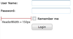
With FieldLabel, common layout tasks such as aligning the header to justify symmetrically to the left or right is as easy as property sets. For example, consider that you have a login form with four data fields. You can easily specify the label's width of the FieldLabel through the HeaderWidth property such as illustrated in the following figure.

The following code shows the example similar to the above illustration.
| XAML |
Copy Code
|
|---|---|
<StackPanel> <Intersoft:FieldLabel Header="User Name: " HeaderWidth="120"> <Intersoft:UXTextBox HorizontalAlignment="Left" VerticalAlignment="Top" Width="150" /> </Intersoft:FieldLabel> <Intersoft:FieldLabel Header="Password: " HeaderWidth="120"> <Intersoft:UXPasswordBox HorizontalAlignment="Left" VerticalAlignment="Top" Width="150" /> </Intersoft:FieldLabel> <Intersoft:FieldLabel HeaderWidth="120"> <Intersoft:UXCheckBox Content="Remember me" /> </Intersoft:FieldLabel> <Intersoft:FieldLabel HeaderWidth="120"> <Intersoft:UXButton Content="Login" Width="80"/> </Intersoft:FieldLabel> </StackPanel> |
|
You can align the header of a FieldLabel to justify horizontally to the right by setting the HorizontalHeaderAlignment to Right. Similarly, you set the VerticalHeaderAlignment to customize the vertical alignment of the header. In addition, there are a number of properties that let you easily configure the header-related appearance such as listed below:
FieldLabel uses content control architecture which allows you to put any arbitrary object to its Header and Content. FieldLabel extends the content model with ImageContent presentation to provide an efficient way to display an image to the Header. For more information about this content model, see Content Model Overview.
FieldLabel implements a built-in UX feature that lets users easily access to the input control of a data field by simply clicking anywhere in the label/header. When FieldLabel hosts a content of which type is input control, or other controls that support focus, the FieldLabel automatically focuses to the particular control when the header element is clicked. If this behavior is not desired in your application, you can disable it by setting the FocusContentOnClick property to false.
For more information about focus and other UX features, see User Experiences Overview.
Since FieldLabel exposes both Header and Content in a standalone control, you can easily style the control through a single XAML resource which consistently apply the style you desire to the header and content as a whole.
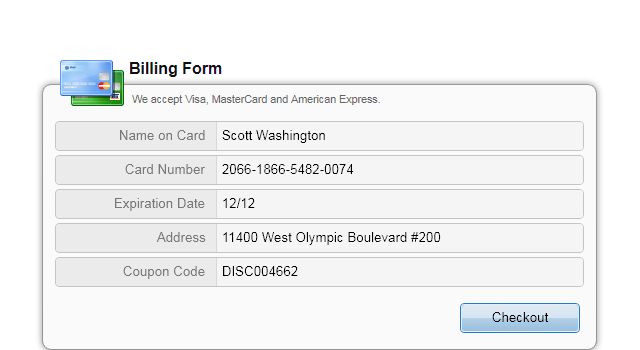
The following example shows how to style FieldLabel with a modern emboss look.
| XAML |
Copy Code
|
|---|---|
<Intersoft:UXPage.Resources> <Style x:Key="EmbossedFieldLabelStyle" TargetType="Intersoft:FieldLabel"> <Setter Property="Padding" Value="0"/> <Setter Property="HeaderForeground" Value="#FF787878"/> <Setter Property="IsTabStop" Value="False"/> <Setter Property="HorizontalContentAlignment" Value="Stretch"/> <Setter Property="VerticalContentAlignment" Value="Stretch"/> <Setter Property="Template"> <Setter.Value> <ControlTemplate TargetType="Intersoft:FieldLabel"> <Grid x:Name="RootElement"> <Border BorderBrush="{TemplateBinding BorderBrush}" BorderThickness="{TemplateBinding BorderThickness}" Background="{TemplateBinding Background}" CornerRadius="{TemplateBinding CornerRadius}"> <Intersoft:DockPanel FillChildMode="Last" Margin="{TemplateBinding Padding}"> <Border BorderBrush="{TemplateBinding HeaderBorderBrush}" Background="{TemplateBinding HeaderBackground}" Intersoft:DockPanel.Dock="{TemplateBinding HeaderPosition}" Visibility="{TemplateBinding HeaderVisibility}" Width="{TemplateBinding HeaderWidth}"> <Intersoft:StylishLabel x:Name="HeaderElement" BorderBrush="{x:Null}" Background="{x:Null}" ContentType="{TemplateBinding HeaderDisplayMode}" ContentTemplate="{TemplateBinding HeaderTemplate}" Content="{TemplateBinding Header}" Foreground="{TemplateBinding HeaderForeground}" HorizontalAlignment="{TemplateBinding HorizontalHeaderAlignment}" ImageWidth="{TemplateBinding ImageWidth}" ImageSource="{TemplateBinding HeaderImage}" ImageHeight="{TemplateBinding ImageHeight}" Margin="{TemplateBinding HeaderMargin}" Padding="0,2,2,2" TextImageRelation="{TemplateBinding TextImageRelation}" VerticalAlignment="{TemplateBinding VerticalHeaderAlignment}"/> </Border> <Intersoft:UXSeparator Orientation="Vertical" Margin="0" Background="#FFD8D8D8"/> <ContentPresenter x:Name="ContentPresenter" ContentTemplate="{TemplateBinding ContentTemplate}" Content="{TemplateBinding Content}" HorizontalAlignment="{TemplateBinding HorizontalContentAlignment}" VerticalAlignment="{TemplateBinding VerticalContentAlignment}"/> </Intersoft:DockPanel> </Border> </Grid> </ControlTemplate> </Setter.Value> </Setter> <Setter Property="Background" Value="#FFEBEBEB"/> <Setter Property="CornerRadius" Value="4"/> <Setter Property="BorderThickness" Value="1"/> <Setter Property="BorderBrush" Value="#FFC4C4C4"/> <Setter Property="Margin" Value="0,0,0,4"/> <Setter Property="HorizontalHeaderAlignment" Value="Right"/> <Setter Property="HeaderWidth" Value="200"/> <Setter Property="HeaderMargin" Value="0,4,8,4"/> </Style> </Intersoft:UXPage.Resources> <Intersoft:FieldLabel Header="User Name: " Style="{StaticResource EmbossedFieldLabelStyle}"> <Intersoft:UXTextBox HorizontalAlignment="Left" VerticalAlignment="Top" Width="150" Background="{x:Null}" BorderThickness="0"/> </Intersoft:FieldLabel> |
|
The result looks like the following figure.

To learn more on how to customize the style, see Styles and Template Overview.
You can easily customize the FieldLabel appearance through the following properties.
If you would like to completely customize the control appearance or if you want to change the styles of each visual state, you can edit the template of the control and do the modification accordingly.
To learn how to customize the template and visual states, see Styles and Template Overview.
For the list of ClientUI walkthroughs, see Walkthroughs and How-to Topics.
For the list of ClientUI samples available in local installation, see Locating the Samples in Local Installation.