
| Intersoft ClientUI 8 > ClientUI Controls > Control Library > Ribbon Controls Overview > UXRibbonBar > UXRibbonGallery Overview |
UXRibbonGallery is an items control that displays a list of items in horizontal direction. Unlike common items control, the gallery control provides a unique way to present user options graphically on the ribbon. You can use UXRibbonGallery as a standalone control, or embed it as an item of other controls such as UXRibbonDropDownButton and UXRibbonSplitButton.
This topic contains the following sections.
UXRibbonGallery can be used as a standalone control or used together with supported controls such as UXRibbonDropDownButton, UXRibbonSplitButton and UXRibbonGalleryList.
The following code shows how to use UXRibbonGallery as a standalone control.
| XAML |
Copy Code
|
|---|---|
<Intersoft:UXRibbonGallery> <Intersoft:UXRibbonGalleryItem DisplayMode="Image" ImageWidth="64" ImageHeight="48" Icon="/RibbonSample;component/Assets/Images/Doc/Item/paragraph.png" /> <Intersoft:UXRibbonGalleryItem DisplayMode="Image" ImageWidth="64" ImageHeight="48" Icon="/RibbonSample;component/Assets/Images/Doc/Item/paragraph1.png" /> <Intersoft:UXRibbonGalleryItem DisplayMode="Image" ImageWidth="64" ImageHeight="48" Icon="/RibbonSample;component/Assets/Images/Doc/Item/paragraph2.png" /> <Intersoft:UXRibbonGalleryItem DisplayMode="Image" ImageWidth="64" ImageHeight="48" Icon="/RibbonSample;component/Assets/Images/Doc/Item/paragraph3.png" /> <Intersoft:UXRibbonGalleryItem DisplayMode="Image" ImageWidth="64" ImageHeight="48" Icon="/RibbonSample;component/Assets/Images/Doc/Item/paragraph4.png" /> <Intersoft:UXRibbonGalleryItem DisplayMode="Image" ImageWidth="64" ImageHeight="48" Icon="/RibbonSample;component/Assets/Images/Doc/Item/paragraph5.png" /> <Intersoft:UXRibbonGalleryItem DisplayMode="Image" ImageWidth="64" ImageHeight="48" Icon="/RibbonSample;component/Assets/Images/Doc/Item/paragraph6.png" /> <Intersoft:UXRibbonGalleryItem DisplayMode="Image" ImageWidth="64" ImageHeight="48" Icon="/RibbonSample;component/Assets/Images/Doc/Item/paragraph7.png" /> <Intersoft:UXRibbonGalleryItem DisplayMode="Image" ImageWidth="64" ImageHeight="48" Icon="/RibbonSample;component/Assets/Images/Doc/Item/paragraph8.png" /> <Intersoft:UXRibbonGalleryItem DisplayMode="Image" ImageWidth="64" ImageHeight="48" Icon="/RibbonSample;component/Assets/Images/Doc/Item/paragraph9.png" /> </Intersoft:UXRibbonGallery> |
|
The result looks like the following figure.

UXRibbonGallery supports selection capability and provides UXRibbonGalleryItem as the item to support the selection infrastructure that complies with MVVM pattern.
UXRibbonGallery uses content control architecture which allows you to put any arbitrary object to its Content. UXRibbonGallery extends the content model with ImageContent presentation to provide an efficient way to display an image in addition to the content itself.
UXRibbonGallery also supports grouped items by category by defining the items within UXRibbonGalleryCategory. When defined, it will automatically create a new row next to the specified item.
The following code shows you to configure UXRibbonGalleryCategory in the gallery control.
| XAML |
Copy Code
|
|---|---|
<Intersoft:UXRibbonGallery> <Intersoft:UXRibbonGalleryCategory Content="Style 1" /> <Intersoft:UXRibbonGalleryItem DisplayMode="Image" ImageWidth="64" ImageHeight="48" Icon="/RibbonSample;component/Assets/Images/Doc/Item/paragraph.png" /> <Intersoft:UXRibbonGalleryItem DisplayMode="Image" ImageWidth="64" ImageHeight="48" Icon="/RibbonSample;component/Assets/Images/Doc/Item/paragraph1.png" /> <Intersoft:UXRibbonGalleryItem DisplayMode="Image" ImageWidth="64" ImageHeight="48" Icon="/RibbonSample;component/Assets/Images/Doc/Item/paragraph2.png" /> <Intersoft:UXRibbonGalleryCategory Content="Style 2" /> <Intersoft:UXRibbonGalleryItem DisplayMode="Image" ImageWidth="64" ImageHeight="48" Icon="/RibbonSample;component/Assets/Images/Doc/Item/paragraph3.png" /> <Intersoft:UXRibbonGalleryItem DisplayMode="Image" ImageWidth="64" ImageHeight="48" Icon="/RibbonSample;component/Assets/Images/Doc/Item/paragraph4.png" /> <Intersoft:UXRibbonGalleryItem DisplayMode="Image" ImageWidth="64" ImageHeight="48" Icon="/RibbonSample;component/Assets/Images/Doc/Item/paragraph5.png" /> <Intersoft:UXRibbonGalleryItem DisplayMode="Image" ImageWidth="64" ImageHeight="48" Icon="/RibbonSample;component/Assets/Images/Doc/Item/paragraph6.png" /> <Intersoft:UXRibbonGalleryItem DisplayMode="Image" ImageWidth="64" ImageHeight="48" Icon="/RibbonSample;component/Assets/Images/Doc/Item/paragraph7.png" /> <Intersoft:UXRibbonGalleryItem DisplayMode="Image" ImageWidth="64" ImageHeight="48" Icon="/RibbonSample;component/Assets/Images/Doc/Item/paragraph8.png" /> <Intersoft:UXRibbonGalleryItem DisplayMode="Image" ImageWidth="64" ImageHeight="48" Icon="/RibbonSample;component/Assets/Images/Doc/Item/paragraph9.png" /> </Intersoft:UXRibbonGallery> |
|
The result looks like the following figure.

In addition to selection control, UXRibbonGallery can also be used as command control which allows you to use controls that support command such as UXRibbonButton. The ability to define command controls in the gallery conforms to the latest Office ribbon specifications which is crucial in building rich ribbon-friendly applications.
The following code shows how to configure UXRibbonGallery and use command control such as UXRibbonButton as the child item.
| XAML |
Copy Code
|
|---|---|
<Intersoft:UXRibbonGallery Margin="10" ItemHeight="25" ItemWidth="120"> <Intersoft:UXRibbonButton Size="Medium" Content="Move to: ?" HorizontalContentAlignment="Left" Icon="/RibbonSample;component/Assets/Images/Outlook/16/move_to.png" Command="{Binding TriggerCommand}" CommandParameter="Move To"/> <Intersoft:UXRibbonButton Size="Medium" Content="To Manager" HorizontalContentAlignment="Left" Icon="/RibbonSample;component/Assets/Images/Outlook/16/to_manager.png" Command="{Binding TriggerCommand}" CommandParameter="To Manager"/> <Intersoft:UXRibbonButton Size="Medium" Content="Team E-mail" HorizontalContentAlignment="Left" Icon="/RibbonSample;component/Assets/Images/Outlook/16/team_email.png"/> <Intersoft:UXRibbonButton Size="Medium" Content="Done" HorizontalContentAlignment="Left" Icon="/RibbonSample;component/Assets/Images/Outlook/16/done.png" Command="{Binding TriggerCommand}" CommandParameter="Done"/> <Intersoft:UXRibbonButton Size="Medium" Content="Reply & Delete" HorizontalContentAlignment="Left" Icon="/RibbonSample;component/Assets/Images/Outlook/16/reply_n_delete.png" Command="{Binding TriggerCommand}" CommandParameter="Replay & Delete"/> <Intersoft:UXRibbonButton Size="Medium" Content="Create New" HorizontalContentAlignment="Left" Icon="/RibbonSample;component/Assets/Images/Outlook/16/create_new.png"/> </Intersoft:UXRibbonGallery> |
|
The result looks like the following figure.

Thanks to the solid architecture, UXRibbonGallery also works well with other ribbon-friendly controls such as:
The following code shows how to use UXRibbonGallery together with UXRibbonDropDownButton.
| XAML |
Copy Code
|
|---|---|
<Intersoft:UXRibbonDropDownButton LargeIcon="/RibbonSample;component/Assets/Images/Doc/32/change_styles.png" Icon="/RibbonSample;component/Assets/Images/Doc/32/change_styles.png" ContentWidth="250"> <Intersoft:UXRibbonGallery VerticalScrollBarVisibility="Disabled"> <Intersoft:UXRibbonGalleryItem DisplayMode="Image" ImageWidth="52" ImageHeight="52" Icon="/RibbonSample;component/Assets/Images/Doc/Item/wordart1.png" /> <Intersoft:UXRibbonGalleryItem DisplayMode="Image" ImageWidth="52" ImageHeight="52" Icon="/RibbonSample;component/Assets/Images/Doc/Item/wordart2.png" /> <Intersoft:UXRibbonGalleryItem DisplayMode="Image" ImageWidth="52" ImageHeight="52" Icon="/RibbonSample;component/Assets/Images/Doc/Item/wordart3.png" /> <Intersoft:UXRibbonGalleryItem DisplayMode="Image" ImageWidth="52" ImageHeight="52" Icon="/RibbonSample;component/Assets/Images/Doc/Item/wordart4.png" /> <Intersoft:UXRibbonGalleryItem DisplayMode="Image" ImageWidth="52" ImageHeight="52" Icon="/RibbonSample;component/Assets/Images/Doc/Item/wordart5.png" /> <Intersoft:UXRibbonGalleryItem DisplayMode="Image" ImageWidth="52" ImageHeight="52" Icon="/RibbonSample;component/Assets/Images/Doc/Item/wordart6.png" /> <Intersoft:UXRibbonGalleryItem DisplayMode="Image" ImageWidth="52" ImageHeight="52" Icon="/RibbonSample;component/Assets/Images/Doc/Item/wordart7.png" /> <Intersoft:UXRibbonGalleryItem DisplayMode="Image" ImageWidth="52" ImageHeight="52" Icon="/RibbonSample;component/Assets/Images/Doc/Item/wordart8.png" /> <Intersoft:UXRibbonGalleryItem DisplayMode="Image" ImageWidth="52" ImageHeight="52" Icon="/RibbonSample;component/Assets/Images/Doc/Item/wordart9.png" /> <Intersoft:UXRibbonGalleryItem DisplayMode="Image" ImageWidth="52" ImageHeight="52" Icon="/RibbonSample;component/Assets/Images/Doc/Item/wordart10.png" /> <Intersoft:UXRibbonGalleryItem DisplayMode="Image" ImageWidth="52" ImageHeight="52" Icon="/RibbonSample;component/Assets/Images/Doc/Item/wordart11.png" /> <Intersoft:UXRibbonGalleryItem DisplayMode="Image" ImageWidth="52" ImageHeight="52" Icon="/RibbonSample;component/Assets/Images/Doc/Item/wordart12.png" /> <Intersoft:UXRibbonGalleryItem DisplayMode="Image" ImageWidth="52" ImageHeight="52" Icon="/RibbonSample;component/Assets/Images/Doc/Item/wordart13.png" /> <Intersoft:UXRibbonGalleryItem DisplayMode="Image" ImageWidth="52" ImageHeight="52" Icon="/RibbonSample;component/Assets/Images/Doc/Item/wordart14.png" /> <Intersoft:UXRibbonGalleryItem DisplayMode="Image" ImageWidth="52" ImageHeight="52" Icon="/RibbonSample;component/Assets/Images/Doc/Item/wordart15.png" /> </Intersoft:UXRibbonGallery> <Intersoft:UXRibbonMenuItem Header="Outline" /> <Intersoft:UXRibbonMenuItem Header="Shadow" /> <Intersoft:UXRibbonMenuItem Header="Reflection" /> <Intersoft:UXRibbonMenuItem Header="Glow" /> </Intersoft:UXRibbonDropDownButton> |
|
The result looks like the following figure.

The following code shows how to use UXRibbonGallery together with UXRibbonSplitButton.
| XAML |
Copy Code
|
|---|---|
<Intersoft:UXRibbonSplitButton LargeIcon="/RibbonSample;component/Assets/Images/Doc/32/WordArt.png" Icon="/RibbonSample;component/Assets/Images/Doc/32/WordArt.png" Content="Highlight" ContentWidth="150" GalleryItemHeight="25" GalleryItemWidth="25"> <Intersoft:UXRibbonGallery VerticalScrollBarVisibility="Disabled"> <Intersoft:UXRibbonGalleryItem Background="Yellow" /> <Intersoft:UXRibbonGalleryItem Background="Green" /> <Intersoft:UXRibbonGalleryItem Background="AliceBlue" /> <Intersoft:UXRibbonGalleryItem Background="Pink" /> <Intersoft:UXRibbonGalleryItem Background="Blue" /> <Intersoft:UXRibbonGalleryItem Background="Red" /> <Intersoft:UXRibbonGalleryItem Background="BlueViolet" /> <Intersoft:UXRibbonGalleryItem Background="GreenYellow" /> <Intersoft:UXRibbonGalleryItem Background="Black" /> <Intersoft:UXRibbonGalleryItem Background="Aquamarine" /> <Intersoft:UXRibbonGalleryItem Background="Bisque" /> <Intersoft:UXRibbonGalleryItem Background="Coral" /> </Intersoft:UXRibbonGallery> <Intersoft:UXRibbonMenuItem Header="No Color" /> <Intersoft:UXSeparator /> <Intersoft:UXRibbonMenuItem Header="Stop Highlight" /> </Intersoft:UXRibbonSplitButton> |
|
The result looks like the following figure.

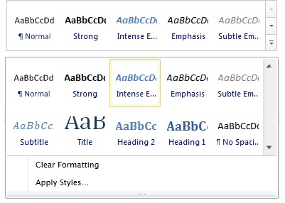
The following code shows how to use UXRibbonGallery together with UXRibbonGalleryList.
| XAML |
Copy Code
|
|---|---|
<Intersoft:UXRibbonGalleryList Content="Styles Styles" MaxLargeButtonWidth="50" Icon="/Intersoft.ClientUI.Samples.UXRibbon;component/Assets/Images/Doc/32/quickstyle.png"> <Intersoft:UXRibbonGallery> <Intersoft:UXRibbonGalleryItem DisplayMode="Image" ImageWidth="64" ImageHeight="48" Icon="/Intersoft.ClientUI.Samples.UXRibbon;component/Assets/Images/Doc/Item/paragraph.png" /> <Intersoft:UXRibbonGalleryItem DisplayMode="Image" ImageWidth="64" ImageHeight="48" Icon="/Intersoft.ClientUI.Samples.UXRibbon;component/Assets/Images/Doc/Item/paragraph1.png" /> <Intersoft:UXRibbonGalleryItem DisplayMode="Image" ImageWidth="64" ImageHeight="48" Icon="/Intersoft.ClientUI.Samples.UXRibbon;component/Assets/Images/Doc/Item/paragraph2.png" /> <Intersoft:UXRibbonGalleryItem DisplayMode="Image" ImageWidth="64" ImageHeight="48" Icon="/Intersoft.ClientUI.Samples.UXRibbon;component/Assets/Images/Doc/Item/paragraph3.png" /> <Intersoft:UXRibbonGalleryItem DisplayMode="Image" ImageWidth="64" ImageHeight="48" Icon="/Intersoft.ClientUI.Samples.UXRibbon;component/Assets/Images/Doc/Item/paragraph4.png" /> <Intersoft:UXRibbonGalleryItem DisplayMode="Image" ImageWidth="64" ImageHeight="48" Icon="/Intersoft.ClientUI.Samples.UXRibbon;component/Assets/Images/Doc/Item/paragraph5.png" /> <Intersoft:UXRibbonGalleryItem DisplayMode="Image" ImageWidth="64" ImageHeight="48" Icon="/Intersoft.ClientUI.Samples.UXRibbon;component/Assets/Images/Doc/Item/paragraph6.png" /> <Intersoft:UXRibbonGalleryItem DisplayMode="Image" ImageWidth="64" ImageHeight="48" Icon="/Intersoft.ClientUI.Samples.UXRibbon;component/Assets/Images/Doc/Item/paragraph7.png" /> <Intersoft:UXRibbonGalleryItem DisplayMode="Image" ImageWidth="64" ImageHeight="48" Icon="/Intersoft.ClientUI.Samples.UXRibbon;component/Assets/Images/Doc/Item/paragraph8.png" /> <Intersoft:UXRibbonGalleryItem DisplayMode="Image" ImageWidth="64" ImageHeight="48" Icon="/Intersoft.ClientUI.Samples.UXRibbon;component/Assets/Images/Doc/Item/paragraph9.png" /> </Intersoft:UXRibbonGallery> <Intersoft:UXRibbonMenuItem Header="Clear Formatting" /> <Intersoft:UXRibbonMenuItem Header="Apply Styles..." /> </Intersoft:UXRibbonGalleryList> |
|
The result looks like the following figure.
