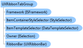

| Intersoft.Client.UI.Aqua.UXRibbon Namespace : UXRibbonTabGroup Class |

<DescriptionAttribute("Represents a collection of tab groups that support fluent interface resizing.")>
Public Class UXRibbonTabGroup
   Inherits UXRibbonTabGroupBase
   Implements Intersoft.Client.Framework.IControl, Intersoft.Client.Framework.IFramework, Intersoft.Client.Framework.IItemsControl, Intersoft.Client.Framework.ILicensing, Intersoft.Client.Framework.ISelectionItem, IRibbonKeyTipAction
Dim instance As UXRibbonTabGroup
[DescriptionAttribute("Represents a collection of tab groups that support fluent interface resizing.")]
public class UXRibbonTabGroup : UXRibbonTabGroupBase, Intersoft.Client.Framework.IControl, Intersoft.Client.Framework.IFramework, Intersoft.Client.Framework.IItemsControl, Intersoft.Client.Framework.ILicensing, Intersoft.Client.Framework.ISelectionItem, IRibbonKeyTipAction
[DescriptionAttribute("Represents a collection of tab groups that support fluent interface resizing.")]
public ref class UXRibbonTabGroup : public UXRibbonTabGroupBase, Intersoft.Client.Framework.IControl, Intersoft.Client.Framework.IFramework, Intersoft.Client.Framework.IItemsControl, Intersoft.Client.Framework.ILicensing, Intersoft.Client.Framework.ISelectionItem, IRibbonKeyTipAction
As mentioned in the section above, UXRibbonTab supports two type of group which are UXRibbonTabGroup and UXRibbonTabOrderedGroup. Both groups arrange the items differently when the space available to UXRibbonBar changes.
UXRibbonTabGroup is the default tab group that arranges all commands in a row. When resized, it will arrange and reposition the commands to adapt the size of the ribbon control based on the resizing properties such as MinimumSize and MaximumSize.
The following code shows how to configure UXRibbonTabGroup with the default MinimumSize and MaximumSize.
| XAML |
Copy Code
|
|---|---|
<Intersoft:UXRibbonTabGroup x:Name="TabGroup" Header="Illustrations"> <Intersoft:UXRibbonButton Content="Picture" MinimumSize="Large" LargeIcon="/assets/icons/picture.png" /> <Intersoft:UXRibbonButton Content="Clip Art" MinimumSize="Large" LargeIcon="/assets/icons/ClipArt.png"/> <Intersoft:UXRibbonDropDownButton Content="Shapes" MinimumSize="Large" LargeIcon="/assets/icons/shapes.png" /> <Intersoft:UXRibbonButton Content="SmartArt" Icon="/assets/icons/SmartArt.png" LargeIcon="/assets/icons/SmartArt.png"/> <Intersoft:UXRibbonButton Content="Chart" Icon="/assets/icons/chart.png" LargeIcon="/assets/icons/chart.png" /> <Intersoft:UXRibbonDropDownButton Content="Screenshot" Icon="/assets/icons/screenshot.png" LargeIcon="/assets/icons/screenshot.png"/> </Intersoft:UXRibbonTabGroup> |
|
The result looks like the following figure.

When the size state of commands are set to either Small or Medium size, they will be automatically arranged into a three-row column. A new column will be created when it finds a Large command, or when the commands cannot fit in the existing column. These arrangement behaviors are the default implementation in UXRibbonTabGroup.
To learn more about group resizing behaviors, see Customizing Fluent Resizing Behaviors in UXRibbonBar.
System.Object
System.Windows.DependencyObject
System.Windows.UIElement
System.Windows.FrameworkElement
System.Windows.Controls.Control
System.Windows.Controls.ItemsControl
Intersoft.Client.Framework.HeaderedItemsControl
Intersoft.Client.Framework.ISHeaderedItemsControl
Intersoft.Client.UI.Aqua.UXRibbon.UXRibbonTabGroupBase
Intersoft.Client.UI.Aqua.UXRibbon.UXRibbonTabGroup
Target Platforms: Windows 7, Windows Vista SP1 or later, Windows XP SP3, Windows Server 2008 (Server Core not supported), Windows Server 2008 R2 (Server Core supported with SP1 or later), Windows Server 2003 SP2