

| Intersoft ClientUI 8 > ClientUI Controls > Control Library > Ribbon Controls Overview > UXRibbonBar > Customizing Fluent Resizing Behaviors in UXRibbonBar |
UXRibbonBar is a full-featured ribbon control that implements adaptive layout (also known as fluent user interface). Modeled after Office 2010 ribbon specification, UXRibbonBar provides numerous ribbon-friendly controls that support the capability to dynamically adjust their organization, size, format, and relative scale based on changes to the size of the ribbon at run time.
This topic contains the following sections.
By default UXRibbonBar will resize the groups from last to first order if the ResizeOrder property is not set. The ResizeOrder property allows you to choose which group you want to resize first according to the resize order. You can also set the resize order in either unpatterned or patterned order. When it reaches the end of the order, it will cycle back to the first order.
The following code shows how to specify ResizeOrder in unpatterned/exact order.
| XAML |
Copy Code
|
|---|---|
<Intersoft:UXRibbonTab Header="Home" ResizeOrder="DeleteGroup,RespondGroup,RespondGroup,NewGroup,DeleteGroup,RespondGroup"> <Intersoft:UXRibbonTabGroup Name="NewGroup" MaximumSize="Small" Header="New"> <Intersoft:UXRibbonButton Content="New E-mail" MinimumSize="Large" LargeIcon="/assets/icons/new_email.png" Icon="/assets/icons/new_email.png" /> <Intersoft:UXRibbonButton Content="New Items" MinimumSize="Large" LargeIcon="/assets/icons/new_items.png" Icon="/assets/icons/new_items.png"> </Intersoft:UXRibbonButton> </Intersoft:UXRibbonTabGroup> <Intersoft:UXRibbonTabGroup Name="DeleteGroup" MaximumSize="Medium" Header="Delete"> <Intersoft:UXRibbonButton Content="Ignore" MaximumSize="Medium" Icon="/assets/icons/ignore.png" /> <Intersoft:UXRibbonButton Content="Clean Up" MaximumSize="Medium" Icon="/assets/icons/clean_up.png" /> <Intersoft:UXRibbonButton Content="Junk" MaximumSize="Medium" Icon="/assets/icons/junk.png" /> <Intersoft:UXRibbonButton Content="Delete" MinimumSize="Large" LargeIcon="/assets/icons/delete.png" /> </Intersoft:UXRibbonTabGroup> <Intersoft:UXRibbonTabGroup Name="RespondGroup" Header="Respond"> <Intersoft:UXRibbonButton Content="Reply" MinimumSize="Medium" LargeIcon="/assets/icons/reply.png" Icon="/assets/icons/reply.png" /> <Intersoft:UXRibbonButton Content="Reply All" MinimumSize="Medium" LargeIcon="/assets/icons/reply_all.png" Icon="/assets/icons/reply_all.png" /> <Intersoft:UXRibbonButton Content="Forward" MinimumSize="Medium" LargeIcon="/assets/icons/forward.png" Icon="/assets/icons/forward.png" /> <Intersoft:UXRibbonButton Content="Meeting" MaximumSize="Medium" Icon="/assets/icons/meeting2.png" /> <Intersoft:UXRibbonDropDownButton Content="IM" MaximumSize="Medium" Icon="/assets/icons/IM.png" /> <Intersoft:UXRibbonDropDownButton Content="More" MaximumSize="Medium" Icon="/assets/icons/more.png" /> </Intersoft:UXRibbonTabGroup> </Intersoft:UXRibbonTab> |
|
The result looks like the following figure.
| Default |  |
| Step 1 |  |
| Step 2 |  |
| Step 3 |  |
| Step 4 |  |
| Step 5 |  |
| Step 6 |  |
There are two types of item that can be defined in UXRibbonTab which are UXRibbonTabGroup and UXRibbonTabOrderedGroup. Each group type implements adaptive layout and has different resizing behaviors based on the specified ResizeOrder.
When the UXRibbonTabOrderedGroup is resized due to changes in the available space, it will perform one of the following possible actions.
The following code shows how to set IsMovable attach property in UXRibbonTabOrderedGroup.
| XAML |
Copy Code
|
|---|---|
<Intersoft:UXRibbonTabOrderedGroup Name="OrderedGroup"> <Intersoft:UXRibbonButton Size="Small" Icon="/assets/icons/new_items.png" /> <Intersoft:UXRibbonButton Size="Small" Icon="/assets/icons/clean_up.png" /> <Intersoft:UXRibbonButton Size="Small" Icon="/assets/icons/create_new.png" Intersoft:UXRibbonOrderedPanel.IsMovable="True"/> <Intersoft:UXRibbonButton Size="Small" Icon="/assets/icons/move.png" Intersoft:UXRibbonOrderedPanel.IsMovable="True" Intersoft:UXRibbonOrderedPanel.IsAlternateRow="True" /> <Intersoft:UXRibbonButton Size="Small" Icon="/assets/icons/new_email.png" Intersoft:UXRibbonOrderedPanel.IsAlternateRow="True" /> <Intersoft:UXRibbonButton Size="Small" Icon="/assets/icons/ignore.png" Intersoft:UXRibbonOrderedPanel.IsAlternateRow="True" /> </Intersoft:UXRibbonTabOrderedGroup> |
|
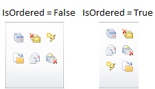
Notice that there are two buttons moved to the third row of the group when IsOrdered property is set to True.
If the group has been resized (IsOrdered = True), it will collapse the group if the IsCollapsible property is set to True. If IsCollapsible is set to False, it will proceed further to the next resize order.

When the UXRibbonTabGroup is resized based on ResizeOrder, it will change the Size using the following sequence.
Large => Medium => Small
The MinimumSize and MaximumSize properties act as the boundary to how far the group can be resized. Similar to UXRibbonTabOrderedGroup, if the group is going to be resized and the current size is already equal with the MinimumSize, it will be collapsed if the IsCollapsible property is set to True. If IsCollapsible is set to False, it will proceed to the next group defined in the ResizeOrder property.
The following code shows how to configure UXRibbonTabGroup with MinimumSize and MazimumSize.
| XAML |
Copy Code
|
|---|---|
<Intersoft:UXRibbonTabGroup x:Name="TabGroup" Header="Illustrations"> <Intersoft:UXRibbonButton Content="Picture" MinimumSize="Large" LargeIcon="/assets/icons/picture.png" /> <Intersoft:UXRibbonButton Content="Clip Art" MinimumSize="Large" LargeIcon="/assets/icons/ClipArt.png"/> <Intersoft:UXRibbonDropDownButton Content="Shapes" MinimumSize="Large" LargeIcon="/assets/icons/shapes.png" /> <Intersoft:UXRibbonButton Content="SmartArt" Icon="/assets/icons/SmartArt.png" LargeIcon="/assets/icons/SmartArt.png"/> <Intersoft:UXRibbonButton Content="Chart" Icon="/assets/icons/chart.png" LargeIcon="/assets/icons/chart.png" /> <Intersoft:UXRibbonDropDownButton Content="Screenshot" Icon="/assets/icons/screenshot.png" LargeIcon="/assets/icons/screenshot.png"/> </Intersoft:UXRibbonTabGroup> |
|
The result looks like the following figure.

The group size in above figure is in Large mode. Notice that all the controls inside the group are in Large mode as well.

The group size in above figure is in Medium mode. Notice that all the controls inside the group are in Medium mode, except for controls which MinimumSize property is set to Large.

The group size in above figure is in Small mode. Notice that all the controls inside the group are in Small mode, except for controls which MinimumSize property is set to Large.

The group size in above picture is in Collapsed mode.
You can create your own controls that participate with the resizing process of UXRibbonBar by implementing the IRibbonControl interface. As a result, your control will define a number of properties such as Size, MinimumSize, MaximumSize, Icon and LargeIcon which are required by the ribbon's adaptive layout implementation.
Intersoft UXRibbon ships with several built-in controls that already participate with the resizing process such as:
The following figure shows each size state of the button control.
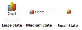
The following figure shows each size state of the toggle button control.
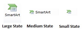
The following figure shows each size state of the dropdown button control.
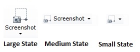
The following figure shows each size state of the split button control.
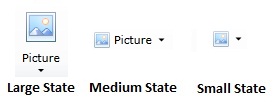
The following figure shows each size state of the field label control.
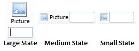
The following figure shows each size state of the gallery list control.
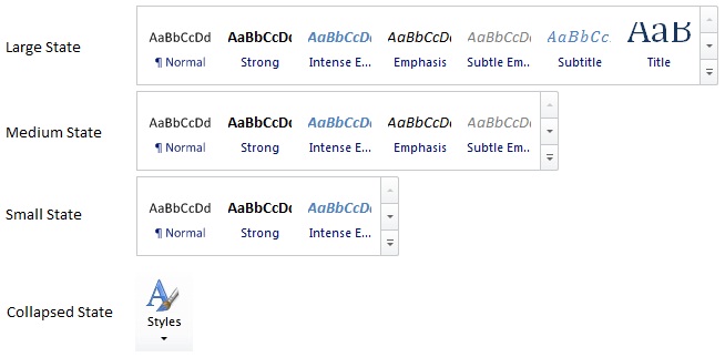
There are certain ribbon-aware controls that don't have any size state due to the control's nature such as:
This section explains a number of scenarios that can be achieved by combining the size-related properties between UXRibbonTabGroup and its child controls. The following list describes the possible scenarios.

The above result can be achieved with the following code.
| XAML |
Copy Code
|
|---|---|
<Intersoft:UXRibbonTabGroup Name="RespondGroup" Header="Respond" Icon="/assets/icons/respond.png"> <Intersoft:UXRibbonButton Content="Reply" MinimumSize="Medium" LargeIcon="/assets/icons/reply.png" Icon="/assets/icons/reply.png" /> <Intersoft:UXRibbonButton Content="Reply All" MinimumSize="Medium" LargeIcon="/assets/icons/reply_all.png" Icon="/assets/icons/reply_all.png" /> <Intersoft:UXRibbonButton Content="Forward" MinimumSize="Medium" LargeIcon="/assets/icons/forward.png" Icon="/assets/icons/forward.png" /> <Intersoft:UXRibbonButton Content="Meeting" MaximumSize="Medium" Icon="/assets/icons/meeting2.png" /> <Intersoft:UXRibbonDropDownButton Content="IM" MaximumSize="Medium" Icon="/assets/icons/IM.png" /> <Intersoft:UXRibbonDropDownButton Content="More" MaximumSize="Medium" Icon="/assets/icons/more.png" /> </Intersoft:UXRibbonTabGroup> |
|
The following table illustrates the tab group and each button appearance when resized.
| Step 1 | Medium |  |
| Step 2 | Small |  |
| Step 3 | Collapsed |  |

The above result can be achieved with the following code.
| XAML |
Copy Code
|
|---|---|
<Intersoft:UXRibbonTabGroup Name="DeleteGroup" MaximumSize="Medium" Header="Delete" Icon="/assets/icons/delete_group.png"> <Intersoft:UXRibbonButton Content="Ignore" MaximumSize="Medium" Icon="/assets/icons/ignore.png" /> <Intersoft:UXRibbonDropDownButton Content="Clean Up" MaximumSize="Medium" Icon="/assets/icons/clean_up.png" /> <Intersoft:UXRibbonDropDownButton Content="Junk" MaximumSize="Medium" Icon="/assets/icons/junk.png" /> <Intersoft:UXRibbonButton Content="Delete" MinimumSize="Large" LargeIcon="/assets/icons/delete.png" /> </Intersoft:UXRibbonTabGroup> |
|
The following table illustrates the result of the tab group when resized.
| Step 1 | Small |  |
| Step 2 | Collapsed |  |
Notice that the resize in this group starts from medium, that's possible since the MaximumSize property of the group is set to Medium.

The above result can be achieved with the following code.
| XAML |
Copy Code
|
|---|---|
<Intersoft:UXRibbonTabGroup x:Name="tab2Group3" Header="Illustrations" Icon="/assets/icons/illustration.png"> <Intersoft:UXRibbonButton Content="Picture" MinimumSize="Large" LargeIcon="/assets/icons/picture.png" /> <Intersoft:UXRibbonButton Content="Clip Art" MinimumSize="Large" LargeIcon="/assets/icons/clipart.png" /> <Intersoft:UXRibbonDropDownButton Content="Shapes" MinimumSize="Large" LargeIcon="/assets/icons/shapes.png" /> <Intersoft:UXRibbonButton Content="SmartArt" Icon="/assets/icons/smartart.png" LargeIcon="/assets/icons/smartart.png" /> <Intersoft:UXRibbonButton Content="Chart" Icon="/assets/icons/chart.png" LargeIcon="/assets/icons/chart.png" /> <Intersoft:UXRibbonDropDownButton Content="Screenshot" Icon="/assets/icons/screenshot.png" LargeIcon="/assets/icons/screenshot.png" /> </Intersoft:UXRibbonTabGroup> |
|
The following table illustrates the tab group and each button appearance when resized.
| Step 1 | Medium | 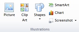 |
| Step 2 | Small | 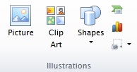 |
| Step 3 | Collapsed |  |
Notice that only the last three buttons are responding to the resizing process since the first three buttons have their MinimumSize property set to Large.