
| Intersoft ClientUI 8 > ClientUI Controls > Control Library > Button Controls Overview > UXDropDownButton |
UXDropDownButton is an advanced button control that represents one or more commands in the form of dropdown menu. It features built-in professional style and Aero-themed menu suitable for corporate business application interface. You can customize many of the menu settings such as the display and hide animation, the preferred position and slide direction and much more.

UXDropDownButton is using ContentItems model which means that the control exposes both Button and ItemsControl characteristic. To learn more about this content model, see Content Model Overview.
UXDropDownButton is an advanced button control that represents one or more commands in the form of dropdown menu. This dropdown menu is created using UXContextMenu control which uses UXPopup as its fundamental architecture.
Consequently, the dropdown menu of UXDropDownButton shares a number of common settings with UXPopup such as positioning, hide and display animation, and more.
To learn more about the popup mechanism, see Popup Overview.
UXDropDownButton also supports binding / hierarchical binding. To learn more about data binding see Data Binding Overview.
To bind the data you can either use ItemTemplate or the member path properties such as:
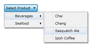
The following example shows how to perform hierarchical binding to UXDropDownButton using MVVM pattern.
| Category (Model) |
Copy Code
|
|---|---|
using System.ComponentModel; using System.Collections.ObjectModel; namespace ClientUI.Samples.Models { public class Category : INotifyPropertyChanged { private string _categoryName; private ObservableCollection<Product> _products; public string CategoryName { get { return this._categoryName; } set { if (this._categoryName != value) { this._categoryName = value; this.OnPropertyChanged("CategoryName"); } } } public ObservableCollection<Product> Products { get { return this._products; } set { if (this._products != value) { this._products = value; this.OnPropertyChanged("Products"); } } } protected void OnPropertyChanged(string propertyName) { if (this.PropertyChanged != null) { this.PropertyChanged(this, new PropertyChangedEventArgs(propertyName)); } } public event PropertyChangedEventHandler PropertyChanged; } } |
|
| Product (Model) |
Copy Code
|
|---|---|
using System.ComponentModel; using System.Windows.Media; namespace ClientUI.Samples.Models { public class Product : INotifyPropertyChanged { private string _productName; public string ProductName { get { return this._productName; } set { if (this._productName != value) { this._productName = value; this.OnPropertyChanged("ProductName"); } } } protected void OnPropertyChanged(string propertyName) { if (this.PropertyChanged != null) { this.PropertyChanged(this, new PropertyChangedEventArgs(propertyName)); } } public event PropertyChangedEventHandler PropertyChanged; } } |
|
| View Model |
Copy Code
|
|---|---|
using System.Collections.ObjectModel; using System.ComponentModel; using ClientUI.Samples.Models; namespace ClientUI.Samples.ViewModels { public class MainPageViewModel : INotifyPropertyChanged { public MainPageViewModel() { this.Data = new ObservableCollection<Category>(); Category beverages = new Category(); beverages.CategoryName = "Beverages"; beverages.Products = new ObservableCollection<Product>(); beverages.Products.Add(new Product() { ProductName = "Chai" }); beverages.Products.Add(new Product() { ProductName = "Chang" }); beverages.Products.Add(new Product() { ProductName = "Sasquatch Ale" }); beverages.Products.Add(new Product() { ProductName = "Ipoh Coffee" }); Category seafood = new Category(); seafood.CategoryName = "Seafood"; seafood.Products = new ObservableCollection<Product>(); seafood.Products.Add(new Product() { ProductName = "Ikura" }); seafood.Products.Add(new Product() { ProductName = "Konbu" }); seafood.Products.Add(new Product() { ProductName = "Carnarvon Tigers" }); seafood.Products.Add(new Product() { ProductName = "Escargots de Bourgogne" }); this.Data.Add(beverages); this.Data.Add(seafood); } private ObservableCollection<Category> _data; public ObservableCollection<Category> Data { get { return this._data; } set { if (this._data != value) { this._data = value; this.OnPropertyChanged("Data"); } } } protected void OnPropertyChanged(string propertyName) { PropertyChangedEventHandler handler = PropertyChanged; if (handler != null) { handler(this, new PropertyChangedEventArgs(propertyName)); } } public event PropertyChangedEventHandler PropertyChanged; } } |
|
| View |
Copy Code
|
|---|---|
<UserControl x:Class="ClientUI.Samples.MainPage" xmlns="http://schemas.microsoft.com/winfx/2006/xaml/presentation" xmlns:x="http://schemas.microsoft.com/winfx/2006/xaml" xmlns:d="http://schemas.microsoft.com/expression/blend/2008" xmlns:mc="http://schemas.openxmlformats.org/markup-compatibility/2006" xmlns:Intersoft="http://intersoft.clientui.com/schemas" xmlns:vm="clr-namespace:ClientUI.Samples.ViewModels" mc:Ignorable="d" d:DesignHeight="400" d:DesignWidth="800"> <Grid x:Name="LayoutRoot" Background="White"> <Grid.DataContext> <vm:MainPageViewModel/> </Grid.DataContext> <Intersoft:UXDropDownButton HorizontalAlignment="Center" VerticalAlignment="Center" Content="Select Product" ItemsSource="{Binding Data}" DisplayMemberPath="CategoryName" CollectionMemberPath="Products"> <Intersoft:UXDropDownButton.ItemContainerStyle> <Style TargetType="Intersoft:UXMenuItem"> <Setter Property="DisplayMemberPath" Value="ProductName"/> </Style> </Intersoft:UXDropDownButton.ItemContainerStyle> </Intersoft:UXDropDownButton> </Grid> </UserControl> |
|

This example is using MVVM pattern that uses data binding concept. To learn more about MVVM pattern, see MVVM Pattern Overview.
The item container type of UXDropDownButton is UXMenuItem, which is a HeaderedItemsControl that using UXContextMenu to display its items.
UXMenuItem implements both ICommandSource and INavigationSource to support commanding and navigation, such as shown in the following example
| XAML |
Copy Code
|
|---|---|
<Intersoft:UXDropDownButton Content="Info" HorizontalAlignment="Center" VerticalAlignment="Center"> <Intersoft:UXMenuItem Header="Contact Us" Command="{Binding ContactCommand}"/> <Intersoft:UXMenuItem Header="About Us" NavigateUri="www.mywebsite.com/contactus" TargetName="_blank"/> </Intersoft:UXDropDownButton> |
|
You can do commanding through Command, CommandTarget and CommandParameter properties and navigation using NavigateUri and TargetName properties. To learn more about commanding, see Commanding Overview. To learn more about navigation, see Navigation Overview.
To open or display the dropdown menu of UXDropDownButton, you can simply set the ISDropDownOpen property to True. Alternatively you can click the UXDropDownButton to set the ISDropDownOpen property.
Similar to other buttons, UXDropDownButton also has ClickMode property that determines the action that triggers the click event. When the ClickMode property is set to Pressed, UXDropDownButton will display the dropdown menu when it is being pressed.
UXDropDownButton shares several common properties with UXPopup that controls the dropdown menu position. The following list describes the properties that control the dropdown menu position.
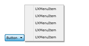
The following examples show how to change the dropdown menu position using the properties above.
| XAML |
Copy Code
|
|---|---|
<Intersoft:UXDropDownButton Content="Button" HorizontalAlignment="Center" VerticalAlignment="Center" PreferredPosition="BottomRight" PreferredVerticalDirection="Up"> <Intersoft:UXMenuItem Header="UXMenuItem"/> <Intersoft:UXMenuItem Header="UXMenuItem"/> <Intersoft:UXMenuItem Header="UXMenuItem"/> <Intersoft:UXMenuItem Header="UXMenuItem"/> <Intersoft:UXMenuItem Header="UXMenuItem"/> </Intersoft:UXDropDownButton> |
|

To learn more about dropdown menu positioning, see Popup Overview.
UXDropDownButton also has similar properties with UXPopup which controls the dropdown menu animation. The following list describes the properties that control the dropdown menu animation.
Although these properties allow you to control each visual effects individually, it is advised that you avoid mixing the animation for DisplayAnimation or HideAnimation. If you want to disable certain animation, you can set the DisplayAnimation or HideAnimation property to None.
You can easily customize the UXDropDownButton appearance through the following properties.
If you would like to completely customize the control appearance or if you want to change the styles of each visual state available in UXDropDownButton, you can edit the template of the control and do the modification accordingly.
To learn more how to change the template and the visual states, see Styles and Template Overview.