
| Intersoft ClientUI 8 > ClientUI Controls > Control Library > Input Controls Overview > UXCheckBox |
UXCheckBox is a lightweight, Aero-style checkbox control featuring standards-compliance usability features such as access key support and keyboard focus visual. It also supports three-state checkbox with built-in visual state for Checked, Unchecked and Indeterminate.

UXCheckBox is one of the fundamental input controls which primarily used to obtain the selection status about particular options in a data entry application. The simplest usage of UXCheckBox is to get the selection state in the form of two-state boolean, true indicates that an option is checked, false otherwise.
UXCheckBox derives from UXToggleButton and shares several features in common such as three state selection, selection routed events and more. This means that you can use UXCheckBox to obtain data input which accepts Checked, Unchecked and Indeterminate state. You enable the three state mode by setting the IsThreeState property to true, then get or set the selection state through the CheckedState property. For more information, see UXToggleButton Overview.
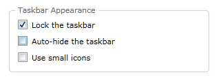
The following example shows how to use UXCheckBox to achieve a scenario similar to the options in task bar settings.
| XAML |
Copy Code
|
|---|---|
<Intersoft:GroupBox Header="Taskbar Appearance" Margin="20" VerticalAlignment="Bottom"> <StackPanel VerticalAlignment="Top"> <Intersoft:UXCheckBox Content="Lock the taskbar" HorizontalAlignment="Left" CheckState="true" /> <Intersoft:UXCheckBox Content="Auto-hide the taskbar" HorizontalAlignment="Left" /> <Intersoft:UXCheckBox Content="Use small icons" HorizontalAlignment="Left" /> </StackPanel> </Intersoft:GroupBox> |
|
The result looks like the following figure.

UXCheckBox comes with predefined Aero-style theme, including the visual states that represent each user interaction, such as mouse over, focused, and more. Unlike toggle button, UXCheckBox includes visual state for Checked, Unchecked and Indeterminate state. This allows you to use the three-state selection feature without the needs to add or customize the visual state.
The following illustration shows the visual state for Checked, Unchecked and Indeterminate.

To learn how to customize the visual states, see Styles and Template Overview.
UXCheckBox indirectly derives from UXButton, which means it exposes all features and characteristics of UXButton, such as ImageContent presentation model, default and cancel button, dialog result, commanding, navigation, and more.
To learn about the common features of button, see UXButton Overview.
UXCheckBox also supports keyboard focus visual, access key using Enter key and other UX features. For more information, see User Experiences Overview.
You can easily customize the UXCheckBox appearance through the following properties.
If you would like to completely customize the control appearance or if you want to change the styles of each visual state, you can edit the template of the control and do the modification accordingly.
To learn how to customize the template and visual states, see Styles and Template Overview.
For the list of ClientUI walkthroughs, see Walkthroughs and How-to Topics.
For the list of ClientUI samples available in local installation, see Locating the Samples in Local Installation.