
| Intersoft ClientUI 8 > ClientUI Controls > Control Library > Input Controls Overview > UXComboBox |
UXComboBox is a selection control with built-in text search support, editable mode and fully support MVVM model.

UXComboBox is inherited from ISSelectionControl, which means it can be used to perform a single selection. For more information about selection control, see ItemsControl Overview and Content Model Overview.
You can bind a collection of data to UXComboBox or to any ItemsControl. To learn more about data binding, see Data Binding Overview.
To bind the data, you can either use ItemTemplate or the member path properties such as:
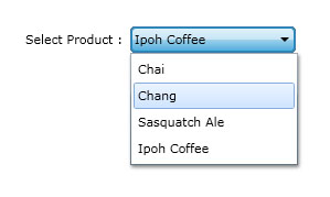
The following example shows how to perform binding to UXComboBox using member path properties.
| Model |
Copy Code
|
|---|---|
using System.ComponentModel; using System.Windows.Media; namespace ClientUI.Samples.Models { public class Product : INotifyPropertyChanged { private string _productName; public string ProductName { get { return this._productName; } set { if (this._productName != value) { this._productName = value; this.OnPropertyChanged("ProductName"); } } } protected void OnPropertyChanged(string propertyName) { if (this.PropertyChanged != null) { this.PropertyChanged(this, new PropertyChangedEventArgs(propertyName)); } } public event PropertyChangedEventHandler PropertyChanged; } } |
|
| View Model |
Copy Code
|
|---|---|
using System.Collections.ObjectModel; using System.ComponentModel; using ClientUI.Samples.Models; namespace ClientUI.Samples.ViewModels { public class MainPageViewModel : INotifyPropertyChanged { public MainPageViewModel() { this.Data = new ObservableCollection<Product>(); this.Data.Add(new Product() { ProductName = "Chai" }); this.Data.Add(new Product() { ProductName = "Chang" }); this.Data.Add(new Product() { ProductName = "Sasquatch Ale" }); this.Data.Add(new Product() { ProductName = "Ipoh Coffee" }); } private ObservableCollection<Product> _data; public ObservableCollection<Product> Data { get { return this._data; } set { if (this._data != value) { this._data = value; this.OnPropertyChanged("Data"); } } } protected void OnPropertyChanged(string propertyName) { PropertyChangedEventHandler handler = PropertyChanged; if (handler != null) { handler(this, new PropertyChangedEventArgs(propertyName)); } } public event PropertyChangedEventHandler PropertyChanged; } } |
|
| View |
Copy Code
|
|---|---|
<UserControl x:Class="ClientUI.Samples.MainPage" xmlns="http://schemas.microsoft.com/winfx/2006/xaml/presentation" xmlns:x="http://schemas.microsoft.com/winfx/2006/xaml" xmlns:d="http://schemas.microsoft.com/expression/blend/2008" xmlns:mc="http://schemas.openxmlformats.org/markup-compatibility/2006" xmlns:Intersoft="http://intersoft.clientui.com/schemas" xmlns:vm="clr-namespace:ClientUI.Samples.ViewModels" mc:Ignorable="d" d:DesignHeight="400" d:DesignWidth="800"> <Grid x:Name="LayoutRoot" Background="White"> <Grid.DataContext> <vm:MainPageViewModel></vm:MainPageViewModel> </Grid.DataContext> <Intersoft:FieldLabel Header="Select Product : " HorizontalAlignment="Center" VerticalAlignment="Center"> <Intersoft:UXComboBox ItemsSource="{Binding Data}" DisplayMemberPath="ProductName" VerticalAlignment="Center" Width="150"></Intersoft:UXComboBox> </Intersoft:FieldLabel> </Grid> </UserControl> |
|

This example is using MVVM pattern that uses an advanced binding concept. To learn more about MVVM pattern, see MVVM Pattern Overview.
The item container type of UXComboBox is UXComboBoxItem.
UXComboBoxItem supports ImageContent model. You can use the ImageMemberPath to bind an image field to the image element of UXComboBoxItem.
| View |
Copy Code
|
|---|---|
<UserControl x:Class="ClientUI.Samples.MainPage" xmlns="http://schemas.microsoft.com/winfx/2006/xaml/presentation" xmlns:x="http://schemas.microsoft.com/winfx/2006/xaml" xmlns:d="http://schemas.microsoft.com/expression/blend/2008" xmlns:mc="http://schemas.openxmlformats.org/markup-compatibility/2006" xmlns:Intersoft="http://intersoft.clientui.com/schemas" xmlns:vm="clr-namespace:ClientUI.Samples.ViewModels" mc:Ignorable="d" d:DesignHeight="400" d:DesignWidth="800"> <Grid x:Name="LayoutRoot" Background="White"> <Grid.DataContext> <vm:MainPageViewModel></vm:MainPageViewModel> </Grid.DataContext> <Intersoft:FieldLabel Header="Select Product : " HorizontalAlignment="Center" VerticalAlignment="Center"> <Intersoft:UXComboBox ItemContentType="ContentAndImage" ItemsSource="{Binding Data}" DisplayMemberPath="ProductName" ImageMemberPath="ProductImage" VerticalAlignment="Center" Width="150"></Intersoft:UXComboBox> </Intersoft:FieldLabel> </Grid> </UserControl> |
|
UXComboBox also supports text search capability similar to UXListBox. To enable the text search, you set the IsTextSearchEnable to true.
| XAML |
Copy Code
|
|---|---|
<Intersoft:UXComboBox HorizontalAlignment="Left" VerticalAlignment="Top" Width="150" IsTextSearchEnabled="True"> <Intersoft:UXComboItem Content="Andrew"/> <Intersoft:UXComboItem Content="Angela"/> <Intersoft:UXComboItem Content="Angeline"/> <Intersoft:UXComboItem Content="David"/> <Intersoft:UXComboItem Content="Hill"/> <Intersoft:UXComboItem Content="Karen"/> <Intersoft:UXComboItem Content="Kory"/> <Intersoft:UXComboItem Content="Michelle"/> </Intersoft:UXComboBox> |
|
To enable case sensitivity in the text search, you set the IsTextSearchCaseSensitity property to true.
For more information about user experience features such as text search, see User Experiences Overview.
UXComboBox supports editable mode that works in conjunction with the text search. If you enable both editable and text search feature, UXComboBox automatically completes the text whenever it found a match in the items. To enable editable mode, set IsEditable set to True, such as shown in the following example.
| XAML |
Copy Code
|
|---|---|
<Intersoft:UXComboBox HorizontalAlignment="Left" VerticalAlignment="Top" Width="150" IsTextSearchEnabled="True" IsEditable="True"> <Intersoft:UXComboItem Content="Andrew"/> <Intersoft:UXComboItem Content="Angela"/> <Intersoft:UXComboItem Content="Angeline"/> <Intersoft:UXComboItem Content="David"/> <Intersoft:UXComboItem Content="Hill"/> <Intersoft:UXComboItem Content="Karen"/> <Intersoft:UXComboItem Content="Kory"/> <Intersoft:UXComboItem Content="Michelle"/> </Intersoft:UXComboBox> |
|
UXComboBox shares several common properties with UXPopup that controls the dropdown menu position. The following list describes the properties that controls the dropdown menu position.
UXComboBox also has properties similar to UXPopup which controls the dropdown menu animation. The following list describes the properties that control the dropdown menu animation.
Although these properties allow you to control each visual effects individually, it is advised that you avoid mixing the animation for DisplayAnimation or HideAnimation. If you want to disable certain animation, you can set the DisplayAnimation or HideAnimation property to None.
You can customize the UXComboBox appearance through the following properties.
If you would like to completely customize the control appearance or if you want to change the styles of each visual state available in UXDropDownButton, you can edit the template of the control and do the modification accordingly.
To learn more how to change the template and the visual states, see Styles and Template Overview.