
| Intersoft ClientUI 8 > ClientUI Controls > Control Library > Input Controls Overview > UXRadioButton |
UXRadioButton is a full-featured input control that represents group of choices within the same group or within the same focus scope. It includes full support for standards-compliance usability such as keyboard support, focus visual, tabbing behavior and more. The appearance and style settings of UXRadioButton, such as the content mode, foreground and brushes can be easily customized.

You use UXRadioButton to allow users to select one of a range of options. UXRadioButton works similar to UXToggleButton in many ways except they use different kind of presentation.
Since UXRadioButton indirectly derives from UXButton, it exposes many of the features available in UXButton such as ImageContent presentation model, default and cancel button, dialog result, commanding, navigation, and more. To learn about the common features of the button, see UXButton Overview.
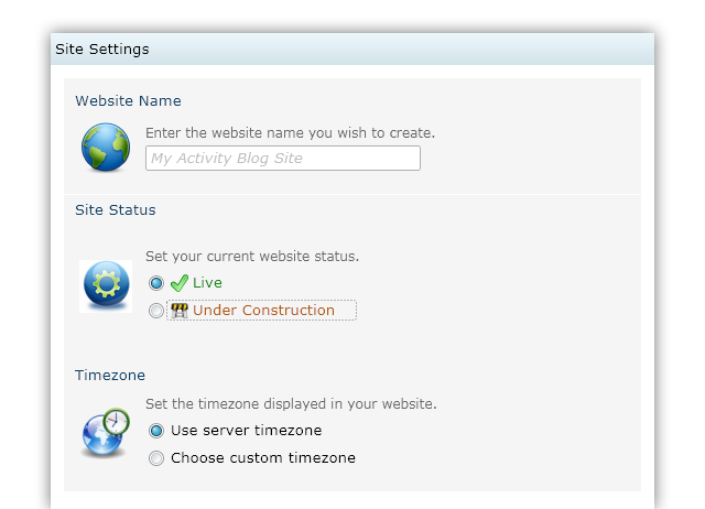
The following example shows how to create a number of UXRadioButton instances to represent a group of choices.
| XAML |
Copy Code
|
|---|---|
<StackPanel> <Intersoft:UXRadioButton Content="Use server timezone" VerticalContentAlignment="Center" CheckedState="True"/> <Intersoft:UXRadioButton Content="Choose custom timezone" VerticalContentAlignment="Center"/> </StackPanel> |
|
Unlike toggle button, the UXRadioButton implements focus scope architecture which automatically define a unique group across multiple instances of UXRadioButton within the same container that defines focus scope. This design is suitable due to the nature of UXRadioButton that allows only a single selection in the group. Containers that define focus scope are such as GroupBox and ExpandableGroupBox.
When UXRadioButton is used in focus scope-aware container, you do not need to explicitly define the GroupName of the radio button instances. This is made possible because the focus scope-aware container has capability to query the active selection required by input controls such as UXRadioButton. Consequently, when you select a radio button, it will automatically deselect the other radio buttons within the same focus scope.
The following example shows the UXRadioButton instances used in a GroupBox.
| XAML |
Copy Code
|
|---|---|
<Intersoft:GroupBox Header="Timezone"> <StackPanel> <Intersoft:UXRadioButton Content="Use server timezone" VerticalContentAlignment="Center" CheckedState="True"/> <Intersoft:UXRadioButton Content="Choose custom timezone" VerticalContentAlignment="Center"/> </StackPanel> </Intersoft:GroupBox> |
|
To learn more about focus scope and related user experience features, see User Experiences Overview.
You can easily customize the UXRadioButton appearance through the following properties.
If you would like to completely customize the control appearance or if you want to change the styles of each visual state, you can edit the template of the control and do the modification accordingly.
To learn how to customize the template and visual states, see Styles and Template Overview.
For the list of ClientUI walkthroughs, see Walkthroughs and How-to Topics.
For the list of ClientUI samples available in local installation, see Locating the Samples in Local Installation.