
| Intersoft.Client.UI.Controls Namespace : FieldLabel Class |

<DescriptionAttribute("Represents a content control for displaying a field label with a single arbitrary child content.")>
<StyleTypedPropertyAttribute(Property="HeaderStyle", StyleTargetType=Intersoft.Client.UI.Controls.StylishLabel)>
Public Class FieldLabel
   Inherits Intersoft.Client.Framework.ISHeaderedContentControl
   Implements Intersoft.Client.Framework.IControl, Intersoft.Client.Framework.IFramework, Intersoft.Client.Framework.ILicensing
Dim instance As FieldLabel
[DescriptionAttribute("Represents a content control for displaying a field label with a single arbitrary child content.")]
[StyleTypedPropertyAttribute(Property="HeaderStyle", StyleTargetType=Intersoft.Client.UI.Controls.StylishLabel)]
public class FieldLabel : Intersoft.Client.Framework.ISHeaderedContentControl, Intersoft.Client.Framework.IControl, Intersoft.Client.Framework.IFramework, Intersoft.Client.Framework.ILicensing
[DescriptionAttribute("Represents a content control for displaying a field label with a single arbitrary child content.")]
[StyleTypedPropertyAttribute(Property="HeaderStyle", StyleTargetType=Intersoft.Client.UI.Controls.StylishLabel)]
public ref class FieldLabel : public Intersoft.Client.Framework.ISHeaderedContentControl, Intersoft.Client.Framework.IControl, Intersoft.Client.Framework.IFramework, Intersoft.Client.Framework.ILicensing
FieldLabel is inherited from IsHeaderedContentControl, which means it has both Header and Content that can contain a single object of any type (such as a string, an image, or a panel). For more information about this content model see Content Model Overview.
You use FieldLabel to represent a data field that typically consists of a label and an input control. The label of a FieldLabel can be customized through the Header property, while the input control is defined in the Content property. Beside input controls, you can actually use any kind of controls as the content such as check box, radio button, combo box and so on.
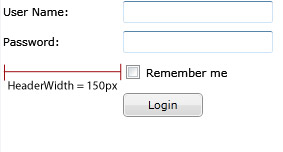
With FieldLabel, common layout tasks such as aligning the header to justify symmetrically to the left or right is as easy as property sets. For example, consider that you have a login form with four data fields. You can easily specify the label's width of the FieldLabel through the HeaderWidth property such as illustrated in the following figure.

The following code shows the example similar to the above illustration.
| XAML |
Copy Code
|
|---|---|
<StackPanel> <Intersoft:FieldLabel Header="User Name: " HeaderWidth="120"> <Intersoft:UXTextBox HorizontalAlignment="Left" VerticalAlignment="Top" Width="150" /> </Intersoft:FieldLabel> <Intersoft:FieldLabel Header="Password: " HeaderWidth="120"> <Intersoft:UXPasswordBox HorizontalAlignment="Left" VerticalAlignment="Top" Width="150" /> </Intersoft:FieldLabel> <Intersoft:FieldLabel HeaderWidth="120"> <Intersoft:UXCheckBox Content="Remember me" /> </Intersoft:FieldLabel> <Intersoft:FieldLabel HeaderWidth="120"> <Intersoft:UXButton Content="Login" Width="80"/> </Intersoft:FieldLabel> </StackPanel> |
|
For more information about FieldLabel, see FieldLabel Overview.
System.Object
System.Windows.DependencyObject
System.Windows.UIElement
System.Windows.FrameworkElement
System.Windows.Controls.Control
System.Windows.Controls.ContentControl
Intersoft.Client.Framework.ISContentControl
Intersoft.Client.Framework.ISHeaderedContentControl
Intersoft.Client.UI.Controls.FieldLabel
Intersoft.Client.UI.Aqua.UXRibbon.UXRibbonFieldLabel
Target Platforms: Windows 7, Windows Vista SP1 or later, Windows XP SP3, Windows Server 2008 (Server Core not supported), Windows Server 2008 R2 (Server Core supported with SP1 or later), Windows Server 2003 SP2