
| Intersoft.Client.UI.Aqua.UXRibbon Namespace : UXRibbonToolTipService Class |
<DescriptionAttribute("Represents a service for UXRibbonToolTip.")>
Public Class UXRibbonToolTipService
Dim instance As UXRibbonToolTipService
[DescriptionAttribute("Represents a service for UXRibbonToolTip.")]
public class UXRibbonToolTipService
[DescriptionAttribute("Represents a service for UXRibbonToolTip.")]
public ref class UXRibbonToolTipService
Ribbon tooltip is an enhanced tooltip that supports four predefined content: header, body, image and footer. You can set the ribbon tooltip by specifying the UXRibbonToolTipService attached property on the desired controls. In addition to the ribbon-aware controls, the ribbon tooltip can also be set on any other controls that derive from Control class. When specified on ribbon-aware controls which are contained in a tab group, the tooltip will be automatically positioned under the ribbon.
The following list describes the properties that you can customize in the ribbon tooltip.
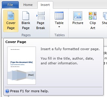
The following example shows how to configure the ribbon tooltip.
| XAML |
Copy Code
|
|---|---|
<Intersoft:UXRibbonButton Content="Cover Page" MinimumSize="Medium" Icon="/assets/icons/cover_page.png" LargeIcon="/assets/icons/cover_page.png" Intersoft:UXRibbonToolTipService.Header="Cover Page" Intersoft:UXRibbonToolTipService.Content="Insert a fully formatted cover page. You fill in the title, author, date, and other information." Intersoft:UXRibbonToolTipService.ImageSource="/Intersoft.ClientUI.Samples.UXRibbon;component/Assets/Images/Doc/Item/insert_cover tooltip.png" > <Intersoft:UXRibbonToolTipService.Footer> <StackPanel Orientation="Vertical"> <Intersoft:UXSeparator /> <StackPanel Orientation="Horizontal" Margin="0,4,0,2"> <Image Source="/assets/icons/help.png" Width="16" Height="16" /> <TextBlock Text="Press F1 for more help." Margin="2,0" VerticalAlignment="Center" /> </StackPanel> </StackPanel> </Intersoft:UXRibbonToolTipService.Footer> </Intersoft:UXRibbonButton> |
|
The result looks like the following figure.

Notice that the ribbon tooltip is automatically displayed under the ribbon bar which conforms to the Office ribbon specifications.
To learn more about UXRibbonToolTipService, see Customizing Ribbon Tooltip.
System.Object
Intersoft.Client.UI.Aqua.UXRibbon.UXRibbonToolTipService
Target Platforms: Windows 7, Windows Vista SP1 or later, Windows XP SP3, Windows Server 2008 (Server Core not supported), Windows Server 2008 R2 (Server Core supported with SP1 or later), Windows Server 2003 SP2