
| Intersoft ClientUI 8 > ClientUI Controls > Control Library > Toolbar and Menu Controls Overview > UXToolBar |
UXToolBar is an advanced, rich-featured toolbar control with elegant built-in styles and built-in support for image button, dropdown menu and split button.
In addition to the easy button configuration, UXToolBar features smart Button AutoFit feature (also known as Overflow) enabling fluid user interface design in which the toolbar will show and hide the buttons according to the available screen real estate.

UXToolBar is an items control that derives from ISItemsControl class, which means that UXToolBar can contain and display a collection of objects. You can display a collection of UIElement through the Items property, or a collection of data entity through the ItemsSource property.
For more information about items control, see Items Control Overview.
You use UXToolBar to host a collection of command buttons which typically represented as a bar-like interface docked in the top edge of the screen. UXToolBar sports a built-in professional style that is suitable for business and productivity applications such as editing form or Office-like applications.
UXToolBar is designed with modern user interface that comprises of three main parts, a handle for dragging purpose, a container that host the commands, and an overflow handle to access commands being hidden due to insufficient screen real estate.
The following illustration shows a simple tool bar that is built with UXToolBar control.

You can customize the appearance and behaviors of the UXToolBar, which is discussed later in this topic.
Depending on your UI scenarios, you can use either UXToolGroup or UXToolBarButton as the item of the tool bar. The following sections describe the overview of UXToolGroup and UXToolBarButton, and how they are used along with the UXToolBar.
Both UXToolBar and UXToolGroup can contain a collection of UXToolBarButton. You use UXToolGroup as the item of the UXToolBar when you have one or more groups that use different settings for the overflow feature, or when you need to arrange them using different alignment.
One of the most common scenarios to use UXToolGroup is to have multiple groups of commands to be arranged in different alignment. For example, it is common to have main commands such as Save and Cancel aligned to the left position of the tool bar, while the complimentary commands such as Help and More Info are typically aligned to the right edge.
The following example shows how to create a UXToolBar with two UXToolGroup instances.
| XAML |
Copy Code
|
|---|---|
<Intersoft:UXToolBar> <Intersoft:UXToolGroup> <Intersoft:UXToolBarButton Content="Save Changes" DisplayMode="ContentAndImage" Icon="/Assets/Images/Commands/Save.png" Command="{Binding Path=SaveCommand}" /> <Intersoft:UXToolBarButton Content="Cancel" DisplayMode="ContentAndImage" Icon="/Assets/Images/Commands/Cancel.png"/> </Intersoft:UXToolGroup> <Intersoft:UXToolGroup Placement="RightOrBottom"> <Intersoft:UXToolBarButton Content="Help" DisplayMode="Image" Icon="/Assets/Images/Commands/Help.png" /> <Intersoft:UXSeparator/> <Intersoft:UXToolBarButton Content="More Actions" ButtonType="DropdownButton"> <Intersoft:UXMenuItem Header="Schedule a meeting" /> </Intersoft:UXToolBarButton> </Intersoft:UXToolGroup> </Intersoft:UXToolBar> |
|
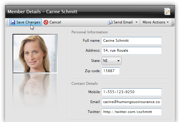
The result looks like the following figure.

As seen in the above illustration, UXToolGroup makes it easy for you to partition your commands into multiple logical groups. It also provides efficient ways to use different placement settings, which is something difficult or impossible to achieve using the traditional tool bar.
For more information about UXToolGroup and its features, see UXToolGroup Overview.
UXToolBarButton can be used in both UXToolBar and UXToolGroup. For basic UI scenarios where only plain commands are needed, you use UXToolBarButton directly as the item of the UXToolBar.
UXToolBarButton implements a hybrid content model that exposes both Button and ItemsControl characteristic. This allows for more solid button architecture that streamlines various type of buttons into a single definition, which makes UI development much easier and more efficient. To learn more about this content model, see Content Model Overview.
Since UXToolBarButton implements Button model, it exposes many of the features available in UXButton, such as ImageContent presentation model, default and cancel button, dialog result, commanding, MVVM pattern, navigation, and more. To learn about the common features of the button, see UXButton Overview.
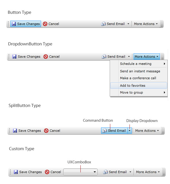
As the result of the hybrid content model implementation, UXToolBarButton provides four types of button that you can apply through ButtonType property, such as discussed in the following.
The following example shows how to create a UXToolBar that contains several buttons that use Button, DropdownButton, SplitButton and Custom type.
| XAML |
Copy Code
|
|---|---|
<Intersoft:UXToolBar> <Intersoft:UXToolGroup> <Intersoft:UXToolBarButton Content="Save Changes" DisplayMode="ContentAndImage" Icon="/Assets/Images/Commands/Save.png" Command="{Binding Path=SaveCommand}" /> <Intersoft:UXToolBarButton Content="Cancel" DisplayMode="ContentAndImage" Icon="/Assets/Images/Commands/Cancel.png"/> <Intersoft:UXToolBarButton ButtonType="Custom"> <Intersoft:UXToolBarButton.Content> <Intersoft:UXComboBox Width="120" /> </Intersoft:UXToolBarButton.Content> </Intersoft:UXToolBarButton> </Intersoft:UXToolGroup> <Intersoft:UXToolGroup Placement="RightOrBottom"> <Intersoft:UXToolBarButton ButtonType="SplitButton" Content="Send Email" DisplayMode="ContentAndImage" Icon="/Assets/Images/Commands/NewMessage.png"> <Intersoft:UXMenuItem Header="Send via Gmail" Icon="/Assets/Images/Commands/Gmail.png" /> <Intersoft:UXMenuItem Header="Send via Facebook" Icon="/Assets/Images/Commands/Facebook16.png" /> </Intersoft:UXToolBarButton> <Intersoft:UXSeparator/> <Intersoft:UXToolBarButton Content="More Actions" ButtonType="DropdownButton"> <Intersoft:UXMenuItem Header="Schedule a meeting" /> </Intersoft:UXToolBarButton> </Intersoft:UXToolGroup> </Intersoft:UXToolBar> |
|
The following illustration shows the UI example of each button type.

In addition to the supported item types described in the previous sections, both UXToolBar and UXToolGroup also support other item types such as UXSeparator. To learn more about using separator in toolbar, see UXSeparator Overview.
Since the UXToolBar is a content control, it can generally contain any arbitrary UIElement or controls. When custom UIElement or controls are defined directly in the item, the tool bar automatically creates a UXToolBarButton with the ButtonType internally set to Custom thus producing the same effect of using Custom button type as described above.
UXToolBar supports advanced design-time features in Visual Studio and Expression Blend which makes it easy for developers and designers to work with the control in the designer. Supported designer features include context menu, smart item placement, default content and show on selected behavior.
For more information about design-time support in Visual Studio, see Working with ClientUI Controls in Visual Studio 2010 Designer. For more information about design-time support in Express Blend, see Working with ClientUI Controls in Expression Blend Designer.
UXToolBar is designed to address the needs of dynamic applications that suppose to work consistently in resolution independent scenarios. One of the key features in UXToolBar is the autofit and overflow capability in which the tool bar automatically measures the available groups and commands to fit the available space.
 |
The overflow feature is enabled by default. To disable this feature, you set the OverflowHandleVisibility property of the UXToolBar to Collapsed. |
By default, when the screen real estate is not sufficient to show all items in the tool bar, certain items would be removed from the UI based on the OverflowPriority and OverflowMode of each item in the tool bar. The items which are removed due to the insufficient space are called overflowing items.
UXToolBar implements its own advanced panels to sophisticatedly handle the overflow mechanism where the overflowing items are virtually moved to the dropdown panel, yet physically existed in the original object model.
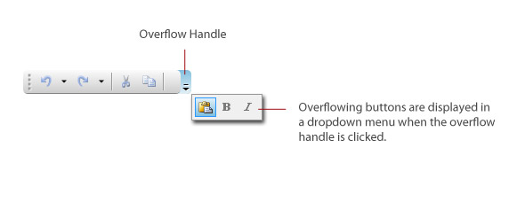
You can access the overflowing items through the overflow handle that appears in the right edge of the tool bar interface. You can control the visibility of the overflow handle through OverflowHandleVisibility property using one of the three modes described in the following:
The following illustration shows an overview of the overflow concept and the related user interface in UXToolBar.

Another advantages of using UXToolGroup beside those described above is that you can exclude the items in a particular tool group from the overflow layout pass. To achieve this, you set the AllowOverflow property of that particular tool group to false.
As explained in the previous sections, the overflow mechanism automatically removes certain items when the UXToolBar does not have sufficient space to show all items. By default, the last visible items nearest to the edge of the tool bar will be removed first, then followed with the previous items in the logical order.
You can change the way UXToolBar determines the order of overflowing items by explicitly specifying the OverflowPriority and OverflowMode attached property to each item in the tool bar, or the tool group. The precedence of the overflow mechanism is to process the items with OverflowMode setting first, then the OverflowPriority setting.
You can attach the OverflowMode property to the item in the UXToolBar, commonly the UXToolBarButton. You can set the OverflowMode to one of the following values:
For all items with OverflowMode set to AsNeeded, the tool bar determines the next overflowing item by calculating the visible items of which OverflowPriority property has the highest value. For example, a button with OverflowPriority set to 5 will be marked as overflow earlier than button with OverflowPriority set to 3, regardless of their logical order.
The following example shows how to use the OverflowPriority and OverflowMode attached property to customize the priority during overflow measurement.
| XAML |
Copy Code
|
|---|---|
<Intersoft:UXToolBar> <Intersoft:UXToolGroup Placement="RightOrBottom"> <Intersoft:UXToolBarButton Content="Save Changes" Intersoft:UXOverflowStackPanel.OverflowMode="Never"/> <Intersoft:UXToolBarButton Content="Cancel" Intersoft:UXOverflowStackPanel.OverflowMode="Never"/> <Intersoft:UXToolBarButton ButtonType="SplitButton" Intersoft:UXOverflowStackPanel.OverflowPriority="2" Content="Send Email" DisplayMode="ContentAndImage" Icon="/Assets/Images/Commands/NewMessage.png"> <Intersoft:UXMenuItem Header="Send via Gmail" Icon="/Assets/Images/Commands/Gmail.png" /> <Intersoft:UXMenuItem Header="Send via Facebook" Icon="/Assets/Images/Commands/Facebook16.png" /> </Intersoft:UXToolBarButton> <Intersoft:UXSeparator/> <Intersoft:UXToolBarButton Content="More Actions" ButtonType="DropdownButton"> <Intersoft:UXMenuItem Header="Schedule a meeting" /> </Intersoft:UXToolBarButton> </Intersoft:UXToolGroup> </Intersoft:UXToolBar> |
|
Powered by ClientUI DragDrop Framework, UXToolBar can be moved by dragging its grip handle, a small visual hint that appears in the left edge (or top edge in vertical orientation) of the tool bar interface. Unlike classic drag and drop, UXToolBar is equipped with fluid drag and drop where the valid target smoothly opens and adjusts its space for the dragged item to be placed. For more information about drag and drop framework, see Drag-drop Framework Overview.
Before you can create tool bar that is effectively moveable through drag and drop, you need to create a dockable zone by using UXDockTray panel which served as a container that hosts one or more UXToolBar instances. To learn how to create dockable zone and enable fluid movement using drag drop in tool bar, see UXDockTray Overview.
By default, UXToolBar is displayed horizontally which typically docked to the top or bottom edge of the screen. In certain cases, you may want to display the tool bar vertically similar to the UI scenarios in Office applications. You can display a UXToolBar vertically by placing it on a UXDockTray panel.
In addition, you can create multiple dockable zones in your page that uses different settings of orientation. When you enable the drag and drop feature together, a tool bar can be dragged from horizontal orientation initially and then transformed into vertical orientation when it enters a dockable zone with vertical orientation. For more information on how to customize the orientation of tool bar, see UXDockTray Overview.
UXToolBar is an advanced tool bar control that does not only provide rich commanding features. It also implements many of the user experience standards such as modal input when navigated with Tab key.
When the UXToolBar has focus, it automatically redirects the logical focus to the first visible button in the tool bar. In this case, the tool bar has entered modal input mode in which the tab navigation applies to the items locally. You press the Escape key to exit from the modal input.
 |
This feature is natively implemented hence does not require additional settings. |
If you use UXToolBar in data input scenarios such as in editing form or in text editor, you may want to implement a focus behavior in which clicking on a button in the tool bar should not cause the current input control to lose its focus. This is expected by most users who demand rich user experiences.
Silverlight does not provide the architecture required to implement this feature. Fortunately, you can achieve this focus behavior by simply setting the ReturnOriginalFocus property of the UXToolBar to true.
For more information about user experiences features in ClientUI, see User Experiences Overview.
You can easily customize the UXToolBar appearance through the following properties.
In addition, you can also customize the spacing between items in the UXToolBar through the ItemSpacing property.
If you would like to completely customize the control appearance or if you want to change the styles of each visual state, you can edit the template of the control and do the modification accordingly.
To learn more how to customize the template and visual states, see Styles and Template Overview.
For the list of ClientUI walkthroughs, see Walkthroughs and How-to Topics.
For the list of ClientUI samples available in local installation, see Locating the Samples in Local Installation.