
| Intersoft ClientUI 8 > ClientUI Controls > Control Library > Toolbar and Menu Controls Overview > UXDockTray |
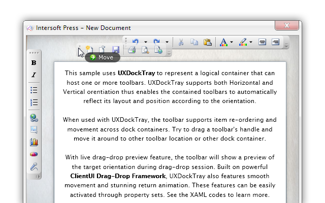
UXDockTray represents a container that hosts multiple toolbars and menu bars with support for horizontal and vertical orientation. When the control's orientation is specified, the supported UI controls such as UXToolBar will update its layout, position and orientation accordingly.
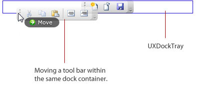
UXDockTray also features intuitive drag-drop capability allowing the hosted toolbars to be dragged and moved within itself or across UXDockTray containers.

While UXDockTray can be used to host any content type, its main function is to host one or more items that support drag and drop operation such as UXToolBar. You typically use UXDockTray to enable the drag and drop operation in the tool bars, as well as to enable automatic orientation layout that supports both horizontal and vertical orientation.
UXDockTray derives from UXStackPanel, which means it exposes many properties and features related to interactivity and drag drop operation. UXStackPanel is a stack panel with sophisticated drag-drop features. It implements fluid animation, a built-in UX feature that shows smooth movement when the children of the UXStackPanel is being moved, removed or added. To learn more about interactivity panels, see Interactive Panels Overview.
To enable drag and drop operation in UXToolBar, you first define a dock zone by creating a UXDockTray in your page layout. Subsequently, you add one or more tool bars in the content of the UXDockTray.
Once you defined the dock zone along with the tool bars, you set the following properties in the UXDockTray to enable the drag and drop operation:
The following example shows how to setup the UXDockTray to enable drag and drop operation for the tool bars that it contains.
| XAML |
Copy Code
|
|---|---|
<Grid x:Name="LayoutRoot"> <Intersoft:DockPanel FillChildMode="Custom"> <Intersoft:UXDockTray Intersoft:DockPanel.Dock="Top" AllowMoveItem="True" AllowReorderItem="True" AllowDropItem="True"> <Intersoft:UXToolBar> <Intersoft:UXToolGroup> <Intersoft:UXToolBarButton DisplayMode="Image" Icon="../Assets/Images/Office/NewDocumentHS.png" ToolTipService.ToolTip="New Document"/> <Intersoft:UXToolBarButton DisplayMode="Image" Icon="../Assets/Images/Office/OpenFile.png" ToolTipService.ToolTip="Open Document"/> <Intersoft:UXToolBarButton DisplayMode="Image" Icon="../Assets/Images/Office/SaveHS.png" ToolTipService.ToolTip="Save"/> </Intersoft:UXToolGroup> </Intersoft:UXToolBar> <Intersoft:UXToolBar> <Intersoft:UXToolGroup> <Intersoft:UXToolBarButton DisplayMode="Image" Icon="../Assets/Images/Office/CutHS.png" IsEnabled="False" ToolTipService.ToolTip="Cut"/> <Intersoft:UXToolBarButton DisplayMode="Image" Icon="../Assets/Images/Office/CopyHS.png" IsEnabled="False" ToolTipService.ToolTip="Copy"/> <Intersoft:UXToolBarButton DisplayMode="Image" Icon="../Assets/Images/Office/PasteHS.png" ToolTipService.ToolTip="Paste"/> <Intersoft:UXSeparator/> <Intersoft:UXToolBarButton DisplayMode="Image" Icon="../Assets/Images/Office/AlignTableCellMiddleCenterHS.png" ToolTipService.ToolTip="Align Center"/> <Intersoft:UXToolBarButton DisplayMode="Image" Icon="../Assets/Images/Office/AlignTableCellMiddleRightHS.png" ToolTipService.ToolTip="Align Right"/> </Intersoft:UXToolGroup> </Intersoft:UXToolBar> </Intersoft:UXDockTray> </Intersoft:DockPanel> </Grid> |
|
The following illustration shows the result of the example above and also describes a high level overview of the dock tray concept.

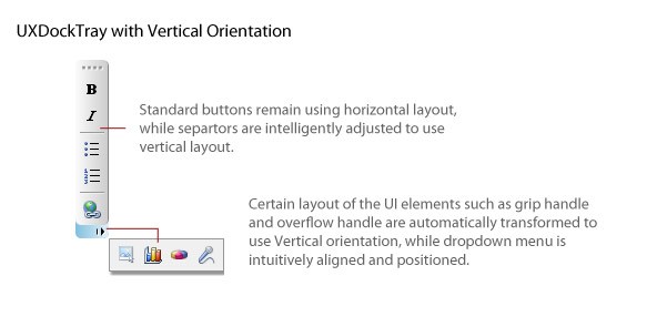
Beside the fluid drag and drop support, UXDockTray supports automatic layout orientation particularly when paired together with UXToolBar. Using UXDockTray, you can display one or more tool bars in vertical orientation which is unique in the way it supports the vertical orientation.
When vertical orientation is used, UXDockTray re-arranges the dimension of the tool bar to fit into the dimension of the dock tray, while smartly transforming the necessary user interface elements to reflect the new orientation, such as the grip handle, overflow handle and overflow drop down menu.
The following illustration shows an overview of the orientation support in UXDockTray.

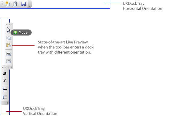
In addition, the UXDockTray delivers powerful user experiences when combined with the drag and drop operation. You can drag a tool bar from a horizontal dock tray and drop it into a vertical tray. While you are dragging the tool bar to a valid dock tray with different orientation, UXDockTray uniquely shows the live preview of the tool bar which greatly enhances user experience such as shown in the following illustration.

The following example shows how to create two UXDockTray instances with different orientation, and enable drag and drop support to the respective tool bars in the dock trays.
| XAML |
Copy Code
|
|---|---|
<Grid x:Name="LayoutRoot"> <Intersoft:DockPanel FillChildMode="Custom"> <Intersoft:UXDockTray Intersoft:DockPanel.Dock="Top" AllowMoveItem="True" AllowReorderItem="True" AllowDropItem="True"> <Intersoft:UXToolBar> <Intersoft:UXToolGroup> <Intersoft:UXToolBarButton DisplayMode="Image" Icon="../Assets/Images/Office/NewDocumentHS.png" ToolTipService.ToolTip="New Document"/> <Intersoft:UXToolBarButton DisplayMode="Image" Icon="../Assets/Images/Office/OpenFile.png" ToolTipService.ToolTip="Open Document"/> <Intersoft:UXToolBarButton DisplayMode="Image" Icon="../Assets/Images/Office/SaveHS.png" ToolTipService.ToolTip="Save"/> </Intersoft:UXToolGroup> </Intersoft:UXToolBar> <Intersoft:UXToolBar> <Intersoft:UXToolGroup> <Intersoft:UXToolBarButton DisplayMode="Image" Icon="../Assets/Images/Office/CutHS.png" IsEnabled="False" ToolTipService.ToolTip="Cut"/> <Intersoft:UXToolBarButton DisplayMode="Image" Icon="../Assets/Images/Office/CopyHS.png" IsEnabled="False" ToolTipService.ToolTip="Copy"/> <Intersoft:UXToolBarButton DisplayMode="Image" Icon="../Assets/Images/Office/PasteHS.png" ToolTipService.ToolTip="Paste"/> <Intersoft:UXSeparator/> <Intersoft:UXToolBarButton DisplayMode="Image" Icon="../Assets/Images/Office/AlignTableCellMiddleCenterHS.png" ToolTipService.ToolTip="Align Center"/> <Intersoft:UXToolBarButton DisplayMode="Image" Icon="../Assets/Images/Office/AlignTableCellMiddleRightHS.png" ToolTipService.ToolTip="Align Right"/> </Intersoft:UXToolGroup> </Intersoft:UXToolBar> </Intersoft:UXDockTray> <Intersoft:UXDockTray Orientation="Vertical" AllowMoveItem="True" AllowReorderItem="True" AllowDropItem="True"> <Intersoft:UXToolBar VerticalAlignment="Top"> <Intersoft:UXToolGroup> <Intersoft:UXToolBarButton DisplayMode="Image" Icon="../Assets/Images/Office/BoldHS.png" ToolTipService.ToolTip="Bold"/> <Intersoft:UXToolBarButton DisplayMode="Image" Icon="../Assets/Images/Office/ItalicHS.png" ToolTipService.ToolTip="Italic"/> <Intersoft:UXSeparator/> <Intersoft:UXToolBarButton DisplayMode="Image" Icon="../Assets/Images/Office/List_BulletsHS.png" ToolTipService.ToolTip="Bullet List"/> <Intersoft:UXToolBarButton DisplayMode="Image" Icon="../Assets/Images/Office/List_NumberedHS.png" ToolTipService.ToolTip="Numbered List"/> </Intersoft:UXToolGroup> </Intersoft:UXToolBar> </Intersoft:UXDockTray> </Intersoft:DockPanel> </Grid> |
|
You can easily customize the UXDockTray appearance through the following properties.
If you would like to completely customize the control appearance or if you want to change the styles of each visual state, you can edit the template of the control and do the modification accordingly.
To learn more how to customize the template and visual states, see Styles and Template Overview.
For the list of ClientUI walkthroughs, see Walkthroughs and How-to Topics.
For the list of ClientUI samples available in local installation, see Locating the Samples in Local Installation.