

| Intersoft ClientUI 8 > ClientUI Application Development > Working with ClientUI Controls in Expression Blend Designer |
ClientUI includes comprehensive and time-saving designer extensions that allow you to rapidly work with the user interface elements in the Expression Blend designer. For example, you can easily add a dropdown button in the toolbar control through context menu, select and expand the dropdown button to see its items, and rapidly add the subsequent menu items into the dropdown button.
This topic highlights the key features available in ClientUI designer extensions such as:
Every ClientUI control is automatically registered to the Blend Assets upon installation. You can find the comprehensive ClientUI controls under the Intersoft ClientUI group. For more information about Blend Assets, see Development Environment Overview.
Every ClientUI control includes full design visual that lets you work in WYSIWYG (What-you-see-is-what-you-get) fashion. Instead of showing a blank white box, all ClientUI controls came with professional styles similar to the Windows Aero experience. The controls will also reflect its visual styles in the designer surface after customized through styles or templates.
The following illustration shows the ClientUI's rich design experience in the Expression Blend designer.
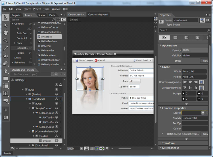
In addition to the visual styles, you can also interact with the user interface elements, such as selecting the control from the designer surface, or from the Objects and Timeline. You can also move the control by using drag and drop, or resize it by dragging the resize handle.
ClientUI includes unparalleled designer features that allow you to work with the UI controls intuitively, thus accelerate the overall development process and improve your productivity.
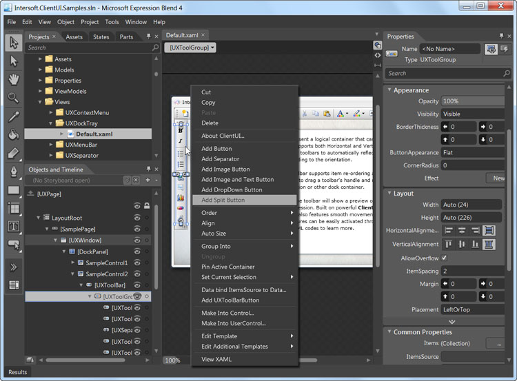
The Context Menu designer feature contains a number of commands related to the selected control in the designer. In specific ClientUI controls that implement Items interface, such as UXMenuBar, UXToolBar, UXDropdownButton and more, the context menu will show several item types that you can insert to the control. This eliminates the need to browse through hundreds of controls in the Toolbox.
The following illustration shows the context menu of a UXToolGroup control that includes numerous contextual commands such as Add Button, Add Separator, Add Image Button and more. These commands enable you to rapidly add multiple new items in the designer.
To learn more about ClientUI controls that implement Items functionality, see Items Control Overview.
The ClientUI designer feature supports selection activation, a powerful design-time feature available in Expression Blend. With this feature, you can work with UI controls that exhibit expandable and collapsible metaphor in an efficient and intuitive way.
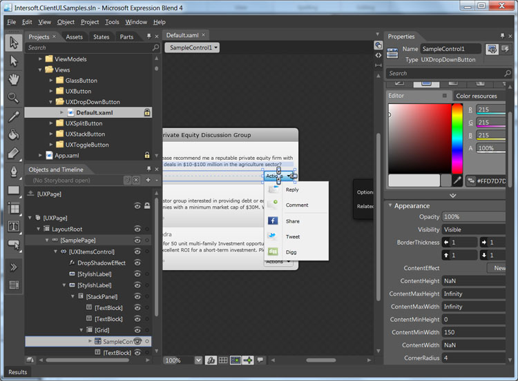
The UXDropDownButton is an example of ClientUI controls that support the Show on Selected designer feature. When you select an UXDropDownButton in the designer, the menu item for the selected UXDropDownButton will be automatically displayed.
 |
The UXDropDownButton control requires its Expand Dropdown turned on to automatically show items when selected. However, certain controls such as UXMenuItem will automatically show its items by default. The design on these behaviors are decided based on the nature and key usage of the controls. |
In the following illustration, the Actions dropdown button shows its items when selected.
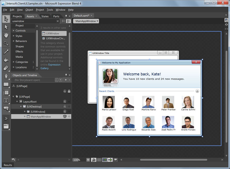
Similarly, certain ClientUI controls, such as UXWindow and UXAccordionItem, support the Activate on Selected designer feature which automatically displays and expands the element when selected. The activation process is performed in the designer level without modifying the real property thus makes development easier and more intuitive.
For example, although the UXWindow is initially inactive (IsActive = false), it will be activated when selected in the designer. This enables you to work with the content of the UXWindow without additional effort.
In the following illustration, the Welcome to My Application element which is an UXWindow, is automatically activated when it is selected in the designer.
To make layouting task easier, ClientUI features an adorner designer feature in certain layout controls such as in DockPanel. An adorner is an advanced designer feature in Expression Blend in which visual cues are displayed to allow users easily interact with the user interface elements.
The DockPanel is an ideal example that shows the adorner designer feature. As DockPanel allows its children to be docked in one of the four sides of the layout boundary, the DockPanel adorner provides a helpful visual cue that indicates the Dock position of the currently selected children. Additionally, you can also click on the visual cue to change the Dock position which makes it easy and intuitive to work with layouting task in the Expression Blend designer.
The following illustration shows the adorner designer for the DockPanel.
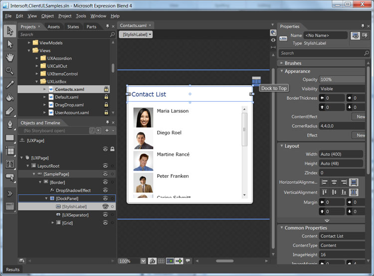
The red highlighted box in the above illustration shows the adorner designer for the DockPanel. The currently selected children is a Border which can be seen docked at Left.
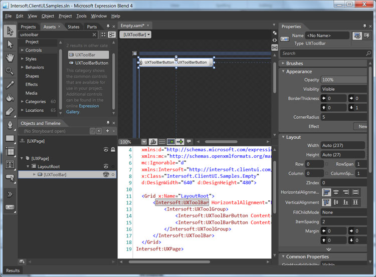
All ClientUI controls implement Default Content, a designer feature in the Expression Blend that allows a new control to be instantiated along with the default content or children.
For example, instead of showing a blank control, the UXToolBar control will create an UXToolGroup item which contains two UXToolBarButton as the children. This feature allows you to quickly learn the control structure as well as the default item types at the first glance. In most scenarios, you can directly customize the existing items and rapidly add new items as needed.
The following illustration shows a new UXToolBar control instantiated with several buttons by default.
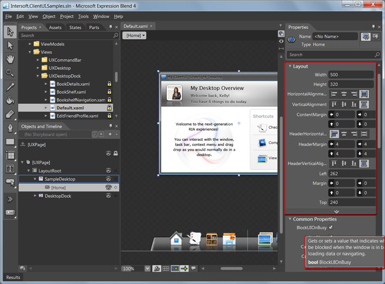
ClientUI includes designer extension that automatically organizes the Category of its properties into groups that make sense to developers. In addition, the description of each property will be displayed when the mouse is over the property in the Properties Window.
The following illustration shows the property category and helpful description of a UXWindow control in the Properties Window.
This section provides the links to the step-by-step walkthroughs related to using Expression Blend application.
Walkthrough: Layout Using Dock Panel in Blend Designer
Walkthrough: Add Menu Item and Separator to Menu Bar in Blend Designer
Walkthrough: Add Button, Split Button and Dropdown to Tool Bar in Blend Designer
Walkthrough: Edit the Navigation Button Template in Blend Designer
Walkthrough: Style a Window in Blend Designer