
| Intersoft ClientUI 8 > ClientUI Application Development > Working with ClientUI Controls in Visual Studio 2010 Designer |
This topic highlights the key features available in ClientUI designer extensions such as:
Every ClientUI control is automatically registered to the Visual Studio Toolbox upon installation. You can find ClientUI controls under the Intersoft ClientUI tab group. For more information about Visual Studio Toolbox, see Development Environment Overview.
Every ClientUI control includes full design visual that lets you work in WYSIWYG (What-you-see-is-what-you-get) fashion. Instead of showing a blank white box, all ClientUI controls came with professional styles similar to the Windows Aero experience. The controls will also reflect its visual styles in the designer surface after customized in other tools such as Expression Blend.
The following illustration shows the ClientUI's rich design experience in the Visual Studio designer.
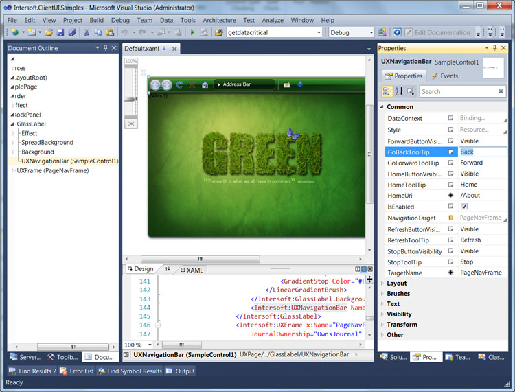
In addition to the visual styles, you can also interact with the user interface elements, such as selecting the control from the designer surface, or from the Document Outline. You can move the control by using drag and drop, or resize it by dragging the resize handle.
ClientUI includes unparalleled designer features that allow you to work with the UI controls intuitively, thus accelerate the overall development process and improve your productivity.
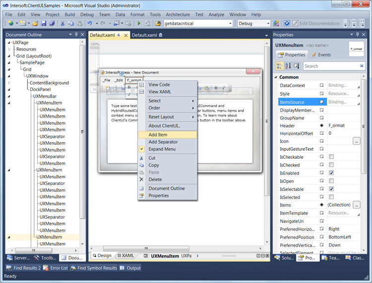
The Context Menu designer feature contains a number of commands related to the selected control in the designer. In specific ClientUI controls that implement Items interface, such as UXMenuBar, UXToolBar, UXDropdownButton and more, the context menu will show several item types that you can insert to the control. This eliminates the need to browse through hundreds of controls in the Toolbox.
The following illustration shows the context menu of a UXMenuBar control that includes Add Item and Add Separator command. These commands enable you to rapidly add multiple new items in the designer.
To learn more about ClientUI controls that implement Items functionality, see Items Control Overview.
The ClientUI designer feature supports selection activation, a new design-time feature introduced in Visual Studio 2010. With this feature, you can work with UI controls that exhibit expandable and collapsible metaphor in an efficient and intuitive way.
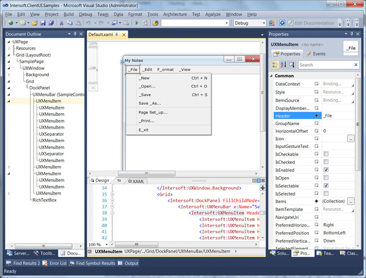
The UXMenuItem is an example of ClientUI controls that support the Show on Selected designer feature. When you select an UXMenuItem in the designer, the sub menu for that selected UXMenuItem will be automatically displayed.
In the following illustration, the File menu shows its sub menu automatically when selected.
Similarly, certain ClientUI controls, such as UXWindow and UXAccordionItem, support the Activate on Selected designer feature which automatically displays and expands the element when selected. The activation process is performed in the designer level without modifying the real property thus makes development easier and more intuitive.
For example, although the UXAccordionItem is collapsed initially (IsSelected = false), it will be expanded in the designer when selected. This enables you to work with the content of the UXAccordionItem without additional effort.
In the following illustration, the Co Workers item which is an UXAccordionItem, is automatically expanded when selected in the designer.
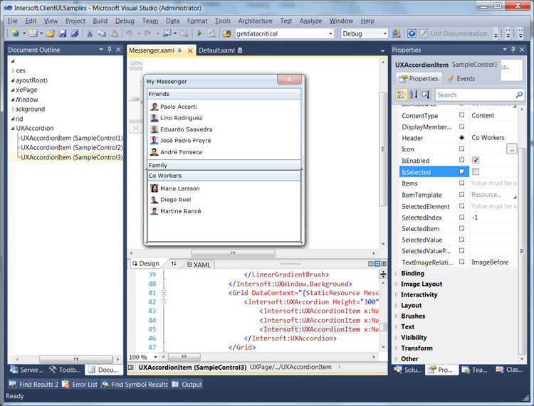
The ClientUI's designer feature takes advantage of the new placement feature introduced in Visual Studio 2010. Called Smart Item Placement, the ClientUI controls know exactly where a new item should be placed in a container based on the current selection in the designer. This time-saving feature enables you to quickly insert new items to the existing control, either by creating the new instance from Toolbox or cloning from an existing instance.
Consider the scenario where you want to insert five buttons to a tool bar. Without the Smart Item Placement feature, Visual Studio will incorrectly place the button outside the tool bar eventhough the current selection is already set to the tool bar. This behavior is by design because Visual Studio does not recognize the item as a valid item type of the tool bar. In contrast, with Smart Item Placement implemented in all ClientUI controls that support children content, Visual Studio will insert the button right inside the selected tool bar.
The following illustration shows the Smart Item Placement feature in the UXToolBar control.
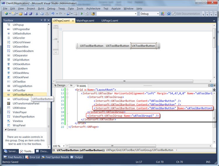
As shown in the above illustration, the UXToolBarButton is correctly inserted inside UXToolGroup that hosts the collection of buttons. With the selection set to UXToolBarButton, adding a new UXToolGroup will not incorrectly insert it under the UXToolBarButton. Instead, the UXToolGroup will be placed to the container that is best known to host it, which is the UXToolBar control. You can notice the result indicated by the red highlighted box in the illustration above.
 |
The Smart Item Placement designer feature is particularly useful when you want to clone several existing items in the same container. You can select multiple items in the Visual Studio designer, press Ctrl+C to copy, then press Ctrl+V to add the cloned items in the same container. |
With the Smart Item Placement, user interface development using ClientUI controls is now easier and intuitive than ever before.
To make layouting task easier, ClientUI features an adorner designer feature in certain layout controls such as in DockPanel. An adorner is an advanced designer feature in Visual Studio in which visual cues are displayed to allow users easily interact with the user interface elements.
The DockPanel is an ideal example that shows the adorner designer feature. As DockPanel allows its children to be docked in one of the four sides of the layout boundary, the DockPanel adorner provides a helpful visual cue that indicates the Dock position of the currently selected children. Additionally, you can also click on the visual cue to change the Dock position which makes it easy and intuitive to work with layouting task in the Visual Studio designer.
The following illustration shows the adorner designer for the DockPanel.
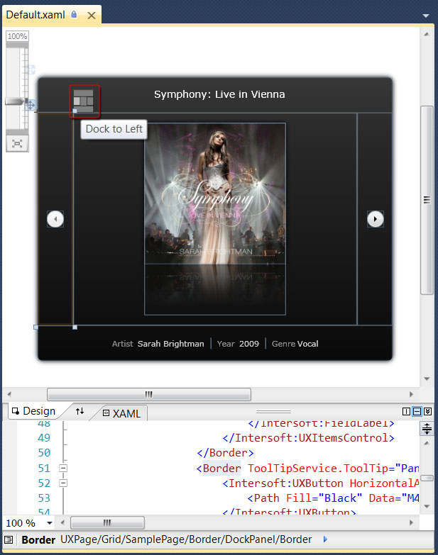
The red highlighted box in the above illustration shows the adorner designer for the DockPanel. The currently selected children is a Border which can be seen docked at Left.
All ClientUI controls implement Default Content, a designer feature in the Visual Studio that allows a new control to be instantiated along with the default content or children.
For example, instead of showing a blank control, the UXMenuBar will create two UXMenuItem as the children and one sub UXMenuItem for the first menu item. This feature allows you to quickly learn the control structure as well as the default item types at the first glance. In most scenarios, you can directly customize the existing items and rapidly add new items as needed.
The following illustration shows a new UXMenuBar control instantiated with several menu items by default.
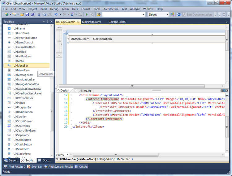
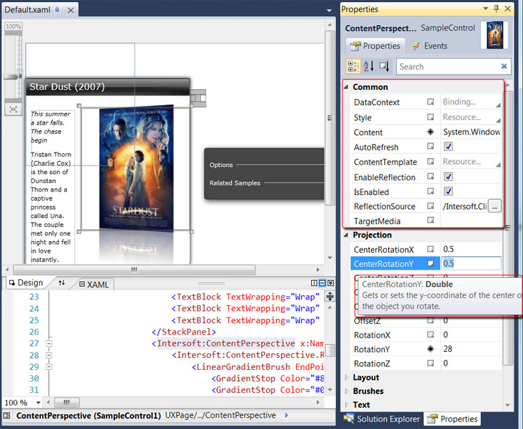
ClientUI includes designer extension that automatically organizes the Category of its properties into groups that make sense to developers. In addition, the description of each property will be displayed when the mouse is over the property in the Properties Window.
The following illustration shows the property category and helpful description of a ContentPerspective control in the Properties Window.
