
| Intersoft ClientUI 8 > ClientUI Controls > Control Library > Toolbar and Menu Controls Overview > UXSeparator |
UXSeparator is a multi-purpose line separator that can be used to separate two logical UI sections or contents.
It features 3D-style border appearance that can be easily customized through property sets. With support for both vertical and horizontal orientation, UXSeparator can be used in various UI controls such as menu bar, tool bar, command bar and more.

UXSeparator draws a single 3D line that generally used to provide visual hint to separate one or more sections of user interface. UXSeparator can be defined in any standard UI elements such as shown in the following example.
| XAML |
Copy Code
|
|---|---|
<Intersoft:UXSeparator HorizontalAlignment="Left" VerticalAlignment="Top" Width="200" /> |
|
One of the most common usage of UXSeparator is to provide visual hint that separate the items in ItemsControl. UXSeparator is natively supported by the following ClientUI controls:
The following example shows how to use UXSeparator in a UXToolBar.
| XAML |
Copy Code
|
|---|---|
<Intersoft:UXToolBar> <Intersoft:UXToolGroup> <Intersoft:UXToolBarButton DisplayMode="Image" Icon="/ClientUIApplication_Docs;component/Assets/Images/CopyHS.png" /> <Intersoft:UXSeparator /> <Intersoft:UXToolBarButton DisplayMode="Image" Icon="/ClientUIApplication_Docs;component/Assets/Images/PasteHS.png" /> </Intersoft:UXToolGroup> </Intersoft:UXToolBar> |
|
The result looks like the following figure.

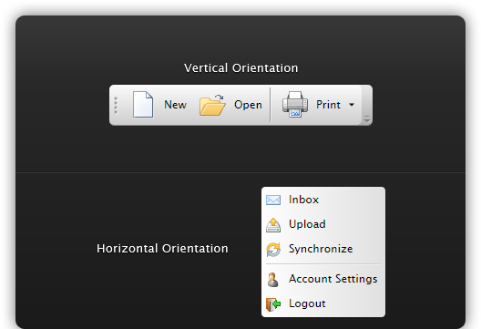
You can display a UXSeparator horizontally which is the default, or vertically, which is controlled through the Orientation property.
When used in the natively supported ItemsControl such as described in the previous section, UXSeparator automatically adjusts its orientation with the setting of the items control.