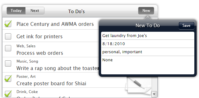

| Intersoft ClientUI 8 > ClientUI Controls > Control Library > Toolbar and Menu Controls Overview > UXToolGroup |
UXToolGroup represents a group of toolbar buttons which can be used within an UXToolBar or in standalone mode. When used with UXToolBar, the tool group can control whether it’s contained buttons should participate in the Overflow calculation.
It can be placed in either Left or Right position within the toolbar by simply setting its Placement property. One of the unique features in UXToolGroup is its built-in support for 3D round-corner border appearance which can be elegantly achieved without tedious styling effort.

UXToolGroup is an items control that derives from ISItemsControl class, which means that UXToolGroup can contain and display a collection of objects. You can display a collection of UIElement through the Items property, or a collection of data entity through the ItemsSource property.
For more information about items control, see Items Control Overview.
You can use UXToolGroup in two key scenarios, as a standalone control or as the item of UXToolBar.
UXToolGroup is commonly used as the item of UXToolBar which serves as the logical groups that host a collection of commands in the tool bar. In this case, UXToolGroup uses a lookless theme by default, allowing the groups to blend properly with the appearance of the tool bar, such as the Background, BorderBrush and others.
There are several advantages to use UXToolGroup in the tool bar, such as placing each group in different position and customizing the overflow setting for each group.
The following example shows how to create a UXToolBar with two UXToolGroup instances.
| XAML |
Copy Code
|
|---|---|
<Intersoft:UXToolBar> <Intersoft:UXToolGroup> <Intersoft:UXToolBarButton Content="Save Changes" DisplayMode="ContentAndImage" Icon="/Assets/Images/Commands/Save.png" Command="{Binding Path=SaveCommand}" /> <Intersoft:UXToolBarButton Content="Cancel" DisplayMode="ContentAndImage" Icon="/Assets/Images/Commands/Cancel.png"/> </Intersoft:UXToolGroup> <Intersoft:UXToolGroup Placement="RightOrBottom"> <Intersoft:UXToolBarButton Content="Help" DisplayMode="Image" Icon="/Assets/Images/Commands/Help.png" /> <Intersoft:UXSeparator/> <Intersoft:UXToolBarButton Content="More Actions" ButtonType="DropdownButton"> <Intersoft:UXMenuItem Header="Schedule a meeting" /> </Intersoft:UXToolBarButton> </Intersoft:UXToolGroup> </Intersoft:UXToolBar> |
|
The result looks like the following figure.

For more information on how to use UXToolGroup along with UXToolBar, see UXToolBar Overview.
Another UXToolGroup scenario is to use it as a standalone control which is particularly suitable for presenting commands in different kind of containers such as in status bar.
The following example shows how to use UXToolGroup in GlassLabel content control that represents a status bar.
| XAML |
Copy Code
|
|---|---|
<Intersoft:GlassLabel HorizontalAlignment="Left" VerticalAlignment="Top"> <Intersoft:UXToolGroup> <TextBlock Text="The customer record has been modified." Foreground="White" VerticalAlignment="Center" Width="400"/> <Intersoft:UXToolBarButton Content="Save Changes" DisplayMode="ContentAndImage" Foreground="White" Icon="/Assets/Images/Commands/Save.png" /> <Intersoft:UXToolBarButton Content="Cancel" DisplayMode="ContentAndImage" Foreground="White" Icon="/Assets/Images/Commands/Cancel.png"/> </Intersoft:UXToolGroup> </Intersoft:GlassLabel> |
|
The result looks like the following figure.

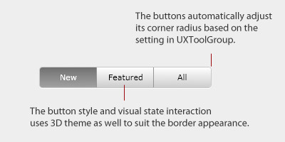
UXToolGroup has a unique feature that allows you to create a group of commands and present them in a stylish round-corner appearance with 3D border. This feature allows you to easily achieve rich design with simply some property sets, which traditionally requires a lot of plumbing code and workaround.
To enable this feature, you set the BorderAppearance of the UXToolGroup to ThreeD, which is illustrated in the following figure.

The following example shows how to achieve iTunes-like tool bar similar to the above illustration using UXToolGroup.
| XAML |
Copy Code
|
|---|---|
<Intersoft:UXToolGroup HorizontalAlignment="Left" VerticalAlignment="Top" ButtonAppearance="ThreeD" CornerRadius="4" Height="30" BorderThickness="1" BorderBrush="#FFBABABA"> <Intersoft:UXToolGroup.Effect> <DropShadowEffect ShadowDepth="1" Color="White" BlurRadius="1"/> </Intersoft:UXToolGroup.Effect> <Intersoft:UXToolBarButton Content="New" Width="80" HorizontalContentAlignment="Center" IsToggleButton="True" IsChecked="True" GroupName="ViewGroup" /> <Intersoft:UXToolBarButton Content="Featured" Width="80" HorizontalContentAlignment="Center" IsToggleButton="True" GroupName="ViewGroup" /> <Intersoft:UXToolBarButton Content="All" Width="80" HorizontalContentAlignment="Center" IsToggleButton="True" GroupName="ViewGroup" /> </Intersoft:UXToolGroup> |
|
As seen in the above illustration, UXToolGroup automatically selects the 3D style that predefined in the control. Technically, UXToolGroup takes advantage of the item container style architecture to internally determines the style to be used based on the property's value. This allows you completely redefine the 3D style, or the flat style, to your liking. To learn more about item container style concept, see Styles and Template Overview.
You can easily customize the UXToolGroup appearance through the following properties.
In addition, you can also customize the spacing between items in the UXToolGroup through the ItemSpacing property.
If you would like to completely customize the control appearance or if you want to change the styles of each visual state, you can edit the template of the control and do the modification accordingly.
To learn more how to customize the template and visual states, see Styles and Template Overview.
For the list of ClientUI walkthroughs, see Walkthroughs and How-to Topics.
For the list of ClientUI samples available in local installation, see Locating the Samples in Local Installation.