

| Intersoft ClientUI 8 > ClientUI Fundamentals > User Experiences Overview |
Intersoft ClientUI is the industry's first user interface toolkit that implements many of the usability and user experience (UX) features that are compliance with ISO Standards 9241. This means that applications built with ClientUI controls automatically enjoy a variety of benefits such as input modality, keyboard navigation and access key, and more.
This overview describes the usability and UX features that implemented right out-of-the-box in the ClientUI controls.
This topic contains the following sections:
The input controls and button family in ClientUI implement keyboard focus identical to the platform standards such as in Windows and WPF. The keyboard focus is one of the most fundamental UX required to help users easily recognize and understand the focus of primary input device during data entry process. Silverlight 3 introduces logical focus support, but unfortunately, fall short in keyboard focus.
The following illustration summarizes the keyboard focus support in ClientUI’s input and button controls.
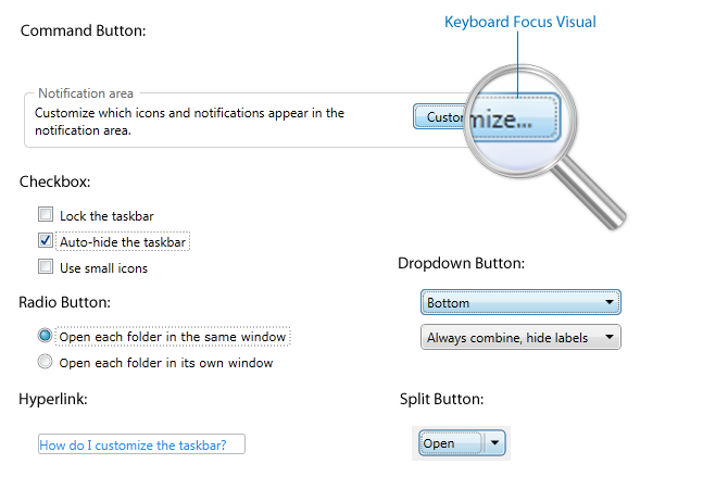
As seen in the illustration above, the dotted rectangle represents the visual hint for the keyboard focus. It’s also important here to distinct between logical and keyboard focus. The keyboard focus visual will appear only when users navigate using keyboard, such as using Tab or arrow keys.
To make keyboard focus works in consistent manner, ClientUI provides the Keyboard and FocusManager architecture that is similar to WPF. This enables you to build interoperable Silverlight and WPF applications with consistent user experience using the same API and code base. Note that the keyboard focus is automatically enabled by default and doesn’t require any further configuration.
In addition to the keyboard focus, certain input controls – such as radio button and toggle button – also support special grouping behavior that based on a focus scope. This grouping behavior enables the radio button to automatically deselect the other radio buttons in the same scope thus enabling intuitive input process such as shown in the following illustration.
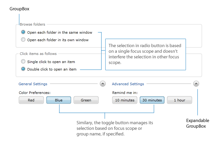
The self-explanatory illustration above shows the focus scope implementation in ClientUI which is essential to appropriately manage the input and grouped selection. ClientUI also includes several containers with built-in focus scope such as GroupBox and ExpandableGroupBox.
Since version 3, Silverlight provides basic support for keyboard navigation which includes tabbing between controls using Tab key is now possible. However, the Silverlight implementation is limited only to the logical focus surface. ClientUI takes the keyboard navigation further by implementing keyboard focus that doesn’t interfere against the logical focus to comply with the usability standards.
ClientUI includes full keyboard navigation support in both the basic and advanced UI controls. The advanced UI controls - such as dropdown button (or also known as menu button), split button, toolbar button, menu bar and context menu - require sophisticated focus and input management. For example, the dropdown button should remain the logical focus in the main container scope regardless of how users interact with the items in the dropdown (i.e, either through keyboard navigation or mouse). The proper implementation of logical and keyboard focus produces consistent navigation experiences either when using keyboard, mouse, or other input devices.
The following illustration shows how logical focus and keyboard navigation works in a dropdown button control.
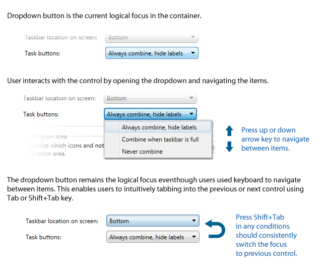
The keyboard navigation support for advanced UI controls such as shown in the above example is made possible with the comprehensive frameworks available in ClientUI, such as the event routing mechanism. For more information about ClientUI architecture, see ClientUI Architecture Overview.
A menu bar UI that conforms to usability standards should support not only the basic keyboard navigation, but also how it deals with the submenu and event bubbling mechanism. The following illustration describes the complete picture of comprehensive keyboard navigation implementation in ClientUI’s menu bar.
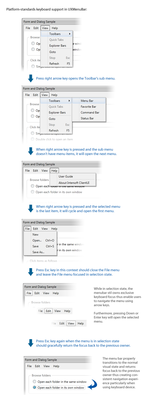
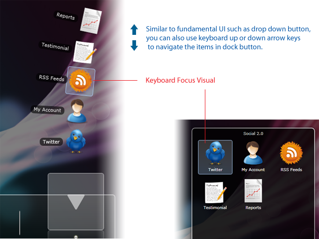
In addition to the fundamental controls such as shown above, more advanced ClientUI controls such as stack button and dock button follow the same usability guidelines as well, thus creating elegant and consistent user experiences across your applications. The following illustration shows the stack and dock button with keyboard navigation and focus visual.
Access key is also one of the most crucial requirements in platform-standards user experiences. With access key, users can quickly perform an action by pressing a shortcut key (also known as access key). Unlike WPF, Silverlight is completely lacking of access key support. This limits you to implement usable applications that enable users to do something like pressing Ctrl+O to show a dialog box or Alt+F to open File menu, which is required in typical line-of-business and productivity applications.
ClientUI pushes the standards beyond Silverlight by making available access key in its various UI components. The following sections highlight some of the ClientUI components that implement access key.
Routed commands help you create user interface that works consistently and reliably. Unlike traditional UI programming that requires you to manually write plumbing codes to disable or enable a control, routed command automatically enable or disable the controls that bound to it according to the value of the CanExecute property in the event data.
In addition, this behavior is also applied to the input devices that associated to the command, which creates a consistent user experiences in the way that keyboard access and mouse would not be able to execute the command when its CanExecute value is false. The input handling is represented by an InputBinding.
To learn more about the access key support and the UI controls that support commanding, see Commanding Overview.
In addition to the shortcut key support available in buttons, dropdowns and menus, ClientUI also implements special access key support required in certain UI components such as in Menu Bar and Context Menu. Starting from Windows Vista, Microsoft added to their UX guidelines a new way to discover the access key (also known as mnemonic key in Winform and WPF).
For example, the earlier version of Windows will show an underline to the access key of a command or menu item such as File, Edit, etc. The recent versions of Windows will show the access key only when you pressed the access modifier keys such as the Alt key in Windows. The ClientUI's menu bar supports both mechanism.
The following illustration shows a menu bar that used automatic access key visibility.
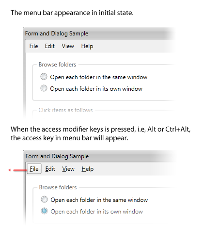
As seen in above illustration, when you press the access modifiers without an access key (see the marked red point), the first menu item will be selected. In more details, the menu bar should already enter modal mode (see Input Modality in the later section) which allows users to press “v” to access the View menu, “h” to access the Help menu and so on.
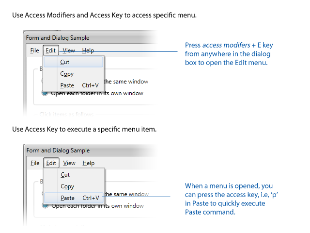
In addition to the visual part, the most important aspect is the real implementation of the access key. Thanks to the solid focus scope implementation as discussed earlier, the access key in menu bar is consistently processed when the current focus is within the same focus scope as the menu bar.
The following illustration shows how access key works in menu bar.
 |
The Alt key can’t be used as access modifiers when the Silverlight application is running in browser. In this case, you can configure the access modifiers through AccesskeyModifiers property and set it to Control+Alt or other possible combinations. |
Identifying a character as the access key is as easy as adding an underscore (_) character in the front of the designated access key, for example, _Edit will automatically identify the "e” character as the access key for that particular menu item. The use of underscore semantic is compatible with the WPF counterpart of menu implementation. To learn more about Menu Bar and its features, see UXMenuBar.
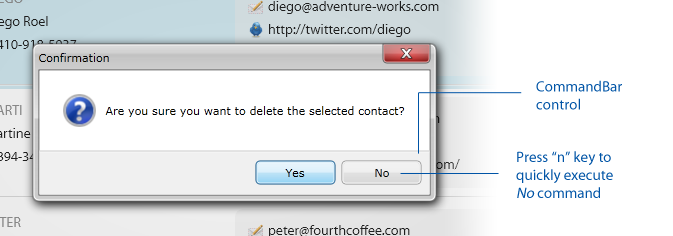
Another ClientUI component that also implements access key support is the Command Bar control. The command bar is commonly used in dialog box, message box or a window that hosts a set of command buttons.
The following figure shows a message box with predefined YesNo commands. Users can quickly access a command by pressing the first character of the command, i.e, “o” in OK, or “c” in Cancel. The same behavior is also consistently implemented in platform standards such as Windows or Macintosh operating system.
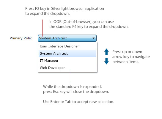
Many of the user interface controls in ClientUI implement access key differently to suit the nature of the respective control. For example, you can open the dropdown of a UXComboBox by pressing F2 or Enter key while the control has focus. However, the same keys might not be well suitable in other similar controls such as in UXSearchBox control.
In UXComboBox, you can use the arrow keys to navigate the items, even if the dropdown is not expanded. Furthermore, you can toggle the dropdown visibility of the control by pressing either the F2, F4 or Enter key. Once the dropdown is visible, you can use arrow keys to navigate the items, then press Enter key to accept changes and close the dropdown, or press Tab key to accept changes and set the focus to the next input control.
The following illustration shows the access key support in UXComboBox.
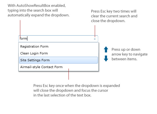
UXSearchBox provides more sophisticated access keys that work conditionally based on certain settings. When AutoShowResultBox feature is enabled, pressing F2 or F4 key will expand the search box result. In this case, any changes on the QueryText, such as by typing into the search box, will cause the search box to re-expand the dropdown result. This behavior doesn't apply when the feature is not enabled which matches the desired result.
The following illustration shows the access key support in UXSearchBox.
To create rich and consistent user experiences that follow standards-compliance design discipline, simply having aesthetic dialogs and form controls aren’t enough. ClientUI adds several exciting features related to commanding such as default focus and visual feedback to the Silverlight platform.
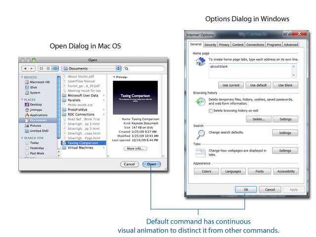
A default command, when correctly implemented, should be the default action to be initiated when users pressed Enter key anywhere in the form, particularly within the input controls. Furthermore, a default command, according to platform-standards guidelines, should have unique visual presentation to distinct itself from other commands. This allows users to intuitively recognize the default action when they committed the changes.
The following illustration shows how Windows and Mac implemented the default command mechanism.
Similarly, ClientUI implements the default command mechanism in all its button family. The following illustration describes the default command implementation in ClientUI.
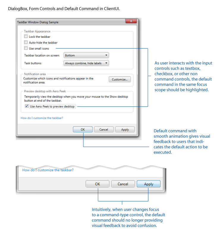
As seen in above illustration, a default command implementation involves a lot of details related to logical and keyboard focus and primarily the user interaction. Built upon its solid architecture, ClientUI built many of these details that are required in default command implementation.
To learn more about commanding, see Commanding Overview. To learn more about ClientUI architecture, see ClientUI Architecture Overview.
Input modality is one of the most fundamental UI architecture that has been long adopted by popular platforms such as Windows and Mac, which unfortunately, is unavailable in Silverlight. The most common implementation of input modality can be often found in dialog boxes, menu, and popup. When the UI requires a sole user focus, the UI routes all input events to that particular UI elements allowing users to easily focus on a specific single task, for example, when selecting a command from a menu, the user input is modal to the menu element.
The following illustration shows the input modality example in Windows, Mac and ClientUI for Silverlight.
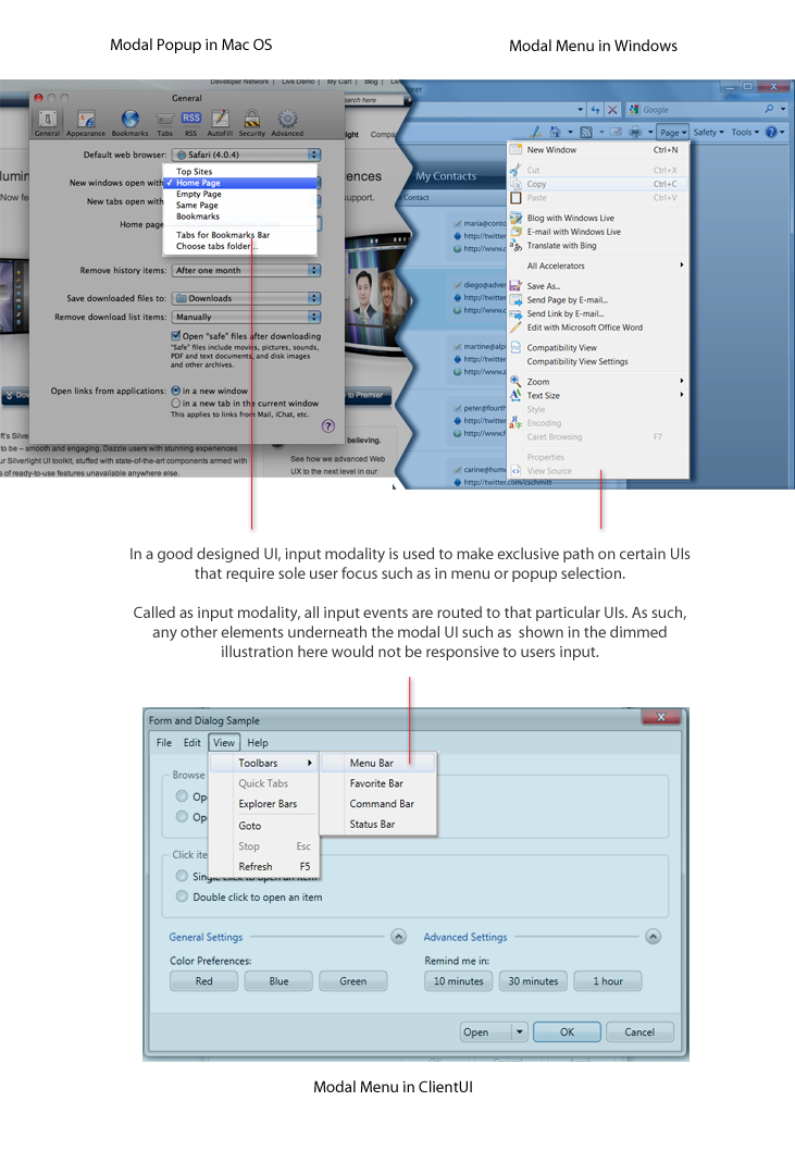
The input modality mechanism becomes more complicated when there are multiple UIs that require user focus. In this case, the precedence of modality should be applied to determine which input should be first processed. This scenario can be often found in multiple window interface applications where a window should be less modal than the task bar UI, and the task bar UI should be less modal than menu or popup.
The following illustration shows how the precedence in input modality is consistently implemented in platform standards such as Windows and Mac, as well as in the ClientUI's windowing controls.
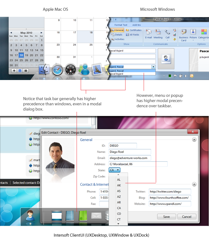
Ultimately, input modality increasingly becomes a popular subject as modern UI platforms such as WPF and Silverlight are gaining converts from traditional line-of-business application developers. While Silverlight falls short in usability features, ClientUI provides a wide range of ready-to-use tools that already meet the strict usability requirements of platform standards which includes keyboard support, navigation, access key, default focus, input modality and much more.
To learn more about user interface controls available in ClientUI, see ClientUI Controls.
Similar to the access key support as described in the above section, several ClientUI controls that expose selection behavior, such as UXListBox and UXComboBox, implement usability features that users to instantly locate a certain item based on the pressed character of the keyboard input device. Called text search, this feature is particularly useful in list controls that operate in read-only mode.
UXListBox implements comprehensive text search feature that supports both unbound and data bound mode. A data bound mode is indicated with the ItemsSource property of the list box assigned to a specific data source, such as a collection of objects.
In unbound mode, the list box selects the first UXListBoxItem that matches the first substring of characters that captured by the keyboard input device. In data bound mode, the list box searches for the data in the provided ItemsSource and matches against the value of the member specified in the DisplayDataMember property. If the DisplayDatamember property is not specified, the list box automatically search against the string value of the object which is equivalent to value represented in object.ToString().
The text search feature is sophisticatedly implemented according to user experience standards. It supports smart item searching behavior based on multiple characters captured by the keyboard input device. The continuous keystroke within a latency of 0.98s (a standard for typing latency defined in ISO Standards 9241) will be added to the text search which will be used to query the items in the control. This allows users to access the information presented by the control in more intuitive way.
The following illustration shows how text search works in UXListBox.
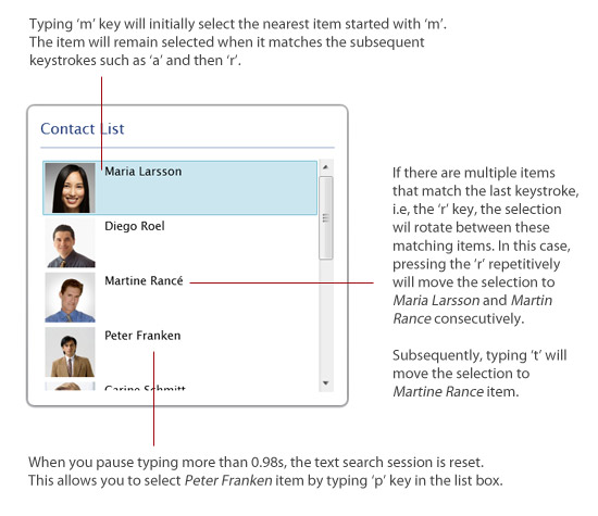
Similar to the UXListBox, the UXComboBox control also implements the text search feature which conforms to the user experience standards. The combo box control supports text search in both read-only and editing mode. The editing mode is indicated by the IsEditable property of the combo box.
When working in read-only mode, the text search has the identical implementation with the list box as described in the above section. In editing mode, the text search performs auto selection which matches the item with the identical characters captured by the keyboard input device. In addition, the text search also performs auto completion by displaying the remaining characters in blocked selection. This allows users to enter data more efficiently and intuitively.
The following illustration shows how text search works in UXComboBox.
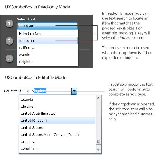
 |
The text search feature, which can be controlled through IsTextSearchEnabled property, has a true value by default. You can also apply case sensitivity to the text search by setting the IsTextSearchCaseSensitive property to true. |
One of the most important aspects in user experience design is the visual hints that indicate the disabled and busy state of a user interface. Without a proper visual hint of a disabled state, users are unaware of certain functions being disabled in a part of the user interface. Similarly, without a proper busy state management, users can be misleaded with the program functions and confused with the results because the user interface did not notify whether a certain operation is in progress or has been completed.
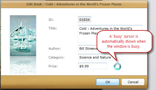
Many of the user interface controls in ClientUI are thoughtfully engineered to include the visual hints and built-in features to manage the disabled and busy state whenever necessary. The disabled visual state is implemented in most of the controls, such as buttons, selection controls and input controls. The busy visual state is implemented mostly in container controls such as UXFrame, UXPage and UXWindow, as well as certain controls that expose common data retrieval features such as UXSearchBox.
The following illustration shows several ClientUI controls that implement disabled state. The disabled controls are highlighted in the red rectangle.
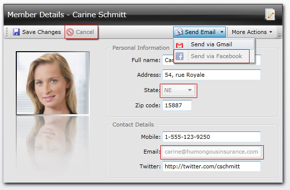
The following figure shows the busy state implementation in a variety of container controls.
 |
You can customize the disabled and busy visual state by providing your XAML template in the provided property, or editing the control template completely using Expression Blend. To learn more about styling and templating, see Styles and Templates Overview. To learn more about working with Expression Blend, see Working with ClientUI Controls in Expression Blend Designer. |
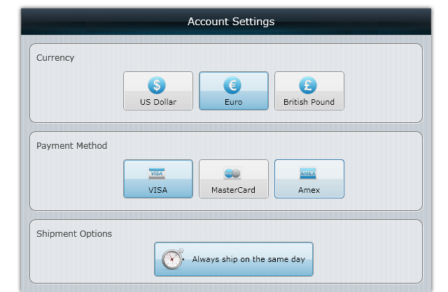
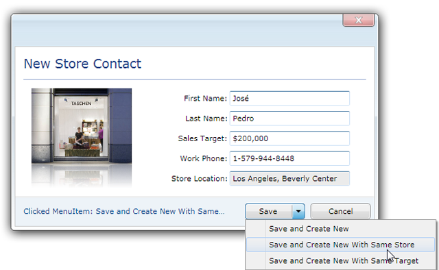
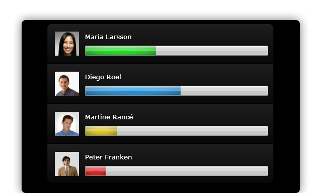
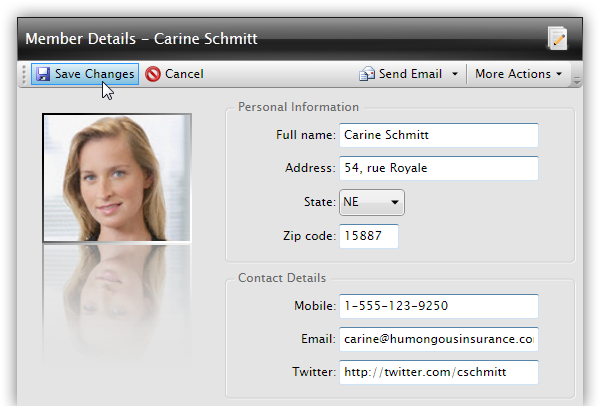
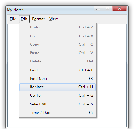
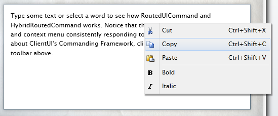
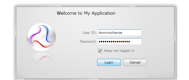
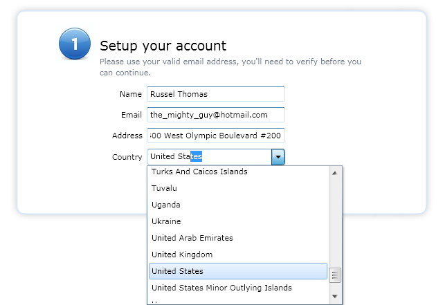
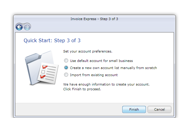
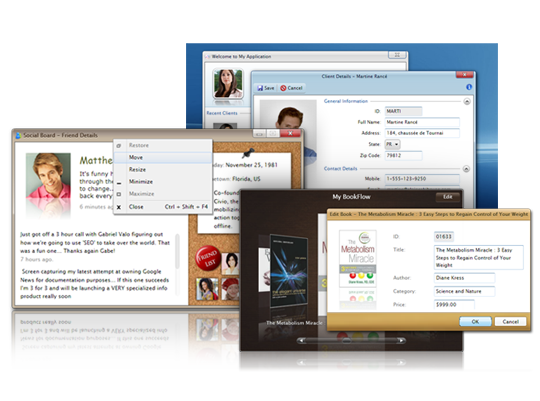
By default, the user interface controls in ClientUI are designed with Aero-style theme which instantly produces professional look to your business applications. With the predefined theme, you can create rich user experiences for Silverlight and WPF applications without have to spent significant amount of time and effort for the styling and templating.
The following figures show several ClientUI controls that come with professional Aero-style theme design.
To learn more about creating rich user experiences using ClientUI controls with the supported development environments, see ClientUI Application Development.