

| Intersoft ClientUI 8 > ClientUI Controls > Control Library > Navigation Controls Overview > UXTabControl |
UXTabControl is a feature-rich content control that lets you share multiple items and display them in the same space of the screen. Comes with a professional and pixel-perfect Aero style theme, UXTabControl enables you to quickly add a tabbed user interface to your applications.
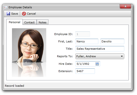
In addition to the standard features, UXTabControl also includes a number of innovative features not available in other similar controls such as flexible tabstrip placement, built-in page transition, dozens of animation library and automatic navigation direction. UXTabControl takes advantage of the ClientUI Navigation Framework, allowing you to load the source of a tab page from external XAML page, or even using the UXTabControl as a navigation control. These features are explained in the following sections.
UXTabControl is inherited from ISSelectionControl, which means the control can contain a collection of items with zero or one item selected. When an item, in this case a UXTabItem, is selected, UXTabControl automatically synchronize the related selection properties such as SelectedIndex, SelectedItem and SelectedValue.
For more information about selection control, see ItemsControl Overview and Content Model Overview respectively.
You use UXTabControl to display multiple content that share the same space of the screen, which generally associates a header to each content in a tabbed user interface. UXTabControl displays only one active content at a time, which is indicated by the active visual state of the tab header such as described in the following illustration.
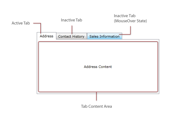
The following example shows a simple UXTabControl with three tab pages to achieve the results similar to the above illustration.
| XAML |
Copy Code
|
|---|---|
<Intersoft:UXTabControl Width="400" Height="200"> <Intersoft:UXTabItem Header="Address" HeaderDisplayMode="ContentAndImage" HeaderImage="/Assets/Address.png"> <Grid> <TextBlock Text="Address Content" VerticalAlignment="Center" HorizontalAlignment="Center"/> </Grid> </Intersoft:UXTabItem> <Intersoft:UXTabItem Header="Contact History" HeaderDisplayMode="ContentAndImage" HeaderImage="/Assets/History.png"> <Grid> <TextBlock Text="Contact History Content" VerticalAlignment="Center" HorizontalAlignment="Center"/> </Grid> </Intersoft:UXTabItem> <Intersoft:UXTabItem Header="Sales Information" HeaderDisplayMode="ContentAndImage" HeaderImage="/Assets/Sales.png"> <Grid> <TextBlock Text="Sales Information Content" VerticalAlignment="Center" HorizontalAlignment="Center"/> </Grid> </Intersoft:UXTabItem> </Intersoft:UXTabControl> |
|
The item container type of UXTabControl is UXTabItem, which derives from ISHeaderedSelectionItemControl class. This means that UXTabItem is designed to host two major content elements: a header and a content. UXTabItem also supports selection architecture for automatic synchronization with UXTabControl. To learn more about content model architecture in ClientUI controls, see Content Model Overview.
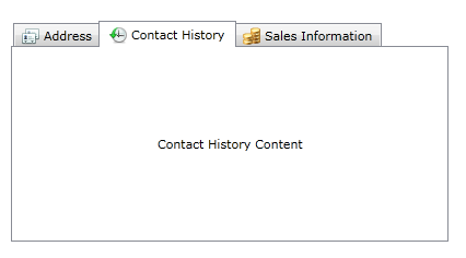
In addition, UXTabItem also supports ImageContent model, allowing you to easily add an image in the tab header, configure the image size, as well as customizing the text and image relation. UXTabItem provides the following properties to support ImageContent model:
The following example shows how to add an icon to the header of the tab pages for more compelling user interface.
| XAML |
Copy Code
|
|---|---|
<Intersoft:UXTabControl Width="400" Height="200"> <Intersoft:UXTabItem Header="Address"> <Grid> <TextBlock Text="Address Content" VerticalAlignment="Center" HorizontalAlignment="Center"/> </Grid> </Intersoft:UXTabItem> <Intersoft:UXTabItem Header="Contact History"> <Grid> <TextBlock Text="Contact History Content" VerticalAlignment="Center" HorizontalAlignment="Center"/> </Grid> </Intersoft:UXTabItem> <Intersoft:UXTabItem Header="Sales Information"> <Grid> <TextBlock Text="Sales Information Content" VerticalAlignment="Center" HorizontalAlignment="Center"/> </Grid> </Intersoft:UXTabItem> </Intersoft:UXTabControl> |
|
The results look like the following illustration.
UXTabControl is designed for an ultimate easy-of-use by providing rich designer extensions for popular development environments such as Visual Studio 2010 and Expression Blend.
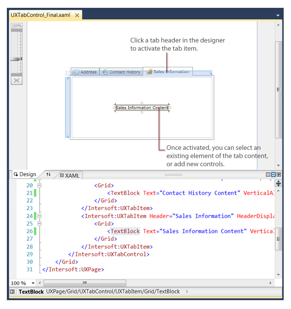
UXTabControl implements WYSIWYG designer extension which allows you to interact with the control as if it were in the runtime. This means that you can click a tab header to activate the content for that particular tab item. Consequently, you can intuitively add elements and controls directly to the tab content in designer surface, without have to switch to code view to write the XAML.
The following illustration describes the WYSIWYG designer extension in Visual Studio 2010.
 |
When you select a content in the tree node, or focus to an element of an inactive tab in XAML view, UXTabControl automatically synchronize the selection and activates the particular tab item to the designer surface. This helps you keep focused on the correct tab content regardless of whether you are designing in the visual mode, or in code view. |
For more information about selection active and other ClientUI designer extensions for Visual Studio 2010 and Expression Blend, see Working with ClientUI Controls in Visual Studio 2010 Designer and Working with ClientUI Controls in Expression Blend Designer respectively.
UXTabControl offers the capability to easily customize the tabstrip placement with a simple property set. Built on the state-of-the-art UI architecture, UXTabControl provides flexible tabstrip placement with very lightweight visual state and XAML.
By default, the tabstrip placement is set to Top. You can customize the tabstrip placement to other positions such as Left, Right or Bottom, by setting the provided TabStripPlacement property.
The following illustration shows the tab control with different tabstrip placement setting.
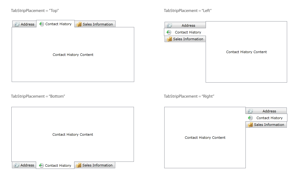
Regardless of the placement, you can also customize the tabstrip alignment through the TabStripHorizontalAlignment and TabStripVerticalAlignment property respectively.
You can define the content of a UXTabItem using an inline XAML content or obtain the source from an external XAML depending on the requirements best suited to your application. The following sections explain the content source in more details.
In most cases, you define the content of a UXTabItem by placing an inline XAML content directly in the control markup declaration. This approach is ideal when the content of your tab item is fairly lightweight, and it doesn't require to be reused in other pages.
The following example uses inline XAML as the content of the tab item.
| XAML |
Copy Code
|
|---|---|
<Intersoft:UXTabControl Width="400" Height="200"> <Intersoft:UXTabItem Header="Address"> <Grid> <TextBlock Text="Address Content" VerticalAlignment="Center" HorizontalAlignment="Center"/> </Grid> </Intersoft:UXTabItem> </Intersoft:UXTabControl> |
|
UXTabControl includes a unique capability in which it allows you to load content of a UXTabItem from an external XAML page. This approach is ideal when the content of the tab item contains a highly reusable content, for instance, a customer information page which can be loaded in other parts of the application.
To use an external XAML page as the content source, you set the Source property of the UXTabItem to the URI where the XAML page is located. It is important to note that you should not define inline XAML content when the Source property is set. The Source property has higher precedence over the inline content, so any existing inline content will be replaced, if defined.
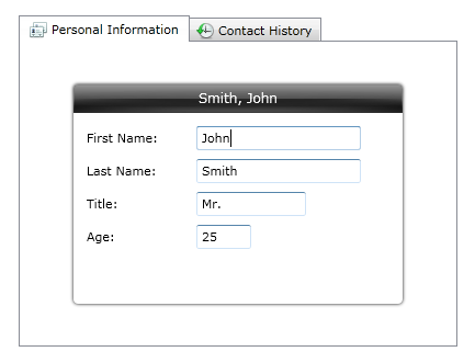
The following example shows a UXTabControl control with the tab items loading its content from external XAML pages.
| XAML |
Copy Code
|
|---|---|
<Intersoft:UXTabControl Width="400" Height="300"> <Intersoft:UXTabItem Header="Personal Information" Source="/Views/PersonalInfo.xaml" HeaderDisplayMode="ContentAndImage" HeaderImage="/Assets/Info.png"/> <Intersoft:UXTabItem Header="Contact History" Source="/Views/ContactHistory.xaml" HeaderDisplayMode="ContentAndImage" HeaderImage="/Assets/History.png"/> </Intersoft:UXTabControl> |
|
The results look like the following illustration. Notice that the Personal Information tab obtains its content from "/Views/PersonalInfo.xaml" page. This allows you to reuse the same content in other parts of the application.
UXTabControl is built upon ClientUI Navigation Framework, allowing you to take advantage many of the advanced navigation features available in the framework such as user-friendly URI mapping, loading pages on demand from external XAP , built-in error pages, shell integration, and much more. For more information about these features and the basics of navigation, see ClientUI Navigation Overview.
The following example shows how to use UriMapper in UXTabControl to provide user-friendly URL for the item's content source.
| XAML |
Copy Code
|
|---|---|
<Intersoft:UXTabControl Width="400" Height="300"> <Intersoft:UXTabControl.UriMapper> <Intersoft:UriMapper> <Intersoft:UriMapping Uri="/{page}" MappedUri="/Views/{page}.xaml"/> </Intersoft:UriMapper> </Intersoft:UXTabControl.UriMapper> <Intersoft:UXTabItem Header="Personal Information" Source="/PersonalInfo" HeaderDisplayMode="ContentAndImage" HeaderImage="/Assets/Info.png"/> <Intersoft:UXTabItem Header="Contact History" Source="/ContactHistory" HeaderDisplayMode="ContentAndImage" HeaderImage="/Assets/History.png"/> </Intersoft:UXTabControl> |
|
Note that when you define UriMapper in the tab control, you are required to define the default UriMapping which takes a blank Uri and assign its MappedUri property to an empty page.
 |
A UXTabControl can have tab items with different content source configuration, for instances, the Personal Information tab loads its content from an external XAML while the Settings tab uses inline XAML content. This allows you to flexibly design your content based on the business requirements. |
In addition to the main features, UXTabControl also includes a host of innovative features such as built-in page transition with a dozens of animation library to choose from. It also enables you to design a more compelling user experiences, such as the popular Metro UI design, by introducing automatic navigation direction detection feature. The following sections describe how to enable these features.
By default, page transition is not enabled in the UXTabControl. As the results, the content for each tab will be displayed directly when selected. The UXTabControl includes a dozen of predefined animation library which enables you to easily add stunning visual transitions when a tab item is selected.
To enable transition, you set the EnablePageTransition property of the UXTabControl to true. When the page transition is enabled, you will notice a fading animation while navigating between tab pages.
The following example shows how to enable page transition to UXTabControl.
| XAML |
Copy Code
|
|---|---|
<Intersoft:UXTabControl Name="TabControl1" EnablePageTransition="True"> </Intersoft:UXTabControl> |
|
UXTabControl provides an advanced mechanism to automatically detect the direction of the current navigation process. Called AutoDetectNavigationDirection, this feature automatically determines the navigation direction of the target selection relative to the current active selection.
The following example shows how to enable automatic navigation direction feature.
| XAML |
Copy Code
|
|---|---|
<Intersoft:UXTabControl Name="TabControl1" EnablePageTransition="True" AutoDetectNavigationDirection="True"> </Intersoft:UXTabControl> |
|
When the page transition and navigation direction detection is enabled, UXTabControl automatically applies the visual transition based on the navigation direction. You can set the visual transition to be applied differently for each navigation direction. The following table lists the basic properties related to visual transitions and its default values.
| Property | Default Value | Description |
|---|---|---|
| BackTransitionEffect | SlideLeft | This transition will be applied when the index of the target tab item is before the current active selection. |
| ForwardTransitionEffect | SlideRight | This transition will be applied when the index of the target tab item is after the current active selection. |
| DefaultTransitionEffect | Fading | This transition will be applied when the navigation direction cannot be determined, such as during the first load. |
You can choose one of the TransitionEffect to apply to your visual transition properties:
The following example shows how to customize the visual transitions for back, forward and new navigation mode.
| XAML |
Copy Code
|
|---|---|
<Intersoft:UXTabControl Name="TabControl1" EnablePageTransition="True" AutoDetectNavigationDirection="True"> BackTransitionEffect="FlipLeft" ForwardTransitionEffect="FlipRight" DefaultTransitionEffect="FlipUp"> </Intersoft:UXTabControl> |
|
By default, the visual transition is set to play for 0.3 seconds. You can customize how long the visual transition should play by setting the TransitionDuration property to the desired value in seconds.
The following example shows how to customize the transition duration of the frame.
| XAML |
Copy Code
|
|---|---|
<Intersoft:UXTabControl EnablePageTransition="True" TransitionDuration="1" BackTransitionEffect="FlipLeft" ForwardTransitionEffect="FlipRight" DefaultTransitionEffect="FlipUp"> </Intersoft:UXTabControl> |
|
 |
The recommended transition duration for a typical business application is between 0.3 and 0.7 seconds. You need to carefully review and evaluate your application's user experiences after applying the visual transition. Reducing or increasing the duration exceeding the above recommended value will often cause a poor user experience. |
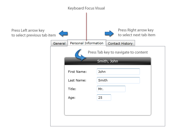
UXTabControl is designed with strong compliance to usability standards defined in ISO 9241, which includes visual hint for keyboard focus, navigation between tab headers and across the content using keyboard device.
The keyboard focus visual is enabled by default. You can customize its visibility through the ShowKeyboardFocusVisual property. Note that the keyboard focus visual appears only when the tab item is activated using keyboard device. When the tab item receives keyboard focus, users can also navigate between tab headers by using navigational arrow keys such as Left arrow key to go to the previous tab item and Right for the next tab item. Once the users selected the desired tab, they can focus to the content by pressing the Tab key. See the following illustration for more details.
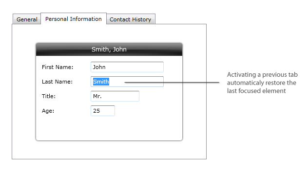
Another important usability feature implemented in the UXTabControl is the automatic focus persistence when users activate a previous tab item. In this case, the last focused element should be properly restored, allowing users to easily resume the data processing tasks without additional effort. See the following illustration for more details.
For more information about user experiences design in ClientUI controls, see User Experiences Overview.
You can easily customize the UXTabControl appearance through the following properties.
If you would like to completely customize the control appearance or if you want to change the styles of each visual state, you can edit the template of the control and do the modification accordingly.
To learn more how to customize the template and visual states, see Styles and Template Overview.
For the list of ClientUI walkthroughs, see Walkthroughs and How-to Topics.
For the list of ClientUI samples available in local installation, see Locating the Samples in Local Installation.