
| Intersoft.Client.UI.Navigation Namespace : UXTabItem Class |

<DescriptionAttribute("Represents a tab item that consists of a header and a content.")>
Public Class UXTabItem
   Inherits Intersoft.Client.Framework.ISHeaderedSelectionItemControl
   Implements Intersoft.Client.Framework.IControl, Intersoft.Client.Framework.IFramework, Intersoft.Client.Framework.ILicensing, Intersoft.Client.Framework.Input.IKeyboardFocus, Intersoft.Client.Framework.ISelectionItem
Dim instance As UXTabItem
[DescriptionAttribute("Represents a tab item that consists of a header and a content.")]
public class UXTabItem : Intersoft.Client.Framework.ISHeaderedSelectionItemControl, Intersoft.Client.Framework.IControl, Intersoft.Client.Framework.IFramework, Intersoft.Client.Framework.ILicensing, Intersoft.Client.Framework.Input.IKeyboardFocus, Intersoft.Client.Framework.ISelectionItem
[DescriptionAttribute("Represents a tab item that consists of a header and a content.")]
public ref class UXTabItem : public Intersoft.Client.Framework.ISHeaderedSelectionItemControl, Intersoft.Client.Framework.IControl, Intersoft.Client.Framework.IFramework, Intersoft.Client.Framework.ILicensing, Intersoft.Client.Framework.Input.IKeyboardFocus, Intersoft.Client.Framework.ISelectionItem
The item container type of UXTabControl is UXTabItem, which derives from ISHeaderedSelectionItemControl class. This means that UXTabItem is designed to host two major content elements: a header and a content. UXTabItem also supports selection architecture for automatic synchronization with UXTabControl. To learn more about content model architecture in ClientUI controls, see Content Model Overview.
In addition, UXTabItem also supports ImageContent model, allowing you to easily add an image in the tab header, configure the image size, as well as customizing the text and image relation. UXTabItem provides the following properties to support ImageContent model:
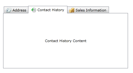
The following example shows how to add an icon to the header of the tab pages for more compelling user interface.
| XAML |
Copy Code
|
|---|---|
<Intersoft:UXTabControl Width="400" Height="200"> <Intersoft:UXTabItem Header="Address"> <Grid> <TextBlock Text="Address Content" VerticalAlignment="Center" HorizontalAlignment="Center"/> </Grid> </Intersoft:UXTabItem> <Intersoft:UXTabItem Header="Contact History"> <Grid> <TextBlock Text="Contact History Content" VerticalAlignment="Center" HorizontalAlignment="Center"/> </Grid> </Intersoft:UXTabItem> <Intersoft:UXTabItem Header="Sales Information"> <Grid> <TextBlock Text="Sales Information Content" VerticalAlignment="Center" HorizontalAlignment="Center"/> </Grid> </Intersoft:UXTabItem> </Intersoft:UXTabControl> |
|
The results look like the following illustration.

System.Object
System.Windows.DependencyObject
System.Windows.UIElement
System.Windows.FrameworkElement
System.Windows.Controls.Control
System.Windows.Controls.ContentControl
Intersoft.Client.Framework.ISContentControl
Intersoft.Client.Framework.ISHeaderedContentControl
Intersoft.Client.Framework.ISHeaderedSelectionItemControl
Intersoft.Client.UI.Navigation.UXTabItem
Target Platforms: Windows 7, Windows Vista SP1 or later, Windows XP SP3, Windows Server 2008 (Server Core not supported), Windows Server 2008 R2 (Server Core supported with SP1 or later), Windows Server 2003 SP2