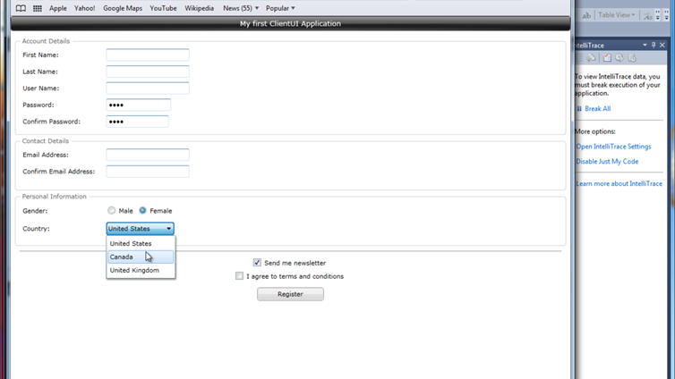
This walkthrough provides an introduction to the development of a Silverlight application using ClientUI user interface library and ClientUI project templates.
This walkthrough guides you through the development of a simple registration form using various ClientUI components such as outlined in the following steps:
- Creating a new ClientUI Application project.
- Creating main layout structure with fluid and docking behavior.
- Creating Account Details group and its required input controls.
- Creating Contact Details group and its required input controls.
- Creating Personal Information group and its required input controls.
- Adding registration options and button to execute the registration process.
- Beautifying the registration form.
- Testing the registration form.
Prerequisites
You need the following components to complete this walkthrough:
- Visual Studio 2010
- Silverlight 4 Tools for Visual Studio 2010
- Intersoft ClientUI
Creating a new ClientUI Application project
In this section, you create the ClientUI application project, which includes a Silverlight project and a Web project to host the Silverlightapplication.
- Start Visual Studio 2010.
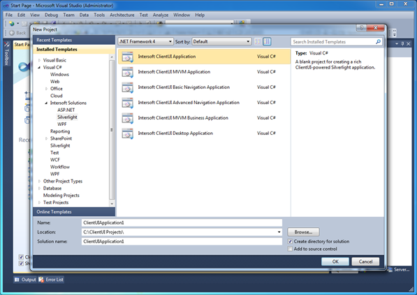
- On the File menu, point to the New, and then select Project. The New Project dialog box appears.
- In the Installed Templates pane, expand Visual Basic or Visual C#, expand Intersoft Solutions, and then select Silverlight.
- In the list of templates, choose Intersoft ClientUI Application.

- Click OK to create the project. You can optionally modify the project name and project location through the provided Name and Location textbox.
- After few seconds, a New Silverlight Application dialog box appears. Leave all settings as it is, press OK to continue.
 |
A Web project will be created in this walkthrough to host the Silverlight application. |
-
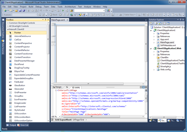
The new ClientUI project is created and you are ready to develop your Silverlight application. Your screen should look similar to the following image.

 |
Several ClientUI assemblies such as framework, common controls and Aqua controls are automatically added for your convenience. A new UXPage is added to the project for the application’s main root visual. You can also notice that Intersoft ClientUI tab group is now available in your Visual Studio toolbox. |
Creating the Layout
Layout provides an ordered way to place UI elements, and also manages the size and position of those elements when a UI is resized. The registration form in the walkthrough uses fluid layout to automatically resizes the UI elements as the browser's window shrinks or grows. Consequently, the DockPanel is the ideal layout element for the application.
In this section, you add a DockPanel using the Visual Studio designer and add UI controls that can be docked within the DockPanel.
- From the Toolbox, in the Intersoft ClientUI group, drag a DockPanel onto the Visual Studio designer surface.
- With the new DockPanel instance selected, reset the layout by right-clicking on the DockPanel, choose Reset Layout and select All menu item. This will clear the margins, alignments, and size that predefined by the Visual Studio designer. Our goal is to have the DockPanel filling the entire available space. For efficiency, the rest of the instructions in walkthrough will refer this step as Reset All Layout task.
- Double click on the GlassLabel control in the toolbox to add a new instance to the designer surface.
 |
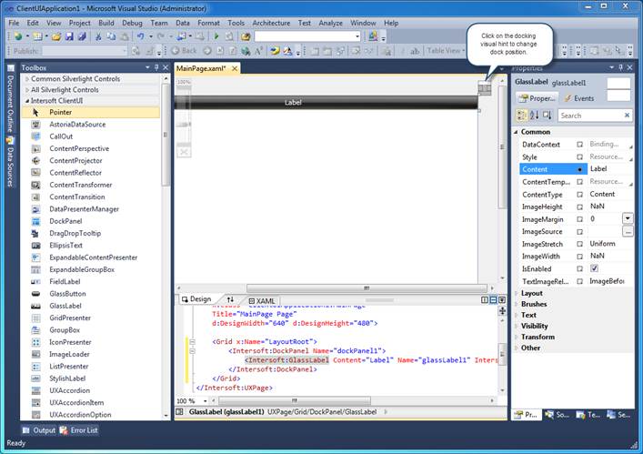
When an UI control is inside a dock panel, a docking visual hint will appear in the top right corner of the control. You can easily choose the docking mode of the control by clicking on the visual hint. |
- Click on the Top section of the docking visual hint to dock the GlassLabel to the top of the layout. See the illustration below.

- Open Property Window, change the Content property to My first ClientUI Application.
- Expand the Text property group, change the FontSize to 13.
- Add a new UXItemsControl from the toolbox.
- Reset all the layout properties of the UXItemsControl.
- With the UXItemsControl instance selected, click on the middle section of the docking visual hint to mark the control as fill element.
 |
In a dock panel layout, the UI element marked as fill element will be stretched to fill the remaining available space. The DockPanel in ClientUI includes an advanced feature that enhances layout efficiency in a way where the fill element can be applied in any children of the DockPanel regardless of its logical order. |
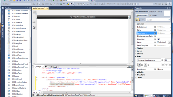
- The page main layout structure is now ready. It contains a GlassLabel which is docked to the top of layout and an UXItemsControl which is stretched to fill. In the next section, you will learn how to use UXItemsControl as a generic container to host a collection of items.
The following illustration shows the DockPanel, GlassLabel and UXItemsControl that are added in this section.

Creating Account Details Group and Input Controls
In this section, the registration form is updated with UI controls that allow users to interact with the information and provide new value to the fields through input controls. You use the GroupBox control to create a logical separation between multiple sections in the data form, UXItemsControl to host a collection of items that supports horizontal and vertical layout arrangement, and FieldLabel to represent a data field typically consisted of a label and an input control such as text box.
-
From the
Toolbox, in the
Intersoft ClientUI group, double click on the
GroupBox control to add it to the current selection in the designer.
-
Reset all the layout properties of the
GroupBox control.
-
Change its
Header property to
Account Details.
-
-
-
Click on the first
FieldLabel control and change its
Header property to
First Name:.
 |
Use a FieldLabel control to represent a user interface that comprises of a label and an input field. By default, a new FieldLabel will automatically add an UXTextBox to its Content. |
-
Change the
Header property of the respective
FieldLabel controls as follow:
Last Name:,
User Name:,
Password: and
Confirm Password:.
-
Click on the
UXTextBox instance of the
Password field label. Remove it by pressing delete key.
-
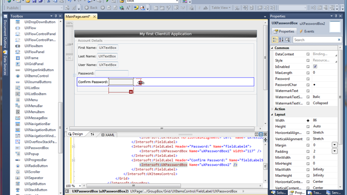
With the selection now changed to the
FieldLabel, simply double click on the
UXPasswordBox from the toolbox. This will insert the password box into the
Content of
FieldLabel.
-
-
Repeat step 7 – 9 for the Confirm Password field label.
The following illustration shows the results of this section.

Creating Contact Details Group and Input Controls
Using the techniques in the previous section, you create a new group and input controls to allow users to provide data for the contact details.
-
Select the main
UXItemsControl instance by clicking on the empty space.
-
From the
Toolbox, in the
Intersoft ClientUI group, double click on the
GroupBox control to add it to the current selection.
-
Reset all the layout properties of the
GroupBox instance.
-
Change its Header property to Contact Details.
-
-
From the
Toolbox, double click on the
FieldLabel control, repeat this step for two times.
-
Select the first
FieldLabel control and change its
Header property to
Email Address:.
-
Select the second
FieldLabel control and change its
Header property to
Confirm Password:.
Creating Personal Information Group and Input Controls
Using the techniques in the previous section, you create a new group and input controls to allow users to provide data for the personal information.
-
Select the main
UXItemsControl instance by clicking on the empty space.
-
From the
Toolbox, in the
Intersoft ClientUI group, double click on the
GroupBox control to add it to the current selection.
-
Reset all the layout properties of the
GroupBox instance.
-
Change its Header property to Personal Information.
-
-
From the
Toolbox, double click on the
FieldLabel control, repeat this step for two times.
-
-
Select the second
FieldLabel control and change its
Header property to
Country:.
-
Select the
UXTextBox control, which is within the content of the
Gender field label. Delete and replace it with a new
UXItemsControl, then reset its layout properties.
-
From the
ToolBox, double click on
UXRadioButton and repeat it twice.
-
Change the first radio button’s Content to Male and the other to Female.
-
To set a default selection in the radio button, select the first radio button and set its IsChecked property to True.
-
Select the
UXTextBox control, which is within the content of the Country field label, delete and replace it with a new
UXComboBox.
-
Resize the new
UXComboBox to a larger width, i.e,
120px, by visually dragging its resize handle, or by entering the value in the
Properties Window.
-
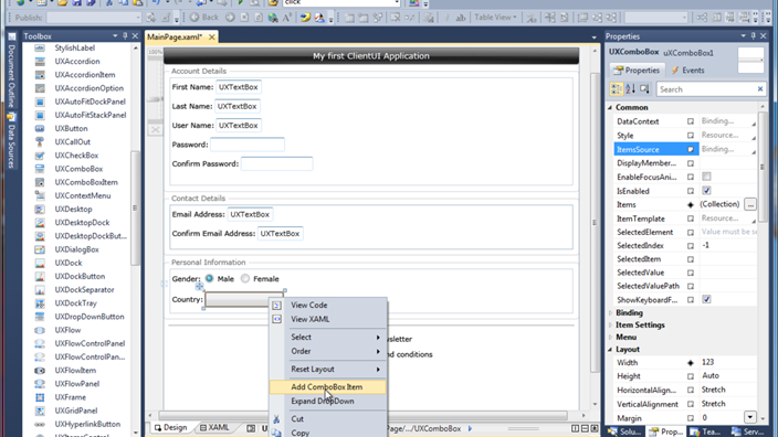
Right click on the combo box control and choose
Add ComboBox Item, repeat this step for three times.
At this point, your result should look like the following illustration.

-
To see how the items look like in the designer, right click on the combo box control again and select Expand DropDown.
-
In the property window, search for the
Items property and click on the
… button to open the collection editor.
-
In the editor dialog box, notice there are three items in the left-side panel. Select the first
UXComboBoxItem and change its
Content property to
United States.
-
Do the same for the second and third items to Canada and United Kingdom respectively.
Adding Registration Options and Button
In this section, the registration form is updated with a separator to make a clear distinction between the general data input groups and the footer groups. You use UXCheckBox to provide input selection for registration options and use UXButton to provide an action command that allows user to submit the input data.
-
From the
Toolbox, in the
Intersoft ClientUI group, double click on the
UXSeparator control to add it to the designer.
 |
Use UXSeparator to create a logical separation between UI sections. |
- Set its Margin to 8 to give some space from the separator the objects around it.
-
Add two
UXCheckBox control to the designer surface and set their
HorizontalAlignment to
Center.
-
Select the first check box, set its Content property to Send me newsletter and the other to I agree to terms and conditions.
-
To make the
Send me newsletter checkbox to be checked by default, set its
IsChecked property to
True.
-
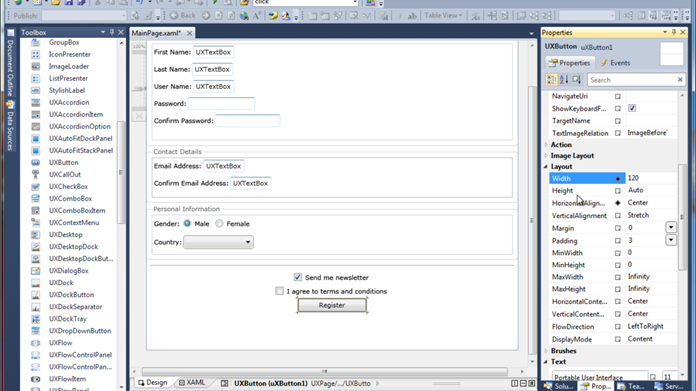
Finally, add a new
UXButton to the designer and set its
HorizontalAlignment to
Center. To make the button larger, you can either resize the drag handle visually, or set its
Width property to larger value such as
120.
-
Set the button's
IsDefault property to true.
 |
ClientUI command button lineups support IsDefault and IsCancel which automatically responds to action keys such as Enter and Escape. When IsDefault is set, users can execute the button by pressing Enter key anywhere within the same focus scope. |
At this point, your designer form should look like the following illustration.

-
Double click on the
UXButton instance in the Visual Studio designer to handle the
Click event.
-
The code editor appears with the Click method pre-populated. Paste the following to the code editor.
| Handling the Click Event of a UXButton |
Copy Code
|
private void uXButton1_Click(object sender, RoutedEventArgs e)
{
    MessageBox.Show("Registering your account. Please wait...");
} |
In this walkthrough, you used a simple
MessageBox to respond on the button click. In a real-world application, you can write codes that saves the data to database via web service such as WCF RIA Services. To find out more walkthroughs about data binding and business application scenarios, see
ClientUI Walkthroughs.
Beautifying the Registration Form
In this section, the registration form is updated with customized layout and alignment to make the labels and input controls look uniform and more intuitive to users.
-
Select the first instance of the
UXTextBox control. Hold down the SHIFT modifier key and select each
UXTextBox that desired to be manipulated.
-
In the
Properties Window, clear the
Content property by removing the value from the textbox, and set its
Width to
150.
 |
In Visual Studio 2010 designer, you can select multiple objects with the same type using SHIFT modifier key. This enables you to easily and quickly set properties to apply to the selected objects. |
-
Next, select all field labels by following the same technique above.
-
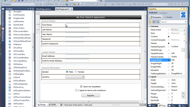
In the
Properties Window, search for the
HeaderWidth property and set its value to
150. Notice that all field labels now have properly space between header and the input field.
 |
The FieldLabel control includes numerous time-saving features that let you easily customize the appearance for the label and the content to achieve uniform look and feel. Additionally, it includes standards-compliance runtime behaviors – such as clicking on the label area will automatically focus to the input control – without additional codes. |
The following illustration shows the registration form with properly aligned header and content.

Testing the Registration Form
In this section, you build and run the application.
-
Congratulations. You have now successfully created your first Silverlight application using Intersoft ClientUI controls.
-
Save your page and project.
-
Press F5 key to run your application and see the results in the browser.
The following illustration shows the results of a simple registration form using Intersoft ClientUI user interface controls with the aid of project templates and Visual Studio designer.

You can try and experiment the results such as expanding the combo box to select an item, typing into the text box or password box.
You can also try some exciting usability features built into the controls, such as pressing Tab or Shift+Tab to navigate between input controls. Notice that check box, radio button, combo box, button and other non-text input controls will also show keyboard focus visual.
Some input controls – such as combo box – implement unique keyboard navigation. For instances, press F2 to show the dropdown, and then use arrow keys to select an item. Press Enter key to commit a selection or Escape key to cancel and close the dropdown.
To learn more about the user experiences standards implemented in ClientUI controls, see Standards-compliance User Experiences Overview.
What's Next
In this walkthrough, you have successfully created a simple Silverlight registration form application using the ClientUI controls. You should now have a basic understanding of the basic building block in a Silverlight application, working with UI controls using Visual Studio designer, customizing properties and handling events in the code behind, and testing your application in browser.
While this walkthrough is intended for new users to get started with Silverlight development using ClientUI, more walkthroughs are also available that discuss real-world business application development scenarios, such as using MVVM (Model-View-ViewModel) pattern, data access and connectivity to WCF RIA Services, and more. See the suggested topics in the following:
For more information about ClientUI architecture, concepts, frameworks and controls, see the following topics:
See Also


