

| Intersoft ClientUI 8 > ClientUI Fundamentals > Panels Overview |
Panel elements are components that control the rendering of elements - their size and dimension, trsheir position and the arrangement of their child content.
Intersoft ClientUI provides a number or predefined panels that can help you in creating application UI. However not all of them are intended for use as root layout providers.
Each panel element encapsulates it own special functionality, as seen in the following list.
The Intersoft DockPanel element uses DockPanel.Dock attached property as set in child content elements to position content along the edges of a container.
When DockPanel.Dock is set to Top or Bottom, it positions child elements above or below each other. When DockPanel.Dock is set to Left or Right it positions child elements to the left or right of each other.
The main difference between Intersoft DockPanel and standard dock panel is that Intersoft DockPanel provides FillChildMode property instead of LastChildFill property. With this approach you do not need to put the element you want to set as fill element as the last child, simply set DockPanel.IsFillElement attached property.
| XAML |
Copy Code
|
|---|---|
<Grid x:Name="LayoutRoot"> <Intersoft:DockPanel HorizontalAlignment="Center" Height="300" VerticalAlignment="Center" Width="400" FillChildMode="Custom"> <Grid Intersoft:DockPanel.Dock="Top" Height="50" Background="Black"/> <Grid Intersoft:DockPanel.IsFillElement="True" Background="White" /> <Grid Intersoft:DockPanel.Dock="Bottom" Height="50" Background="Black"/> </Intersoft:DockPanel> </Grid> |
|
If its Height and Width properties are not specified, DockPanel sizes to its content. The size can increase or decrease to accommodate the size of its child elements. However, when these properties are specified and there is no longer room for the next specified child element, DockPanel does not display that child element or subsequent child and does not measure subsequent child elements.
To make layouting task easier, ClientUI features an adorner designer feature in certain layout controls such as in DockPanel. An adorner is an advanced designer feature in both Expression Blend and Visual Studio 2010 in which visual cues are displayed to allow users easily interact with the user interface elements.
The DockPanel is an ideal example that shows the adorner designer feature. As DockPanel allows its children to be docked in one of the four sides of the layout boundary, the DockPanel adorner provides a helpful visual cue that indicates the Dock position of the currently selected children. Additionally, you can also click on the visual cue to change the Dock position which makes it easy and intuitive to work with layouting task in the Expression Blend designer.
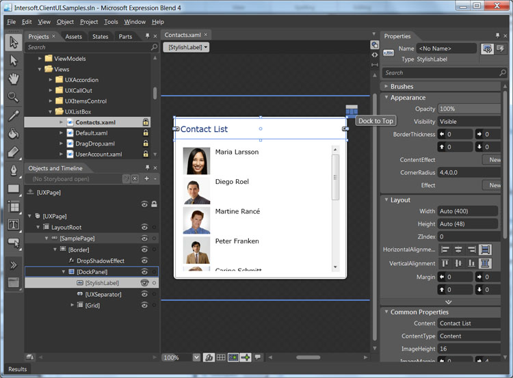
To learn more about these design time features, see Development Environment Overview.
The following example demonstrates how to partition space using a DockPanel.
| XAML |
Copy Code
|
|---|---|
<Grid x:Name="LayoutRoot"> <Intersoft:DockPanel Name="dockPanel1" FillChildMode="Custom"> <Border BorderBrush="Silver" BorderThickness="1" Height="50" Name="border1" Intersoft:DockPanel.Dock="Top"> <TextBlock Height="23" Name="textBlock1" Text="Sarah Brightman : Live in Vienna" FontSize="16" HorizontalAlignment="Center" /> </Border> <Border BorderBrush="Silver" BorderThickness="1" Height="50" Name="border2" Intersoft:DockPanel.Dock="Bottom"> <Intersoft:UXItemsControl Name="uXItemsControl1" Orientation="Horizontal" HorizontalAlignment="Center" VerticalAlignment="Center"> <Intersoft:FieldLabel Header="Artist" Name="fieldLabel1"> <Intersoft:UXTextBox HorizontalAlignment="Left" Name="uXTextBox1" Text="Sarah Brightman" VerticalAlignment="Top" /> </Intersoft:FieldLabel> <Intersoft:UXSeparator Name="uXSeparator1" Orientation="Vertical" Width="3" Height="12" /> <Intersoft:FieldLabel Header="Year" Name="fieldLabel2"> <Intersoft:UXTextBox HorizontalAlignment="Left" Name="uXTextBox2" Text="2009" VerticalAlignment="Top" /> </Intersoft:FieldLabel> <Intersoft:UXSeparator Name="uXSeparator2" Width="3" Height="12" Orientation="Vertical" /> <Intersoft:FieldLabel Header="Genre" Name="fieldLabel3"> <Intersoft:UXTextBox HorizontalAlignment="Left" Name="uXTextBox3" Text="Vocal" VerticalAlignment="Top" /> </Intersoft:FieldLabel> </Intersoft:UXItemsControl> </Border> <Border BorderBrush="Silver" BorderThickness="1" Name="border3" Width="50" Intersoft:DockPanel.Dock="Left"> <Intersoft:UXButton Name="uXButton1" Width="24" Height="24" CornerRadius="12" Content="<" FontWeight="Bold" /> </Border> <Border BorderBrush="Silver" BorderThickness="1" Name="border4" Width="50" Intersoft:DockPanel.Dock="Right"> <Intersoft:UXButton Content=">" CornerRadius="12" FontWeight="Bold" Height="24" Name="uXButton2" Width="24" /> </Border> <Border BorderBrush="Silver" BorderThickness="1" Name="border5" Intersoft:DockPanel.IsFillElement="True"> <Intersoft:ImageLoader Name="imageLoader1" ImageSource="/DockPanel;component/Assets/Images/1.jpg" /> </Border> </Intersoft:DockPanel> </Grid> |
|
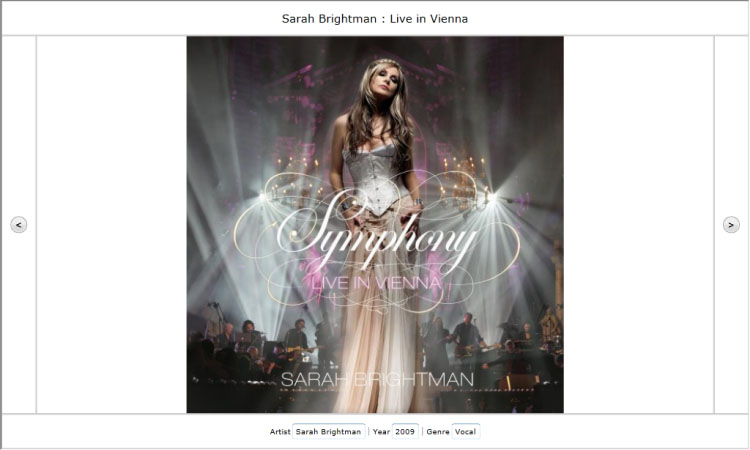
To learn more how to create this example step by step using layout adorner, see Walkthrough: Create Fluid UI Layout using DockPanel.
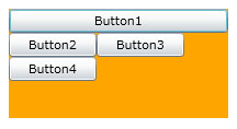
WrapPanel is used to position child elements in sequential position from left to right, breaking content to the next line when it reaches the edge of its parent container. Content can be oriented horizontally or vertically. WrapPanel is useful for simple flowing user interface (UI) scenarios. It can also be used to apply uniform sizing to all of its child elements.
The following example demonstrates how to create a WrapPanel to display Button controls that wrap when they reach the edge of their container.
| XAML |
Copy Code
|
|---|---|
<Grid x:Name="LayoutRoot"> <Intersoft:WrapPanel Background="Orange" Width="200" Height="100"> <Button Width="200" Content="Button1"/> <Button Content="Button2" Width="80"/> <Button Content="Button3" Width="80"/> <Button Content="Button4" Width="80"/> </Intersoft:WrapPanel> </Grid> |
|
UXGridPanel is used to arrange children in grid will equal cell sizes, which means all UXGridPanel has equal size specified by ItemHeight and ItemWidth property, thus you need to be careful when configuring the size its children. It is recommended to use auto size for all children in the UXGridPanel.
Similar with WrapPanel, UXGridPanel has an Orientation property that controls the item arrangement. If it is set to Horizontal, it will fill the column first then the row. Similarly, if it is set to Vertical, it will fill the row first then column.
All children in a UXGridPanel will be arranged in logical order based on their index. You do not need to set the Grid.Column, or Grid.Row for any of the children since the layout is automatically handled by the panel.
The following example shows how to create a Uniform Grid to display list of items with equal size.
| XAML |
Copy Code
|
|---|---|
<Intersoft:UXGridPanel AllowReorderItem="True" Column="4" Row="4" ItemHeight="80" ItemWidth="80" Margin="16"> <Grid> <Grid.RowDefinitions> <RowDefinition/> <RowDefinition Height="Auto"/> </Grid.RowDefinitions> <Image Source="phone-icon.png"/> <Intersoft:EllipsisText Text="Call" Grid.Row="1" Padding="6,2" TooltipStyle="{StaticResource EllipsisTooltipStyle}"/> </Grid> <Grid> <Grid.RowDefinitions> <RowDefinition/> <RowDefinition Height="Auto"/> </Grid.RowDefinitions> <Image Source="SMS-icon.png"/> <Intersoft:EllipsisText Text="SMS" Grid.Row="1" Padding="6,2" TooltipStyle="{StaticResource EllipsisTooltipStyle}"/> </Grid> <Grid> <Grid.RowDefinitions> <RowDefinition/> <RowDefinition Height="Auto"/> </Grid.RowDefinitions> <Image Source="chat-blank-icon.png"/> <Intersoft:EllipsisText Text="Instant Messanger" Grid.Row="1" Padding="6,2" TooltipStyle="{StaticResource EllipsisTooltipStyle}"/> </Grid> <Grid> <Grid.RowDefinitions> <RowDefinition/> <RowDefinition Height="Auto"/> </Grid.RowDefinitions> <Image Source="cal-icon.png"/> <Intersoft:EllipsisText Text="Calendar" Grid.Row="1" Padding="6,2" TooltipStyle="{StaticResource EllipsisTooltipStyle}"/> </Grid>... </Intersoft:UXGridPanel> |
|
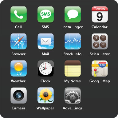
UXGridPanel is also categorized as interactive panels because it supports drag drop capability. To learn more about this concept, see Interactive Panels Overview and Drag-drop Framework Overview.
UXStackPanel enables you to stack elements in an assigned direction. The default stack direction is horizontal. The Orientation property can be used to control content flow.
The following example demonstrates how to use a UXStackPanel to create a set of vertically-positioned buttons. For horizontal positioning, set the Orientation property to Horizontal.
| XAML |
Copy Code
|
|---|---|
<Intersoft:UXStackPanel HorizontalAlignment="Center" VerticalAlignment="Center"> <Button Content="Button1" Width="80"/> <Button Content="Button2" Width="80"/> <Button Content="Button3" Width="80"/> </Intersoft:UXStackPanel> |
|

UXStackPanel is also categorized as interactive panels because it supports drag drop capability. To learn more about this concept, see Interactive Panels Overview and Drag-drop Framework Overview.
UXOverflowStackPanel is an innovative panel featuring built-in items overflow detection mechanism. The overflow logic works by intelligently measuring the desired size of all the contained items against the panel's actual dimension.
The items that exceeded the panel's actual dimension, called overflow items, will be seamlessly removed from the UXOverflowStackPanel to ensure the remaining items to fit into the available dimension. Consequently, the overflow items are moved to the overflow container panel which can be any type of panels that derive from Panel class. The overflow container panel can be specified in the OverFlowContainer property of the UXOverflowStackPanel.
The following example demonstrates how to use a UXOverflowStackPanel to moved the overflow items to overflow container panel.
In this sample there are eight images that registered under UXItemsControl that use UXOverflowStackPanel as its ItemsPanel since the container size is restricted to 500 pixel, UXOverflowStackPanel can only render four of them, while the other four is passed to overflow container panel.
| XAML |
Copy Code
|
|---|---|
<Grid x:Name="LayoutRoot" Width="800" Height="600" Background="White"> <Intersoft:DockPanel Width="600"> <StackPanel Intersoft:DockPanel.Dock="Right" x:Name="OverflowPanel" Width="100" Orientation="Vertical" VerticalAlignment="Bottom" Background="#FFA0FF92"/> <Intersoft:UXItemsControl Intersoft:DockPanel.Dock="Bottom" Height="100" Orientation="Horizontal" ItemsPanel="{StaticResource ItemsPanelTemplate1}" Background="#FFE7FF5A"> <Image Height="100" Source="/Penguins.jpg" Stretch="Fill" Width="100" Margin="8"/> <Image Height="100" Source="/Tulips.jpg" Stretch="Fill" Width="100" Margin="8"/> <Image Height="100" Source="/Lighthouse.jpg" Stretch="Fill" Width="100" Margin="8"/> <Image Height="100" Source="/Chrysanthemum.jpg" Stretch="Fill" Width="100" Margin="8"/> <Image Height="100" Source="/Desert.jpg" Stretch="Fill" Width="100" Margin="8"/> <Image Height="100" Source="/Hydrangeas.jpg" Stretch="Fill" Width="100" Margin="8"/> <Image Height="100" Source="/Jellyfish.jpg" Stretch="Fill" Width="100" Margin="8"/> <Image Height="100" Source="/Koala.jpg" Stretch="Fill" Width="100" Margin="8"/> </Intersoft:UXItemsControl> </Intersoft:DockPanel> </Grid> |
|
