
| Intersoft.Client.UI.Controls Namespace : DockPanel Class |

Public Class DockPanel
   Inherits Intersoft.Client.Framework.ISPanel
   Implements Intersoft.Client.Framework.IFramework, Intersoft.Client.Framework.ILicensing
Dim instance As DockPanel
public class DockPanel : Intersoft.Client.Framework.ISPanel, Intersoft.Client.Framework.IFramework, Intersoft.Client.Framework.ILicensing
public ref class DockPanel : public Intersoft.Client.Framework.ISPanel, Intersoft.Client.Framework.IFramework, Intersoft.Client.Framework.ILicensing
The Intersoft DockPanel element uses DockPanel.Dock attached property as set in child content elements to position content along the edges of a container.
When DockPanel.Dock is set to Top or Bottom, it positions child elements above or below each other. When DockPanel.Dock is set to Left or Right it positions child elements to the left or right of each other.
The main difference between Intersoft DockPanel and standard dock panel is that Intersoft DockPanel provides FillChildMode property instead of LastChildFill property. With this approach you do not need to put the element you want to set as fill element as the last child, simply set DockPanel.IsFillElement attached property.
| XAML |
Copy Code
|
|---|---|
<Grid x:Name="LayoutRoot"> <Intersoft:DockPanel HorizontalAlignment="Center" Height="300" VerticalAlignment="Center" Width="400" FillChildMode="Custom"> <Grid Intersoft:DockPanel.Dock="Top" Height="50" Background="Black"/> <Grid Intersoft:DockPanel.IsFillElement="True" Background="White" /> <Grid Intersoft:DockPanel.Dock="Bottom" Height="50" Background="Black"/> </Intersoft:DockPanel> </Grid> |
|
If its Height and Width properties are not specified, DockPanel sizes to its content. The size can increase or decrease to accommodate the size of its child elements. However, when these properties are specified and there is no longer room for the next specified child element, DockPanel does not display that child element or subsequent child and does not measure subsequent child elements.
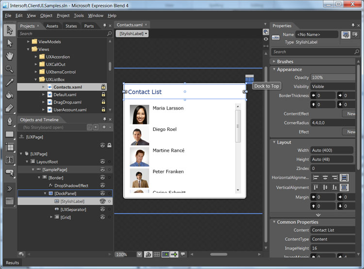
To make layouting task easier, ClientUI features an adorner designer feature in certain layout controls such as in DockPanel. An adorner is an advanced designer feature in both Expression Blend and Visual Studio 2010 in which visual cues are displayed to allow users easily interact with the user interface elements.
The is an ideal example that shows the adorner designer feature. As DockPanel allows its children to be docked in one of the four sides of the layout boundary, the DockPanel adorner provides a helpful visual cue that indicates the Dock position of the currently selected children. Additionally, you can also click on the visual cue to change the Dock position which makes it easy and intuitive to work with layouting task in the Expression Blend designer.

To learn more about these design time features, see Development Environment Overview.
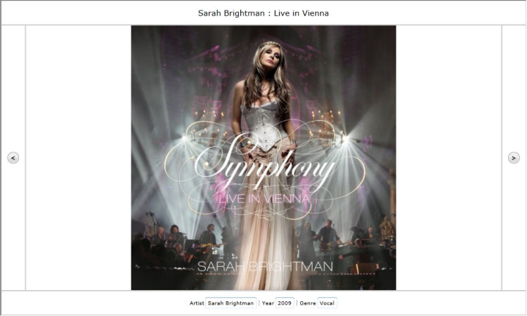
The following example demonstrates how to partition space using a DockPanel.
| XAML |
Copy Code
|
|---|---|
<Grid x:Name="LayoutRoot"> <Intersoft:DockPanel Name="dockPanel1" FillChildMode="Custom"> <Border BorderBrush="Silver" BorderThickness="1" Height="50" Name="border1" Intersoft:DockPanel.Dock="Top"> <TextBlock Height="23" Name="textBlock1" Text="Sarah Brightman : Live in Vienna" FontSize="16" HorizontalAlignment="Center" /> </Border> <Border BorderBrush="Silver" BorderThickness="1" Height="50" Name="border2" Intersoft:DockPanel.Dock="Bottom"> <Intersoft:UXItemsControl Name="uXItemsControl1" Orientation="Horizontal" HorizontalAlignment="Center" VerticalAlignment="Center"> <Intersoft:FieldLabel Header="Artist" Name="fieldLabel1"> <Intersoft:UXTextBox HorizontalAlignment="Left" Name="uXTextBox1" Text="Sarah Brightman" VerticalAlignment="Top" /> </Intersoft:FieldLabel> <Intersoft:UXSeparator Name="uXSeparator1" Orientation="Vertical" Width="3" Height="12" /> <Intersoft:FieldLabel Header="Year" Name="fieldLabel2"> <Intersoft:UXTextBox HorizontalAlignment="Left" Name="uXTextBox2" Text="2009" VerticalAlignment="Top" /> </Intersoft:FieldLabel> <Intersoft:UXSeparator Name="uXSeparator2" Width="3" Height="12" Orientation="Vertical" /> <Intersoft:FieldLabel Header="Genre" Name="fieldLabel3"> <Intersoft:UXTextBox HorizontalAlignment="Left" Name="uXTextBox3" Text="Vocal" VerticalAlignment="Top" /> </Intersoft:FieldLabel> </Intersoft:UXItemsControl> </Border> <Border BorderBrush="Silver" BorderThickness="1" Name="border3" Width="50" Intersoft:DockPanel.Dock="Left"> <Intersoft:UXButton Name="uXButton1" Width="24" Height="24" CornerRadius="12" Content="<" FontWeight="Bold" /> </Border> <Border BorderBrush="Silver" BorderThickness="1" Name="border4" Width="50" Intersoft:DockPanel.Dock="Right"> <Intersoft:UXButton Content=">" CornerRadius="12" FontWeight="Bold" Height="24" Name="uXButton2" Width="24" /> </Border> <Border BorderBrush="Silver" BorderThickness="1" Name="border5" Intersoft:DockPanel.IsFillElement="True"> <Intersoft:ImageLoader Name="imageLoader1" ImageSource="/DockPanel;component/Assets/Images/1.jpg" /> </Border> </Intersoft:DockPanel> </Grid> |
|

To learn more how to create this example step by step using layout adorner, see Walkthrough: Create Fluid UI Layout using DockPanel.
System.Object
System.Windows.DependencyObject
System.Windows.UIElement
System.Windows.FrameworkElement
System.Windows.Controls.Panel
Intersoft.Client.Framework.ISPanel
Intersoft.Client.UI.Controls.DockPanel
Intersoft.Client.UI.Aqua.UXAutoFitDockPanel
Target Platforms: Windows 7, Windows Vista SP1 or later, Windows XP SP3, Windows Server 2008 (Server Core not supported), Windows Server 2008 R2 (Server Core supported with SP1 or later), Windows Server 2003 SP2