
| Intersoft.Client.UI.Controls.Interactivity Namespace : UXGridPanel Class |

<DescriptionAttribute("Provides a UXPanel layout in form of grid panel where item can be inserted, moved or removed interactively.")>
Public Class UXGridPanel
   Inherits UXPanel
   Implements Intersoft.Client.Framework.IFramework, Intersoft.Client.Framework.ILicensing, IGridPanel
Dim instance As UXGridPanel
[DescriptionAttribute("Provides a UXPanel layout in form of grid panel where item can be inserted, moved or removed interactively.")]
public class UXGridPanel : UXPanel, Intersoft.Client.Framework.IFramework, Intersoft.Client.Framework.ILicensing, IGridPanel
[DescriptionAttribute("Provides a UXPanel layout in form of grid panel where item can be inserted, moved or removed interactively.")]
public ref class UXGridPanel : public UXPanel, Intersoft.Client.Framework.IFramework, Intersoft.Client.Framework.ILicensing, IGridPanel
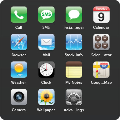
UXGridPanel is a uniform grid panel with drag drop capability and fluid adjustment animation when an item is moved, removed or added to the UXGridPanel.

All children in a UXGridPanel will be arranged in logical order based on their index. You do not need to set the Grid.Column, or Grid.Row for any of the children since the layout is automatically handled by the panel.
| XAML |
Copy Code
|
|---|---|
<Intersoft:UXGridPanel AllowReorderItem="True" Column="4" Row="4" ItemHeight="80" ItemWidth="80" Margin="16"> <Grid> <Grid.RowDefinitions> <RowDefinition/> <RowDefinition Height="Auto"/> </Grid.RowDefinitions> <Image Source="phone-icon.png"/> <Intersoft:EllipsisText Text="Call" Grid.Row="1" Padding="6,2" TooltipStyle="{StaticResource EllipsisTooltipStyle}"/> </Grid> <Grid> <Grid.RowDefinitions> <RowDefinition/> <RowDefinition Height="Auto"/> </Grid.RowDefinitions> <Image Source="SMS-icon.png"/> <Intersoft:EllipsisText Text="SMS" Grid.Row="1" Padding="6,2" TooltipStyle="{StaticResource EllipsisTooltipStyle}"/> </Grid> <Grid> <Grid.RowDefinitions> <RowDefinition/> <RowDefinition Height="Auto"/> </Grid.RowDefinitions> <Image Source="chat-blank-icon.png"/> <Intersoft:EllipsisText Text="Instant Messanger" Grid.Row="1" Padding="6,2" TooltipStyle="{StaticResource EllipsisTooltipStyle}"/> </Grid> <Grid> <Grid.RowDefinitions> <RowDefinition/> <RowDefinition Height="Auto"/> </Grid.RowDefinitions> <Image Source="cal-icon.png"/> <Intersoft:EllipsisText Text="Calendar" Grid.Row="1" Padding="6,2" TooltipStyle="{StaticResource EllipsisTooltipStyle}"/> </Grid> </Intersoft:UXGridPanel> |
|
UXGridPanel has an Orientation property that controls the item arrangement. If it is set to Horizontal, it will fill the column first then the row. Similarly, if it is set to Vertical, it will fill the row first then column.
UXGridPanel used a uniform grid arrangement which means that all children will be placed inside a container that has dimension specified by ItemHeight and ItemWidth property, thus you need to be careful when configuring the size of the children. It is recommended to use auto size for all children in the UXGridPanel.
You can also control the margin between item by customizing the ItemMargin property. It's not necessary to manually change the margin of each child element.
System.Object
System.Windows.DependencyObject
System.Windows.UIElement
System.Windows.FrameworkElement
System.Windows.Controls.Panel
Intersoft.Client.Framework.ISPanel
Intersoft.Client.UI.Controls.Interactivity.UXPanel
Intersoft.Client.UI.Controls.Interactivity.UXGridPanel
Target Platforms: Windows 7, Windows Vista SP1 or later, Windows XP SP3, Windows Server 2008 (Server Core not supported), Windows Server 2008 R2 (Server Core supported with SP1 or later), Windows Server 2003 SP2