

| Intersoft ClientUI 8 > ClientUI Controls > Control Library > Data Visualization Controls Overview > UXChart > Understanding UXChart Series |
This topic provides an in-depth overview of the series concept in UXChart, and discusses the series types supported as well as certain capabilities and restrictions of each series.
In UXChart, there are more than one way to define series, you can put single series or multiple series for the same series type, for example line series. Alternatively, you can use multiple series from different series types when you combine several chart types with line or step line to highlight data trends or to show variance.
When you add a line or other chart series onto bar, scatter, or other chart types, the resulting chart is called a combined chart. Note that only axis-based chart types that can be combined together. This means that you cannot combine pie chart and column chart, or radar chart and line chart.
There are more than twenty series type that you can choose and use. You can see list of types, description, image and list of feature that supported by each series describe below.
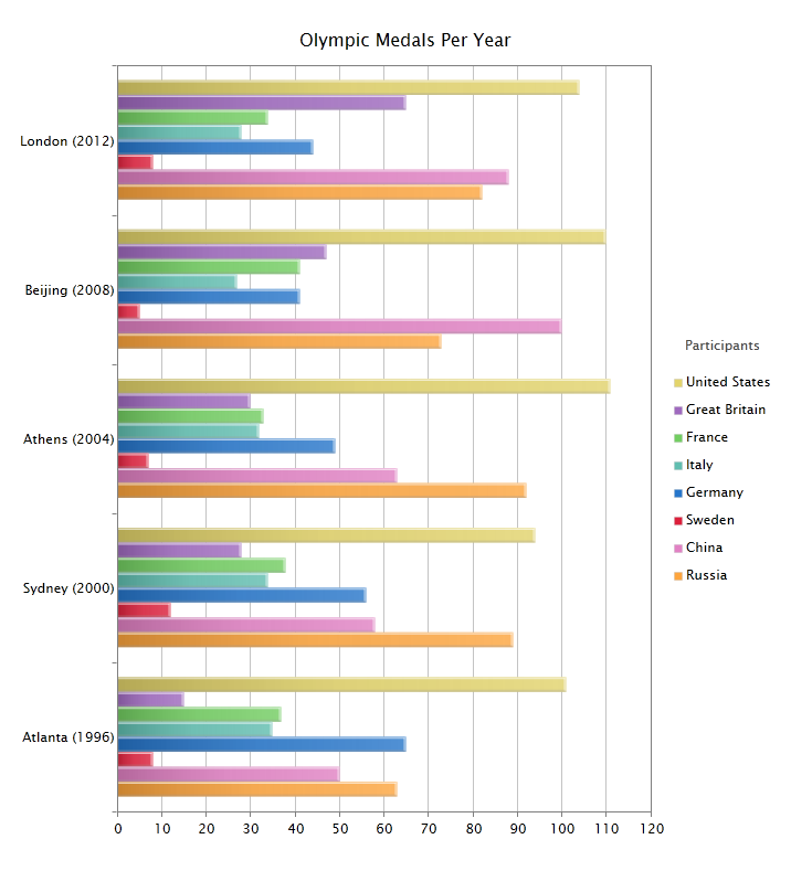
A BarSeries is a series with rectangular bars with lengths proportional to the values that they represent. BarSeries provide a visual presentation of series data. The bar will be plotted horizontally.
BarSeries can also be used for more complex comparisons of data with grouped bar charts. A BarSeries is very useful for recording certain information whether it is continuous or not continuous data. BarSeries also look a lot like a histogram, however BarSeries have spaces between columns (unlike histograms) as values are independent of each other.
The following table shows list of features that supported using this series.
| Features | Supported |
| Data Annotation | Yes |
| Data Label | |
|
Yes |
| Data Selection | |
|
Yes |
| Drill Down | Yes |
| Color Palette | |
|
Yes |
| Tooltip | |
|
Yes |
| Series Mode | |
|
Yes |
| Zoom | |
|
Yes |
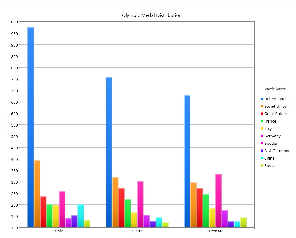
A ColumnSeries is a series with rectangular bars with lengths proportional to the values that they represent. ColumnSeries provide a visual presentation of series data. The bar will be plotted vertically. ColumnSeries can also be used for more complex comparisons of data with grouped bar charts.
A ColumnSeries is very useful for recording certain information whether it is continuous or not continuous data. ColumnSeries also look a lot like a histogram, however ColumnSeries have spaces between columns (unlike histograms) as values are independent of each other.
The following table shows list of features that supported using this series
| Features | Supported |
| Data Annotation | Yes |
| Data Label | |
|
Yes |
| Data Selection | |
|
Yes |
| Drill Down | Yes |
| Color Palette | |
|
Yes |
| Tooltip | |
|
Yes |
| Series Mode | |
|
Yes |
| Zoom | |
|
Yes |
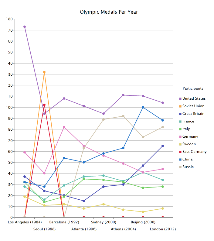
A LineSeries is a type of series which displays information as a series of data points connected by straight line segments.It is a basic type of chart common in many fields. It is an extension of a scatter graph, and is created by connecting a series of points that represent individual measurements with line segments.
A line LineSeries is often used to visualize a trend in data over intervals of time thus the line is often drawn chronologically
The following table shows list of features that supported using this series
| Features | Supported |
| Data Annotation | Yes |
| Data Label | |
|
Yes |
| Data Selection | |
|
Yes |
| Drill Down | Yes |
| Color Palette | |
|
Yes |
| Tooltip | |
|
Yes |
| Series Mode | |
|
Yes |
| Zoom | |
|
Yes |
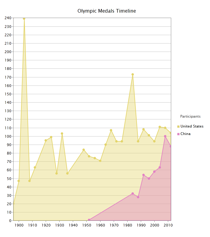
An AreaSeries is a type of chart which displays information as a series of data points connected by straight line segments, the first and last start will be pin point from zero Y position value, and last point will be closed it shape by joined with first point.
AreaSeries emphasizes the degree of change over time. It also shows the relationship of the parts to a whole.
The following table shows list of features that supported using this series
| Features | Supported |
| Data Annotation | Yes |
| Data Label | |
|
Yes |
| Data Selection | |
|
Yes |
| Drill Down | Yes |
| Color Palette | |
|
Yes |
| Tooltip | |
|
Yes |
| Series Mode | |
|
Yes |
| Zoom | |
|
Yes |
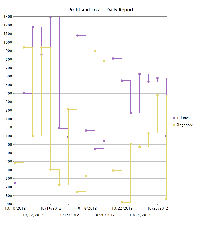
StepLineSeries are a specialized form of line charts that use only vertical and horizontal lines to connect the data points. These charts are used when the data is not continuous in nature but characterized by a jump from one level to another.
They are preferred over line charts in such cases because they form a step-like structure and bring out the intermittent pattern (the rise and fall in data) better. it can be used for Monitoring Systems,Financial Analysis,Sales Analysis,Price Change Analysis,Weather Analysis
The following table shows list of features that supported using this series
| Features | Supported |
| Data Annotation | Yes |
| Data Label | |
|
Yes |
| Data Selection | |
|
Yes |
| Drill Down | Yes |
| Color Palette | |
|
Yes |
| Tooltip | |
|
Yes |
| Series Mode | |
|
Yes |
| Zoom | |
|
Yes |
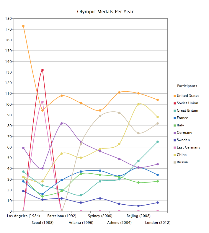
A SmoothLineSeries can be thought of as an advanced line chart that automatically draws a smoothened curve between a set of given data points. The chart calculates a suitable smooth curve between any pair of points.
They can be used as an alternative to ordinary line. it can be used in marketing, scientific research, and economics area.
The following table shows list of features that supported using this series
| Features | Supported |
| Data Annotation | Yes |
| Data Label | |
|
Yes |
| Data Selection | |
|
Yes |
| Drill Down | Yes |
| Color Palette | |
|
Yes |
| Tooltip | |
|
Yes |
| Series Mode | |
|
Yes |
| Zoom | |
|
Yes |
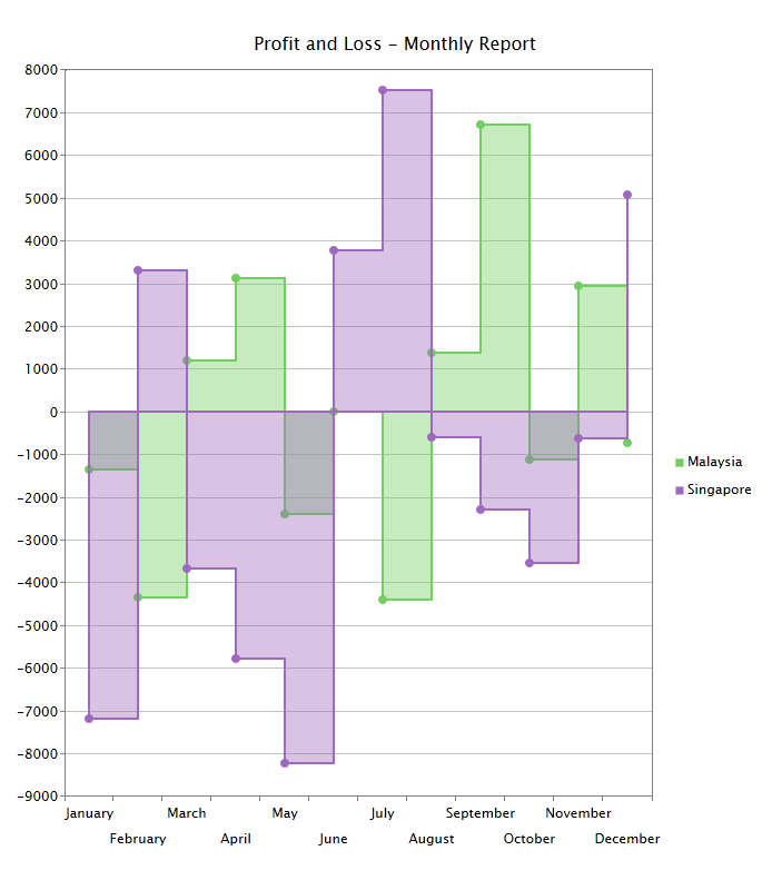
StepAreaSeries can be thought of as an advanced StepLineSeries with ability to defined area in between lines.
The following table shows list of features that supported using this series
| Features | Supported |
| Data Annotation | Yes |
| Data Label | |
|
Yes |
| Data Selection | |
|
Yes |
| Drill Down | Yes |
| Color Palette | |
|
Yes |
| Tooltip | |
|
Yes |
| Series Mode | |
|
Yes |
| Zoom | |
|
Yes |
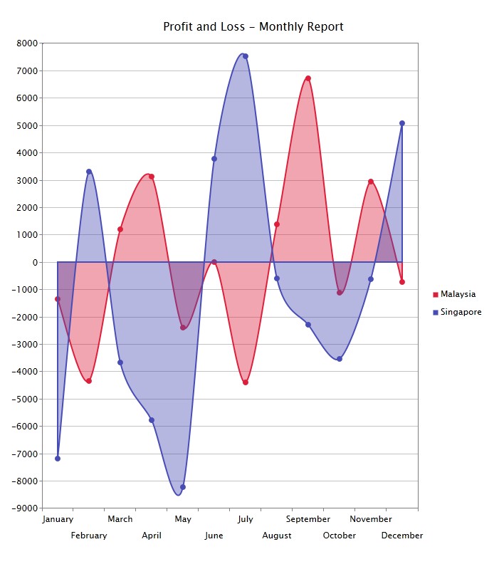
SmoothAreaSeries can be thought of as an advanced smooth Line Chart with ability to defined area in between lines.
The following table shows list of features that supported using this series
| Features | Supported |
| Data Annotation | Yes |
| Data Label | |
|
Yes |
| Data Selection | |
|
Yes |
| Drill Down | Yes |
| Color Palette | |
|
Yes |
| Tooltip | |
|
Yes |
| Series Mode | |
|
Yes |
| Zoom | |
|
Yes |
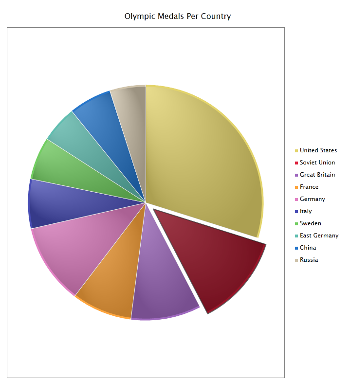
A PieSeries is a circular chart divided into sectors, illustrating proportion. In a PieSeries chart, the arc length of each sector is proportional to the quantity it represents. When angles are measured with 1 turn as unit then a number of percent is identified with the same number of centiturns.
Together, the sectors create a full disk. It is named for its resemblance to a pie which has been sliced. The size of the sectors are calculated by converting between percentage and degrees or by the use of a percentage protractor. Pie chart only support single series
The following table shows list of features that supported using this series
| Features | Supported |
| Data Annotation | Yes |
| Data Label | |
|
Yes |
| Data Selection | |
|
Yes |
| Drill Down | Yes |
| Color Palette | |
|
Yes |
| Tooltip | |
|
Yes |
| Series Mode | |
|
Yes |
| Zoom | |
|
No |
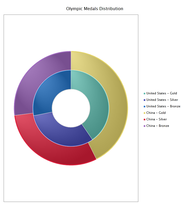
DoughnutSeries is similar to Pie chart, but it support multiple series, and it have hole in the center.
The following table shows list of features that supported using this series
| Features | Supported |
| Data Annotation | Yes |
| Data Label | |
|
Yes |
| Data Selection | |
|
Yes |
| Drill Down | Yes |
| Color Palette | |
|
Yes |
| Tooltip | |
|
Yes |
| Series Mode | |
|
Yes |
| Zoom | |
|
No |
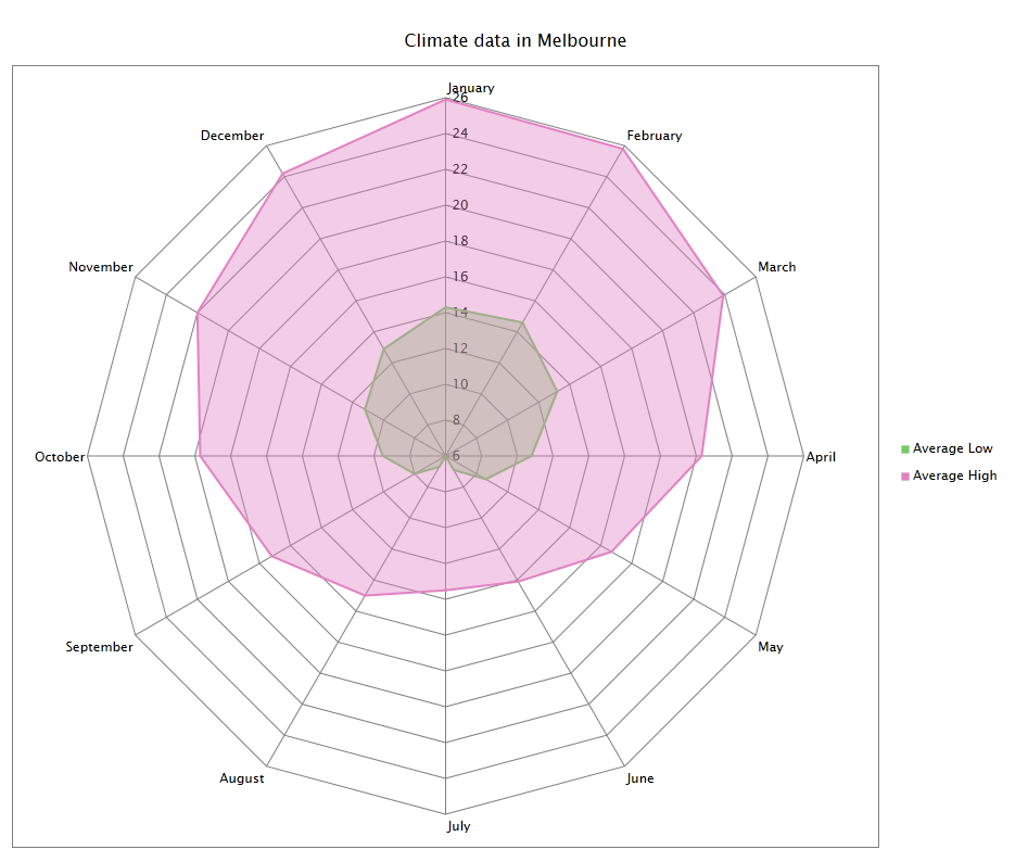
In a RadarSeries, data points are drawn evenly spaced, clockwise around the chart. The value of the point is represented as the distance from the center of the chart, where the center represents the minimum value, and the chart edge is the maximum value. Each series is drawn as one complete circuit of the chart. The chart connects these points with straight or curved lines, as you specify.
So, a RadarSeries is essentially a line chart wrapped into a circle, where the y-axis goes from the center of the chart to the perimeter, and the x-axis is the perimeter of the chart, starting and ending at the 12:00 line. One application of RadarSeries is the control of quality improvement to display the performance metrics of any ongoing program,
They are also being used in sports to chart players' strengths and weaknesses, where they are usually called spider charts. If you have multiple series, only same category in each series that will be plotted.
The following table shows list of features that supported using this series.
| Features | Supported |
| Data Annotation | Yes |
| Data Label | |
|
Yes |
| Data Selection | |
|
Yes |
| Drill Down | Yes |
| Color Palette | |
|
Yes |
| Tooltip | |
|
Yes |
| Series Mode | |
|
Yes |
| Zoom | |
|
Yes |
| Radar / Polar Options | |
|
Yes |
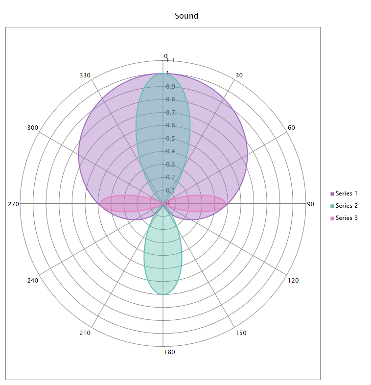
The PolarSeries is a circular graph on which data points are displayed using the angle, and the distance from the center point. The X axis is located on the boundaries of the circle and the Y axis connects the center of the circle with the X axis.
The following table shows list of features that supported using this series.
| Features | Supported |
| Data Annotation | Yes |
| Data Label | |
|
Yes |
| Data Selection | |
|
Yes |
| Drill Down | Yes |
| Color Palette | |
|
Yes |
| Tooltip | |
|
Yes |
| Series Mode | |
|
Yes |
| Zoom | |
|
Yes |
| Radar / Polar Options | |
|
Yes |
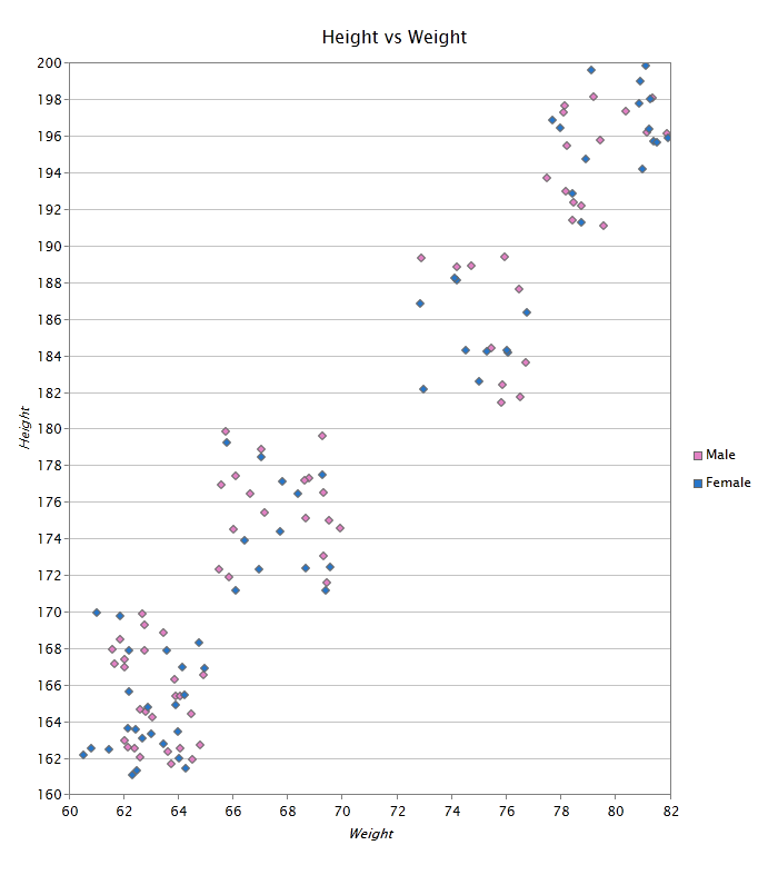
A ScatterSeries is a set of individual dots on a two-dimensional chart. ScatterSeries are good for detecting groupings or patterns in many data points that have two variables (if you have only one variable, consider a line chart).
The following table shows list of features that supported using this series.
| Features | Supported |
| Data Annotation | Yes |
| Data Label | |
|
Yes |
| Data Selection | |
|
Yes |
| Drill Down | Yes |
| Color Palette | |
|
Yes |
| Tooltip | |
|
Yes |
| Series Mode | |
|
Yes |
| Zoom | |
|
Yes |
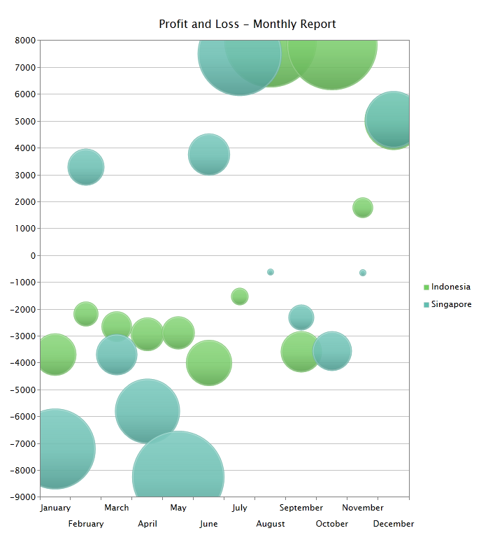
A BubbleSeries can be considered a variation of the scatter series in which the data points are replaced with bubbles
The following table shows list of features that supported using this series.
| Features | Supported |
| Data Annotation | Yes |
| Data Label | |
|
Yes |
| Data Selection | |
|
Yes |
| Drill Down | Yes |
| Color Palette | |
|
Yes |
| Tooltip | |
|
Yes |
| Series Mode | |
|
Yes |
| Zoom | |
|
Yes |
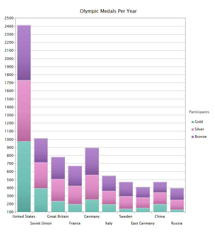
The StackedColumnSeries is used to compare the contribution of each value to a total across categories.
The following table shows list of features that supported using this series.
| Features | Supported |
| Data Annotation | Yes |
| Data Label | |
|
Yes |
| Data Selection | |
|
Yes |
| Drill Down | Yes |
| Color Palette | |
|
Yes |
| Tooltip | |
|
Yes |
| Series Mode | |
|
Yes |
| Zoom | |
|
Yes |
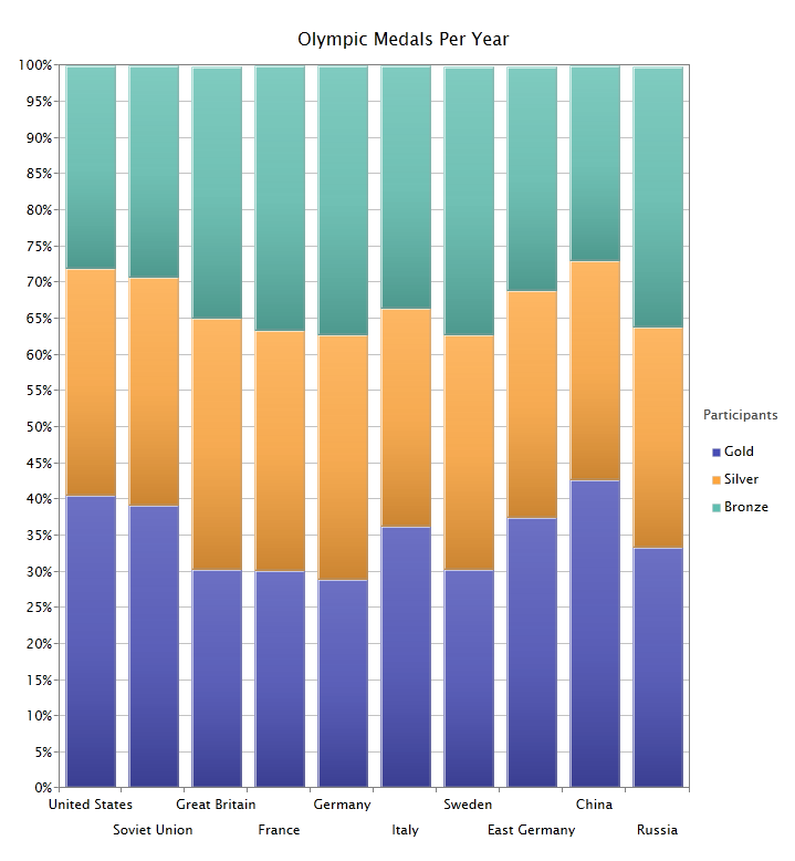
This chart type displays multiple data series as stacked columns, and the cumulative proportion of each stacked element always totals 100%. The 100% StackedColumnSeries is useful for measuring multiple series as a proportion versus time.
The following table shows list of features that supported using this series.
| Features | Supported |
| Data Annotation | Yes |
| Data Label | |
|
Yes |
| Data Selection | |
|
Yes |
| Drill Down | Yes |
| Color Palette | |
|
Yes |
| Tooltip | |
|
Yes |
| Series Mode | |
|
Yes |
| Zoom | |
|
Yes |
The StackedBarSeries displays series of the same chart type as stacked bars.
The following table shows list of features that supported using this series.
| Features | Supported |
| Data Annotation | Yes |
| Data Label | |
|
Yes |
| Data Selection | |
|
Yes |
| Drill Down | Yes |
| Color Palette | |
|
Yes |
| Tooltip | |
|
Yes |
| Series Mode | |
|
Yes |
| Zoom | |
|
Yes |
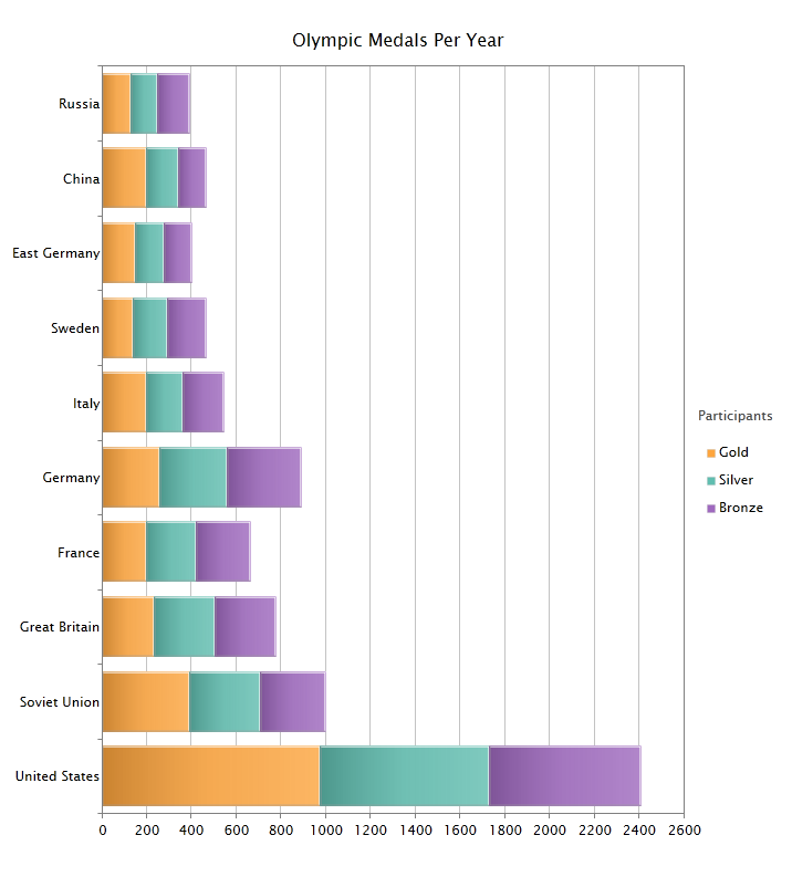
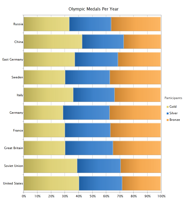
This chart type displays multiple data series as stacked bars, and the cumulative proportion of each stacked element always totals 100%. The 100% StackedBarSeries is useful for measuring multiple series as a proportion vs. time.
The following table shows list of features that supported using this series.
| Features | Supported |
| Data Annotation | Yes |
| Data Label | |
|
Yes |
| Data Selection | |
|
Yes |
| Drill Down | Yes |
| Color Palette | |
|
Yes |
| Tooltip | |
|
Yes |
| Series Mode | |
|
Yes |
| Zoom | |
|
Yes |
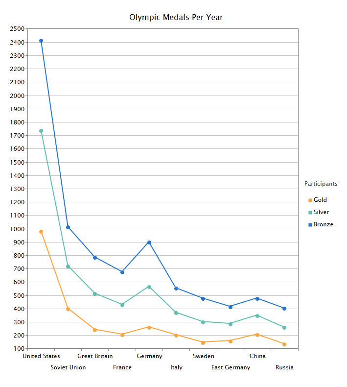
A StackedLineSeries is an line chart in which lines do not overlap because they are cumulative at each point.
The following table shows list of features that supported using this series.
| Features | Supported |
| Data Annotation | Yes |
| Data Label | |
|
Yes |
| Data Selection | |
|
Yes |
| Drill Down | Yes |
| Color Palette | |
|
Yes |
| Tooltip | |
|
Yes |
| Series Mode | |
|
Yes |
| Zoom | |
|
Yes |
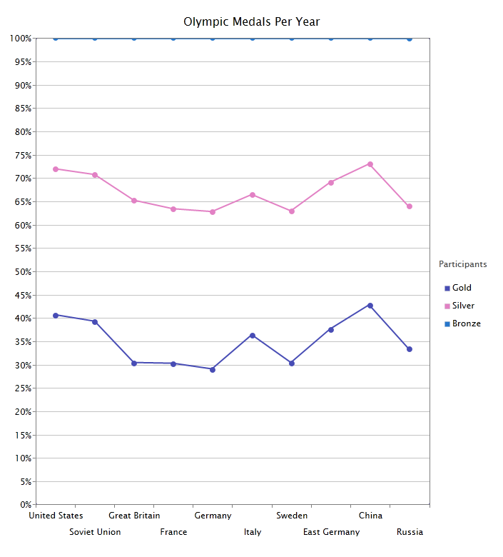
A 100% StackedLineSeries is an line chart in which lines do not overlap because they are cumulative at each point. The cumulative proportion of each stacked element is always 100% of the Y axis.
The following table shows list of features that supported using this series.
| Features | Supported |
| Data Annotation | Yes |
| Data Label | |
|
Yes |
| Data Selection | |
|
Yes |
| Drill Down | Yes |
| Color Palette | |
|
Yes |
| Tooltip | |
|
Yes |
| Series Mode | |
|
Yes |
| Zoom | |
|
Yes |
The StackedAreaSeries is an Area chart that stacks two or more data series on top of one another.
The following table shows list of features that supported using this series.
| Features | Supported |
| Data Annotation | Yes |
| Data Label | |
|
Yes |
| Data Selection | |
|
Yes |
| Drill Down | Yes |
| Color Palette | |
|
Yes |
| Tooltip | |
|
Yes |
| Series Mode | |
|
Yes |
| Zoom | |
|
Yes |
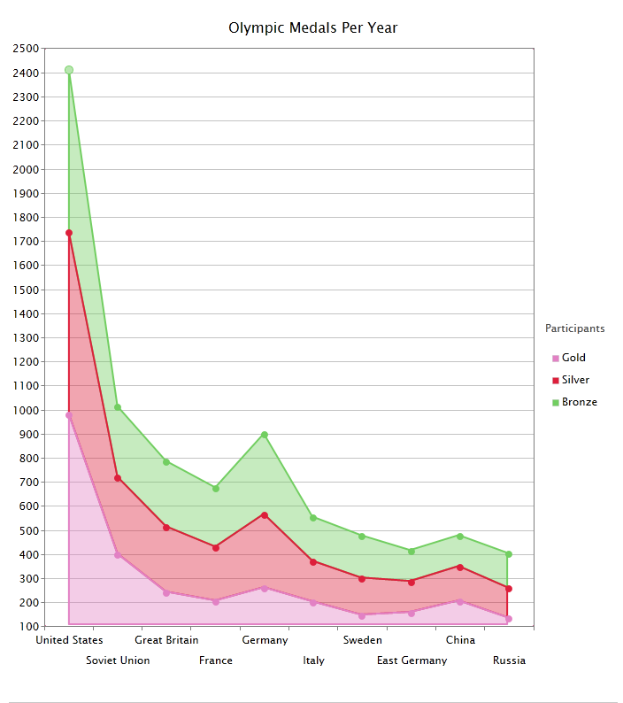
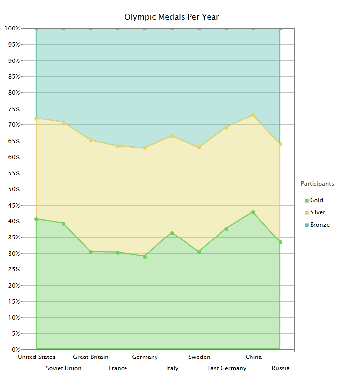
The 100% StackedAreaSeries displays multiple series of data as stacked areas. The cumulative proportion of each stacked element is always 100% of the Y axis.
The following table shows list of features that supported using this series.
| Features | Supported |
| Data Annotation | Yes |
| Data Label | |
|
Yes |
| Data Selection | |
|
Yes |
| Drill Down | Yes |
| Color Palette | |
|
Yes |
| Tooltip | |
|
Yes |
| Series Mode | |
|
Yes |
| Zoom | |
|
Yes |
In the above section, you've learnt the basics of charting data visualization and learnt how to visualize your data in the simplest way. The following links describe more advanced concepts and features of the charting control with in-depth explanation and samples.