Intersoft ClientUI Documentation
How-to: Add Additional Axis In UXChart

| Intersoft ClientUI 8 > ClientUI Controls > Control Library > Data Visualization Controls Overview > UXChart > UXChart How-to Topics > How-to: Add Additional Axis In UXChart |
This example shows how to add additional axis in UXChart.
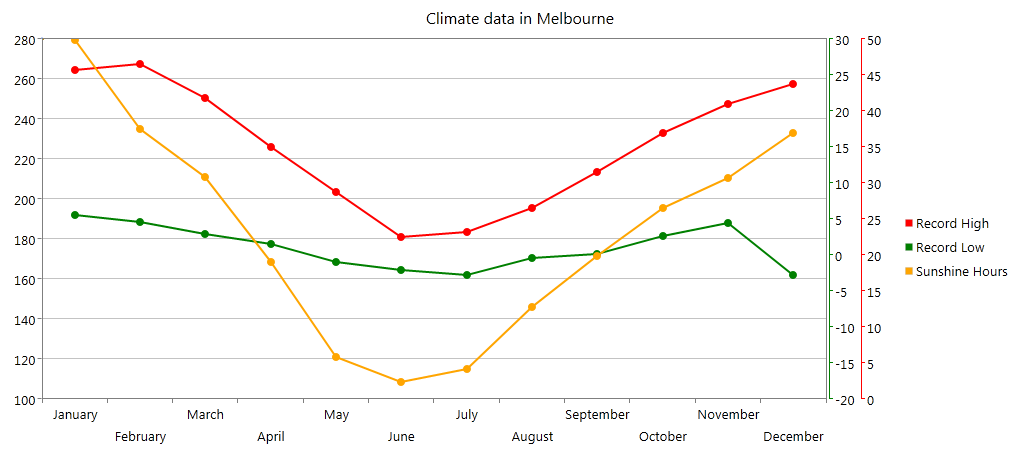
Not only to visualize data, chart is often used to compare different types of data. To give a clear explanation to users, it’s recommended to plot one or more data series on additional axis. In this scenario, climate data will be used to compare between record high, sunshine hours, and record low.
The following code shows how to use additional axis to meet these scenario needs. You will notice that the red and green axis is placed on the right side.
| XAML |
Copy Code
|
|---|---|
<Intersoft:UXChart Title="Climate data in Melbourne"> <Intersoft:UXChart.Series> <Intersoft:LineSeries Title="Record High" ItemsSource="{Binding DataSource}" IndependentValueBinding="{Binding Month}" DependentValueBinding="{Binding RecordHigh}" PathLineBrush="Red" Style={StaticResource RedAxis}"> <Intersoft:LineSeries.DataPointStyle> <Style TargetType="Control"> <Setter Property="Background" Value="Red"/> </Style> </Intersoft:LineSeries.DataPointStyle> <Intersoft:LineSeries.DependentRangeAxis> <Intersoft:LinearAxis Maximum="50" Minimum="-20" Location="Right" Orientation="Y" Background="Red" Margin="2,0"/> </Intersoft:LineSeries.DependentRangeAxis> </Intersoft:LineSeries> <Intersoft:LineSeries Title="Record Low" ItemsSource="{Binding DataSource}" IndependentValueBinding="{Binding Month}" DependentValueBinding="{Binding RecordLow}" PathLineBrush="Green" Style={StaticResource GreenAxis}"> <Intersoft:LineSeries.DataPointStyle> <Style TargetType="Control"> <Setter Property="Background" Value="Green"/> </Style> </Intersoft:LineSeries.DataPointStyle> <Intersoft:LineSeries.DependentRangeAxis> <Intersoft:LinearAxis Maximum="30" Minimum="-20" Location="Right" Orientation="Y" Background="Green" Margin="2,0"/> </Intersoft:LineSeries.DependentRangeAxis> </Intersoft:LineSeries> <Intersoft:LineSeries Title="Sunshine Hours" ItemsSource="{Binding DataSource}" IndependentValueBinding="{Binding Month}" DependentValueBinding="{Binding SunshineHours}" PathLineBrush="Orange"> <Intersoft:LineSeries.DataPointStyle> <Style TargetType="Control"> <Setter Property="Background" Value="Orange"/> </Style> </Intersoft:LineSeries.DataPointStyle> </Intersoft:LineSeries> </Intersoft:UXChart.Series> </Intersoft:UXChart |
|
After implementing these code, the results will looks like the following image.
