
| Intersoft ClientUI 8 > ClientUI Controls > Control Library > Data Visualization Controls Overview > UXChart > Customizing UXChart Elements |
UXChart consists of numerous visual elements that work together to produce wonderful charting experiences. In addition, most of the visual elements are fully customizable. There are two main category of UXChart elements: UXChart specific and Series specific.
A plot area is the rectangular area where all series are drawn. It is displayed by default and has a white background color as well as a black border line. The chart data is rendered in the plot area.The plot area changes for different chart types.
You can add borders to and change the default background color of the chart plot area. You can change style of plot area using PlotAreaStyle property, and PlotAreaBorderStyle Property
Title Element is not always put on the top of control, there are several mode that you can use. you can choose from TitlePosition property. There are eight position that you can choose from:
Beside TitlePosition, you can also set the title visibility to visible or collapsed using TitleVisibility property. If you would like to customize further, you can customize the title style through the TitleStyle property.
The following example shows how to set TitlePosition.
| XAML |
Copy Code
|
|---|---|
<Intersoft:UXChart TitlePosition="Right" TitleVisibility="Visible"/> |
|

Legend usually contains a list of the series appearing in the chart and an example of their appearance, which by default appear as colorful rectangle. You can also change the appearance using LegendItemStyle property, This information allows the data from each variable to be identified in the chart.
Depending on the type of chart, the legend keys represent different groups of data. For instances, for a LineSeries , BarSeries or ColumnSeries, each legend key represents a single data series. On the other hand, a PieSeries or DoughnutSeries, each Legend key represents only a portion of one data series.
In a normal chart, the legend is most often located on the right hand side of the chart and can sometimes be surrounded by a border. However, you can set the position of legend to your liking by using LegendPosition property of UXChart. There are eight position that you can choose from:
The following sample show how to set LegendPosition
| XAML |
Copy Code
|
|---|---|
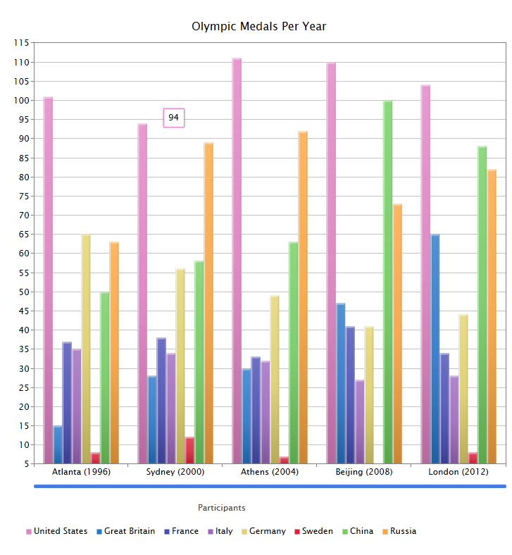
<Intersoft:UXChart LegendTitle="Participants" LegendPosition="BottomLeft" LegendVisibility="Visible" /> |
|

LegendTitle is a textual element at the top of legend list element. You can set this textual element using LegendTitle property of UXChart and if needed you can also collapse the legend title element through the LegendTitleVisibility property.
UXChart provides full control over legend appearance. You are able to specify the shape of the Legend Item Markers just by setting the style. It can be different shapes, such as rectangle, ellipse, or even an image. you can also set its style using LegendStyle and LegendItemStyle.
The following example shows how to customize legend item and appearance.
| XAML |
Copy Code
|
|---|---|
<Intersoft:UXChart TitlePosition="TopLeft" LegendPosition="Bottom" TitleStyle="{StaticResource TitleStyle}"> <Intersoft:UXChart.LegendStyle> <Style TargetType="Intersoft:Legend"> <Setter Property="ItemContainerStyle"> <Setter.Value> <Style TargetType="Intersoft:LegendItem"> <Setter Property="Template"> <Setter.Value> <ControlTemplate TargetType="Intersoft:LegendItem"> <StackPanel Orientation="Horizontal"> <Image Height="20" Width="20" Margin="4" Source="{Binding Content, Converter={StaticResource ImageConverter}, RelativeSource={RelativeSource TemplatedParent}}"/> <Border BorderThickness="1" BorderBrush="{Binding Background}" VerticalAlignment="Center"> <Grid> <Grid Background="{Binding Background}" Opacity="0.3"/> <Intersoft:Title Margin="4,2" Content="{TemplateBinding Content}"/> </Grid> </Border> </StackPanel> </ControlTemplate> </Setter.Value> </Setter> </Style> </Setter.Value> </Setter> </Style> </Intersoft:UXChart.LegendStyle> <Intersoft:BubbleSeries ItemsSource="{Binding CountryUS}" Title="US" IndependentValueBinding="{Binding FormattedDate}" DependentValueBinding="{Binding NumberOfVisitor}"/> </Intersoft:UXChart> |
|
Zoom scroll bar is a slider type bar that can be used to zoom, move, and indicate position of the elements in the chart area. It can be put on bottom or left side of chart, have two thumbs on each end, and can be dragged or click to zoom in or zoom out the chart elements. Furthermore, it can also be used for panning.
There are two zoom bars in UXChart, you can control their visibility through HorizontalZoomScrollBarVisibility and VerticalZoomScrollBarVisibility properties. The visibility of these property is preceded by ZoomMode, if the ZoomMode is set to X, the VerticalZoomScrollBar will be forced to be collapsed regardless the settings in VerticalZoomScrollBarVisibility.
The following example shows how to apply style to zoom scroll bar.
| XAML |
Copy Code
|
|---|---|
<Style TargetType="Intersoft:UXChart"> <Setter Property="ZoomScrollBarStyle"> <Setter.Value> <Style TargetType="Intersoft:RangeScrollBar"> <Setter Property="BorderThickness" Value="0"/> <Setter Property="Template"> <Setter.Value> <ControlTemplate TargetType="Intersoft:RangeScrollBar"> <Grid x:Name="RootElement" Background="{TemplateBinding Background}"> <Grid x:Name="HorizontalSliderElement"> <Rectangle Height="1" Margin="6, 0, 6, 0" Style="{TemplateBinding TrackStyle}" StrokeThickness="{TemplateBinding BorderThickness}"/> <Grid x:Name="HorizontalTrackElement"> <Border BorderBrush="#FFA3AEB9" BorderThickness="0" Height="1" VerticalAlignment="Center"> <Rectangle Fill="#FF477AE0" IsHitTestVisible="False" StrokeThickness="0"/> </Border> </Grid> <Grid x:Name="HorizontalLeftTrackElement" Canvas.ZIndex="2" Margin="0,0,0,0"> <Grid.ColumnDefinitions> <ColumnDefinition Width="Auto"/> <ColumnDefinition Width="Auto"/> <ColumnDefinition/> </Grid.ColumnDefinitions> <Intersoft:UXRepeatButton x:Name="HorizontalDecreaseElement" Command="Intersoft:UXChartCommands.DecreaseScroll" Delay="{TemplateBinding Delay}" Interval="{TemplateBinding Interval}" Style="{StaticResource UXRepeatButtonEmptyStyle}" CommandParameter="Horizontal"/> <Grid Grid.Column="1" Margin="0,3"> <Intersoft:UXThumb x:Name="HorizontalThumbLeftElement" BorderThickness="0" CornerRadius="0" Width="6" Height="12" Style="{TemplateBinding StartThumbStyle}" Background="{StaticResource ComplementBrush}"/> </Grid> </Grid> <Grid x:Name="HorizontalRightTrackElement" Canvas.ZIndex="2" Margin="0,0,0,0"> <Grid.ColumnDefinitions> <ColumnDefinition/> <ColumnDefinition Width="Auto"/> <ColumnDefinition Width="Auto"/> </Grid.ColumnDefinitions> <Grid Grid.Column="1" Margin="0, 3"> <Intersoft:UXThumb x:Name="HorizontalThumbRightElement" BorderThickness="0" CornerRadius="0" Width="6" Height="12" Style="{TemplateBinding EndThumbStyle}" Background="{StaticResource ComplementBrush}"/> </Grid> <Intersoft:UXRepeatButton x:Name="HorizontalIncreaseElement" Grid.Column="2" Command="Intersoft:UXChartCommands.IncreaseScroll" Delay="{TemplateBinding Delay}" Interval="{TemplateBinding Interval}" Style="{StaticResource UXRepeatButtonEmptyStyle}" CommandParameter="Horizontal"/> </Grid> <Grid x:Name="HorizontalDragTrackElement" Visibility="Collapsed"> <Grid.ColumnDefinitions> <ColumnDefinition Width="Auto"/> <ColumnDefinition Width="6"/> <ColumnDefinition/> <ColumnDefinition/> <ColumnDefinition Width="6"/> <ColumnDefinition Width="Auto"/> </Grid.ColumnDefinitions> <Border Grid.ColumnSpan="2" Grid.Column="2"> <Intersoft:UXThumb x:Name="HorizontalThumbRangeElement" CornerRadius="0" BorderThickness="0" Height="3" Style="{StaticResource DragThumbStyle}" Background="{StaticResource ScrollThumbBackground}"/> </Border> </Grid> </Grid> <Grid x:Name="VerticalSliderElement" Visibility="Collapsed"> <Rectangle Margin="0, 6, 0, 6" Style="{TemplateBinding TrackStyle}" StrokeThickness="{TemplateBinding BorderThickness}" Width="1"/> <Grid x:Name="VerticalTrackElement"> <Border BorderBrush="#FFA3AEB9" BorderThickness="0" HorizontalAlignment="Center" Width="1"> <Rectangle Fill="#FF477AE0" IsHitTestVisible="False" StrokeThickness="0"/> </Border> </Grid> <Grid x:Name="VerticalBottomTrackElement" Canvas.ZIndex="1" Margin="0,0,0,0"> <Grid.RowDefinitions> <RowDefinition Height="Auto"/> <RowDefinition Height="Auto"/> <RowDefinition/> </Grid.RowDefinitions> <Intersoft:UXRepeatButton x:Name="VerticalIncreaseElement" Command="Intersoft:UXChartCommands.IncreaseScroll" Delay="{TemplateBinding Delay}" Interval="{TemplateBinding Interval}" Style="{StaticResource UXRepeatButtonEmptyStyle}" CommandParameter="Vertical"/> <Grid Margin="3, 0" Grid.Row="1"> <Intersoft:UXThumb x:Name="VerticalThumbBottomElement" BorderThickness="0" CornerRadius="0" Width="12" Height="6" Style="{TemplateBinding EndThumbStyle}" Background="{StaticResource ComplementBrush}"/> </Grid> </Grid> <Grid x:Name="VerticalTopTrackElement" Margin="0,0,0,0" Canvas.ZIndex="1"> <Grid.RowDefinitions> <RowDefinition/> <RowDefinition Height="Auto"/> <RowDefinition Height="Auto"/> </Grid.RowDefinitions> <Grid Margin="3, 0" Grid.Row="1"> <Intersoft:UXThumb x:Name="VerticalThumbTopElement" BorderThickness="0" CornerRadius="0" Width="12" Height="6" Style="{TemplateBinding StartThumbStyle}" Background="{StaticResource ComplementBrush}"/> </Grid> <Intersoft:UXRepeatButton x:Name="VerticalDecreaseElement" Command="Intersoft:UXChartCommands.DecreaseScroll" Delay="{TemplateBinding Delay}" Interval="{TemplateBinding Interval}" Grid.Row="2" Style="{StaticResource UXRepeatButtonEmptyStyle}" CommandParameter="Vertical"/> </Grid> <Grid x:Name="VerticalDragTrackElement" Visibility="Collapsed"> <Grid.RowDefinitions> <RowDefinition Height="Auto"/> <RowDefinition Height="6"/> <RowDefinition/> <RowDefinition/> <RowDefinition Height="6"/> <RowDefinition Height="Auto"/> </Grid.RowDefinitions> <Border Grid.Row="2" Grid.RowSpan="2"> <Intersoft:ContentTransformer> <Intersoft:ContentTransformer.Transform> <RotateTransform Angle="-90"/> </Intersoft:ContentTransformer.Transform> <Intersoft:UXThumb x:Name="VerticalThumbRangeElement" CornerRadius="0" BorderThickness="0" Height="3" Style="{StaticResource DragThumbStyle}" Background="{StaticResource ScrollThumbBackground}"/> </Intersoft:ContentTransformer> </Border> </Grid> </Grid> </Grid> </ControlTemplate> </Setter.Value> </Setter> </Style> </Setter.Value> </Setter> </Style> |
|
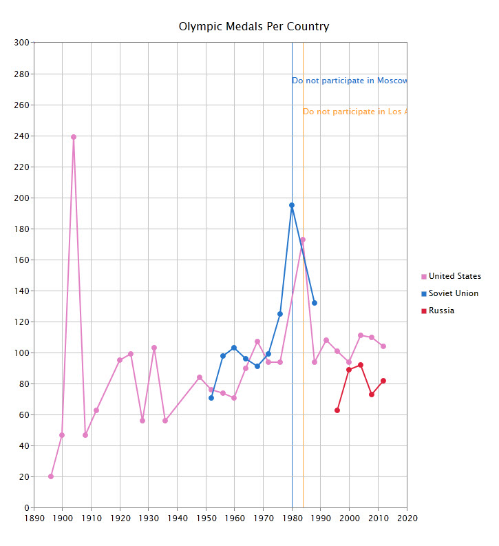
DataAnnotation is a text area that can be utilized for adding information or detail inside the chart. This feature is particularly useful when you want to show significant changes in your data and you need to explain the cause. In this particular scenario, you can give more sense to your data by annotating the additional information.
DataAnnotations are visual elements that can be used to mark points or areas of some significance. Annotations are anchored to specific coordinates in the inner frame based on specified IndependentValue and DependentValue.
The following example show how to use data annotation in UXChart.
| XAML |
Copy Code
|
|---|---|
<Intersoft:UXChart> <Intersoft:UXChart.Series> <Intersoft:LineSeries ItemsSource="{Binding MedalDistributionForUSA.Medals}" IndependentValueBinding="{Binding Year}" DependentValueBinding="{Binding MedalCount}"> <Intersoft:LineSeries.DataAnnotations> <Intersoft:DataAnnotation Content="Do not participate in Moscow (1980)" Foreground="#2676CB" DependentValue="280" IndependentValue="1980" /> </Intersoft:LineSeries.DataAnnotations> </Intersoft:LineSeries> </Intersoft:UXChart.Series> </Intersoft:UXChart> |
|

Palette is a range of colors used in a particular series in chart. it's a collection of resources consist of many color, that already pre define into PalleteType. there are four types of palettes that you can choose
Beside the types mentioned above ,you can define your own collection of color palettes and apply it to customize your chart. When using either built-in palettes or custom palettes, you can define in which order the color will appear. There are three modes that you can choose.
In addition to customizing color palettes, you can also set the data point's border style by using BorderStyle property. There are three mode that you can choose.
To learn more how to customize the palette, see How-to: Add Custom Palettes in UXChart.
DataPoint is set of data that consist information for your chart display, it can appear as small rectangle, bar, circle, or line. It usually have color to distinguish one set of data points from other series data points. By default, DataPoint uses color from the predefined collection of color palette. But you can override style from given palette by using custom palette.
As for Style, you can apply style to data point so it can appear as rectangle, circle or others. by simply assigning the desired style to the DataPointStyle property.
By default, a set of data points in one series will have same color, however if you want each data point in one series to use different colors, you can use DataPointStyleSelector to change its color. It behaves similarly with others style selector.
DataLabel is text label that appear on data point to display information of data point, such as value, or percentage. You can set its visibility to be visible or collapsed using DataLabelVisibility property.
As for position you can set data label position to be inside or outside data point. When data label is used in bar chart you may need to rotate the position of data label. You can set the angle using DataLabelAngle properties on UXChart .
Data label have line shape connector to connect the data label and data point. You can set connector length with DataLabelConnectorLength property. You can also set its visibility through the DataLabelConnectorVisibility property. In most cases, data label connector will appear straight, but there's another mode which is spider, applicable only in Pie and Doughnut series.
The following sample shows how to use data label.
| XAML |
Copy Code
|
|---|---|
<Intersoft:UXChart > <Intersoft:UXChart.Series> <Intersoft:LineSeries DataLabelAngle="30" DataLabelConnectorLength="20" DataLabelConnectorVisibility="Visible" DataLabelVisibility="Visible" ItemsSource="{Binding DataSource}" IndependentValueBinding="{Binding Month}" DependentValueBinding="{Binding RecordHigh}"> </Intersoft:LineSeries> </Intersoft:UXChart.Series> </Intersoft:UXChart> |
|
To learn more about the concepts and more advanced features of the charting control, please refer to the following topics.