
| Intersoft ClientUI 8 > ClientUI Controls > Control Library > Input Controls Overview |
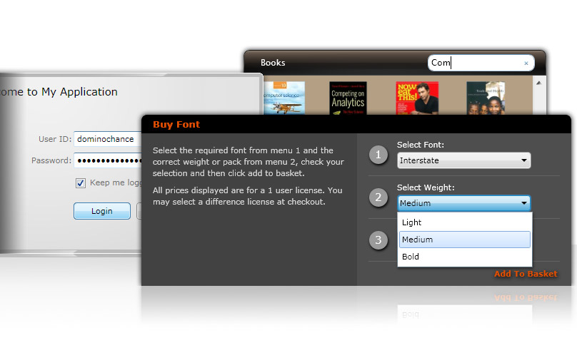
Intersoft ClientUI provides a comprehensive library of input controls to support rich form and modern user interface development. Ranging from tri-state check box and radio button, Aero-style text box and password box, to auto-complete combo box and innovative search box - ClientUI input controls are paramount in building rich form and presentation application with great user experiences.
Standards-compliance usability features are built into the control architecture of many input controls which includes focus management, keyboard focus visual, access key, and more - enabling you to ship compelling applications that comply to the usability standards. Some selection controls such as radio button and check box seamlessly work with focus-enabled container such as GroupBox to provide automatic selection synchronization on controls within the same focus scope. The UXComboBox sports an elegant, Aero-style look and feel packed with comprehensive editing and selection features that support MVVM pattern development.

The following table lists the input controls available in ClientUI.
| UXCheckBox A check box with customizable styles and three-state support. | |
| UXComboBox A combo box control with built-in text search support. | |
| UXPasswordBox A password box control with customizable mask character. | |
| UXRadioButton A button control that represents group of input choices. | |
| UXSearchBox A search box control with MVVM and Navigation support. | |
| UXTextBox A multi-purpose text box control with built-in Aero style. |