
| Intersoft ClientUI 8 > ClientUI Controls > Control Library > Input Controls Overview > UXTextBox |
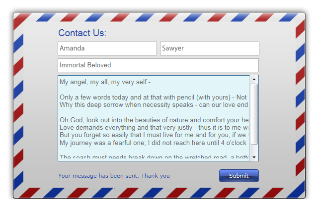
UXTextBox is a multi-purpose text box control featuring elegant Aero-style interface, watermark text and various easy-to-customize appearance settings. It supports hybrid routed command and validation framework for robust two-way MVVM pattern binding.

UXTextBox is a fundamental input control generally used to obtain input data from users through input devices such as keyboard. Using UXTextBox in XAML is straightforward and easy, you simply define an instance of the UXTextBox and set the Text property for an initial text. In data bound application, you bind the Text property to the data entity specified in the data context by using Binding extension markup such as shown in the following example.
| XAML |
Copy Code
|
|---|---|
<Intersoft:FieldLabel Header="Author:"> <Intersoft:UXTextBox Text="{Binding Mode=TwoWay, Path=Book.Author, ValidatesOnDataErrors=True}" Width="150"/> </Intersoft:FieldLabel> |
|
In most scenarios, it is recommended to use MVVM pattern to bind the Text property to a ViewModel class. To learn more about MVVM pattern, see MVVM Pattern Overview.
For a better user experience, you can display a watermark text when the text box is empty, which is useful to give additional hints to users about the particular input. You can configure watermark text through the following properties:
By default, when a validation error occured on a text box, the validation error indicator is displayed to the user. In Silverlight, the validation error indicator remains visible eventhough correction has been made to the text box. The validation error will be invalidated only when the text box lose its focus, which is the default behavior of the standard text box. This behavior, however, is not an ideal user experience for data intensive applications.
To enhance user experience, UXTextBox implements a mechanism that automatically clears the validation error on the subsequent text input. You can easily enable this behavior by attaching ClearErrorOnTextInput attached property to the UXTextBox, which is shown in the following example.
| XAML |
Copy Code
|
|---|---|
<Intersoft:FieldLabel Header="Price:" HeaderWidth="80" HorizontalHeaderAlignment="Right"> <Intersoft:UXTextBox HorizontalAlignment="Center" Width="60" Text="{Binding Path=Book.Price, Mode=TwoWay, ValidatesOnDataErrors=True, ValidatesOnExceptions=True, StringFormat=\{0:c\}}" Intersoft:DataBinding.ClearErrorOnTextInput="True"/> </Intersoft:FieldLabel> |
|
For more information about this behavior and other data binding features in ClientUI, see Data Binding Overview.
UXTextBox raises TextChanged event when the Text property has changed. To handle the event, you add the TextChanged handler in the XAML and write the logic in code to respond the TextChanged event such as shown in the following example:
| XAML |
Copy Code
|
|---|---|
<Intersoft:UXTextBox TextChanged="TextBox1_TextChanged" Name="TextBox1" Width="150" /> |
|
| C# |
Copy Code
|
|---|---|
private void TextBox1_TextChanged(object sender, TextChangedEventArgs e) { StatusLabel.Text = TextBox1.Text; } |
|
UXTextBox comes with predefined Aero-style theme and includes pixel-perfect animation as well as the visual states.
You can easily customize the UXTextBox appearance through the following properties.
If you would like to completely customize the control appearance or if you want to change the styles of each visual state, you can edit the template of the control and do the modification accordingly.
To learn how to customize the template and visual states, see Styles and Template Overview.
For the list of ClientUI walkthroughs, see Walkthroughs and How-to Topics.
For the list of ClientUI samples available in local installation, see Locating the Samples in Local Installation.