
| Intersoft ClientUI 8 > ClientUI Controls > Control Library > Input Controls Overview > UXSearchBox |
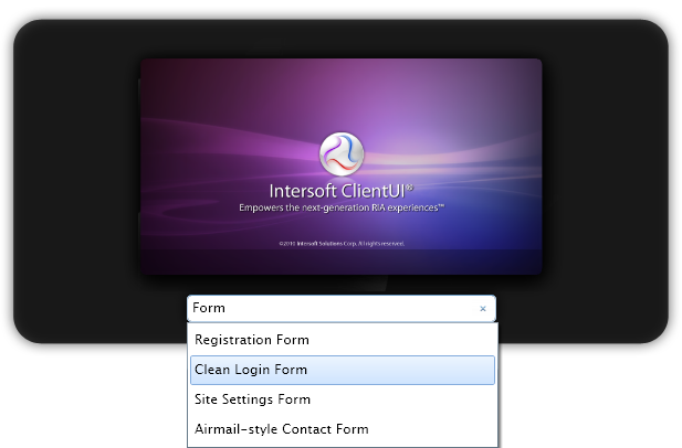
UXSearchBox is a full-featured input control that provides search query to search provider.
The UXSearchBox has several customizable behaviors, such as AutoShowResultBox when user type in a query, QueryLatency to determine the latency before it sends the query to search provider, and many more.

UXSearchBox does not perform the search query by itself. It requires a search service to retrieve the result. To accomplish this efficiently, UXSearchBox provides several properties that can be used in MVVM pattern development, such as listed in the following.
| XAML |
Copy Code
|
|---|---|
<Intersoft:UXSearchBox DisplayMemberPath="DisplayName" WatermarkTextVisibility="Visible" WatermarkText="Enter keyword" AutoShowResultBox="True" IsSearching="{Binding IsSearching, Mode=TwoWay}" QueryText="{Binding QueryText, Mode=TwoWay}" SearchResult="{Binding SearchResult}" NavigateUriMemberPath="Uri"/> |
|
IsSearching property identifies when the search takes place. You can set the latency that determines the time span to wait before UXSearchBox performs the search query through the QueryLatency property. When UXSearchBox starts a search query, it sets the IsSearching property to True.
You typically perform the search operation in your ViewModel when IsSearching property is changed to true.
| C# |
Copy Code
|
|---|---|
public bool IsSearching { get { return this._isSearching; } set { if (this._isSearching != value) { this._isSearching = value; this.OnPropertyChanged("IsSearching"); this.DoSearch(); } } } |
|
You obtain the search query through the QueryText property, which contains the text that user typed such as shown in the following example.
| C# |
Copy Code
|
|---|---|
private void DoSearch() { var query = from q in this.Samples where q.DisplayName.ToLower(CultureInfo.InvariantCulture).Contains(this.QueryText.ToLower(CultureInfo.InvariantCulture)) select q; ObservableCollection<SampleData> data = new ObservableCollection<SampleData>(); foreach (SampleData d in query) { data.Add(d); } this.SearchResult = data; this.IsSearching = false; } |
|
SearchResult property acts as a recipient. When this property is set, the UXSearchBox will display the search result in its dropdown menu.
Alternatively, you can also assign the search results directly to other data-aware controls, such as UXListBox or UXItemsControl.
UXSearchBox supports data binding operation. To customize the content of each item, you can use either ItemTemplate or the member path properties described below:
The item container type of UXSearchBox is UXSearchBoxItem.
UXSearchBoxItem implements both ICommandSource and INavigationSource that allows both commanding and navigation using UXSearchBoxItem.
You can do commanding through Command, CommandTarget and CommandParameter properties and navigation using NavigateUri and TargetName properties.
To learn more about commanding, see Commanding Overview. To learn more about navigation, see Navigation Overview.
UXSearchBox has similar properties as in UXPopup that controls the dropdown menu position. The following list describes the properties that control the dropdown menu positioning.
UXSearchBox also has similar properties as in UXPopup that controls the dropdown menu animation. The following list describes the properties that control the dropdown menu animation.
Although these properties allow you to control each visual effects individually, it is advised that you avoid mixing the animation for DisplayAnimation or HideAnimation. If you want to disable certain animation, you can set the DisplayAnimation or HideAnimation property to None.
UXSearchBox has several user experience aspects that you can customize, such as when to display the result box and when to show the busy text / template.
Using the default settings, the UXSearchBox will not open the result box immediately when you type in a query text. Instead, it waits until the search result becomes available and then display it along with the result box. Once the result box is opened, it stays open until you close it by clicking outside the search box visual element, or clicking the reset button.
By setting the AutoShowResultBox property to True, UXSearchBox immediately opens the result box as you type into the text box. While waiting for the search result, the search box displays the BusyText or BusyTemplate which indicates that the searching is in progress.
You can also determine the behavior of the BusyText or BusyTemplate by customizing the BusyMode property. This property determines when the BusyText or BusyTemplate should be shown. If you set the BusyMode to First, the search box shows the BusyText or BusyTemplate only once during the first search until the search is reset. On the other hand, if you set the BusyMode to Always, the search box show the BusyText or BusyTemplate whenever searching is in progress.
| XAML |
Copy Code
|
|---|---|
<Intersoft:UXSearchBox DisplayMemberPath="DisplayName" WatermarkTextVisibility="Visible" WatermarkText="Enter keyword" AutoShowResultBox="True" BusyMode="Always" IsSearching="{Binding IsSearching, Mode=TwoWay}" QueryText="{Binding QueryText, Mode=TwoWay}" SearchResult="{Binding SearchResult}" NavigateUriMemberPath="Uri"/> |
|
For more information about user experience features in ClientUI controls, see User Experiences Overview.
You can customize the UXSearchBox appearance from the following properties.
If you need to completely customize the control appearance or if you want to change the styles of each visual states available in UXSearchBox, you can edit the template of the control and do the modification accordingly.
To learn more how to change the template and the visual states, see Styles and Template Overview.