
| Intersoft ClientUI 8 > ClientUI Controls > Control Library > Input Controls Overview > UXPasswordBox |
UXPasswordBox provides text input control with masked character commonly used for entering password. Various appearance settings can be customized with simple property sets such as the caret brush, selection brush, password character, watermark and more.

UXPasswordBox is a fundamental input control generally used to obtain password input through input devices such as keyboard. UXPasswordBox automatically masks the original input text with the character specified in PasswordChar property. You access the original input text by accessing the Password property.
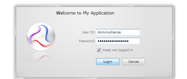
The following example shows a simple login form that uses UXPasswordBox to obtain password input.
| XAML |
Copy Code
|
|---|---|
<StackPanel> <Intersoft:FieldLabel Header="User:"> <Intersoft:UXTextBox Width="150"/> </Intersoft:FieldLabel> <Intersoft:FieldLabel Header="Password:"> <Intersoft:UXPasswordBox Width="150"/> </Intersoft:FieldLabel> </StackPanel> |
|
In data bound scenarios, it is recommended to use MVVM pattern to bind the Password property to a ViewModel class. To learn more about MVVM pattern, see MVVM Pattern Overview.
For a better user experience, you can display a watermark text when the password box is empty, which is useful to give additional hints to users about the particular input. You can configure watermark text through the following properties:
By default, when a validation error occured on a password box, the validation error indicator is displayed to the user. In Silverlight, the validation error indicator remains visible eventhough correction has been made to the text box. The validation error will be invalidated only when the text box lose its focus, which is the default behavior of the standard input box. This behavior, however, is not an ideal user experience for data intensive applications.
To enhance user experience, UXPasswordBox implements a mechanism that automatically clears the validation error on the subsequent text input. You can easily enable this behavior by attaching ClearErrorOnTextInput attached property to the UXPasswordBox, which is shown in the following example.
| XAML |
Copy Code
|
|---|---|
<Intersoft:FieldLabel Header="Password:" HeaderWidth="80" HorizontalHeaderAlignment="Right"> <Intersoft:UXPasswordBox HorizontalAlignment="Center" Width="60" Text="{Binding Path=PasswordAccessor, Mode=TwoWay, ValidatesOnDataErrors=True}" Intersoft:DataBinding.ClearErrorOnTextInput="True"/> </Intersoft:FieldLabel> |
|
For more information about this behavior and other data binding features in ClientUI, see Data Binding Overview.
You can easily customize the UXPasswordBox appearance through the following properties.
If you would like to completely customize the control appearance or if you want to change the styles of each visual state, you can edit the template of the control and do the modification accordingly.
To learn how to customize the template and visual states, see Styles and Template Overview.
For the list of ClientUI walkthroughs, see Walkthroughs and How-to Topics.
For the list of ClientUI samples available in local installation, see Locating the Samples in Local Installation.