

| Intersoft ClientUI 8 > ClientUI Controls > Control Library > Scheduling Controls Overview > UXScheduleView |
Intersoft UXScheduleView is a powerful, MVVM-ready scheduling control for Silverlight and WPF application development. UXScheduleView provides a multitude of advanced scheduling features such as full MVVM pattern support, extensible view architecture, integrated navigation interface, multi-level grouping, fluid event resizing and drag drop, sophisticated editing form and ISO standards user experiences. In addition to the rich features, UXScheduleView delivers blazing-fast performance – thanks to the smart virtual layout and comprehensive LINQ operation.
This topic contains the following sections.
UXScheduleView is a full-featured scheduling control that combines rock-solid architecture with superior user experiences. With its extensible architecture, UXScheduleView enables you to define any number of calendar views with the simplicity of XAML markup declaration. You can also create your own custom views that leverages many of the built-in features like calendar navigation and automatic view synchronization feature, and consume the custom view in a single XAML declaration.
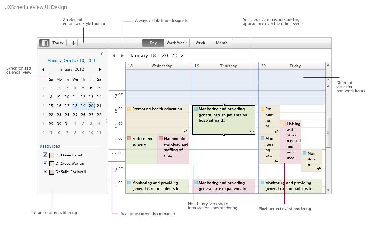
UXScheduleView sports an elegant user interface with industrial standards design featuring a minimalistic toolbar and built-in collapsible navigation pane. It also pays very detailed attention on every user interface element – for instances, the time designator that keeps visible as you scroll, real-time hour indicator, razor-sharp lines, and smart layout rendering. Furthermore, each row and cell is rendered in pixel-perfect fashion to ensure the best viewing experiences.
The following illustration describes the overall user interface design of the UXScheduleView control.
UXScheduleView provides a flexible way to display a collection of data in resource and time dimension. You can choose between UXScheduleDayView, UXScheduleWeekView, UXScheduleWorkWeekView and UXScheduleMonthView to display your collection of data. Every view has its own unique behaviors to display data which can be used individually or integrated in UXScheduleView. Furthermore, you can also create a custom view to be integrated to UXScheduleView by creating a new class that derives from UXScheduleViewBase.
| Defining Views |
Copy Code
|
|---|---|
<Intersoft:UXScheduleView> <Intersoft:UXScheduleDayView/> <Intersoft:UXScheduleWorkWeekView/> <Intersoft:UXScheduleWeekView IsActive="True"/> <Intersoft:UXScheduleMonthView/> </Intersoft:UXScheduleView> |
|
To learn more how to create custom view, see How-to: Create And Integrates Custom View to UXScheduleView.
To bind UXScheduleView or any individual view to data, set the EventsSource property to an object that implements IEnumerable. Each event in the UXScheduleView is bound to an object in data source. In order for the UXScheduleView user interface to update automatically when items are added to or removed from the source data, UXScheduleView must be bound to a collection that implements INotifyCollectionChanged such as an ObservableCollection<T>. In addition, the objects in the source collection should implement the INotifyPropertyChanged interface to enable the changes to be automatically reflected in the user interface.
| Defining Events Source |
Copy Code
|
|---|---|
<Intersoft:UXScheduleView x:Name="SampleControl1" IsBusy="{Binding IsBusy, Mode=TwoWay}" EventsSource="{Binding Events}" CategoriesSource="{Binding Categories}" ResourcesSource="{Binding Resources}"> <Intersoft:UXScheduleDayView/> <Intersoft:UXScheduleWorkWeekView/> <Intersoft:UXScheduleWeekView/> <Intersoft:UXScheduleMonthView/> <local:AgendaView Header="Agenda" IsActive="True"/> </Intersoft:UXScheduleView> |
|
Besides EventsSource, UXScheduleView also provides CategoriesSource and ResourcesSource that work in conjunction with the EventsSource. CategoriesSource provides collection of category data, while the ResourcesSource provides collection of resource data that belong to each event. In general, the relationship between Category, Resource and Event can be illustrated in the following figure.
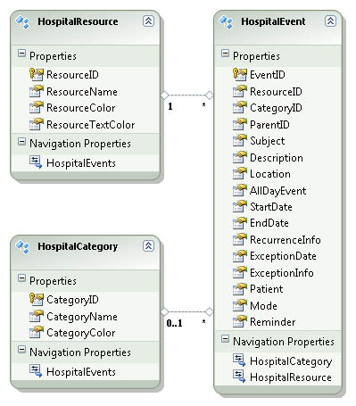
The tables schema such as shown in the figure above is the minimum requirement that you should implement to effectively use UXScheduleView in your application. You can have additional fields such as PatientID field in the HospitalEvent table, but all other columns are required in the tables schema. To understand the purpose of each field, please refer to the following section.
When the EventsSource is specified, UXScheduleView will create a UXScheduleViewEventModel for each item available in the collection. The UXScheduleViewEventModel class represents users data by mapping the important fields as follow:
 |
All member path properties in UXScheduleView already have their default value set. It is not necessary to define these member path again if your data model already matches the default value of the member path. |
Besides the fields mapping, UXScheduleViewEventModel provides OriginalObject property which represents the original data item specified in EventsSource. The OriginalObject property is particularly useful when you need to access additional fields that are not in mapped to UXScheduleViewEventModel. It enables you to use the {Binding} markup to display the additional fields in the custom data template of the event, event details or in the editing form.
The same concept is also applied to CategoriesSource and ResourcesSource with their own respective member paths.
Resource member paths:
Category member paths:
Events in UXScheduleView is rendered uniquely based on the current active view.
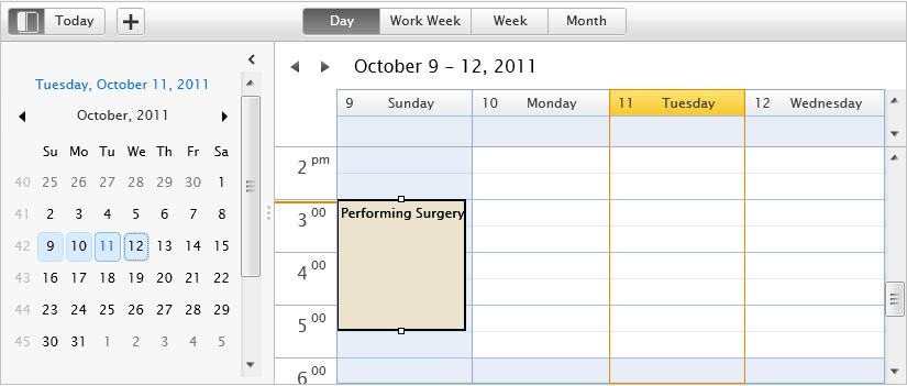
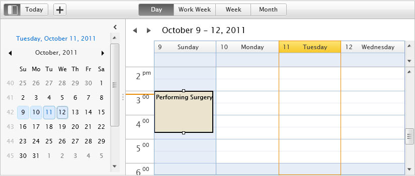
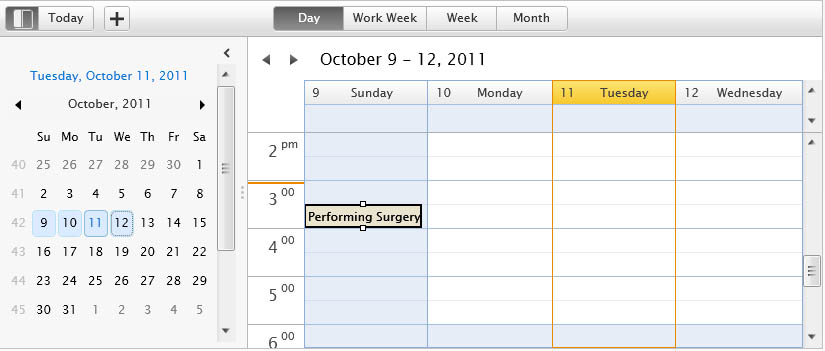
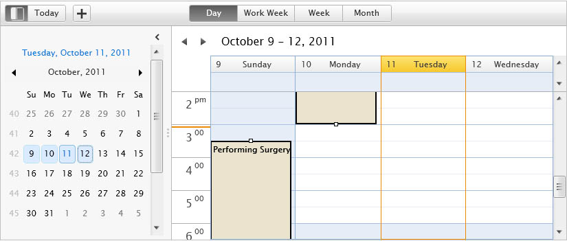
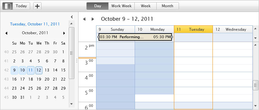
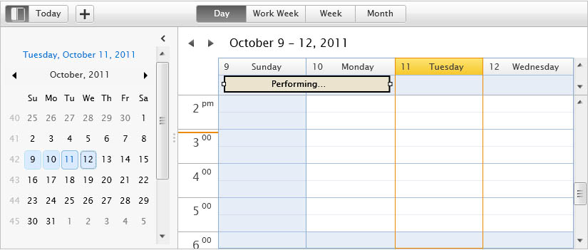
In UXScheduleDayView, UXScheduleWeekView, and UXScheduleWorkWeekView; the event can be rendered in the time cell or at the all day event area depending the StartDate and EndDate of the event. The following figures list all possible event rendering in UXScheduleDayView, UXScheduleWeekView, and UXScheduleWorkWeekView.
In UXScheduleMonthView, the event will be rendered in the available area depending on its StartDate and EndDate. If it is a time-based event, it will have an icon indicating that the particular event is a time-based event. The following figures list all possible event rendering in UXScheduleMonthView.
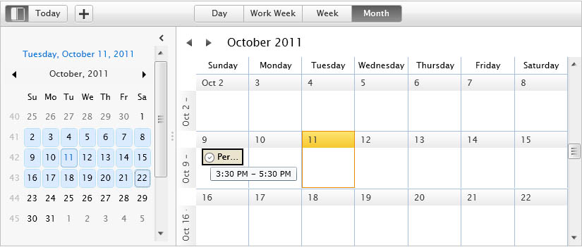
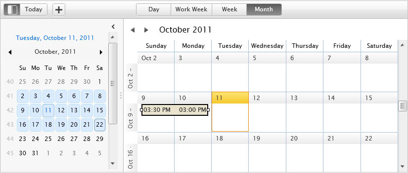
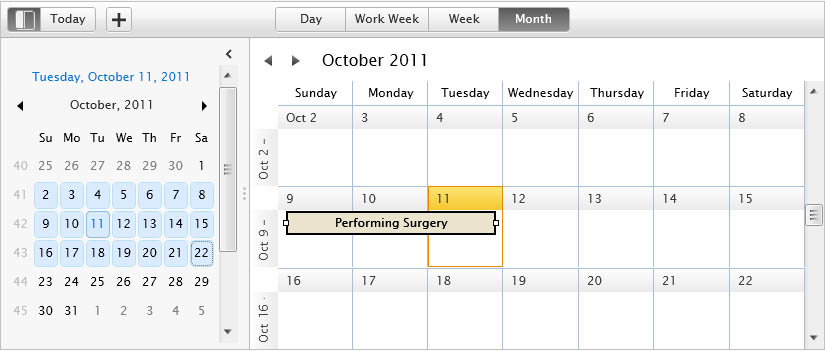
As you can see in the above figures, there are time indicator visual hint displayed in the event which is useful to directly understand when the event is started or ended. Besides the time indicator, UXScheduleViewEvent also provides a date indicator that will appear if the event start date or end date is out of the current view.
The following figures describe how date indicator works in various scenarios.
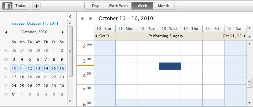
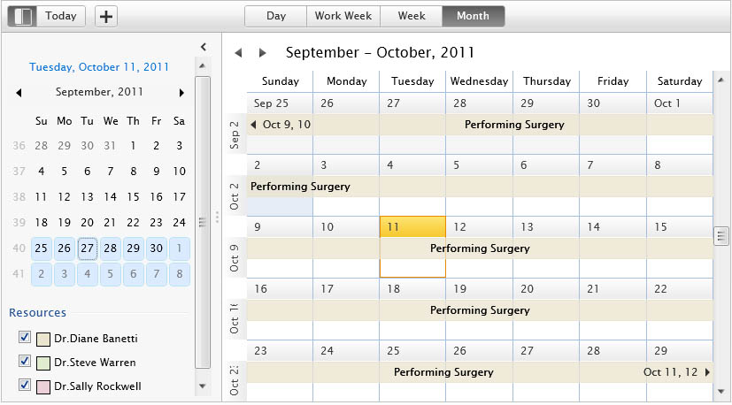
You can see the detail of the event by double clicking the event, or using the context menu by right clicking on the event and select Show Detail. This action will show an elegant callout-style popup that contain more detailed information about the event such as shown below.
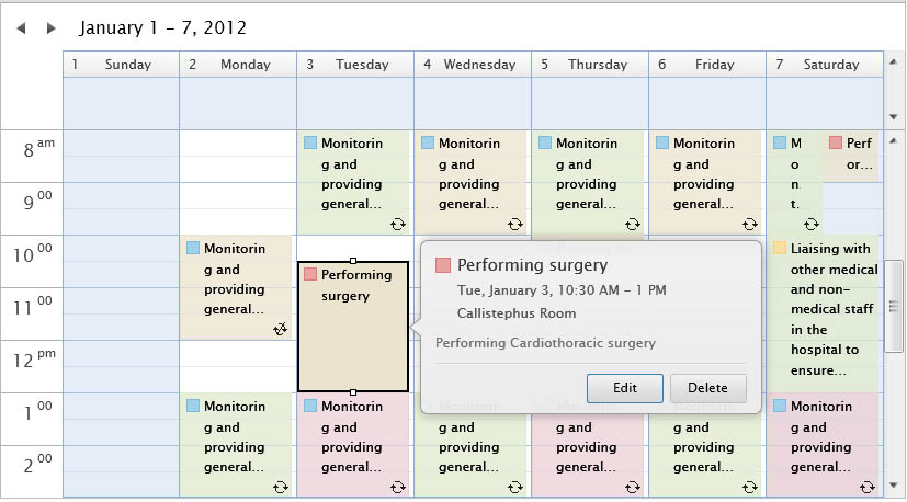
You can also customize the event detail to suit your application's requirements. To learn more how to customize the event detail, see How-to: Customize Event Detail in UXScheduleView.
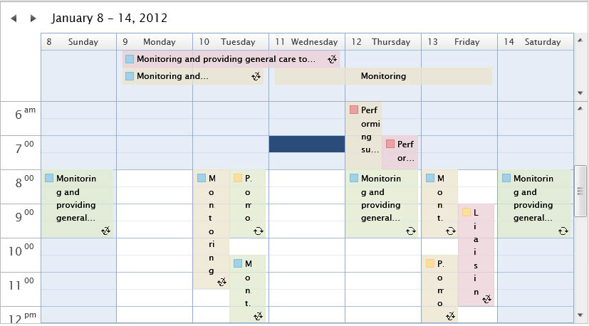
Each view in UXScheduleView has their own unique way in handling overlapping events, however they share common rules as follows.
Overlapping events in UXScheduleWeekView
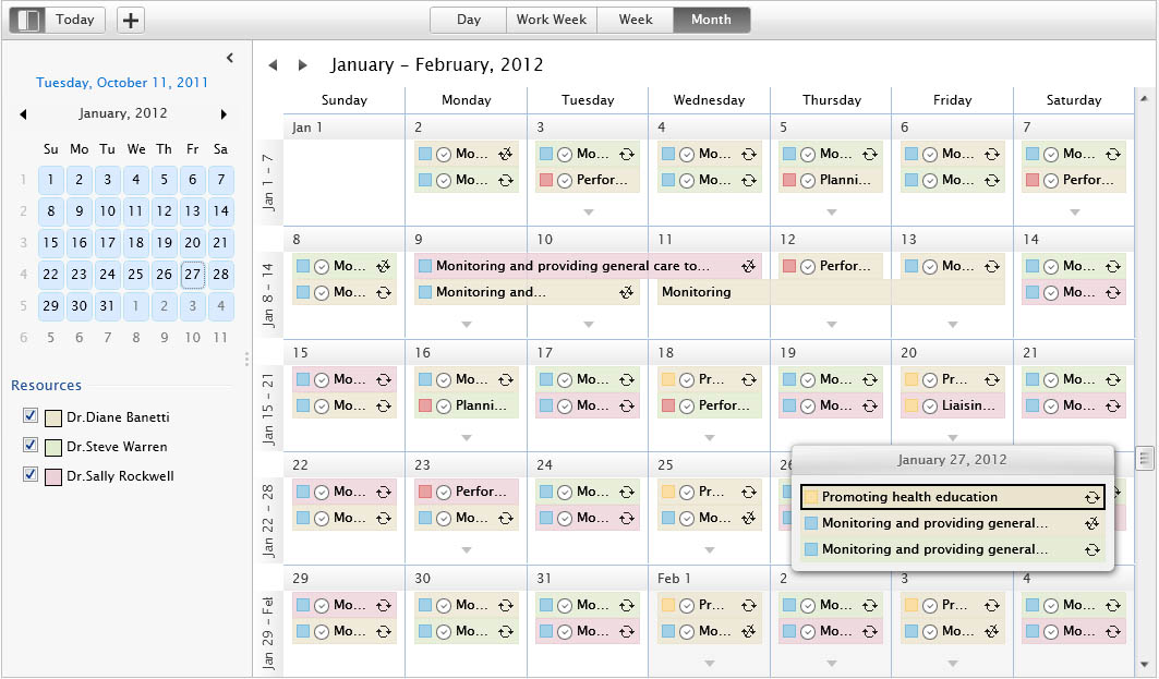
Overlapping events in UXScheduleMonthView
If the overlapping events exceeded the available space, they will be automatically shifted to the "more items" popup. You will see an arrow visual hint indicating that you can click on it to show the other events in that particular day.
As mentioned in previous section, UXScheduleView supports both standard and recurring event. A recurring event is an event that will occur more than once according to the specified recurring pattern.
There are five type of recurrence patterns supported in UXScheduleView:
UXScheduleView expects the recurrence pattern to be stored in the RecurringInfo property of your event data model. The RecurringInfo data is persisted in the form of XML format such as shown in the following example.
| RecurrenceInfo |
Copy Code
|
|---|---|
<RecurrenceInfo StartDate="1/2/2012" RecurrenceMode="2" RecurrenceRangeMode="0" WeekDays="1, 3, 5" /> |
|
The raw XML data will be serialized and deserialized automatically by the UXScheduleView control during data binding process. Note that the tag name should be exactly RecurrenceInfo, while the attributes should follow the data member listed in the previous section.
The following list describes the attributes that you can use.
The persisted attributes can vary depending on the RecurrenceMode, however the following attributes are always required in the recurring info:
As mentioned above, the value of recurrence mode will be converted to an enumeration value of RecurrenceMode. Let see how the data looks like for five types of recurrence patterns that supported by UXScheduleView.
 |
WeekDays should be in integer value. 0 = Sunday, 1 = Monday, 2 = Tuesday, 3 = Wednesday, 4 = Thursday, 5 = Friday, 6 = Saturday. |
For the recurrence range, there are three mode that you can choose from:
 |
All the date format in recurring info must use the following format: MM/dd/yyyy. |
 |
For scalability purpose, it is common to filter the data based on specific range or date, resource, and any other specific filter scenarios. However, when you implement the data filtering, please retrieve all exception events particularly when you have recurring events retrieved in the filtering clause. This is important because when the recurring pattern of an event changes, all exception events will be deleted to maintain data consistency. Therefore, it is required to retrieve all exception events enabling UXScheduleView to provide a collection of events to be deleted when this scenario occurred. An exception event is an event that has ParentID and ExceptionDate. |
Each event in UXScheduleView must be linked to a resource object in ResourcesSource through the ResourceID property. The resource object is used to identify which events belong to which resource in multiple resources scheduling applications. By default, the resources are differentiated through the background color of the event.
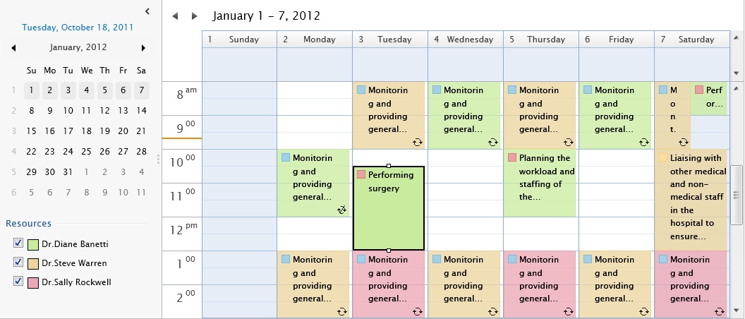
The resource colors can be further customized by providing the ResourceColor and ResourceTextColor in the resource model. Please refer to the data binding section above to learn how to bind the colors to a resource model.
When you have multiple resources in your application as seen in the figure above, the resources list will be populated and presented under the Resources section in the navigation pane. Each resource has a check box which indicates whether the resource should be displayed in the active schedule view. To filter out a resource, simply uncheck the resource's check box such as shown in the figure below.
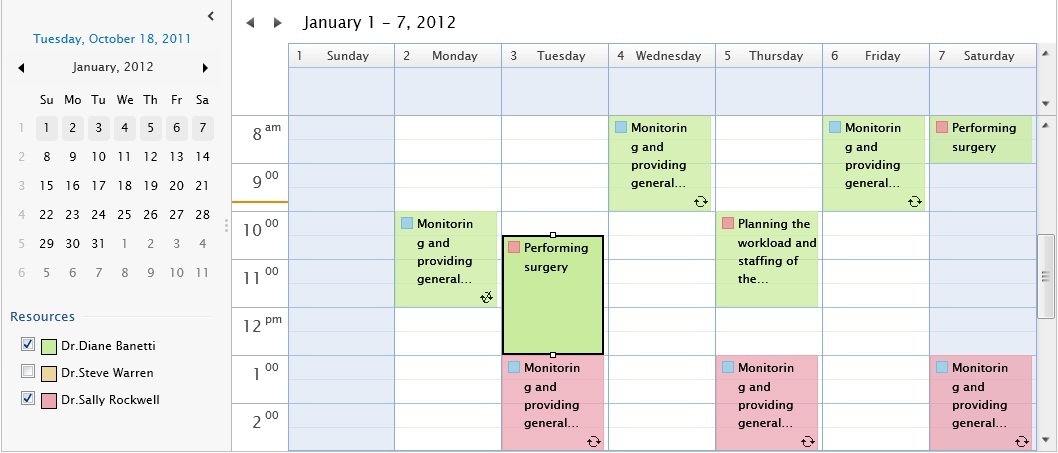
UXScheduleView includes a high-performance grouping feature enabling you to group events based on resources. To learn more about the grouping feature, see Grouping Data in UXScheduleView.
You can categorize an event by adding a category which is linked to a category object specified in CategoriesSource through the CategoryID property. When an event has a category, you will see a colored rectangle in the top left section of both the event and event details such as shown in the following figure.
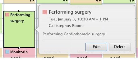
The colors can be further customized by specifying the CategoryColor in the category model. Please refer to the data binding section above to learn how to bind the colors to CategoryColor.
To add or modify the category of an event, you can use the built-in context menu or the editing form feature in UXScheduleView. Note that you need to have the CanUserEditItems feature set to True.
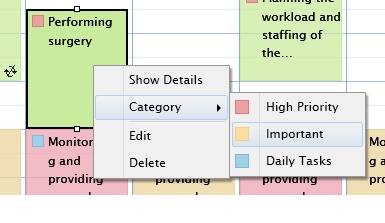
The following figure shows the category editor in the built-in editing form.
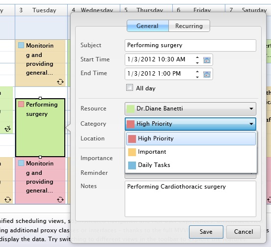
UXScheduleView includes a high-performance grouping feature enabling you to group events based on categories. To learn more about the grouping feature, see Grouping Data in UXScheduleView.
To navigate events in UXScheduleView, you can use several access points such as explained in the sections below.
Calendar is the main access point that you can use to navigate events. It is using UXCalendar control which means you have access to all the rich features available in the control such as clicking on a date to navigate to a certain date, or select multiple dates to navigate across certain date range. Furthermore, the calendar also provides additional behaviors depending on the current active view.
In addition, you can also perform range selection in the calendar. UXScheduleView will change the current active view depending on the number of days you select.
 |
When you navigate between one view to another view, UXScheduleView will persist the current selected dates from the previous view to the current view. |
Each view includes built-in navigation buttons that you can use to navigate to previous and/or next range of date. The navigation buttons are located in the title area by default.

Each cell that represents a day in the view contains a header button that you can click to jump directly to specific date/date range that it represents.


When you select a cell, you can use Arrow Key in your keyboard to navigate from one range of date to another range of date. You can also use Shift + Arrow Key to select multiple cells to indicate the date range when you insert a new event. To learn more about editing feature in UXScheduleView, see Editing Data in UXScheduleView.
Furthermore, you can also use Tab to select from one event to another event, or use Shift + Tab to navigate backward.
You can easily localize the textual content of UXScheduleView by setting the ResourceOverride property to a UXScheduleViewResource instance containing the customized textual content.
The default textual content are listed in the following table.
| Resource Key | Resource Value |
|---|---|
| CancelText | Cancel |
| CategoriesText | Category |
| ConfirmDeleteText | Confirm Delete |
| DeleteOccurrenceInfoText | Delete this occurrence. |
| DeleteOccurrenceText | Delete Occurrence |
| DeleteRecurringEventInfoText | Do you want to delete all occurrences of the recurring appointment {0}, or just this one? |
| DeleteSeriesInfoText | Delete this series. |
| DeleteSeriesText | Delete Series |
| DeleteText | Delete |
| EditOccurrenceText | Edit Occurrence |
| EditSeriesText | Edit Series |
| EditText | Edit |
| EventDateRangeText | {0} - {1} |
| LoadingText | Loading... |
| MoreItemsText | {0} more items |
| MoreItemText | {0} more item |
| NewAllDayEventText | New All Day Event |
| NewEventText | New Event |
| NewRecurringEventText | New Recurring Event |
| NextText | Next |
| OKText | OK |
| PreviousText | Previous |
| RecurringText_AllDayEvent | Occurs {0} effective {1:M/d/yyyy} |
| RecurringText_AllDayEventWithEndRange | Occurs {0} effective {1:M/d/yyyy} until {2:M/d/yyyy} |
| RecurringText_Event | Occurs {0} effective {1:M/d/yyyy} from {2:h:mm tt} to {3:h:mm tt} |
| RecurringText_EventWithEndRange | Occurs {0} effective {1:M/d/yyyy} until {2:M/d/yyyy} from {3:h:mm tt} to {4:h:mm tt} |
| RecurringText_EveryDay | every day |
| RecurringText_EveryNDay | every {0} days |
| RecurringText_EveryNWeek | every {0} weeks on {1} |
| RecurringText_EveryNYearOnDate | every {0} years on {1} |
| RecurringText_EveryWeek | every {0} |
| RecurringText_EveryWeekDay | every week days |
| RecurringText_EveryYearOnDate | every year {0} |
| RecurringText_FullDayEvent | Occurs {0} effective {1:M/d/yyyy} at {2:h:mm tt}. |
| RecurringText_FullDayEventWithEndRange | Occurs {0} effective {1:M/d/yyyy} until {2:h:mm tt} at {3:h:mm tt}. |
| RecurringText_NDayEveryMonth | day {0} every month |
| RecurringText_NDayEveryNMonth | day {0} every {1} month |
| ResourcesText | Resources |
| ShowDetailText | Show Details |
| TodayText | Today |
| TooltipText_AddNewEvent | Add new event |
| TooltipText_Back | Back |
| TooltipText_Forward | Forward |
| TooltipText_NextGroup | Go to next group |
| TooltipText_PreviousGroup | Go to previous group |
| TooltipText_ShowToday | Show today in calendar |
| TooltipText_ToggleNavigationPane | Toggle navigation pane |
The following examples show how to localize the textual content of a UXScheduleView.
| Example Title |
Copy Code
|
|---|---|
<Intersoft:UXScheduleView x:Name="SampleControl1" DisplayDate="1/2/2012" Culture="de-DE" IsBusy="{Binding IsBusy, Mode=TwoWay}" EventsSource="{Binding Events}" CategoriesSource="{Binding Categories}" ResourcesSource="{Binding Resources}"> <Intersoft:UXScheduleView.ResourceOverride> <Intersoft:UXScheduleViewResource CancelText="Stornieren" CategoriesText="Kategorien" ConfirmDeleteText="Löschen bestätigen" DeleteOccurrenceInfoText="Löschen Sie diesen Vorgang." DeleteOccurrenceText="löschen Vorkommen" DeleteRecurringEventInfoText="Wollen Sie alle Vorkommen des Termins {0} zu löschen, oder nur diese eine?" DeleteSeriesInfoText="Löschen dieser Serie." DeleteSeriesText="Löschen Serie" DeleteText="Löschen" EditOccurrenceText="bearbeiten Vorkommen" EditSeriesText="bearbeiten Series" EditText="bearbeiten" MoreItemsText="\{0} mehr Elemente" MoreItemText="\{0} mehr Artikel" NewAllDayEventText="Neues ganztägiges Ereignis" NewEventText="Neuer Termin" NewRecurringEventText="New Wiederkehrend" NextText="nächste" PreviousText="Vorherige" RecurringText_AllDayEvent="Tritt {0} {1: M / d / yyyy}" RecurringText_AllDayEventWithEndRange="Tritt {0} {1: M / d / yyyy} bis {2: M / d / yyyy}" RecurringText_Event="Tritt {0} {1: M / d / yyyy} von {2: h: mm tt} {3: h: mm tt}" RecurringText_EventWithEndRange="Tritt {0} {1: M / d / yyyy} bis {2: M / d / yyyy} von {3: h: mm tt} bis {4: h: mm tt}" RecurringText_EveryDay="täglich" RecurringText_EveryNDay="jeder dayevery {0} Tage" RecurringText_EveryNWeek="jeden {0} Wochen {1}" RecurringText_EveryNYearOnDate="jedes Jahr {0}" RecurringText_EveryWeek="jeden {0}" RecurringText_EveryWeekDay="alle Wochentage" RecurringText_EveryYearOnDate="jedes Jahr {0}" RecurringText_FullDayEvent="Tritt {0} {1: M / d / yyyy} am {2: h: mm tt}." RecurringText_FullDayEventWithEndRange="Tritt {0} {1: M / d / yyyy} bis {2: h: mm tt} um {3: h: mm tt}." RecurringText_NDayEveryMonth="Tag {0} pro Monat" RecurringText_NDayEveryNMonth="Tag {0} alle {1} Monat" ResourcesText="Ressourcen" ShowDetailText="Details anzeigen" TodayText="heute" TooltipText_AddNewEvent="Legen Sie eine neue Veranstaltung" TooltipText_Back="zurück" TooltipText_Forward="nach vorn" TooltipText_NextGroup="Zur nächsten Gruppe" TooltipText_PreviousGroup="Zum vorherigen Gruppe" TooltipText_ShowToday="Show heute in Kalender" TooltipText_ToggleNavigationPane="Toggle Navigationsbereich" /> </Intersoft:UXScheduleView.ResourceOverride> <Intersoft:UXScheduleDayView Header="Tag"/> <Intersoft:UXScheduleWorkWeekView Header="Arbeitswoche"/> <Intersoft:UXScheduleWeekView IsActive="True" Header="Woche"/> <Intersoft:UXScheduleMonthView Header="Monat"/> </Intersoft:UXScheduleView> |
|
For more information about ClientUI localization framework, see Localization Overview.
This topic provides a comprehensive overview of UXScheduleView which discusses the basics of data binding and explains the fundamental elements and settings available in the control.
UXScheduleView also provides more advanced features which you can explore through the following links: