

| Intersoft ClientUI 8 > ClientUI Controls > Control Library > Scheduling Controls Overview > UXScheduleView > Grouping Data in UXScheduleView |
This topic provides an overview of the data grouping feature in UXScheduleView, discusses the supported grouping capabilities such as date time interval grouping, nested grouping, and explains how to implement custom grouping. For information about UXScheduleView and its features in general, see UXScheduleView Overview.
This topic contains the following sections.
To enable data grouping in UXScheduleView, you can set either the GroupBy property or GroupCollection property. The GroupBy property is used to group the data based on provided categories or resources, while the GroupCollection property offers a more flexible way to group data including nested grouping capability.
 |
When the data is grouped, you can not move an item from one group to another group using the drag-drop feature in UXScheduleView. |
| Group By |
Copy Code
|
|---|---|
<Intersoft:UXScheduleView DisplayDate="1/2/2012" EventsSource="{Binding Events}" CategoriesSource="{Binding Categories}" ResourcesSource="{Binding Resources}" GroupBy="Resources"> <Intersoft:UXScheduleDayView/> <Intersoft:UXScheduleWorkWeekView IsActive="True"/> <Intersoft:UXScheduleWeekView/> <Intersoft:UXScheduleMonthView/> </Intersoft:UXScheduleView> |
|
The following figure shows the schedule data grouped by resources.
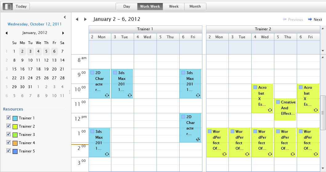
GroupCollection holds a collection of UXScheduleViewGroup which defines how the data should be grouped. The following code shows how to group the data based on Mode property.
| Data Grouping |
Copy Code
|
|---|---|
<Intersoft:UXScheduleView DisplayDate="1/2/2012" EventsSource="{Binding Events}" CategoriesSource="{Binding Categories}" ResourcesSource="{Binding Resources}"> <Intersoft:UXScheduleView.GroupCollection> <Intersoft:UXScheduleViewGroup PropertyName="Mode"> <Intersoft:UXScheduleViewGroupItem Value="1" Display="Important" /> <Intersoft:UXScheduleViewGroupItem Value="0" Display="Normal" /> </Intersoft:UXScheduleViewGroup> </Intersoft:UXScheduleView.GroupCollection> <Intersoft:UXScheduleDayView/> <Intersoft:UXScheduleWorkWeekView IsActive="True"/> <Intersoft:UXScheduleWeekView/> <Intersoft:UXScheduleMonthView/> </Intersoft:UXScheduleView> |
|
The following figure shows the UXScheduleView control where the data is grouped by the values available in the Mode property.
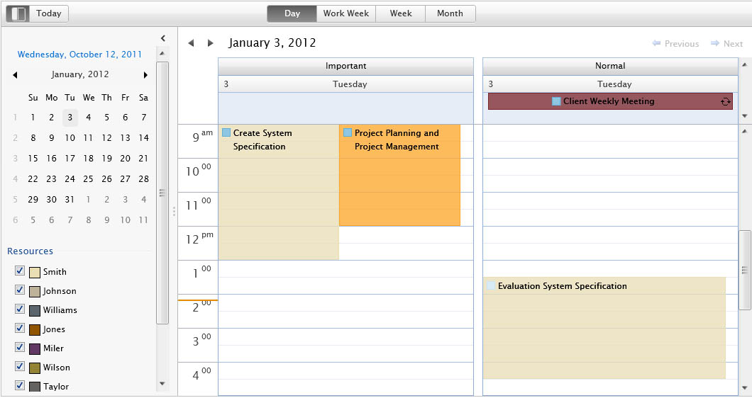
The UXScheduleViewGroup must have a PropertyName specified and have a collection of data that will be used for the data grouping. Note that the property name must be a public property in UXScheduleViewEventModel. If custom grouping is required, you can specify the PropertyName with any values that indicate the property of which the custom grouping will use.
Similar to the property grouping, the GroupCollection is also required when implementing custom data grouping. You also need to implement the FilterGroupCommand to handle the logic of the custom grouping.
| Custom Grouping |
Copy Code
|
|---|---|
<Intersoft:UXScheduleView DisplayDate="1/2/2012" EventsSource="{Binding Events}" CategoriesSource="{Binding Categories}" ResourcesSource="{Binding Resources}" FilterGroupCommand="{Binding FilterGroupCommand}"> <Intersoft:UXScheduleView.GroupCollection> <Intersoft:UXScheduleViewGroup PropertyName="Customer"> <Intersoft:UXScheduleViewGroupItem Value="Pepsi Ltd." Display="Pepsi Ltd." /> <Intersoft:UXScheduleViewGroupItem Value="Coca Cola Ltd" Display="Coca Cola Ltd" /> <Intersoft:UXScheduleViewGroupItem Value="Standard Chartered Bank" Display="Standard Chartered Bank" /> <Intersoft:UXScheduleViewGroupItem Value="Prospect Customer" Display="Prospect Customer" /> </Intersoft:UXScheduleViewGroup> </Intersoft:UXScheduleView.GroupCollection> <Intersoft:UXScheduleDayView/> <Intersoft:UXScheduleWorkWeekView IsActive="True"/> <Intersoft:UXScheduleWeekView/> <Intersoft:UXScheduleMonthView/> </Intersoft:UXScheduleView> |
|
| Filter Group Command |
Copy Code
|
|---|---|
public SoftwareDevViewModel() : base() { this.FilterGroupCommand = new DelegateCommand(ExecuteFilterGroup); } public DelegateCommand FilterGroupCommand { get; set; } protected override void ExecuteFilterGroup(object parameter) { UXScheduleViewFilterGroupArgs args = parameter as UXScheduleViewFilterGroupArgs; if (args.PropertyName == "Customer") args.Events = args.Events.Where(o => ((SoftwareDevEvent)o.OriginalObject).Customer == args.PropertyValue.ToString()); } |
|
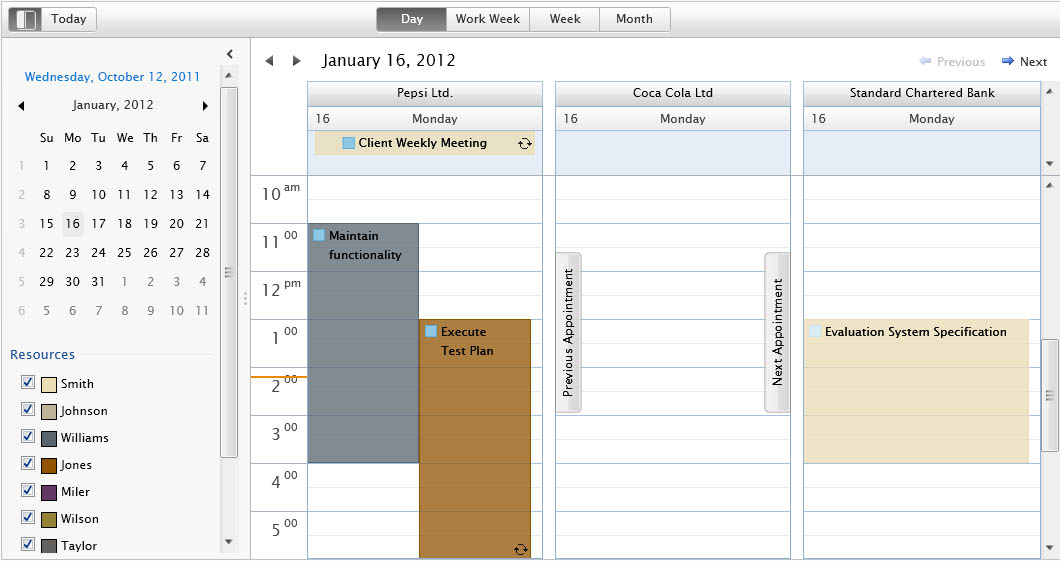
As you can refer to the code above, the PropertyName is checked against "Customer" which is used in the ExecuteFilterGroup to determine the available group values. Note that the value of available UXScheduleViewGroupItem can be obtained in the PropertyValue property of UXScheduleViewFilterGroupArgs instance. At the end of the process, you need to assign the args.Events with the filtered data such as shown in the code example above.
You can also add another UXScheduleViewGroup in GroupCollection to create a nested grouping. The order of the nested grouping follows the order of the group collection. Please refer to the example below.
| Nested Grouping |
Copy Code
|
|---|---|
<Intersoft:UXScheduleView DisplayDate="1/2/2012" EventsSource="{Binding Events}" CategoriesSource="{Binding Categories}" ResourcesSource="{Binding Resources}" FilterGroupCommand="{Binding FilterGroupCommand}"> <Intersoft:UXScheduleView.GroupCollection> <Intersoft:UXScheduleViewGroup PropertyName="DivisionID"> <Intersoft:UXScheduleViewGroupItem Value="1" Display="Development" /> <Intersoft:UXScheduleViewGroupItem Value="2" Display="Support" /> <Intersoft:UXScheduleViewGroupItem Value="3" Display="Marketing" /> </Intersoft:UXScheduleViewGroup> <Intersoft:UXScheduleViewGroup PropertyName="Mode"> <Intersoft:UXScheduleViewGroupItem Value="1" Display="Important" /> <Intersoft:UXScheduleViewGroupItem Value="0" Display="Normal" /> </Intersoft:UXScheduleViewGroup> </Intersoft:UXScheduleView.GroupCollection> <Intersoft:UXScheduleDayView/> <Intersoft:UXScheduleDayView Header="Next 3 Days" NumberOfDays="3"/> </Intersoft:UXScheduleView> |
|
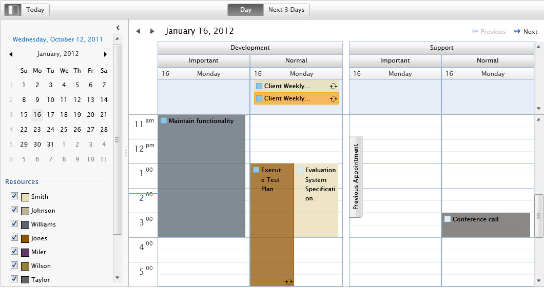
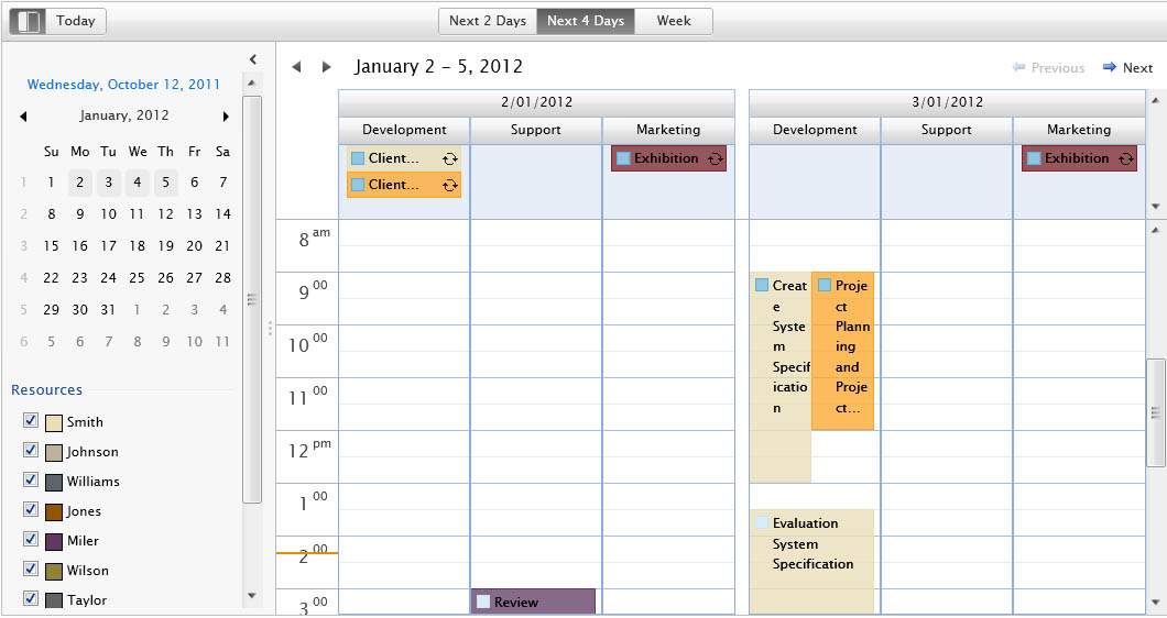
In addition, when you implement nested grouping, you can change the GroupInterval for one of the UXScheduleViewGroup to DateTime. Called "time interval grouping", this feature transforms the dimension of the schedule view in a way that enables you to group the data by time before other groups.
| Time Interval |
Copy Code
|
|---|---|
<Intersoft:UXScheduleView DisplayDate="1/2/2012" EventsSource="{Binding Events}" CategoriesSource="{Binding Categories}" ResourcesSource="{Binding Resources}" FilterGroupCommand="{Binding FilterGroupCommand}"> <Intersoft:UXScheduleView.GroupCollection> <Intersoft:UXScheduleViewGroup GroupInterval="DateTime"/> <Intersoft:UXScheduleViewGroup> <Intersoft:UXScheduleViewGroupItem Value="1" Display="Development" /> <Intersoft:UXScheduleViewGroupItem Value="2" Display="Support" /> <Intersoft:UXScheduleViewGroupItem Value="3" Display="Marketing" /> </Intersoft:UXScheduleViewGroup> </Intersoft:UXScheduleView.GroupCollection> <Intersoft:UXScheduleDayView Header="Next 2 Days" NumberOfDays="2"/> <Intersoft:UXScheduleDayView Header="Next 4 Days" NumberOfDays="4"/> <Intersoft:UXScheduleWeekView/> </Intersoft:UXScheduleView> |
|
The following figure illustrates the nested grouping with time interval group defined in the first order.
 |
UXScheduleViewGroup that uses GroupInterval = DateTime must not be the last order in the group collection. In addition, you need to have at least two UXScheduleViewGroup in your group collection for the scheduling control to work correctly. |
Grouping data in UXScheduleView can make the schedule view look crowded and cluttered especially when you are displaying a lot of days in one view. To overcome this challenge, UXScheduleView limits the number of group item visible which can be customized through the NumberOfGroups property. You can then use the Next and Previous Group button at the top right of each view to navigate between groups.
| Group By |
Copy Code
|
|---|---|
<Intersoft:UXScheduleView DisplayDate="1/2/2012" NumberOfGroups="3" EventsSource="{Binding Events}" CategoriesSource="{Binding Categories}" ResourcesSource="{Binding Resources}" GroupBy="Resources"> <Intersoft:UXScheduleDayView/> <Intersoft:UXScheduleWorkWeekView IsActive="True"/> <Intersoft:UXScheduleWeekView/> <Intersoft:UXScheduleMonthView/> </Intersoft:UXScheduleView> |
|
The following figure shows the group navigation buttons.

Since all the views in UXScheduleView are inherited from ItemsControl, you can use the StyleSelector to customize the group header appearances. The following code shows how to create a style selector to differentiate the first group header with the rest group header.
| Group Style Selector |
Copy Code
|
|---|---|
/// <summary> /// Represents a group style selector class which is used to select a style based on type. /// </summary> public class UXScheduleViewGroupStyleSelector : StyleSelector { /// <summary> /// Gets or sets the root group style. /// </summary> public Style RootGroupStyle { get; set; } /// <summary> /// Gets or sets the group style. /// </summary> public Style GroupStyle { get; set; } /// <summary> /// Select the style to be used in UXToolGroup based on ButtonAppearance property. /// </summary> /// <param name="item">An object that represents the original item to be styled.</param> /// <param name="container">The container of the item to be styled.</param> /// <returns></returns> public override Style SelectStyle(object item, DependencyObject container) { UXScheduleViewGroupHeader control = container as UXScheduleViewGroupHeader; if (control != null) { if (control.Level == 0) return this.RootGroupStyle; return this.GroupStyle; } return null; } } |
|