

| Intersoft ClientUI 8 > ClientUI Controls > Control Library > Advanced Content Controls Overview > UXResizablePane |
UXResizablePane is a rich and versatile content control featuring fluid resizing, built-in expand/collapse, and intuitive 'resize-to-snap' dragging behavior. It employs a lightweight "manager-less" UI architecture enabling you to wrap an existing element into a resizable layout without requiring major layout revamp. With the flexible docking mode, you can specify the resize direction with the simplicity of a property set.
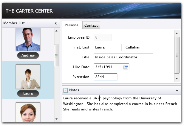
In addition to the standard features, UXResizablePane also includes several innovative features such as flexible 4-edge resize dock, bi-directional resizing mode, and loosely-coupled integration to other content control that supports unique expand/collapse behavior such as UXNavigationPane.
UXResizablePane uses the headered content control model and derives from ExpandableGroupBox, which means it has both Header and Content that can contain a single object of any type (such as a string, an image, or a panel). For more information about this content model see Content Model Overview. The UXResizablePane control also share many of the common features available in ExpandableGroupBox such as expand/collapse and header's customization.
You use UXResizablePane control to display a single content that can be collapsed and expanded through the expander button attached to its header element. In addition to the expand and collapse feature, the content of UXResizablePane will become resizable which means that users can drag the resize thumb to increase or decrease the dimension of the content. The position of the resize thumb is controlled by the ResizeDock property explained later in this topic.
Unlike traditional layout controls, UXResizablePane can work independently without requiring a layout manager. One of the benefits is that it allows you to use UXResizablePane with any Silverlight/WPF panels such as Grid and StackPanel. The most recommended panel to use with UXResizablePane is a DockPanel, which allows fluid resizing and fill layout behavior.
The following example shows how to define a simple UXResizablePane in XAML and use it with DockPanel.
| XAML |
Copy Code
|
|---|---|
<Intersoft:DockPanel FillChildMode="Custom"> <Intersoft:UXResizablePane Header="Navigation" Width="140" MaxWidth="200"> <Intersoft:UXItemsControl> <Intersoft:UXNavigationButton Content="Home" NavigateUri="/Home" Icon="Assets/Images/Home.png" IsDefaultNavigationSource="True"/> <Intersoft:UXNavigationButton Content="Customers" NavigateUri="/Customers" Icon="Assets/Images/CustomersFolder.png"/> <Intersoft:UXNavigationButton Content="Products" NavigateUri="/Products" Icon="Assets/Images/Products.png"/> <Intersoft:UXNavigationButton Content="About" NavigateUri="/About" Icon="Assets/Images/ClientUI_Silverlight.png"/> </Intersoft:UXItemsControl> </Intersoft:UXResizablePane> <Grid Intersoft:DockPanel.IsFillElement="True"> <TextBlock Text="Fill Element" HorizontalAlignment="Center" VerticalAlignment="Center" /> </Grid> </Intersoft:DockPanel> |
|
 |
It is best practice to define the size in the UXResizablePane instead of defining it in the content. This allows the UXResizablePane control to properly maintain the dimension during resizing and expand/collapse. |
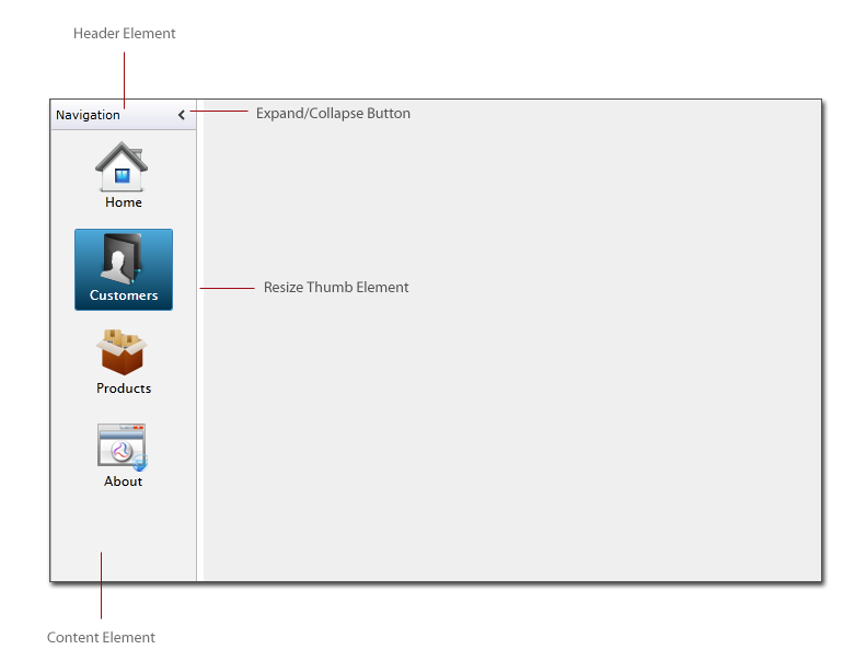
The UXResizablePane control sports a modern user interface design which includes an expander button for expanding and collapsing the content section, as well as the resize thumb for fluid content resizing. UXResizablePane is shown in expanded state by default, which is shown in the following figure.
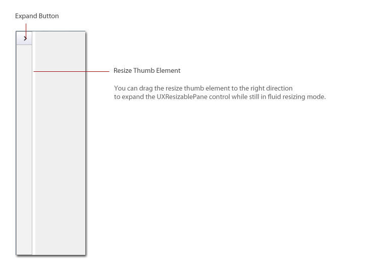
The following figure shows the UXResizablePane control while in collapsed/minimized state.
The following list describes the properties that related to resizing customization:
You can control the layout behaviors of the UXResizablePane control through the native layout properties such as MinWidth, MinHeight, MaxWidth and MaxHeight. You configure these properties to ensure smooth experiences during user interaction, for instances, you may want to restrict the navigation pane's maximum width to a value that makes sense in your application's layout.
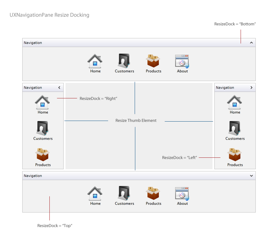
One of the unique features in the UXResizablePane control is the flexible resize dock position customization which allows you to easily determine the position of the resize thumb element. The default value of the ResizeDock property is Right, which means the resize thumb is placed at the right edge of the control. The expand/collapse direction is also automatically determined based on the specified ResizeDock property value. For examples, when ResizeDock is set to Right, the collapse will be naturally set to the left direction.
The UXResizablePane control will also adjust the resizing behavior based on the specified ResizeDock property value, enabling you to rapidly create rich resizable user interface without the hassles of complex configuration.
The following figure illustrates the UXResizablePane control in different resize dock position.
By default, the UXResizablePane is displayed in expanded state which can be customized through the IsExpanded property. You set the IsExpanded property to false to display the UXResizablePane in collapsed state.
In certain scenarios, you may want to prevent users to collapse or expand a particular group in your user interface. You can achieve this scenario by setting the AllowExpandCollapse property to false, which consequently hide the expander button from the user interface.
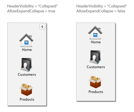
In the cases when the header element is not necessary, you can hide the header bar by setting the HeaderVisibility property to Collapsed. Note that although the header is collapsed, the expander button will remain visible. To hide the header bar entirely including the expander button, you need to set the AllowExpandCollapse property to false.
The following illustration compares the UXResizablePane layout with different header visibility and expand/collapse configuration.
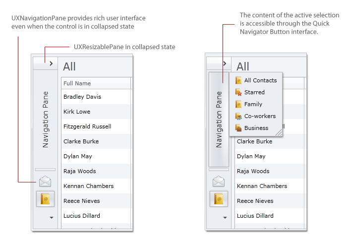
In addition to its core functionality as layout resizer, UXResizablePane also supports content expand and collapse out-of-the-box. The UXResizablePane control can be more useful when its content supports specific collapse behavior, such as UXNavigationPane, which significantly improves user experience through its intuitive buttons and contextual menu. Instead of showing an empty content, UXNavigationPane transforms the buttons into mini buttons when collapsed, allowing users to maximize the application's real screen estate while preserving the navigation consistency.
You can use UXNavigationPane as the content of the UXResizablePane control. To take advantage of navigation pane's unique collapse behavior, simply bind the navigation pane's IsExpanded property to the resizable pane's IsExpanded property, thanks to the loosely-coupled UI architecture design. Finally, you set the CollapseAction of the UXResizablePane control to KeepContentVisible.
The following example shows how to implement UXResizablePane together with UXNavigationPane to create visually compelling user experiences.
| XAML |
Copy Code
|
|---|---|
<Intersoft:UXResizablePane x:Name="ResizablePane" Width="200" Header="My Outlook" MinWidth="56" CollapseAction="KeepContentVisible"> <Intersoft:UXNavigationPane Header="Navigation Pane" IsExpanded="{Binding IsExpanded, ElementName=ResizablePane}" VisibleItemCount="2" AutoSelectFirstItem="True"> <Intersoft:UXNavigationPaneItem Header="Mail" DisplayMode="ContentAndImage" Icon="Mail.png"/> <Intersoft:UXNavigationPaneItem Header="My Contacts" DisplayMode="ContentAndImage" Icon="MyContacts.png"> <Grid> ... </Grid> </Intersoft:UXNavigationPaneItem> <Intersoft:UXNavigationPaneItem Header="My Tasks" DisplayMode="ContentAndImage" Icon="MyTask.png"/> <Intersoft:UXNavigationPaneItem Header="My Notes" DisplayMode="ContentAndImage" Icon="MyNotes.png"/> </Intersoft:UXNavigationPane> </Intersoft:UXResizablePane> |
|
The results look like the following illustration which shows both controls in the collapsed state.
For more information about UXNavigationPane's concept and features, see UXNavigationPane Overview.
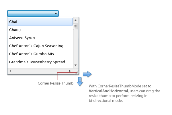
UXResizablePane is built with smart UI design enabling developers to elegantly address common UI and layout challenges. In addition to the layout resizer, you can also use UXResizablePane to provide resize capability to the content in a floating popup. To support this scenario, the control introduces the CornerThumbVisibility property. When set to Visible, the corner resize thumb will appear in the right bottom part of the control.
You can also specify how users interact with the corner resize thumb element by customizing the CornerThumbResizeMode property. By default, users can only resize horizontally. For bi-directional resizing (both vertically and horizontally), you change the property value to VerticalAndHorizontal.
The following code snippet shows how to customize a UXComboBox control and change the static popup content into a resizable content.
| XAML |
Copy Code
|
|---|---|
<Grid.Resources> <Style x:Key="ResizableComboBoxStyle" TargetType="Intersoft:UXComboBox"> <Setter Property="Background" Value="{StaticResource Button_Background}"/> <Setter Property="Foreground" Value="{StaticResource Button_Foreground}"/> ... <Setter Property="Template"> <Setter.Value> <ControlTemplate TargetType="Intersoft:UXComboBox"> <Grid x:Name="RootElement"> <VisualStateManager.VisualStateGroups> ... </VisualStateManager.VisualStateGroups> <Border x:Name="DropDownMenuContainer"> <Intersoft:UXPopup x:Name="PopupElement" BoundaryOffset="{TemplateBinding BoundaryOffset}" DisplayAnimation="{TemplateBinding DisplayAnimation}" ... > <Intersoft:UXResizablePane BorderBrush="{TemplateBinding DropDownBorderBrush}" BorderThickness="{TemplateBinding DropDownBorderThickness}" Background="{TemplateBinding DropDownBackground}" Effect="{TemplateBinding DropDownEffect}" MaxWidth="{TemplateBinding MaxDropDownWidth}" MaxHeight="{TemplateBinding MaxDropDownHeight}" MinHeight="{TemplateBinding MinDropDownHeight}" Height="{TemplateBinding DropDownHeightCalculated}" Width="{TemplateBinding DropDownWidth}" MinWidth="{TemplateBinding MinWidthCalculated}" AllowExpandCollapse="False" HeaderVisibility="Collapsed" ResizeThumbVisibility="Collapsed" CornerThumbVisibility="Visible" CornerThumbResizeMode="VerticalAndHorizontal"> <Intersoft:UXScrollViewer x:Name="ScrollElement" HorizontalAlignment="Stretch" HorizontalScrollBarVisibility="Visible" IsTabStop="False" Padding="2" VerticalScrollBarVisibility="Auto" VerticalAlignment="Stretch"> <ItemsPresenter x:Name="ItemsPresenter"/> </Intersoft:UXScrollViewer> </Intersoft:UXResizablePane> </Intersoft:UXPopup> </Border> ... </Grid> </ControlTemplate> </Setter.Value> </Setter> </Style> </Grid.Resources> <Intersoft:UXComboBox HorizontalAlignment="Center" VerticalAlignment="Center" Width="180" DropDownHeight="200" ItemsSource="{Binding Products}" DisplayMemberPath="ProductName" Style="{StaticResource ResizableComboBoxStyle}"/> |
|
The results look like the following illustration.
For more information about UXPopup's concept and features, see Popup Overview.
UXResizablePane derives from ExpandableGroupBox, which means they shared a variety of properties in common such as the header appearance related properties, image content model, and more. To learn more about header appearance and behaviors supported in UXResizablePane, see ExpandableGroupBox Overview.
In addition to the common header properties, UXResizablePane adds several properties that control the header appearance such as listed below.
 |
You can simulate the effect of removing the header line by setting the HeaderLineBorder to Transparent color. |
You can easily customize the UXResizablePane appearance through the following properties.
If you would like to completely customize the control appearance or if you want to change the styles of each visual state, you can edit the template of the control and do the modification accordingly.
To learn more how to customize the template and visual states, see Styles and Template Overview.
UXResizablePane is among the content controls in ClientUI that implements focus scope architecture. This means that input controls within the UXResizablePane would be logically grouped to provide focus related functions such as modal input, default button, group options, and more.
For more information about focus scope architecture, see User Experiences Overview.
For the list of ClientUI walkthroughs, see Walkthroughs and How-to Topics.
For the list of ClientUI samples available in local installation, see Locating the Samples in Local Installation.