
| Intersoft ClientUI 8 > ClientUI Controls > Control Library > Content Controls Overview > ExpandableGroupBox |
ExpandableGroupBox is an advanced content control that consists of a header and an expandable/collapsible content area.
It features a built-in expander button which is seamlessly synchronized with the content’s expanded state. In addition, a variety of settings are provided for easy header configuration such as line border, display mode, expand/collapse mode, and more.

ExpandableGroupBox is inherited from IsHeaderedContentControl, which means it has both Header and Content that can contain a single object of any type (such as a string, an image, or a panel). For more information about this content model see Content Model Overview.
You use ExpandableGroupBox control to display a single content that can be collapsed and expanded through the expander button attached to its header element. You set the title that appears in the header through the Header property. The ExpandableGroupBox is displayed in expanded state by default.
The following example shows how to define a simple ExpandableGroupBox in XAML.
| XAML |
Copy Code
|
|---|---|
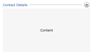
<Intersoft:ExpandableGroupBox Header="Contact Details"> <Grid Width="300" Height="150" Background="#FFF6F6F6"> <TextBlock Text="Content" HorizontalAlignment="Center" VerticalAlignment="Center" /> </Grid> </Intersoft:ExpandableGroupBox> |
|
 |
It is best practice to define the size in the content element of the ExpandableGroupBox instead of defining it in the control itself. This allows the ExpandableGroupBox to support fluid layout and perform smoother animation. |
The ExpandableGroupBox includes predefined UI elements for the header area which draws a 3D line followed with an expander button used to expand and collapse the content section, such as shown in the following figure.

By default, the ExpandableGroupBox is displayed in expanded state which can be customized through the IsExpanded property.
You set the IsExpanded property to false to display the ExpandableGroupBox in collapsed state.
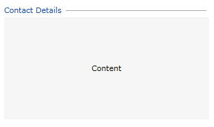
In certain scenarios, you may want to prevent users to collapse or expand a particular group in your user interface. You can achieve this scenario by setting the AllowExpandCollapse property to false, which consequently hide the expander button from the user interface.
The following illustration shows the ExpandableGroupBox with AllowExpandCollapse set to false.

ExpandableGroupBox derives from GroupBox, which means they shared a variety of properties in common such as the header appearance related properties, image content model, and more. To learn more about header appearance and behaviors supported in ExpandableGroupBox, see GroupBox Overview.
In addition to the common header properties, ExpandableGroupBox adds several properties that control the header appearance such as listed below.
 |
You can simulate the effect of removing the header line by setting the HeaderLineBorder to Transparent color. |
You can easily customize the ExpandableGroupBox appearance through the following properties.
If you would like to completely customize the control appearance or if you want to change the styles of each visual state, you can edit the template of the control and do the modification accordingly.
To learn more how to customize the template and visual states, see Styles and Template Overview.
ExpandableGroupBox is among the content controls in ClientUI that implements focus scope architecture. This means that input controls within the ExpandableGroupBox would be logically grouped to provide focus related functions such as modal input, default button, group options, and more.
For more information about focus scope architecture, see User Experiences Overview.
For the list of ClientUI walkthroughs, see Walkthroughs and How-to Topics.
For the list of ClientUI samples available in local installation, see Locating the Samples in Local Installation.