

| Intersoft ClientUI 8 > ClientUI Controls > Control Library > Advanced Content Controls Overview > UXNavigationPane |
UXNavigationPane is a rich user interface control modeled after the Outlook 2010 style navigation interface which allows you to display multiple content that share the same space on the screen, making it an ideal choice for large-scale navigation application. It features built-in navigation support and sophisticated UX features such as fluid items resizing, automatic overflow, and contextual menu.
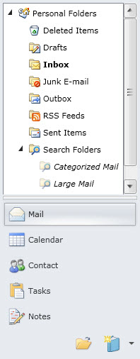
UXNavigationPane is inherited from ISHeaderedSelectionControl, which means it can be used to perform a single selection. You can also specify a content for the Header and customize the header template. You can use the selection properties to capture the currently selected item such as the SelectedIndex and SelectedItem properties.
For more information about selection control and content model, see ItemsControl Overview and Content Model Overview respectively.
You use UXNavigationPane to display multiple sections of content that share the same space on the screen. Each item generally contains a header and a content. The header is represented by a button control which is stacked together with the other items. The item's content will be displayed when its associated header is clicked. Unlike an accordion control, UXNavigationPane displays only one content at a time which is indicated by the selected item.
The following example shows a simple UXNavigationPane with five items.
| XAML |
Copy Code
|
|---|---|
<Intersoft:UXNavigationPane Width="250" SelectedIndex="0" VisibleItemCount="3"> <Intersoft:UXNavigationPaneItem Header="Mail" DisplayMode="ContentAndImage" Icon="/SLNavigationPane;component/images/Outlook/Mail.png"> <Grid> <TextBlock Text="Mail" /> </Grid> </Intersoft:UXNavigationPaneItem> <Intersoft:UXNavigationPaneItem Header="Calendar" DisplayMode="ContentAndImage" Icon="/SLNavigationPane;component/images/Outlook/Calendar.png"> <Grid> <TextBlock Text="Calendar" /> </Grid> </Intersoft:UXNavigationPaneItem> <Intersoft:UXNavigationPaneItem Header="Contacts" DisplayMode="ContentAndImage" Icon="/SLNavigationPane;component/images/Outlook/Contact.png"> <Grid> <TextBlock Text="Contacts" /> </Grid> </Intersoft:UXNavigationPaneItem> <Intersoft:UXNavigationPaneItem Header="Tasks" DisplayMode="ContentAndImage" Icon="/SLNavigationPane;component/images/Outlook/Tasks.png"> <Grid> <TextBlock Text="Tasks" /> </Grid> </Intersoft:UXNavigationPaneItem> <Intersoft:UXNavigationPaneItem Header="Notes" DisplayMode="ContentAndImage" Icon="/SLNavigationPane;component/images/Outlook/Notes.png"> <Grid> <TextBlock Text="Notes" /> </Grid> </Intersoft:UXNavigationPaneItem> </Intersoft:UXNavigationPane> |
|
UXNavigationPane comes with a modern user interface design which includes a number of predefined elements for rich user interaction features. An expanded navigation pane generally contains a content element, a resize thumb element, a list of visible items represented with button, a footer element to hold the overflowing items, and a dropdown menu to access the invisible items.
The following figure illustrates the UXNavigationPane user interface elements in expanded state.
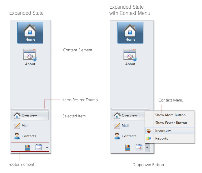
When the navigation pane is in minimized state, the user interface elements will be transformed to fit into the compact screen estate. In this mode, the content will be replaced with a "quick access" button. When clicked, the actual content will be displayed in a resizable floating popup.
The following figure illustrates the UXNavigationPane elements in minimized state.
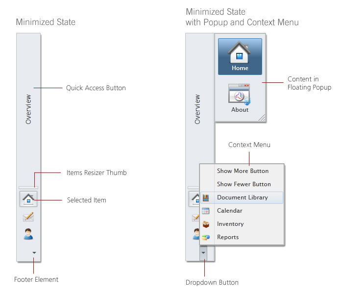
UXNavigationPane is built around the commanding semantics which allows the value changing interaction to be executed through declarative definition in the XAML markup. The commanding semantics is also an ideal approach for MVVM pattern development.
UXNavigationPane includes several predefined commands that you can use in your application such as listed below.
Represents a command that increase the value of VisibleItemCount property by one. This command can be invoked by clicking on the Show More Button.
Represents a command that decrease the value of VisibleItemCount property by one. This command can be invoke by clicking on the Show Fewer Button.
Although these commands are consumed in the elements of UXNavigationPane, you can raise these commands from other UIElement outside the UXNavigationPane scope. For examples, you can have a UXButton that performs ShowMoreButton command. For more information, see How-to: Register UXNavigationPane Command to UXButton.
UXNavigationPaneItem implements INavigationSource interface which means that you can use UXNavigationPaneItem to perform navigation to pages through the provided NavigateUri property. When the NavigateUri property is specified, the page navigation will occur when the item is selected, either through user interaction or programmatically.
The following example shows how to setup the UXNavigationPaneItem to navigate to a UXPage in a navigation frame.
| XAML |
Copy Code
|
|---|---|
<Intersoft:UXNavigationPane x:Name="NavPane" FooterButtonHeight="20" SelectedIndex="1" Header="Navigation Pane" IsExpanded="{Binding IsExpanded, ElementName=MainPane}"> <Intersoft:UXNavigationPaneItem Header="Mail" DisplayMode="ContentAndImage" Icon="/SLNavigationPane;component/images/Outlook/Mail.png" NavigateUri="/Mail"> <Grid> <ContentPresenter Content="Mail" /> </Grid> </Intersoft:UXNavigationPaneItem> <Intersoft:UXNavigationPaneItem Header="Calendar" DisplayMode="ContentAndImage" Icon="/SLNavigationPane;component/images/Outlook/Calendar.png" NavigateUri="/Calendar"> <Grid> <ContentPresenter Content="Calendar" /> </Grid> </Intersoft:UXNavigationPaneItem> <Intersoft:UXNavigationPaneItem Header=" Contact" DisplayMode="ContentAndImage" Icon="/SLNavigationPane;component/images/Outlook/Contact.png" NavigateUri="/Contact"> <Grid> <ContentPresenter Content="Contact" /> </Grid> </Intersoft:UXNavigationPaneItem> </Intersoft:UXNavigationPane> <Intersoft:UXFrame> <Intersoft:UXFrame.UriMapper> <Intersoft:UriMapper> <Intersoft:UriMapping Uri="" MappedUri="/Mail.xaml"/> <Intersoft:UriMapping Uri="/Error" MappedUri="/ErrorPage.xaml"/> <Intersoft:UriMapping Uri="/{page}" MappedUri="/{page}.xaml" /> </Intersoft:UriMapper> </Intersoft:UXFrame.UriMapper> </Intersoft:UXFrame> |
|
You can also create user-friendly URI to simplify the URI reference and enhance navigation experience. For more information about ClientUI navigation framework and its features, see Navigation Overview.
UXNavigationPane is built with fluid user interface design which allows you to define as much items as you need without compromising the application's layout and real screen estate. UXNavigationPane displays only a specific number of items in the main items container which is determined by the VisibleItemCount property. The rest of items, often called overflowing items, will be smartly placed in either the footer element or context menu depending on the available space.
The following code shows how to customize the VisibleItemCount property.
| XAML |
Copy Code
|
|---|---|
<Grid> <Intersoft:UXNavigationPane Width="250" VisibleItemCount="3"> <Intersoft:UXNavigationPaneItem Header="Mail" DisplayMode="ContentAndImage" Icon="/SLNavigationPane;component/images/Outlook/Mail.png"> Mail </Intersoft:UXNavigationPaneItem> <Intersoft:UXNavigationPaneItem Header="Calendar" DisplayMode="ContentAndImage" Icon="/SLNavigationPane;component/images/Outlook/Calendar.png"> Calendar </Intersoft:UXNavigationPaneItem> <Intersoft:UXNavigationPaneItem Header="Contacts" DisplayMode="ContentAndImage" Icon="/SLNavigationPane;component/images/Outlook/Contact.png"> Contacts </Intersoft:UXNavigationPaneItem> </Intersoft:UXNavigationPane> </Grid> |
|
Although UXNavigationPane displays only a number of items initially as specified in the VisibleItemCount property, users can increase or decrease the number of visible items at runtime by dragging the resize thumb element to the desired height. If you do not wish users to modify the number of visible items at runtime, you can disable the interactive resizing feature by setting the AllowResize property to false.
The item container type of the UXNavigationPane control is UXNavigationPaneItem. UXNavigationPaneItem uses content control architecture which allows you to put any arbitrary object to its Content. UXNavigationPaneItem extends the content model with ImageContent presentation to provide an efficient way to display an image in addition to the content itself.
The following example shows how to setup the UXNavigationPane to use ImageContent presentation and specify an image to the header of the items.
| XAML |
Copy Code
|
|---|---|
<Intersoft:UXNavigationPane Width="250" VisibleItemCount="3"> <Intersoft:UXNavigationPaneItem Header="Mail" DisplayMode="ContentAndImage" Icon="/SLNavigationPane;component/images/Outlook/Mail.png"> <Grid> <TextBlock Text="Mail" /> </Grid> </Intersoft:UXNavigationPaneItem> <Intersoft:UXNavigationPaneItem Header="Calendar" DisplayMode="ContentAndImage" Icon="/SLNavigationPane;component/images/Outlook/Calendar.png"> <Grid> <TextBlock Text="Calendar" /> </Grid> </Intersoft:UXNavigationPaneItem> <Intersoft:UXNavigationPaneItem Header="Contacts" DisplayMode="ContentAndImage" Icon="/SLNavigationPane;component/images/Outlook/Contact.png"> <Grid> <TextBlock Text="Contacts" /> </Grid> </Intersoft:UXNavigationPaneItem> <Intersoft:UXNavigationPaneItem Header="Tasks" DisplayMode="ContentAndImage" Icon="/SLNavigationPane;component/images/Outlook/Tasks.png"> <Grid> <TextBlock Text="Tasks" /> </Grid> </Intersoft:UXNavigationPaneItem> <Intersoft:UXNavigationPaneItem Header="Notes" DisplayMode="ContentAndImage" Icon="/SLNavigationPane;component/images/Outlook/Notes.png"> <Grid> <TextBlock Text="Notes" /> </Grid> </Intersoft:UXNavigationPaneItem> </Intersoft:UXNavigationPane> |
|
The result looks like the following figure.
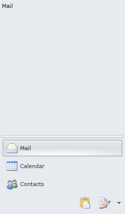
UXNavigationPane can be initially set to expanded or minimized state by customizing the IsExpanded property, which is set to true by default. As explained in the earlier section, the control automatically transforms the user interface elements according to the expanded or minimized state.
For the best user experiences, it is recommended to use UXNavigationPane together with a content control that supports built-in expand/collapse UI elements such as UXResizablePane. In such scenario, you can bind the IsExpanded property of the UXNavigationPane to the IsExpanded property of the UXResizablePane control. This allows both controls to synchronize the user interface state in realtime without requiring tightly coupling.
The following code shows how to implement the UXNavigationPane control within UXResizablePane, and implement binding for the IsExpanded property for seamless state synchronization.
| XAML |
Copy Code
|
|---|---|
<Intersoft:UXResizablePane x:Name="MainPane" Header="{Binding SelectedItem.Header, ElementName=NavPane}" MinWidth="54" Width="250" Margin="4,4,0,4" CollapseAction="KeepContentVisible" ResizeDock="Right" HorizontalAlignment="Left" IsExpanded="False"> <Intersoft:UXNavigationPane x:Name="NavPane" Header="Navigation Pane" IsExpanded="{Binding IsExpanded, ElementName=MainPane}"> <Intersoft:UXNavigationPaneItem Header="Mail" DisplayMode="ContentAndImage" Icon="/SLNavigationPane;component/images/Outlook/Mail.png"> <Grid> <ContentPresenter Content="Mail" /> </Grid> </Intersoft:UXNavigationPaneItem> <Intersoft:UXNavigationPaneItem Header="Calendar" DisplayMode="ContentAndImage" Icon="/SLNavigationPane;component/images/Outlook/Calendar.png"> <Grid> <ContentPresenter Content="Calendar" /> </Grid> </Intersoft:UXNavigationPaneItem> <Intersoft:UXNavigationPaneItem Header="Contact" DisplayMode="ContentAndImage" Icon="/SLNavigationPane;component/images/Outlook/Contact.png"> <Grid> <ContentPresenter Content="Contact" /> </Grid> </Intersoft:UXNavigationPaneItem> </Intersoft:UXNavigationPane> </Intersoft:UXResizablePane> |
|

For more information about UXResizablePane and its features, see UXResizablePane Overview.
In addition to the basic navigation capability such as explained in the earlier section, UXNavigationPane also supports many of the advanced features available in ClientUI navigation framework. One of the noteworthy features is the automatic synchronization with the current navigation URI.
When the NavigateUri property of UXNavigationPaneItem is specified and target a navigation frame that integrated to browser, the item will perform page navigation when it is selected. More importantly, the UXNavigationPaneItem will also be consistently selected when users navigate to a page that matches the item's NavigateUri through other means, such as typing directly in the browser's address bar, loading the page from browser's bookmark, or navigate to the page from other navigation source. In addition, the nested navigation source within the selected item will also be automatically synchronized to ensure consistent navigation experiences. To be more exact, the supported navigation source includes all controls that implement INavigationSource such as UXNavigationButton, UXToolBarButton, as well as UXTreeViewItem.
UXNavigationPane also supports the scenario where the NavigateUri property value might differ with the base navigation state to synchronize during page navigation. For examples, consider a scenario where the Mail item should navigate to /Mail/Inbox when clicked. However, the desired navigation state for synchronization is /Mail, so that page navigation to either /Mail, /Mail/Outbox, or /Mail/Follow-ups will automatically select the Mail item. To achieve this scenario, you set the NavigationState property of the UXNavigationPaneItem to the desired value that represents the base navigation URI to synchronize, such as shown in the following example.
| XAML |
Copy Code
|
|---|---|
<Intersoft:UXNavigationPane> <Intersoft:UXNavigationPaneItem Header="Overview" NavigateUri="/Overview/Home" NavigationState="/Overview" IsDefaultNavigationSource="True" Icon="Assets/Images/Home.png"> ... </Intersoft:UXNavigationPaneItem> <Intersoft:UXNavigationPaneItem Header="Mail" NavigateUri="/Mail/Inbox" NavigationState="/Mail" Icon="Assets/Images/Email.png"> ... </Intersoft:UXNavigationPaneItem> <Intersoft:UXNavigationPaneItem Header="Contacts" NavigateUri="/Contacts/All" NavigationState="/Contacts" Icon="Assets/Images/Contact.png"> ... </Intersoft:UXNavigationPaneItem> <Intersoft:UXNavigationPane> |
|
With these built-in navigation features, you can create rich business applications with the most reliable and consistent navigation interface without requiring additional effort or workaround.
The following figure illustrates how the automatic navigation synchronization works.
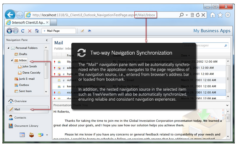
In the case that automatic synchronization is not desired, you can disable the behavior on a particular UXNavigationPaneItem by settings its SynchronizeNavigateUri property to false.
To learn more about ClientUI navigation framework, see Navigation Overview.
You can easily customize the UXNavigationPane appearance through the following properties.
If you would like to completely customize the control appearance or if you want to change the styles of each visual state, you can edit the template of the control and do the modification accordingly.
To learn more how to change the template and the visual states, see Styles and Template Overview.