
| Intersoft ClientUI 8 > ClientUI Fundamentals > Popup Overview |
The Popup control provides a way to display content in a separate layer that floats over the current application relative to a designated element or screen coordinate. This topic introduces the Intersoft ClientUI Popup control known as UXPopup and provides information about its usage.
This topic contains the following sections.
A UXPopup control displays content in a separate layer relative to an element or point on the screen. When the IsOpen property is set to True, UXPopup will show the content with a smooth animation.
This animation is one of the many added values from UXPopup that allows you to create richer application.
The following example shows how to define a UXPopup control. This example places the Button and UXPopup in a Grid panel. The content of the UXPopup appears in a TextBlock control, which displays its text in a separate layer that floats over the application near the Grid panel that host it.
| XAML |
Copy Code
|
|---|---|
<Grid x:Name="LayoutRoot" Background="White"> <Grid HorizontalAlignment="Center" VerticalAlignment="Center"> <Intersoft:UXPopup PreferredPosition="BottomLeft" x:Name="MyPopup"> <Grid Width="100" Height="100" Background="#FF8ECEFF"> <TextBlock TextWrapping="Wrap" Text="Put your popup content here" Margin="4"/> </Grid> </Intersoft:UXPopup> <Button Content="Button" VerticalAlignment="Top" Width="80" Click="Button_Click"/> </Grid> </Grid> |
|
| C# |
Copy Code
|
|---|---|
private void Button_Click(object sender, System.Windows.RoutedEventArgs e) { this.MyPopup.IsOpen = !this.MyPopup.IsOpen; } |
|
You can build UXPopup controls into other controls. The following controls implement the UXPopup control for specific uses:
These controls have also define commons properties as in UXPopup and behave similarly.
The UXPopup control provides functionality that enables you to customize its behavior and appearance. For example, you can set open and close behavior, animation, opacity and bitmap effects.
UXPopup control displays its content when the IsOpen property is set to True. By default there will be an overlay element that blocks the entire application so that if the user click at any elements outside the UXPopup contents, the UXPopup will be closed.
You can change this default behavior by setting the DisableOverlay property to True. Furthermore you can also used the StaysOpen property if you want to always display the UXPopup.
The Opened and Closed events are raised when the UXPopup is open or closed.
The UXPopup control has built-in support for the animations that are typically associated with behaviors like fade-in and slide-in. You can turn on these animations by setting the DisplayAnimation, HideAnimation, EnableFadeInAnimation, EnableFadeOutAnimation, SlideDirection properties. SlideDirection property is used when the DisplayAnimation and HideAnimation properties are set to Slide.
Although with these properties you can control each visual effects individually, it is advised not to mix match the animations for DisplayAnimation or HideAnimation, except if you want to disable one of the animation by setting the DisplayAnimation or HideAnimation property to None.
The Opacity property for a UXPopup control has no effect on its content.
The content of a UXPopup does not inherit bitmap effects, such as DropShadowEffect, that you directly set on the UXPopup control or on any other element in the parent window. For bitmap effects to appear on the content of a UXPopup, you must set the bitmap effect directly on its content. For example, if the child of a UXPopup is a StackPanel, set the bitmap effect on the StackPanel.
UXPopup control displays content in a separate layer that floats over an application. You can specify the position of a UXPopup relative to a control using the PreferredPosition, PreferredHorizontalDirection, PreferredVerticalDirection, HorizontalOffset, VerticalOffset and RelativeTo properties. These properties work together to give you flexibility in specifying the position of the UXPopup.
The position of UXPopup can be generalized into two types, one is relative and the other is absolute.
In absolute positioning, the position of UXPopup will be depends on the root element, you'll then need to specify the HorizontalOffset and VerticalOffset which determine the position of the UXPopup.
In relative positioning, the position of UXPopup will be depends on its bounding box which is the control itself. There are ten positions that you can choose from, they are:
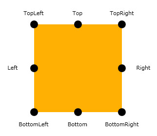
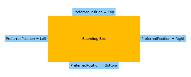
The following illustrations show how UXPopup positioning works.
Top, Left, Right and Bottom Positions
| XAML |
Copy Code
|
|---|---|
<Grid HorizontalAlignment="Center" VerticalAlignment="Center" Width="300" Height="150" Background="#FFFFBB00"> <Intersoft:UXPopup x:Name="UXPopup_Top" PreferredPosition="Top"> <Grid Background="#FF8ECEFF"> <TextBlock Text="PreferredPosition = Top" Margin="4"/> </Grid> </Intersoft:UXPopup> <Intersoft:UXPopup x:Name="UXPopup_Left" PreferredPosition="Left"> <Grid Background="#FF8ECEFF"> <TextBlock Text="PreferredPosition = Left" Margin="4"/> </Grid> </Intersoft:UXPopup> <Intersoft:UXPopup x:Name="UXPopup_Right" PreferredPosition="Right"> <Grid Background="#FF8ECEFF"> <TextBlock Text="PreferredPosition = Right" Margin="4"/> </Grid> </Intersoft:UXPopup> <Intersoft:UXPopup x:Name="UXPopup_Bottom" PreferredPosition="Bottom"> <Grid Background="#FF8ECEFF"> <TextBlock Text="PreferredPosition = Bottom" Margin="4"/> </Grid> </Intersoft:UXPopup> <TextBlock HorizontalAlignment="Center" Text="Bounding Box" VerticalAlignment="Center"/> </Grid> |
|
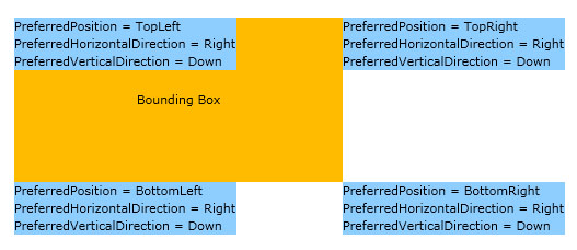
TopLeft, TopRight, BottomLeft and BottomRight positions
| XAML |
Copy Code
|
|---|---|
<Grid HorizontalAlignment="Center" VerticalAlignment="Center" Width="300" Height="150" Background="#FFFFBB00"> <Intersoft:UXPopup x:Name="UXPopup_TopLeft" PreferredPosition="TopLeft" PreferredHorizontalDirection="Right" PreferredVerticalDirection="Down"> <StackPanel Background="#FF8ECEFF"> <TextBlock Text="PreferredPosition = TopLeft"/> <TextBlock Text="PreferredHorizontalDirection = Right"/> <TextBlock Text="PreferredVerticalDirection = Down"/> </StackPanel> </Intersoft:UXPopup> <Intersoft:UXPopup x:Name="UXPopup_TopRight" PreferredPosition="TopRight" PreferredHorizontalDirection="Right" PreferredVerticalDirection="Down"> <StackPanel Background="#FF8ECEFF"> <TextBlock Text="PreferredPosition = TopRight"/> <TextBlock Text="PreferredHorizontalDirection = Right"/> <TextBlock Text="PreferredVerticalDirection = Down"/> </StackPanel> </Intersoft:UXPopup> <Intersoft:UXPopup x:Name="UXPopup_BottomRight" PreferredPosition="BottomRight" PreferredHorizontalDirection="Right" PreferredVerticalDirection="Down"> <StackPanel Background="#FF8ECEFF"> <TextBlock Text="PreferredPosition = BottomRight"/> <TextBlock Text="PreferredHorizontalDirection = Right"/> <TextBlock Text="PreferredVerticalDirection = Down"/> </StackPanel> </Intersoft:UXPopup> <Intersoft:UXPopup x:Name="UXPopup_BottomLeft" PreferredPosition="BottomLeft" PreferredHorizontalDirection="Right" PreferredVerticalDirection="Down"> <StackPanel Background="#FF8ECEFF"> <TextBlock Text="PreferredPosition = BottomLeft"/> <TextBlock Text="PreferredHorizontalDirection = Right"/> <TextBlock Text="PreferredVerticalDirection = Down"/> </StackPanel> </Intersoft:UXPopup> <TextBlock HorizontalAlignment="Center" Text="Bounding Box" VerticalAlignment="Center"/> </Grid> |
|
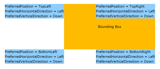
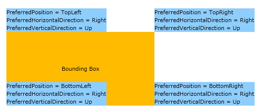
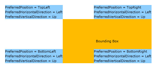
This positioning is determined by the PreferredPosition property. As you can see above, the Top, Left, Right, and Bottom mode always show the popup position in the center of each respective position, while the BottomLeft, BottomRight, TopLeft and TopRight include calculation that determined by PreferredHorizontalDirection and PreferredVerticalDirection.
See the following illustration to understand how these properties work together.
| XAML |
Copy Code
|
|---|---|
<Grid HorizontalAlignment="Center" VerticalAlignment="Center" Width="300" Height="150" Background="#FFFFBB00"> <Intersoft:UXPopup x:Name="UXPopup_TopLeft" PreferredPosition="TopLeft" PreferredHorizontalDirection="Left" PreferredVerticalDirection="Down"> <StackPanel Background="#FF8ECEFF"> <TextBlock Text="PreferredPosition = TopLeft"/> <TextBlock Text="PreferredHorizontalDirection = Left"/> <TextBlock Text="PreferredVerticalDirection = Down"/> </StackPanel> </Intersoft:UXPopup> <Intersoft:UXPopup x:Name="UXPopup_TopRight" PreferredPosition="TopRight" PreferredHorizontalDirection="Left" PreferredVerticalDirection="Down"> <StackPanel Background="#FF8ECEFF"> <TextBlock Text="PreferredPosition = TopRight"/> <TextBlock Text="PreferredHorizontalDirection = Left"/> <TextBlock Text="PreferredVerticalDirection = Down"/> </StackPanel> </Intersoft:UXPopup> <Intersoft:UXPopup x:Name="UXPopup_BottomRight" PreferredPosition="BottomRight" PreferredHorizontalDirection="Left" PreferredVerticalDirection="Down"> <StackPanel Background="#FF8ECEFF"> <TextBlock Text="PreferredPosition = BottomRight"/> <TextBlock Text="PreferredHorizontalDirection = Left"/> <TextBlock Text="PreferredVerticalDirection = Down"/> </StackPanel> </Intersoft:UXPopup> <Intersoft:UXPopup x:Name="UXPopup_BottomLeft" PreferredPosition="BottomLeft" PreferredHorizontalDirection="Left" PreferredVerticalDirection="Down"> <StackPanel Background="#FF8ECEFF"> <TextBlock Text="PreferredPosition = BottomLeft"/> <TextBlock Text="PreferredHorizontalDirection = Left"/> <TextBlock Text="PreferredVerticalDirection = Down"/> </StackPanel> </Intersoft:UXPopup> <TextBlock HorizontalAlignment="Center" Text="Bounding Box" VerticalAlignment="Center"/> </Grid> |
|
| XAML |
Copy Code
|
|---|---|
<Grid HorizontalAlignment="Center" VerticalAlignment="Center" Width="300" Height="150" Background="#FFFFBB00"> <Intersoft:UXPopup x:Name="UXPopup_TopLeft" PreferredPosition="TopLeft" PreferredHorizontalDirection="Right" PreferredVerticalDirection="Up"> <StackPanel Background="#FF8ECEFF"> <TextBlock Text="PreferredPosition = TopLeft"/> <TextBlock Text="PreferredHorizontalDirection = Right"/> <TextBlock Text="PreferredVerticalDirection = Up"/> </StackPanel> </Intersoft:UXPopup> <Intersoft:UXPopup x:Name="UXPopup_TopRight" PreferredPosition="TopRight" PreferredHorizontalDirection="Right" PreferredVerticalDirection="Up"> <StackPanel Background="#FF8ECEFF"> <TextBlock Text="PreferredPosition = TopRight"/> <TextBlock Text="PreferredHorizontalDirection = Right"/> <TextBlock Text="PreferredVerticalDirection = Up"/> </StackPanel> </Intersoft:UXPopup> <Intersoft:UXPopup x:Name="UXPopup_BottomRight" PreferredPosition="BottomRight" PreferredHorizontalDirection="Right" PreferredVerticalDirection="Up"> <StackPanel Background="#FF8ECEFF"> <TextBlock Text="PreferredPosition = BottomRight"/> <TextBlock Text="PreferredHorizontalDirection = Right"/> <TextBlock Text="PreferredVerticalDirection = Up"/> </StackPanel> </Intersoft:UXPopup> <Intersoft:UXPopup x:Name="UXPopup_BottomLeft" PreferredPosition="BottomLeft" PreferredHorizontalDirection="Right" PreferredVerticalDirection="Up"> <StackPanel Background="#FF8ECEFF"> <TextBlock Text="PreferredPosition = BottomLeft"/> <TextBlock Text="PreferredHorizontalDirection = Right"/> <TextBlock Text="PreferredVerticalDirection = Up"/> </StackPanel> </Intersoft:UXPopup> <TextBlock HorizontalAlignment="Center" Text="Bounding Box" VerticalAlignment="Center"/> </Grid> |
|
| XAML |
Copy Code
|
|---|---|
<Grid HorizontalAlignment="Center" VerticalAlignment="Center" Width="300" Height="150" Background="#FFFFBB00"> <Intersoft:UXPopup x:Name="UXPopup_TopLeft" PreferredPosition="TopLeft" PreferredHorizontalDirection="Left" PreferredVerticalDirection="Up"> <StackPanel Background="#FF8ECEFF"> <TextBlock Text="PreferredPosition = TopLeft"/> <TextBlock Text="PreferredHorizontalDirection = Left"/> <TextBlock Text="PreferredVerticalDirection = Up"/> </StackPanel> </Intersoft:UXPopup> <Intersoft:UXPopup x:Name="UXPopup_TopRight" PreferredPosition="TopRight" PreferredHorizontalDirection="Right" PreferredVerticalDirection="Up"> <StackPanel Background="#FF8ECEFF"> <TextBlock Text="PreferredPosition = TopRight"/> <TextBlock Text="PreferredHorizontalDirection = Left"/> <TextBlock Text="PreferredVerticalDirection = Up"/> </StackPanel> </Intersoft:UXPopup> <Intersoft:UXPopup x:Name="UXPopup_BottomRight" PreferredPosition="BottomRight" PreferredHorizontalDirection="Right" PreferredVerticalDirection="Up"> <StackPanel Background="#FF8ECEFF"> <TextBlock Text="PreferredPosition = BottomRight"/> <TextBlock Text="PreferredHorizontalDirection = Left"/> <TextBlock Text="PreferredVerticalDirection = Up"/> </StackPanel> </Intersoft:UXPopup> <Intersoft:UXPopup x:Name="UXPopup_BottomLeft" PreferredPosition="BottomLeft" PreferredHorizontalDirection="Right" PreferredVerticalDirection="Up"> <StackPanel Background="#FF8ECEFF"> <TextBlock Text="PreferredPosition = BottomLeft"/> <TextBlock Text="PreferredHorizontalDirection = Left"/> <TextBlock Text="PreferredVerticalDirection = Up"/> </StackPanel> </Intersoft:UXPopup> <TextBlock HorizontalAlignment="Center" Text="Bounding Box" VerticalAlignment="Center"/> </Grid> |
|
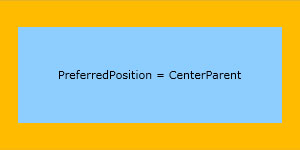
Center Parent position
| XAML |
Copy Code
|
|---|---|
<Grid HorizontalAlignment="Center" VerticalAlignment="Center" Width="300" Height="150" Background="#FFFFBB00"> <Intersoft:UXPopup x:Name="UXPopup_CenterParent" PreferredPosition="CenterParent"> <Grid Background="#FF8ECEFF"> <TextBlock Text="PreferredPosition = CenterParent" VerticalAlignment="Center" d:LayoutOverrides="Width" HorizontalAlignment="Center" Margin="40"/> </Grid> </Intersoft:UXPopup> </Grid> |
|
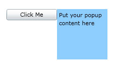
By default the bounding box of UXPopup is the control itself, you can customize this by specifying the RelativeTo property. The following code shows how to change the bounding box to another UIElement, in this case its a Button.
| XAML |
Copy Code
|
|---|---|
<Grid x:Name="LayoutRoot"> <Grid VerticalAlignment="Top" HorizontalAlignment="Left"> <Intersoft:UXPopup PreferredPosition="TopRight" x:Name="MyPopup" RelativeTo="{Binding ElementName=MyButton}"> <Grid Width="100" Height="100" Background="#FF8ECEFF"> <TextBlock TextWrapping="Wrap" Text="Put your popup content here" Margin="4"/> </Grid> </Intersoft:UXPopup> </Grid> <Button Width="100" Content="Click Me" x:Name="MyButton" HorizontalAlignment="Center" VerticalAlignment="Center" Click="MyButton_Click"/> </Grid> |
|
| C# |
Copy Code
|
|---|---|
private void Button_Click(object sender, System.Windows.RoutedEventArgs e) { this.MyPopup.IsOpen = !this.MyPopup.IsOpen; } |
|
Another powerful feature of UXPopup is that you can assign UXPopup to any UIElement and defines set of rules when the popup should be opened and closed easily. You can do this by specifying attached properties provided by UXPopup listed in the following.
The following code example shows how to assign UXPopup to an image. The UXPopup will be opened when the mouse is entering the Image element and will be closed when mouse is leaving the Image element.
| XAML |
Copy Code
|
|---|---|
<Grid x:Name="LayoutRoot"> <Intersoft:UXPopup PreferredPosition="BottomLeft" x:Name="MyPopup" DisableOverlay="False"> <Grid Width="150" Height="100" Background="#FF8ECEFF"> <TextBlock TextWrapping="Wrap" Text="Put your popup content here" Margin="4"/> </Grid> </Intersoft:UXPopup> <Image Source="/Hydrangeas.jpg" Stretch="Fill" HorizontalAlignment="Center" VerticalAlignment="Center" Width="100" Height="100" Intersoft:UXPopup.TargetMouseEnterAction="ShowPopup" Intersoft:UXPopup.TargetMouseLeaveAction="HidePopup" Intersoft:UXPopup.TargetPopup="{Binding ElementName=MyPopup}" Intersoft:UXPopup.TargetShowLatency="0.2" Intersoft:UXPopup.TargetHideLatency="0.2"/> </Grid> |
|
For more advanced examples about using these properties, see the following how-to topics.
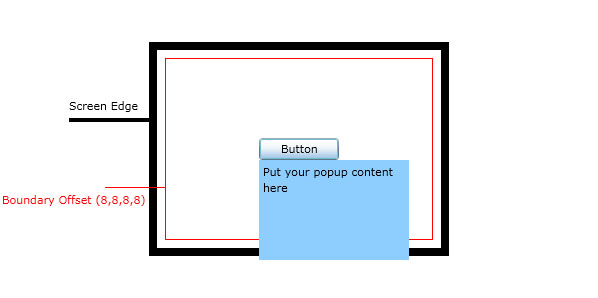
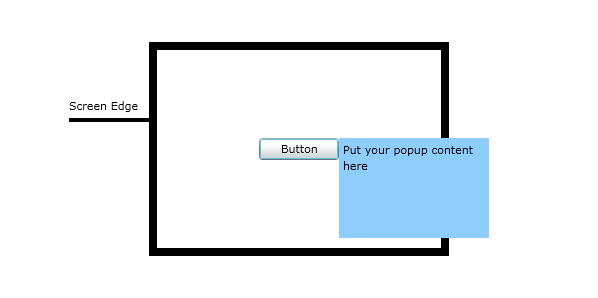
UXPopup can align to the edge of the screen by repositioning itself so the entire content is visible on the screen. When this occurs, the distance between the target origin and popup alignment point might differ from the values of HorizontalOffset and VerticalOffset. The following illustration shows how this feature works.
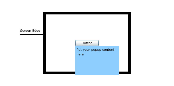
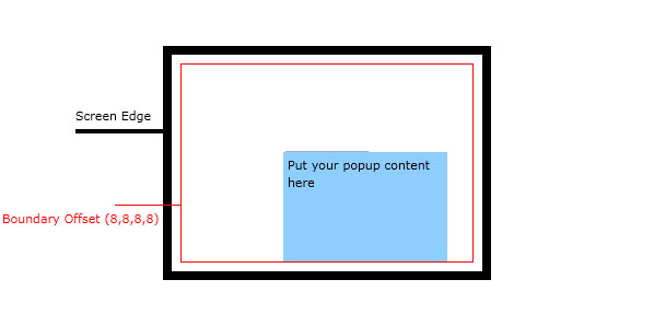
When the UXPopup show its content, some of the content can exceed the bottom screen edge. In this case, the popup will reposition itself so that the entire content is visible, such as shown in the following illustration.
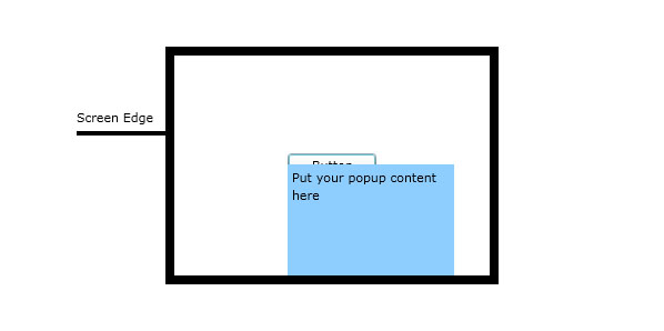
The same concept is also applied when the content of UXPopup is beyond any edges of the screen.
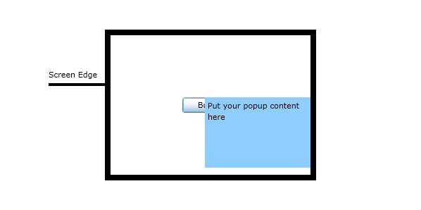
The Repositioned event is raised when the UXPopup is repositioned such as illustrated above.
Considering user experience aspects, there are certain scenarios where you do not want to align the popup to screen edge directly. You may want to have a certain distance from the screen edge as the boundary of the popup.
Using UXPopup you can achieve this scenario by specifying the BoundaryOffset property.
The following illustration shows how the boundary offset works.
