
| Intersoft ClientUI 8 > ClientUI Controls > Control Library > Toolbar and Menu Controls Overview > UXContextMenu |
UXContextMenu is an attachable context menu control with built-in animation and customizable positioning.

UXContextMenu is inherited from ISSelectionControl which means it has properties that indicates and controls the current selection such as SelectedIndex, SelectedItem, SelectedValue, SelectedValuePath, SelectedElement. You can bind these properties to a DataContext using object binding, or using MVVM pattern. To learn more about MVVM pattern, see MVVM Pattern Overview.
Any changes to one of the properties means that the current selection has changed, and it will synchronize the UI and other related properties automatically. To learn more about selection control see Items Control Overview.
UXContextMenu supports data binding / hierarchical binding. To learn more about data binding, see Data Binding Overview.
To bind to the item to a datasource, you can use ItemTemplate or the member path properties such as listed below.
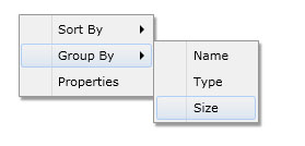
The following example shows how to perform hierarchical binding to UXContextMenu.
| Model |
Copy Code
|
|---|---|
using System.Collections.ObjectModel; using System.ComponentModel; namespace ClientUI.Samples.Models { public class ItemObject : INotifyPropertyChanged { private string _text; private ObservableCollection<ItemObject> _subItems; public string Text { get { return this._text; } set { if (this._text != value) { this._text = value; this.OnPropertyChanged("Text"); } } } public ObservableCollection<ItemObject> SubItems { get { return this._subItems; } set { if (this._subItems != value) { this._subItems = value; this.OnPropertyChanged("SubItems"); } } } protected void OnPropertyChanged(string propertyName) { if (this.PropertyChanged != null) { this.PropertyChanged(this, new PropertyChangedEventArgs(propertyName)); } } public event PropertyChangedEventHandler PropertyChanged; } } |
|
| View Model |
Copy Code
|
|---|---|
using System.Collections.ObjectModel; using System.ComponentModel; using ClientUI.Samples.Models; namespace ClientUI.Samples.ViewModels { public class MainPageViewModel : INotifyPropertyChanged { public MainPageViewModel() { this.Items = new ObservableCollection<ItemObject>(); ItemObject sortBy = new ItemObject() { Text = "Sort By" }; sortBy.SubItems = new ObservableCollection<ItemObject>(); sortBy.SubItems.Add(new ItemObject() { Text = "Name" }); sortBy.SubItems.Add(new ItemObject() { Text = "Type" }); sortBy.SubItems.Add(new ItemObject() { Text = "Size" }); ItemObject groupBy = new ItemObject() { Text = "Group By" }; groupBy.SubItems = new ObservableCollection<ItemObject>(); groupBy.SubItems.Add(new ItemObject() { Text = "Name" }); groupBy.SubItems.Add(new ItemObject() { Text = "Type" }); groupBy.SubItems.Add(new ItemObject() { Text = "Size" }); ItemObject properties = new ItemObject() { Text = "Properties" }; this.Items.Add(sortBy); this.Items.Add(groupBy); this.Items.Add(properties); } private ObservableCollection<ItemObject> _items; public ObservableCollection<ItemObject> Items { get { return this._items; } set { if (this._items != value) { this._items = value; this.OnPropertyChanged("Items"); } } } protected void OnPropertyChanged(string propertyName) { PropertyChangedEventHandler handler = PropertyChanged; if (handler != null) { handler(this, new PropertyChangedEventArgs(propertyName)); } } public event PropertyChangedEventHandler PropertyChanged; } } |
|
| View |
Copy Code
|
|---|---|
<UserControl x:Class="ClientUI.Samples.MainPage" xmlns="http://schemas.microsoft.com/winfx/2006/xaml/presentation" xmlns:x="http://schemas.microsoft.com/winfx/2006/xaml" xmlns:d="http://schemas.microsoft.com/expression/blend/2008" xmlns:mc="http://schemas.openxmlformats.org/markup-compatibility/2006" xmlns:Intersoft="http://intersoft.clientui.com/schemas" xmlns:vm="clr-namespace:ClientUI.Samples.ViewModels" mc:Ignorable="d" d:DesignHeight="400" d:DesignWidth="800"> <Grid x:Name="LayoutRoot" Background="White" Intersoft:ContextMenuService.ContextMenu="{Binding ElementName=ContextMenu1}"> <Grid.DataContext> <vm:MainPageViewModel></vm:MainPageViewModel> </Grid.DataContext> <Intersoft:UXContextMenu x:Name="ContextMenu1" HorizontalAlignment="Left" VerticalAlignment="Top" ItemsSource="{Binding Items}" DisplayMemberPath="Text" CollectionMemberPath="SubItems"> <Intersoft:UXContextMenu.ItemContainerStyle> <Style TargetType="Intersoft:UXMenuItem"> <Setter Property="DisplayMemberPath" Value="Text"></Setter> </Style> </Intersoft:UXContextMenu.ItemContainerStyle> </Intersoft:UXContextMenu> </Grid> </UserControl> |
|

This example is using MVVM pattern that uses advanced data binding concept. To learn more about MVVM pattern, see MVVM Pattern Overview.
The item container type of UXContextMenu is UXMenuItem.
UXMenuItem implements both ICommandSource and INavigationSource to support commanding and navigation, which is shown in the following example.
| XAML |
Copy Code
|
|---|---|
<Grid x:Name="LayoutRoot" Background="White" Intersoft:ContextMenuService.ContextMenu="{Binding ElementName=ContextMenu1}"> <Grid.DataContext> <vm:MainPageViewModel></vm:MainPageViewModel> </Grid.DataContext> <Intersoft:UXContextMenu x:Name="ContextMenu1" HorizontalAlignment="Left" VerticalAlignment="Top"> <Intersoft:UXMenuItem Header="Sort By"> <Intersoft:UXMenuItem Header="Name" Command="{Binding SortCommand}" CommandParameter="Name"/> <Intersoft:UXMenuItem Header="Type" Command="{Binding SortCommand}" CommandParameter="Type"/> <Intersoft:UXMenuItem Header="Size" Command="{Binding SortCommand}" CommandParameter="Size"/> </Intersoft:UXMenuItem> <Intersoft:UXMenuItem Header="Properties"/> <Intersoft:UXMenuItem Header="About Us" NavigateUri="www.mywebsite.com" TargetName="_blank"/> </Intersoft:UXContextMenu> </Grid> |
|
You can do commanding through Command, CommandTarget and CommandParameter properties and navigation using NavigateUri and TargetName properties. To learn more about commanding, see Commanding Overview. To learn more about navigation, see Navigation Overview.
To use UXContextMenu, you create a UXContextMenu anywhere in your page along with some items such as shown in the following code example.
| XAML |
Copy Code
|
|---|---|
<Intersoft:UXContextMenu x:Name="ContextMenu1" HorizontalAlignment="Left" VerticalAlignment="Top"> <Intersoft:UXMenuItem Header="UXMenuItem1"/> <Intersoft:UXMenuItem Header="UXMenuItem2"/> <Intersoft:UXMenuItem Header="UXMenuItem3"/> <Intersoft:UXSeparator/> <Intersoft:UXMenuItem Header="About MyApplication v1.0"/> </Intersoft:UXContextMenu> |
|
To attach the UXContextMenu to an element or control, you attach the ContextMenuService.ContextMenu or ContextMenuService.ContextMenuName property to the desired element, and specify the instance or name of the target context menu.
The following code example shows how to attach the context menu to your root element.
| XAML |
Copy Code
|
|---|---|
<Grid x:Name="LayoutRoot" Background="White" Intersoft:ContextMenuService.ContextMenu="{Binding ElementName=ContextMenu1}"> <Intersoft:UXContextMenu x:Name="ContextMenu1" HorizontalAlignment="Left" VerticalAlignment="Top"> <Intersoft:UXMenuItem Header="UXMenuItem1"/> <Intersoft:UXMenuItem Header="UXMenuItem2"/> <Intersoft:UXMenuItem Header="UXMenuItem3"/> <Intersoft:UXSeparator/> <Intersoft:UXMenuItem Header="About MyApplication v1.0"/> </Intersoft:UXContextMenu> </Grid> |
|

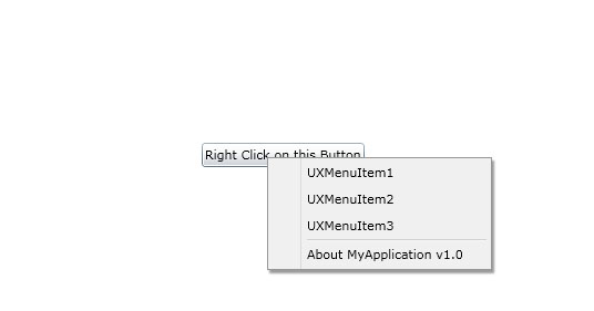
Beside attaching to an element, you can also attach the context menu to Silverlight or WPF controls such as a Button, which is shown in the following example.
| XAML |
Copy Code
|
|---|---|
<Grid x:Name="LayoutRoot" Background="White"> <Intersoft:UXContextMenu x:Name="ContextMenu1" HorizontalAlignment="Left" VerticalAlignment="Top"> <Intersoft:UXMenuItem Header="UXMenuItem1"/> <Intersoft:UXMenuItem Header="UXMenuItem2"/> <Intersoft:UXMenuItem Header="UXMenuItem3"/> <Intersoft:UXSeparator/> <Intersoft:UXMenuItem Header="About MyApplication v1.0"/> </Intersoft:UXContextMenu> <Button Content="Right Click on this Button" HorizontalAlignment="Center" VerticalAlignment="Center" Intersoft:ContextMenuService.ContextMenu="{Binding ElementName=ContextMenu1}"/> </Grid> |
|

Try right clicking at the button and compare it with the previous example.
UXContextMenu is built upon UXPopup architecture which means that it will always stay on the top of other elements in your application. You can display the context menu by right clicking on the element which was attached to, or through its IsOpen property. To learn more about the user experience features, see User Experiences Overview.
As the context menu is built upon UXPopup architecture, both the context menu and the popup shares a number of settings in common. The following list describes the properties that control the context menu animation.
Although these properties allow you to control each visual effects individually, it is advised that you avoid mixing the animation for DisplayAnimation or HideAnimation. If you want to disable certain animation, you can set the DisplayAnimation or HideAnimation property to None.
To learn more about the popup concept, see Popup Overview.
You can customize the UXContextMenu appearance through the following properties.
If you need to completely customize the control appearance or if you want to change the styles of each visual states, you can edit the template of the control and do the modification accordingly.
To learn more how to change the template and the visual states, see Styles and Template Overview.