

| Intersoft ClientUI 8 > ClientUI Controls > Control Library > Content Controls Overview > GroupBox |
GroupBox is a lightweight content control used to display a group of relevant information in a round-corner, stylish box.
It sports Windows 7-style group box with 3D round corner border and closed caption. A host of appearance properties enable you to easily customize the look-and-feel of the control, such as customizing the header’s position, display mode, icon, font size, and more.
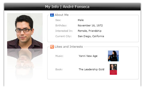
GroupBox is inherited from IsHeaderedContentControl, which means it has both Header and Content that can contain a single object of any type (such as a string, an image, or a panel). For more information about this content model see Content Model Overview.
You use GroupBox to represent a single object that defined in the Content property. To display a title to the GroupBox, you set the Header property to a string value that you desire.
The following example shows how to define a simple GroupBox in XAML.
| XAML |
Copy Code
|
|---|---|
<Intersoft:GroupBox Header="Likes and Interests" Width="300" Height="200"> <StackPanel VerticalAlignment="Center" HorizontalAlignment="Center"> <TextBlock Text="Content"/> </StackPanel> </Intersoft:GroupBox> |
|
GroupBox automatically measures the text width of the Header and draws a smooth round-corner 3D line around it, such as shown in the following figure.
You can customize many of the header settings and border appearance which are discussed later in this topic.
GroupBox provides a variety of properties that allow you to customize the appearance and behaviors related to the header such as discussed in the following sections.
GroupBox uses content control architecture which allows you to put any arbitrary object to its Header and Content. GroupBox extends the content model with ImageContent presentation to provide an efficient way to display an image to the Header.
The following example shows how to configure the GroupBox to add an Image to its Header.
| XAML |
Copy Code
|
|---|---|
<Intersoft:GroupBox Header="Likes and Interests" HeaderDisplayMode="ContentAndImage" HeaderImage="../Assets/Images/Interest.png" Width="300" Height="200"> <StackPanel VerticalAlignment="Center" HorizontalAlignment="Center"> <TextBlock Text="Content"/> </StackPanel> </Intersoft:GroupBox> |
|
The result looks like the following figure.
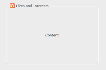
You can also customize a variety of settings related to the ImageContent model such as TextImageRelation, ImageWidth and ImageHeight. For more information, see Content Model Overview.
One of the unique features in the GroupBox is the capability to draw a smooth 3D border around the control. You can easily customize the appearance of the border such as the round corner radius, stroke thickness as well as the border brush.
The following example shows a simple GroupBox with customized border appearance, and then followed with the result.
| XAML |
Copy Code
|
|---|---|
<Intersoft:GroupBox Header="Likes and Interests" CornerRadius="12" StrokeThickness="1.2" BorderBrush="#FF0065C9" Width="300" Height="200"> <StackPanel VerticalAlignment="Center" HorizontalAlignment="Center"> <TextBlock Text="Content"/> </StackPanel> </Intersoft:GroupBox> |
|
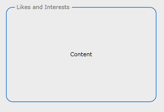
GroupBox offers two kind of built-in header presentation such as discussed in the following.
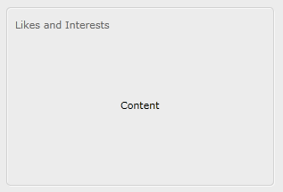
GroupBox provides several properties that let you easily customize the header appearance such as the HeaderFontSize and HeaderForeground property. The following example shows how to customize the header appearance of the group box.
| XAML |
Copy Code
|
|---|---|
<Intersoft:GroupBox Header="Likes and Interests" HeaderFontSize="12" HeaderForeground="Navy" Width="300" Height="200"> <StackPanel VerticalAlignment="Center" HorizontalAlignment="Center"> <TextBlock Text="Content"/> </StackPanel> </Intersoft:GroupBox> |
|
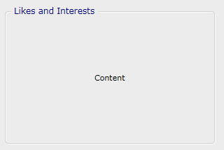
In certain cases, you may want to use a more complex UIElement for the header of the GroupBox. You can completely customize the header template by assigning a DataTemplate to the HeaderTemplate property of the GroupBox in XAML.
To learn more how to customize the template of a control, see Styles and Template Overview.
You can hide the header entirely by setting the HeaderVisibility property of the GroupBox to Collapsed.
You can easily customize the GroupBox appearance through the following properties.
If you would like to completely customize the control appearance or if you want to change the styles of each visual state, you can edit the template of the control and do the modification accordingly.
To learn more how to customize the template and visual states, see Styles and Template Overview.
GroupBox is among the content controls in ClientUI that implements focus scope architecture. This means that input controls within the GroupBox would be logically grouped to provide focus related functions such as modal input, default button, group options, and more.
For more information about focus scope architecture, see User Experiences Overview.
For the list of ClientUI walkthroughs, see Walkthroughs and How-to Topics.
For the list of ClientUI samples available in local installation, see Locating the Samples in Local Installation.