
| Intersoft ClientUI 8 > ClientUI Controls > Control Library > Windowing Controls Overview > UXCommandBar |
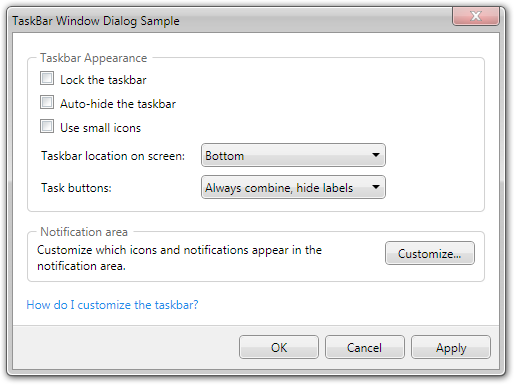
UXCommandBar is an items control designed specifically to host command buttons, although other UI elements are supported as well. Themed in Aero-theme by default, the command bar displays a 3D-style line separator in its top border which can be easily customizable through SeparatorBorder brush.
It also includes special access key and focus management features in which the contained buttons can be intuitively accessed through keyboard by pressing the first character of its text, i.e, c in Cancel.

UXCommandBar is an items control that derives from ISItemsControl class, which means that UXCommandBar can contain and display a collection of objects. You can display a collection of UIElement through the Items property, or a collection of data entity through the ItemsSource property.
For more information about items control, see Items Control Overview.
You use UXCommandBar to display a bar-like container that contains one or more command buttons such as UXButton. UXCommandBar is typically used within a dialog box, or a window, to represent the main actions of the dialog box like OK, Cancel and Apply. UXCommandBar is best displayed in the bottom edge of the dialog box.
By default, UXCommandBar draws a 3D line separator in the top border of the control, which can be customized through the SeparatorBorder property.
The following example shows how to setup UXCommandBar within a UXDialogBox.
| XAML |
Copy Code
|
|---|---|
<Intersoft:UXDialogBox xmlns="http://schemas.microsoft.com/winfx/2006/xaml/presentation" xmlns:x="http://schemas.microsoft.com/winfx/2006/xaml" xmlns:d="http://schemas.microsoft.com/expression/blend/2008" xmlns:mc="http://schemas.openxmlformats.org/markup-compatibility/2006" mc:Ignorable="d" xmlns:Intersoft="http://intersoft.clientui.com/schemas" x:Class="ClientUIApplication_Docs.Desktop.EditDialogBox" Header="EditDialogBox" ContentMargin="0" d:DesignWidth="640" d:DesignHeight="480"> <Grid x:Name="LayoutRoot"> <Grid.RowDefinitions> <RowDefinition/> <RowDefinition Height="44"/> </Grid.RowDefinitions> <Grid> <TextBlock Text="Put your content here." HorizontalAlignment="Center" VerticalAlignment="Center"/> </Grid> <Intersoft:UXCommandBar Height="44" VerticalAlignment="Bottom" Grid.Row="1"> <Intersoft:UXButton Content="OK" Width="80" IsDefault="True" DialogResult="OK"/> <Intersoft:UXButton Content="Cancel" Width="80" IsCancel="True"/> </Intersoft:UXCommandBar> </Grid> </Intersoft:UXDialogBox> |
|
UXCommandBar implements focus scope architecture which enables a variety of user experience features implemented in controls that support focus scope such as UXButton, UXToolBarButton and more. Specifically for UXCommandBar, it allows users to execute a button by simply pressing the first character of the button's text. Also known as access key, this behavior is implemented natively in the UXCommandBar and does not require you to write additional code.
To learn more about focus scope and other UX features, see User Experiences Overview.
You can easily customize the UXCommandBar appearance through the following properties.
If you would like to completely customize the control appearance or if you want to change the styles of each visual state, you can edit the template of the control and do the modification accordingly.
To learn how to customize the template and visual states, see Styles and Template Overview.
For the list of ClientUI walkthroughs, see Walkthroughs and How-to Topics.
For the list of ClientUI samples available in local installation, see Locating the Samples in Local Installation.