
| Intersoft ClientUI 8 > ClientUI Controls > Control Library > Navigation Controls Overview > UXNavigationButton |
UXNavigationButton is a full-featured button control featuring advanced navigation capabilities that seamlessly integrated to the UXFrame. With automatic state synchronization, the UXNavigationButton detects the current navigation session and intelligently activates the matching associated button. This feature applies to nested/children navigation too, thus delivers consistent navigation experiences without the hassles of writing extensive code.

You use UXNavigationButton to facilitate navigation across the pages in your application. When a UXNavigationButton is selected, it will become the active selection in the page and automatically deactivate the other navigation buttons in the page. At a glance, the UXNavigationButton works similar to the UXToggleButton, except the navigation button automates certain processes during the navigation and thus more suitable to be used as navigation source.
UXNavigationButton implements INavigationSource interface, which exposes NavigationUri and TargetName property. Therefore, UXNavigationButton can be used to facilitate navigation between pages in a valid navigation host such as UXFrame. To learn more about the navigation host and related features, see Navigation Overview.
The following example shows how to navigate to the pages in the project using UXNavigationButton.
| XAML |
Copy Code
|
|---|---|
<StackPanel Orientation="Horizontal" Intersoft:DockPanel.Dock="Top"> <Intersoft:UXNavigationButton Content="Home" NavigateUri="/Home"/> <Intersoft:UXNavigationButton Content="Products" NavigateUri="/Products"/> <Intersoft:UXNavigationButton Content="Services" NavigateUri="/Services"/> <Intersoft:UXNavigationButton Content="About" NavigateUri="/About"/> </StackPanel> |
|
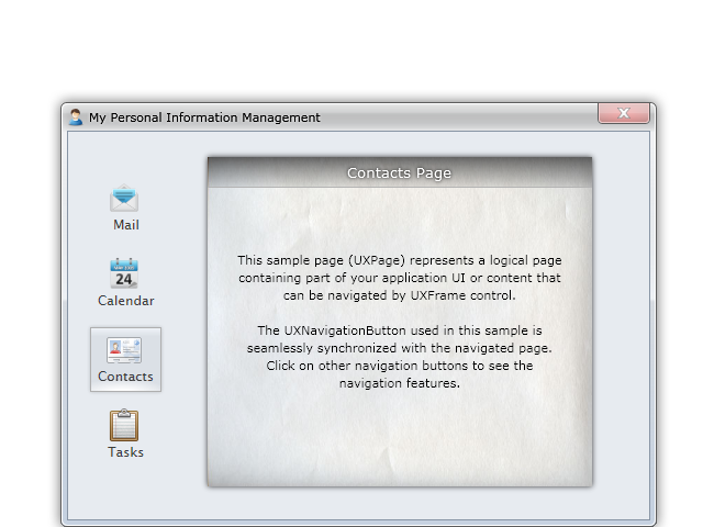
The result looks like the following figure.

For a more complete walkthrough that shows how to define the UXFrame and use UXNavigationButton to navigate to the pages in the frame, see Walkthrough: Create Simple Website Navigation Using Frame, Navigation Button and Hyperlink.
 |
If your page contains multiple UXFrame instances, you can set the UXNavigationButton to navigate the page on a particular frame by setting the TargetName property of the button to the name of the target frame. |
Beside local pages, you can also use UXNavigationButton to navigate to external URIs such as a web page. Certain safe protocols are supported as well, including http, https, and mailto.
If you navigate to an external web page, you can also set the target where the page will be displayed. You set the TargetName property to one of the following values:
The following example shows how to use UXNavigationButton to navigate to external URIs.
| XAML |
Copy Code
|
|---|---|
<StackPanel Orientation="Horizontal" Intersoft:DockPanel.Dock="Top"> <Intersoft:UXNavigationButton Content="ClientUI Home" NavigateUri="http://www.clientui.com"/> <Intersoft:UXNavigationButton Content="ClientUI Live Samples" NavigateUri="http://live.clientui.com" TargetName="_blank"/> <Intersoft:UXNavigationButton Content="Contact Us" NavigateUri="mailto:technical@intersoftpt.com"/> </StackPanel> |
|
One of the advanced features in ClientUI navigation framework is the seamless integration with the application framework to provide navigation capability to the external application package using the same semantics and API used in the navigation framework. As a result, you can rapidly create composite navigation application that capable to navigate to pages in an external package without writing extensive code.
For more information on how to navigate to external application packages using ClientUI navigation framework, see ClientUI Application Services.
For more information about the ClientUI application framework and its fundamental architecture and concepts, see Application Framework Overview.
UXNavigationButton derives from UXButton, which means it exposes all features and characteristics of UXButton, such as ImageContent presentation model, default and cancel button, dialog result, commanding, navigation, and more. To learn about the common features of button, see UXButton Overview.
UXNavigationButton also supports keyboard focus visual, access key and other UX features. For more information, see User Experiences Overview.
One of the unique features in UXNavigationButton is the automatic state synchronization when used with UXFrame for pages navigation. Regardless of the navigation source, UXNavigationButton automatically activates the particular button associated to the currently navigated page and consistently deactivates the other buttons. This handful feature enables you to rapidly add new pages to your application without have to manually write code to activate particular button during navigation.
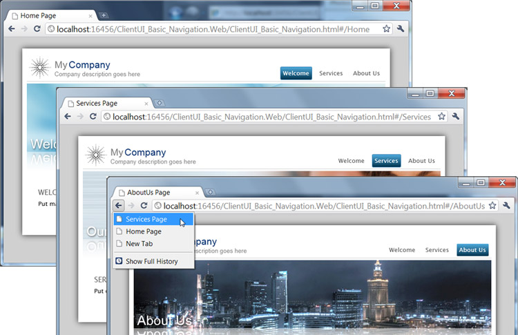
The UXNavigationButton is not only synchronized when the navigation is initiated from the user interface. It also consistently synchronized when the navigation is initiated from external source such as through the browser's address bar or history, such as shown in the following illustration.

This feature is made possible through the routed events architecture implemented in the ClientUI Navigation Framework. For more information about routed events, see Routed Events Overview.
 |
When the navigation framework is unable to find the navigation button that matches the current page, all the navigation buttons in the page would be deactivated. You can set a button as the default source, if desired, by setting the IsDefaultNavigationSource property of the navigation button to true. |
You can easily customize the UXNavigationButton appearance through the following properties.
If you would like to completely customize the control appearance or if you want to change the styles of each visual state, you can edit the template of the control and do the modification accordingly.
To learn how to customize the template and visual states, see Styles and Template Overview.
For the list of ClientUI walkthroughs, see Walkthroughs and How-to Topics.
For the list of ClientUI samples available in local installation, see Locating the Samples in Local Installation.