

| Intersoft ClientUI 8 > ClientUI Controls > Control Library > Advanced Input Controls Overview > UXRangeSliderBar |
UXRangeSliderBar is a unique slider bar control with two instances of UXThumb control for selecting a range of values. You can use mouse to drag the handle or directional arrows to move the handle. While dragging, press the Shift key to move both handles together while maintaining the value span.
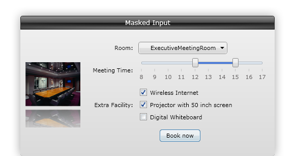
The track in UXRangeSliderBar represents the range span of values that can be selected by user. The lowest possible value in UXRangeSliderBar is specified in Minimum property, while the highest possible value is specified in Maximum property. The LargeChange and SmallChange properties indicates the value to be added or subtracted from the value of UXRangeSliderBar.
Unlike UXSliderBar, UXRangeSliderBar uses two selection properties, SelectionStart and SelectionEnd, to indicate the selected range of values. By default, both properties are set to NaN, which means the range selection starts from the lowest possible value specified in Minimum property and ends at the highest possible value specified in Maximum property.
The following example shows how to define a simple UXRangeSliderBar in XAML.
| View |
Copy Code
|
|---|---|
<Intersoft:UXRangeSliderBar HandlesVisibility="Visible" TickPlacement="BottomRight" Minimum="10" Maximum="50" LargeChange="5" SmallChange="1" SelectionStart="20" SelectionEnd="40"/> |
|

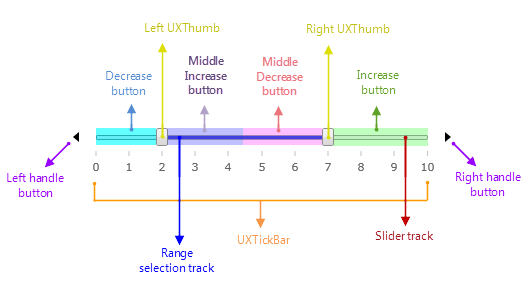
UXSliderBar mainly consists of two instances of UXThumb, a slider track, two instances of UXTickBar, two handle buttons, increase and decrease buttons, and middle increase and middle decrease buttons. By default, UXRangeSliderBar only shows the slider track and the two instances of UXThumb. To display the handle buttons and tick bar, you need to set HandlesVisibility and TickPlacement properties.
| View |
Copy Code
|
|---|---|
<StackPanel> <Intersoft:UXRangeSliderBar TickPlacement="BottomRight" /> <Intersoft:UXRangeSliderBar HandlesVisibility="Visible" /> </StackPanel> |
|
The following figure shows the structure of horizontal UXRangeSliderBar.
The following figure shows the structure of vertical UXRangeSliderBar.
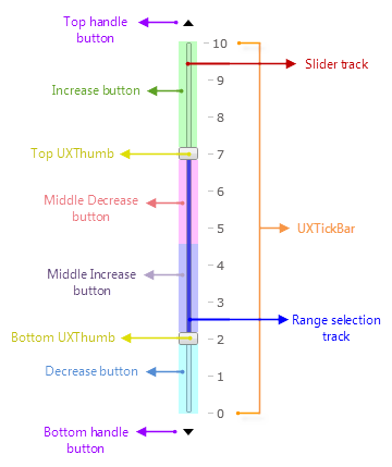
You can specify the orientation of UXRangeSliderBar to Horizontal or Vertical using Orientation property. In horizontal UXRangeSliderBar, the increasing value will start from left to right. In vertical UXRangeSliderBar, the increasing value will start from bottom to top.
Alternatively, you can set IsDirectionReversed property to reverse the direction of the increasing value. If IsDirectionReversed property is set to True, the increasing value will start from right to left in horizontal UXRangeSliderBar and from top to bottom in vertical UXRangeSliderBar.
The following example shows how to enable IsDirectionReversed in horizontal UXRangeSliderBar.
| View |
Copy Code
|
|---|---|
<Intersoft:UXRangeSliderBar IsDirectionReversed="True" TickPlacement="BottomRight" SelectionStart="2" SelectionEnd="7"/> |
|

To learn more about Orientation and IsDirectionReversed in UXRangeSliderBar, see How-to: Customize Orientation in UXRangeSliderBar.
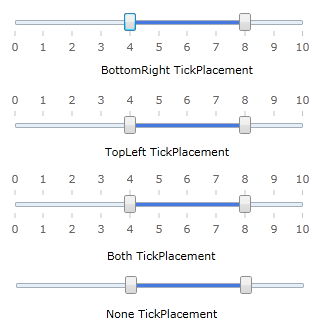
By default, the tick bar element are not displayed in UXRangeSliderBar. You can set TickPlacement property to set the position of UXTickBar with respect to the track of UXRangeSliderBar. The following options are available as the value of TickPlacement property:
Specifies that UXTickBar will be displayed below the track bar for horizontal UXRangeSliderBar, or to the right of the track bar for vertical UXRangeSliderBar.
Specifies that UXTickBar will be displayed above the track bar for horizontal UXRangeSliderBar, or to the left of the track bar for vertical UXRangeSliderBar.
Specifies that UXTickBar will displayed above and below the track bar for horizontal UXRangeSliderBar, or to the left and right of the track bar for vertical UXRangeSliderBar.
Specifies that no UXTickBar will be displayed in the UXRangeSliderBar.
The following example shows how to set the tick placement in horizontal UXRangeSliderBar.
| View |
Copy Code
|
|---|---|
<StackPanel> <Intersoft:UXRangeSliderBar SelectionStart="4" SelectionEnd="8" TickPlacement="BottomRight"/> <Intersoft:UXRangeSliderBar SelectionStart="4" SelectionEnd="8" TickPlacement="TopLeft"/> <Intersoft:UXRangeSliderBar SelectionStart="4" SelectionEnd="8" TickPlacement="Both"/> <Intersoft:UXRangeSliderBar SelectionStart="4" SelectionEnd="8" TickPlacement="None"/> </StackPanel> |
|
The following example shows how to set the tick placement in vertical UXRangeSliderBar.
| View |
Copy Code
|
|---|---|
<StackPanel Orientation="Horizontal"> <Intersoft:UXRangeSliderBar Orientation="Vertical" SelectionStart="4" SelectionEnd="8" TickPlacement="BottomRight"/> <Intersoft:UXRangeSliderBar Orientation="Vertical" SelectionStart="4" SelectionEnd="8" TickPlacement="TopLeft"/> <Intersoft:UXRangeSliderBar Orientation="Vertical" SelectionStart="4" SelectionEnd="8" TickPlacement="Both"/> <Intersoft:UXRangeSliderBar Orientation="Vertical" SelectionStart="4" SelectionEnd="8" TickPlacement="None"/> </StackPanel> |
|
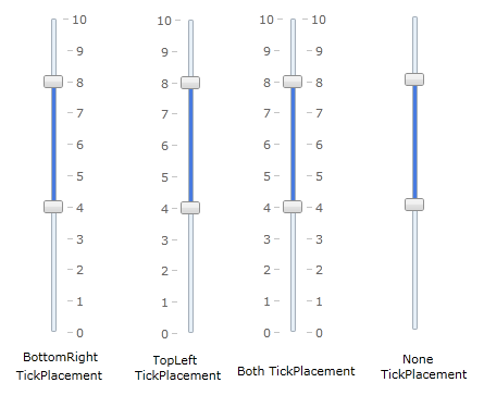
Both UXRangeSliderBar and UXTickBar contains properties that performs the same functionality. The following table shows UXRangeSliderBar properties and the corresponding UXTickBar properties to which they are bound.
| UXRangeSliderBar property | UXTickBar property |
|---|---|
| UXRangeSliderBar.IsDirectionReversed | UXTickBar.IsDirectionReversed |
| UXRangeSliderBar.LargeChange | UXTickBar.LargeChange |
| UXRangeSliderBar.SmallChange | UXTickBar.SmallChange |
| UXRangeSliderBar.Maximum | UXTickBar.Maximum |
| UXRangeSliderBar.Minimum | UXTickBar.Minimum |
| UXRangeSliderBar.TickContentVisibility | UXTickBar.ContentVisibility |
| UXRangeSliderBar.TickFormat | UXTickBar.TickFormat |
| UXRangeSliderBar.Ticks | UXTickBar.Ticks |
By default the tickbar items are generated automatically. Howewer, you can specify custom tickbar item collection using BottomRightTickBarStyle and TopLeftTickBarStyle properties.
BottomRightTickBarStyle will be applied to bottom UXTickBar in horizontal UXRangeSliderBar or to the right UXTickBar in vertical UXRangeSliderBar. TopLeftTickBarStyle property will be applied to top UXTickBar in horizontal UXRangeSliderBar or to the left UXTickBar in vertical UXRangeSliderBar.
To learn more about using custom tickbar item in UXRangeSliderBar, see How-to: Use Custom Tick Bar Item in UXRangeSliderBar.
By default, the handle buttons are not displayed in UXRangeSliderBar. In order, to display the handle buttons, you need to set HandlesVisibility property to Visible.
The following example shows how to display the handle buttons in UXRangeSliderBar.
| View |
Copy Code
|
|---|---|
<Intersoft:UXRangeSliderBar TickPlacement="BottomRight" HandlesVisibility="Visible" SelectionStart="3" SelectionEnd="7" /> |
|

UXRangeSliderBar is built around the commanding semantics which allows the value changing interaction to be executed through declarative definition in the XAML markup. The commanding semantics is also an ideal approach for MVVM pattern development.
In order to know whether the value of SelectionStart or SelectionEnd property to be changed, UXRangeSliderBar needs to know which UXThumb will be affected by the command. If the command is applied to the left or bottom UXThumb, the value of SelectionStart will be changed. If the command is applied to the right or top UXThumb, the value of SelectionEnd will be changed.
To serve this purpose, each handle buttons and decrease and increase buttons are tagged with the affected UXThumb info. For example: in horizontal UXRangeSliderBar, the decrease button is tagged with left UXThumb info, so when it is clicked, UXRangeSliderBar will perform DecreaseLarge command to the left UXThumb, which will affect the value of SelectionStart property.
When key gesture is invoked, UXRangeSliderBar will invoke the command based on the active UXThumb. If the right UXThumb is active and you press the Up key, UXRangeSliderBar will invoke the IncreaseLarge command to the right UXThumb, which will affect the value of SelectionEnd property.
UXRangeSliderBar already includes several predefined commands to change the selected value that you can use in your application.
Gets a command that decreases the UXRangeSliderBar's SelectionStart or SelectionEnd value by the same amount as the SmallChange property.
DecreaseSmall command will be invoked when you perform the following action:
The value of SelectionStart property will be subtracted.
If the left or bottom UXThumb is active, the value of SelectionStart will be subtracted. If the right or top UXThumb is active, the value of SelectionEnd will be subtracted.
Gets a command that decreases the value of the UXRangeSliderBar by the same amount as the LargeChange property.
DecreaseLarge command will be invoked when you perform the following action:
The value of SelectionStart property will be subtracted.
The value of SelectionEnd property will be subtracted.
If the left or bottom UXThumb is active, the value of SelectionStart will be subtracted. If the right or top UXThumb is active, the value of SelectionEnd property will be subtracted.
Gets a command that increases the value of the UXRangeSliderBar by the same amount as the SmallChange property.
IncreaseSmall command will be invoked when you perform the following action:
The value of SelectionEnd property will be added.
If the left or bottom UXThumb is active, the value of SelectionStart will be added. If the right or top UXThumb is active, the value of SelectionEnd will be added.
Gets a command that increases the value of the UXRangeSliderBar by the same amount as the LargeChange property.
IncreaseLarge command will be invoked when you perform the following action:
The value of SelectionEnd property will be added.
The value of SelectionStart property will be added.
If the left or bottom UXThumb is active, the value of SelectionStart will be added. If the right or top UXThumb is active, the value of SelectionEnd property will be added.
Gets a command that sets the value of SelectionStart property to the value of Minimum property.
Minimize command will be invoked when you press the Home keyboard key.
Gets a command that sets the value of SelectionEnd property to the value of Maximum property.
Maximize command will be invoked when you press the End keyboard key.
Although these commands are already registered in the elements of UXRangeSliderBar, you can still register these commands to other UIElement outside UXRangeSliderBar scope. For example, you can have a UXButton that performs DecreaseLarge command. For more information on how to register UXRangeSliderBar commands to other type of UIElement, see How-to: Register UXRangeSliderBar Command to UXButton.
You can use some options of user interaction to change the value of SelectionStart and SelectionEnd properties in UXRangeSliderBar.
You can move one of the UXThumb controls along the UXRangeSliderBar track to select a range of value. The UXThumb cannot be moved passed the other UXThumb. For example, if you move the first UXThumb, you cannot move it past than the second UXThumb and vice versa. This behavior is implemented to ensure the validity of the selected range value.
When you move one of the UXThumb, the value of SelectionStart or the SelectionEnd property will be changed. If you want to maintain the selected range value and move both UXThumb instances, you can use the Shift key. When you press the Shift key while moving one of the UXThumb, both UXThumb instances will move together. In this case, the value of both SelectionStart and SelectionEnd properties will be changed.
Some key gestures are already registered to UXRangeSliderBar commands. You can use Up, Down, Left, and Right keys to invoke DecreaseSmall and IncreaseSmall command action to the active UXThumb. To invoke DecreaseLarge and IncreaseLarge command action, you can use PageUp and PageDown keys. You can also use Home key to perform Minimize command action and End key to perform Maximize command action.
You can use Shift key along with the arrow keys to apply the command to both UXThumb instances.
As explained above, these buttons are also registered to UXRangeSliderBar commands. These buttons are actually UXRepeatButton control, so they shares the same behavior implemented in UXRepeatButton control, such as Delay and Interval properties. When you press Middle Decrease button, UXRangeSliderBar will invoke DecreaseLarge command action to the right or top UXThumb, which will affect the value of SelectionEnd property. Note that these buttons will be reversed when IsDirectionReversed property is set to True.
The handle buttons are also UXRepeatButton control, so they also shares the same behavior implemented in UXRepeatButton control, such as Delay and Interval properties. When you press the Left or Bottom handle button, UXRangeSliderBar will invoke DecreaseSmall command action to the left or bottom UXThumb. When you press the Right or Top handle button, UXRangeSliderBar will invoke IncreaseSmall command action to the right or top UXThumb. Note that the handle buttons will be reversed if IsDirectionReversed property is set to True.
You can enable snap to tick behavior in UXRangeSliderBar using IsSnapToTickEnabled property. When this property is enabled, all user interaction to change the value of SelectionStart and SelectionEnd properties will be adjusted to the closest tickbar item. When you select a position within a tickbar range, it will be adjusted to the closest tickbar item. For example, when you select 3.2 as the selection start of a UXRangeSliderBar that starts from 0 to 10 with LargeChange set to 1, the selection start will be adjusted to the closest tickbar item, which is 3.
| View |
Copy Code
|
|---|---|
<Intersoft:UXRangeSliderBar TickPlacement="BottomRight" HandlesVisibility="Visible" SelectionStart="3" SelectionEnd="7" IsSnapToTickEnabled="True" /> |
|
Snap to tick behavior is implemented in all user interaction of UXRangeSliderBar. When you press the arrow keys or handle buttons, the UXThumb will snap to the previous or next tickbar item. When you drag UXThumb and moves along the track, the UXThumb will snap to the previous or next tickbar item based on the movement.
When snap to tick behavior is enabled, you can still enable precision selection by pressing Ctrl key. If you press Ctrl key while pressing the keyboard keys or buttons or moving the UXThumb, UXThumb will not snap to the closest tickbar item.
Since this behavior is implemented for user interaction only, you can still set the value of UXRangeSliderBar programmatically without invoking the snap to tick. For example: if you use UXButton to set the value of SelectionEnd to 8.2, UXRangeSliderBar will not adjust the value to the closest tickbar item.
To learn more about snap to tick behavior, see How-to: Enable Snap to Tick Behavior in UXRangeSliderBar.
By default when you click the decrease, middle increase, middle decrease, and increase button, UXRangeSliderBar will invoke DecreaseLarge and IncreaseLarge command. Alternatively, you can use IsMoveToPointEnabled property to enable another behavior where UXThumb will immediately moves to the location of the mouse click when you click on these buttons. The value of SelectionStart or SelectionEnd will be adjusted changed based on the button clicked and the position of the UXThumb.
| View |
Copy Code
|
|---|---|
<Intersoft:UXRangeSliderBar TickPlacement="BottomRight" HandlesVisibility="Visible" SelectionStart="3" SelectionEnd="7" IsMoveToPointEnabled="True" /> |
|
If IsSnapToTickEnabled property is also set to True, the value of UXRangeSliderBar will be adjusted based on the closest tick bar item. In the above sample, if you click on the a position where the selection start will be set to 4.2, the value of SelectionStart property will be adjusted to the closest tickbar item, which is 4.
You can set the minimum and maximum range span allowed in UXRangeSlider using MinimumRangeSpan and MaximumRangeSpan properties. When these properties are specified, the selected range value will be limited. You cannot select a range of value that is smaller than the value of MinimumRangeSpan property or larger than the value of MaximumRangeSpan property.
The following example shows how to set the minimum range span to 3 and the maximum range span to 5. Using this configuration, user cannot select a range of values smaller than 3 or larger than 5.
| View |
Copy Code
|
|---|---|
<Intersoft:UXRangeSliderBar TickPlacement="BottomRight" HandlesVisibility="Visible" SelectionStart="4" SelectionEnd="7" MinimumRangeSpan="3" MaximumRangeSpan="5" /> |
|
Note that this feature is applied to user interaction only. You can programmatically select a range of values that does not meet the minimum and maximum range span limitation.
By default, the MinimumRangeSpan property is set to 0 and MaximumRangeSpan property is set to NaN. This configuration allows user to select any range span of values without limitation.
In UXRangeSliderBar, the area between the two UXThumb is the selected range of values, indicated by a blue track. By default this track is divided into two, middle increase and middle decrease button area. You can click on these areas to invoke the DecreaseLarge or IncreaseLarge commands.
Alternatively, you can enable another mode in UXRangeSliderBar using IsDragRangeEnabled property, which enables users to move the range selection track. In this mode, the DecreaseLarge and IncreaseLarge commands will not be invoked. You can drag the range selection area and both values of SelectionStart and SelectionEnd properties will be changed.
| View |
Copy Code
|
|---|---|
<Intersoft:UXRangeSliderBar TickPlacement="BottomRight" HandlesVisibility="Visible" SelectionStart="4" SelectionEnd="7" IsDragRangeEnabled="True" /> |
|
When you moves UXThumb along the track, it is useful to have a tooltip that contains the value of the hovered position. To display the tooltip, you can set AutoTooltipVisibility property to True.
The following example shows how to enable auto tooltip in UXRangeSliderBar.
| View |
Copy Code
|
|---|---|
<Intersoft:UXRangeSliderBar TickPlacement="BottomRight" AutoTooltipVisibility="Visible" HandlesVisibility="Visible" SelectionStart="4" SelectionEnd="7"/> |
|

When you press Shift key while moving the UXThumb, both UXThumb will be moved. In this case, the tooltip will be displayed for both UXThumb instances.

Besides that, you can also set the following properties in the tooltip.
Gets or sets the placement of the tooltip when it is displayed.
Gets or sets the format string applied to the content of the tooltip.
You can apply the standard numeric format string to the content of the tooltip. For more information on standard numeric format string, see Standards Numeric Format Strings.
Gets or set the horizontal direction of the tooltip popup.
Gets or set the vertical direction of the tooltip popup.
To learn more about auto tooltip, see How-to: Configure Auto ToolTip in UXRangeSliderBar.
As an input control, you can enable data validation in UXRangeSliderBar. When the value of UXRangeSliderBar is bound to a data entity, you can throw an exception when the data is invalid. The following example shows how to validate that the price range in UXSliderBar is between 200,000 USD and 600,000 USD range.
| View |
Copy Code
|
|---|---|
<UserControl x:Class="ClientUI.Samples.Views.PropertyFinder" xmlns="http://schemas.microsoft.com/winfx/2006/xaml/presentation" xmlns:x="http://schemas.microsoft.com/winfx/2006/xaml" xmlns:d="http://schemas.microsoft.com/expression/blend/2008" xmlns:mc="http://schemas.openxmlformats.org/markup-compatibility/2006" xmlns:Intersoft="http://intersoft.clientui.com/schemas" xmlns:ViewModels="clr-namespace:ClientUI.Samples.ViewModels" mc:Ignorable="d" d:DesignHeight="300" d:DesignWidth="400"> <UserControl.Resources> <ViewModels:PropertyFinderViewModel x:Key="PropertyFinderViewModel"></ViewModels:PropertyFinderViewModel> </UserControl.Resources> <Grid x:Name="LayoutRoot" Background="White" DataContext="{StaticResource PropertyFinderViewModel}"> <Intersoft:FieldLabel Header="Select Price (in 1000 USD.): " HeaderWidth="170" VerticalAlignment="Top"> <Intersoft:UXRangeSliderBar HandlesVisibility="Visible" TickPlacement="BottomRight" TickFormat="C0" Minimum="100" Maximum="700" LargeChange="100" SmallChange="10" SelectionStart="{Binding PropertyFinder.StartPrice, Mode=TwoWay, ValidatesOnDataErrors=True, ValidatesOnExceptions=True}" SelectionEnd="{Binding PropertyFinder.EndPrice, Mode=TwoWay, ValidatesOnDataErrors=True, ValidatesOnExceptions=True}"/> </Intersoft:FieldLabel> </Grid> </UserControl> |
|

To learn more about data validation in UXRangeSliderBar, see How-to: Enable Data Validation in UXRangeSliderBar.