
| Intersoft ClientUI 8 > ClientUI Controls > Control Library > Advanced Input Controls Overview > UXTickBar |
UXTickBar is a control used to render a set of tickbar items, such as used in UXSliderBar and UXRangeSliderBar controls.

UXTickBar uses the value of Minimum, Maximum, and LargeChange properties to calculate the number of tickbar items to be displayed.
The following example shows how to create a tick bar that renders five tickbar items that starts from 2 and ends at 10. The value of LargeChange property determines the position where each tickbar item will be rendered with respect of Minimum and Maximum value.
| View |
Copy Code
|
|---|---|
<Intersoft:UXTickBar Minimum="2" Maximum="10" LargeChange="2"> </Intersoft:UXTickBar> |
|

By default, as you can see in the above figure, the content of each tickbar item is generated automatically. Alternatively, you can specify custom content for each tick bar item by specifying the Items collection. Note that the number of items will still be determined by Minimum, Maximum, and LargeChange properties. This means, in order to achieve the same layout, you need to specify the same number of tickbar items with custom content.
The following example shows how to create a tick bar with custom content for each tick bar item.
| View |
Copy Code
|
|---|---|
<Intersoft:UXTickBar Minimum="2" Maximum="10" LargeChange="2"> <Intersoft:UXTickBarItem Content="Item 2" /> <Intersoft:UXTickBarItem Content="Item 4" /> <Intersoft:UXTickBarItem Content="Item 6" /> <Intersoft:UXTickBarItem Content="Item 8" /> <Intersoft:UXTickBarItem Content="Item 10" /> </Intersoft:UXTickBar> |
|

UXTickBar is an items control that derives from ISItemsControl class, which means that UXTickBar can contain and display a collection of objects. You can display a collection of UIElement through the Items property, or a collection of data entity through the ItemsSource property. When UXTickBar is bound to a collection of data entity, the tickbar item will not be generated automatically. The tickbar item will be considered as tickbar item with custom content.
| View |
Copy Code
|
|---|---|
<Intersoft:UXTickBar Minimum="1" ItemsSource="{Binding Data}" DisplayMemberPath="NumeralText"/> |
|
For more information about items control, see Items Control Overview. To learn more about data binding in UXTickBar, see How-to: Bind Data to UXTickBar.
The item container type of UXTickBar is UXTickBarItem. Each UXTickBarItem contains a pointer element and a content element. The content of each tickbar item is not restricted to string type only. You can specify other UIElement as the content of UXTickBarItem. Besides that, you can choose to show either the pointer or content element only using PointerVisibility and ContentVisibility properties.
The following example shows how to hide pointer element in UXTickBar.
| View |
Copy Code
|
|---|---|
<Intersoft:UXTickBar PointerVisibility="Collapsed"/> |
|

The following example shows how to hide content element in UXTickBar.
| View |
Copy Code
|
|---|---|
<Intersoft:UXTickBar ContentVisibility="Collapsed"/> |
|

By default, the width and height of the pointer element is 1 pixel and 5 pixel respectively. You can simply customize the size of the pointer element using PointerWidth and PointerHeight properties. Besides that, the pointer can be positioned to Top, Left, Bottom, or Right using PointerPosition property.
| View |
Copy Code
|
|---|---|
<StackPanel Width="400" VerticalAlignment="Center"> <Intersoft:UXTickBarItem Content="Item 1" PointerWidth="5" PointerHeight="10" /> <Intersoft:UXTickBarItem Content="Item 2" PointerPosition="Left"/> <Intersoft:UXTickBarItem Content="Item 3" PointerPosition="Right"/> <Intersoft:UXTickBarItem Content="Item 4" PointerPosition="Top"/> <Intersoft:UXTickBarItem Content="Item 5" PointerPosition="Bottom"/> </StackPanel> |
|
You can use PointerTemplate to fully customize the appearance of the pointer. For more information on how to customize the pointer appearance using PointerTemplate, see How-to: Customize Pointer Element in UXTickBar.
When the tickbar items are generated automatically, UXTickBar will use the value of each tickbar item as the content of the item. You can set the format string of tickbar items' content using TickFormat property. You can apply the standard numeric format string to the content of the tickbar item. For more information on standard numeric format string, see Standards Numeric Format Strings.
The following example shows how to apply one digit decimal format string to the tickbar items.
| View |
Copy Code
|
|---|---|
<Intersoft:UXTickBar Maximum="5" LargeChange="0.5" TickFormat="F1"/> |
|

You can customize the appearance of UXTickBar using the following properties:
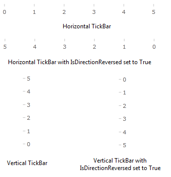
You can specify the orientation of UXTickBar to Horizontal or Vertical using Orientation property. In horizontal UXTickBar, the tick bar items will be displayed from left to right. In vertical UXTickBar, the tick bar items will be displayed from bottom to top. Alternatively, you can set IsDirectionReversed property to reverse the direction of the increasing value. If IsDirectionReversed property is set to True, the tick bar items will be displayed from right to left in horizontal UXTickBar and from top to bottom in vertical UXTickBar.
| View |
Copy Code
|
|---|---|
<StackPanel Width="300" VerticalAlignment="Center"> <Intersoft:UXTickBar Maximum="5" Orientation="Horizontal"/> <Intersoft:UXTickBar Maximum="5" Orientation="Horizontal" IsDirectionReversed="True"/> <StackPanel Orientation="Horizontal"> <Intersoft:UXTickBar Maximum="5" Orientation="Vertical" PointerPosition="Right"/> <Intersoft:UXTickBar Maximum="5" Orientation="Vertical" PointerPosition="Right" IsDirectionReversed="True"/> </StackPanel> </StackPanel> |
|

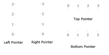
Similar to the UXTickBarItem, you can set the position of the pointer to Top, Left, Bottom, or Right using PointerPosition property.
The following example shows how to set the position of the pointer in UXTickBar.
| View |
Copy Code
|
|---|---|
<StackPanel Width="300" VerticalAlignment="Center"> <Intersoft:UXTickBar Maximum="5" Orientation="Horizontal" PointerPosition="Top"/> <Intersoft:UXTickBar Maximum="5" Orientation="Horizontal" PointerPosition="Bottom"/> <StackPanel Orientation="Horizontal"> <Intersoft:UXTickBar Maximum="5" Orientation="Vertical" PointerPosition="Left"/> <Intersoft:UXTickBar Maximum="5" Orientation="Vertical" PointerPosition="Right" /> </StackPanel> </StackPanel> |
|

By default, all tickbar items will be displayed in the calculated position based on the number of tickbar items and the available rendered area. In some cases, you might need to show some tickbar items and hide the others. In this case, you can specify which tickbar items to be displayed using Ticks property. For example, if you set Ticks property to 1, 5, 7, then the first, fifth, and seventh tickbar items will be displayed and the other tickbar items will be hidden.
| XAML |
Copy Code
|
|---|---|
<Intersoft:UXTickBar Ticks="1 5 7"> </Intersoft:UXTickBar> |
|
