
| Intersoft ClientUI 8 > ClientUI Fundamentals > Interactive Panels Overview |
Intersoft ClientUI provides advanced panels that include built-in drag and drop capability called interactive panels. The interactive panels include predefined visual hints and fluid user experience when an item is removed or dragged into to the panel.
With interactive panels, you can easily add interactivity features to an existing ItemsControl such as a ListBox. To learn more about how to make standard ListBox interactive using UXStackPanel, see How-to: Enable drag drop to standard ListBox using UXStackPanel. To learn more about drag-drop capability of these panels, see Drag-drop Framework Overview.
This topic discusses the interactive panels derived from UXPanel in the following sections.
UXStackPanel is a stack panel with sophisticated drag-drop features. It implements fluid animation, a built-in UX feature that shows smooth movement when the children of the UXStackPanel is being moved, removed or added.

An item is being dragged from UXStackPanel

An item is being reorder to the last position.

An item is being dragged out from UXStackPanel
You can change the Orientation property in order to change the item arrangement. The animation will be automatically adjusted when the Orientation property is changed to show the correct behavior when a children element is being reordered, removed or moved from the UXStackPanel.
Note that positioning the UXStackPanel using alignment will also affect the animation.
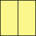
In a standard drag and drop experience, you move an element half way of its actual dimension to start reordering the element. This is determined by the Sensitivity property (default value is 0.5).

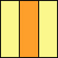
If you change the Sensitivity property to 0.3, you need to move the element a little bit further until it reach the yellow area.

Note that if you are moving the element from right to left direction, you need to move it until the left yellow area and vice versa.
By default, when you enable the AllowReorderItem or AllowDropItem property in an UXPanel, all children elements in the panel will be queried to accept the dragged object. A children element will show an empty space in its left or the right position which indicates that the element can accept the dragged object to drop into the provided empty space.
In certain scenarios, you may want to restrict the dragged object from being dropped to the left or right side of a certain element in the panel.
The following code shows how to prevent drop using the ISDragDrop.AllowNextDrop and ISDragDrop.AllowPreviousDrop attached property.
| XAML |
Copy Code
|
|---|---|
<Grid Width="600" Height="200" Background="White"> <Intersoft:UXStackPanel HorizontalAlignment="Center" VerticalAlignment="Center" DragMode="Move" AllowMoveItem="True" AllowDropItem="True" AllowReorderItem="True"> <Rectangle Intersoft:ISDragDrop.AllowNextDrop="False" Intersoft:ISDragDrop.AllowPreviousDrop="False" Fill="#FFFF2222" Height="100" Stroke="Black" Width="100" StrokeThickness="0"/> <Rectangle Fill="#FFE7FF5B" Height="100" Stroke="Black" Width="100" StrokeThickness="0"/> <Rectangle Fill="#FF88FF8F" Height="100" Stroke="Black" Width="100" StrokeThickness="0"/> <Rectangle Fill="#FF9ABCF3" Height="100" Stroke="Black" Width="100" StrokeThickness="0"/> </Intersoft:UXStackPanel> </Grid> |
|

In the above illustration, the green rectangle is moved to the area between the red and the yellow rectangle. Since the red rectangle has the ISDragDrop.AllowNextDrop set to False, the green rectangle can not be dropped in the area between the read and the yellow rectangle. Notice that the animation that opens the empty space will not be performed in this case.
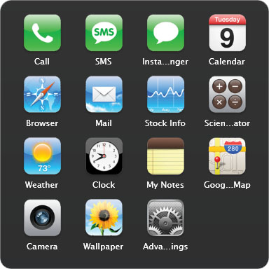
UXGridPanel is a uniform grid panel with drag drop capability and fluid adjustment animation when an item is moved, removed or added to the UXGridPanel.

All children in a UXGridPanel will be arranged in logical order based on their index. You do not need to set the Grid.Column, or Grid.Row for any of the children since the layout is automatically handled by the panel.
| XAML |
Copy Code
|
|---|---|
<Intersoft:UXGridPanel AllowReorderItem="True" Column="4" Row="4" ItemHeight="80" ItemWidth="80" Margin="16"> <Grid> <Grid.RowDefinitions> <RowDefinition/> <RowDefinition Height="Auto"/> </Grid.RowDefinitions> <Image Source="phone-icon.png"/> <Intersoft:EllipsisText Text="Call" Grid.Row="1" Padding="6,2" TooltipStyle="{StaticResource EllipsisTooltipStyle}"/> </Grid> <Grid> <Grid.RowDefinitions> <RowDefinition/> <RowDefinition Height="Auto"/> </Grid.RowDefinitions> <Image Source="SMS-icon.png"/> <Intersoft:EllipsisText Text="SMS" Grid.Row="1" Padding="6,2" TooltipStyle="{StaticResource EllipsisTooltipStyle}"/> </Grid> <Grid> <Grid.RowDefinitions> <RowDefinition/> <RowDefinition Height="Auto"/> </Grid.RowDefinitions> <Image Source="chat-blank-icon.png"/> <Intersoft:EllipsisText Text="Instant Messanger" Grid.Row="1" Padding="6,2" TooltipStyle="{StaticResource EllipsisTooltipStyle}"/> </Grid> <Grid> <Grid.RowDefinitions> <RowDefinition/> <RowDefinition Height="Auto"/> </Grid.RowDefinitions> <Image Source="cal-icon.png"/> <Intersoft:EllipsisText Text="Calendar" Grid.Row="1" Padding="6,2" TooltipStyle="{StaticResource EllipsisTooltipStyle}"/> </Grid> </Intersoft:UXGridPanel> |
|
UXGridPanel has an Orientation property that controls the item arrangement. If it is set to Horizontal, it will fill the column first then the row. Similarly, if it is set to Vertical, it will fill the row first then column.
UXGridPanel used a uniform grid arrangement which means that all children will be placed inside a container that has dimension specified by ItemHeight and ItemWidth property, thus you need to be careful when configuring the size of the children. It is recommended to use auto size for all children in the UXGridPanel.
You can also control the margin between item by customizing the ItemMargin property. It's not necessary to manually change the margin of each child element.
Often times, you may want to restrict objects from being dropped next to certain items in the UXGridPanel. The following code shows how to prevent drop using ISDragDrop.AllowGridDrop property.
| XAML |
Copy Code
|
|---|---|
<Intersoft:UXGridPanel AllowReorderItem="True" Column="4" Row="4" ItemHeight="80" ItemWidth="80" Margin="16"> <Grid Intersoft:ISDragDrop.AllowGridDrop="False"> <Grid.RowDefinitions> <RowDefinition/> <RowDefinition Height="Auto"/> </Grid.RowDefinitions> <Image Source="phone-icon.png"/> <Intersoft:EllipsisText Text="Call" Grid.Row="1" Padding="6,2" TooltipStyle="{StaticResource EllipsisTooltipStyle}"/> </Grid> <Grid> <Grid.RowDefinitions> <RowDefinition/> <RowDefinition Height="Auto"/> </Grid.RowDefinitions> <Image Source="SMS-icon.png"/> <Intersoft:EllipsisText Text="SMS" Grid.Row="1" Padding="6,2" TooltipStyle="{StaticResource EllipsisTooltipStyle}"/> </Grid> <Grid> <Grid.RowDefinitions> <RowDefinition/> <RowDefinition Height="Auto"/> </Grid.RowDefinitions> <Image Source="chat-blank-icon.png"/> <Intersoft:EllipsisText Text="Instant Messanger" Grid.Row="1" Padding="6,2" TooltipStyle="{StaticResource EllipsisTooltipStyle}"/> </Grid> <Grid> <Grid.RowDefinitions> <RowDefinition/> <RowDefinition Height="Auto"/> </Grid.RowDefinitions> <Image Source="cal-icon.png"/> <Intersoft:EllipsisText Text="Calendar" Grid.Row="1" Padding="6,2" TooltipStyle="{StaticResource EllipsisTooltipStyle}"/> </Grid> </Intersoft:UXGridPanel> |
|
Interactive panels provide drag and drop capability that enables user to add, reorder and remove item from the panel. Each action raises a routed event that allows you to perform further customization during the drag-drop operation.
The following list describes the routed events available in interactive panels.