
| Intersoft ClientUI 8 > ClientUI Controls > Control Library > UI Controls Overview > GlassLabel |
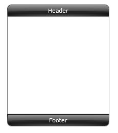
GlassLabel is a content control that visualizes a content inside a round-cornered container with built-in glass effect. GlassLabel is commonly used in modern user interface application which is suitable to be used for toolbars, headers, status bars and more.
GlassLabel is inherited from ISContentControl, which means that it can contain a single object of any types, such as a string, an image, or a panel. For more information about this content model, see Content Model Overview.
GlassLabel supports ImageContent model concept which provides capability to efficiently specify the Image and Content through the provided properties. To learn more about ImageContent model, see Content Model Overview.
You can customize the GlassLabel appearance through the following properties.
| XAML |
Copy Code
|
|---|---|
<Intersoft:DockPanel HorizontalAlignment="Center" Height="240" VerticalAlignment="Center" Width="200" FillChildMode="Custom"> <Intersoft:GlassLabel Content="Header" Intersoft:DockPanel.Dock="Top" VerticalAlignment="Top" CornerRadius="8,8,0,0"/> <Intersoft:GlassLabel Content="Footer" Intersoft:DockPanel.Dock="Bottom" VerticalAlignment="Bottom" CornerRadius="0,0,8,8"/> <Border BorderBrush="#FF7A7A7A" BorderThickness="1" Intersoft:DockPanel.IsFillElement="True" /> </Intersoft:DockPanel> |
|
