

| Intersoft ClientUI 8 > ClientUI Fundamentals > Flow Document Framework Overview |
New in ClientUI 6 is a solid and comprehensive Flow Document Framework that works in both Silverlight and WPF platforms. In contrast to the static presentation of fixed document, the content of FlowDocument will flow from the top-to-bottom order in the available view port. This topic describes the concept of Intersoft Flow Document Framework, including the flow document object model and its element.
Flow document is designed to optimize viewing and readability. Rather than being set to a predefined layout, flow document dynamically adjusts and reflows their content based on run-time variables such as window size, device resolution, and optional user preferences. In addition, flow document offers advanced document pagination capability.
This topic contains the following sections:
A flow document is designed to "reflow content" depending on window size, device resolution, and other environment variables. It also has a number of built in features including search, viewing modes that optimize readability, and the ability to apply formatting to the flow elements. Flow document is best utilized when ease of reading is the primary document consumption scenario. In contrast, fixed document is useful when fidelity of the source content is essential. For more information about fixed document, see Document Framework Overview.
To view a flow document, it must be contained in a flow document viewer control. There are three types of flow document viewer, which are UXFlowDocumentViewer, UXFlowDocumentPageViewer, and UXFlowDocumentScrollViewer. For further information about these viewers, see the overview of each control.
The following code example shows how to author a simple FlowDocument in a UXFlowDocumentViewer.
| XAML |
Copy Code
|
|---|---|
<Intersoft:UXFlowDocumentViewer> <Intersoft:FlowDocument> <Intersoft:Paragraph> <Intersoft:Run> Hello World </Intersoft:Run> </Intersoft:Paragraph> </Intersoft:FlowDocument> </Intersoft:UXFlowDocumentViewer> |
|

FlowDocument can consist a collection of block elements. For further information about flow elements, see Understanding FlowDocument Elements.
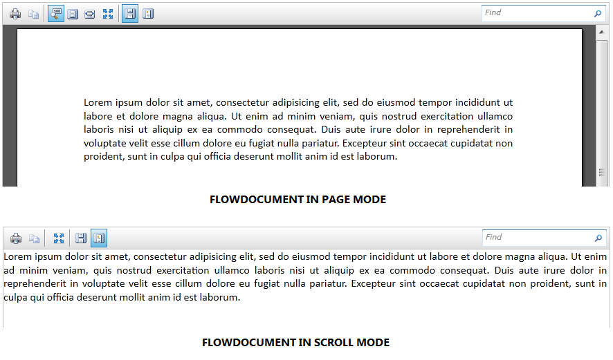
FlowDocument is designed to have multiple viewing ability. It can be viewed in either page or scroll mode. When FlowDocument is in page mode, it will look similar with Microsoft Word layout. When FlowDocument is in scroll mode, it will look similar with HTML layout viewed in browser. Note that all page-related configuration will only be applied if FlowDocument is contained within UXFlowDocumentViewer or UXFlowDocumentPageViewer.
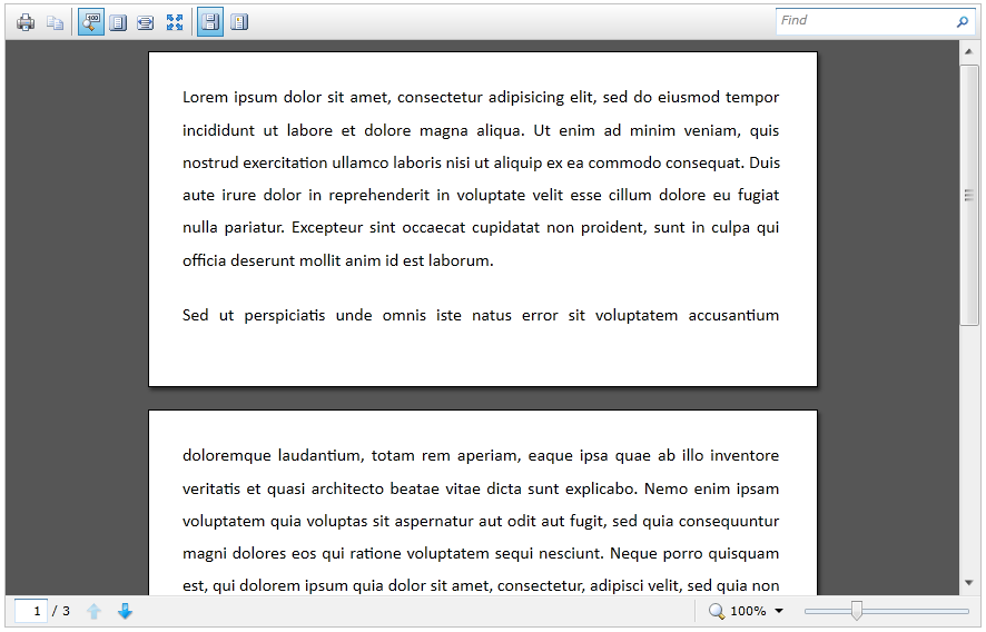
When FlowDocument is in page mode, you can set the default page size using PageHeight and PageWidth properties. The default page size in FlowDocument is letter size (816 px x 1056 px). You can set PagePadding property to set the padding space between the boundaries of a page and the page's content. You can set PageMargin property to set the margin space between pages. You can also set PageBorderThickness to set the border thickness for each page.
| XAML |
Copy Code
|
|---|---|
<Intersoft:FlowDocument LineSpacingType="OneAndHalfLines" TextAlignment="Justify" PageHeight="300" PageWidth="600" PagePadding="30" PageMargin="10"> <Intersoft:Paragraph SpacingAfter="20"> <Intersoft:Run> Lorem ipsum dolor sit amet, consectetur adipisicing elit, sed do eiusmod tempor incididunt ut labore et dolore magna aliqua. Ut enim ad minim veniam, quis nostrud exercitation ullamco laboris nisi ut aliquip ex ea commodo consequat. Duis aute irure dolor in reprehenderit in voluptate velit esse cillum dolore eu fugiat nulla pariatur. Excepteur sint occaecat cupidatat non proident, sunt in culpa qui officia deserunt mollit anim id est laborum. </Intersoft:Run> </Intersoft:Paragraph> <Intersoft:Paragraph> <Intersoft:Run> Sed ut perspiciatis unde omnis iste natus error sit voluptatem accusantium doloremque laudantium, totam rem aperiam, eaque ipsa quae ab illo inventore veritatis et quasi architecto beatae vitae dicta sunt explicabo. Nemo enim ipsam voluptatem quia voluptas sit aspernatur aut odit aut fugit, sed quia consequuntur magni dolores eos qui ratione voluptatem sequi nesciunt. Neque porro quisquam est, qui dolorem ipsum quia dolor sit amet, consectetur, adipisci velit, sed quia non numquam eius modi tempora incidunt ut labore et dolore magnam aliquam quaerat voluptatem. Ut enim ad minima veniam, quis nostrum exercitationem ullam corporis suscipit laboriosam, nisi ut aliquid ex ea commodi consequatur? Quis autem vel eum iure reprehenderit qui in ea voluptate velit esse quam nihil molestiae consequatur, vel illum qui dolorem eum fugiat quo voluptas nulla pariatur? </Intersoft:Run> </Intersoft:Paragraph> </Intersoft:FlowDocument> |
|
Global formatting can be applied to all elements in FlowDocument by configuring it in FlowDocument object. You can set a series of font configuration, such as FontFamily, FontSize, FontStretch, FontStyle, FontWeight to the document. In addition, you can use Foreground property to set the default foreground color for all document elements. You can use TextAlignment property to set default text alignment, as well as LineSpacingType and LineSpacing properties to specify the default line spacing configuration. Note that the global configuration will be overridden if there is individual configuration specified in element level.
The following code example shows a simple FlowDocument with various font formatting.
| XAML |
Copy Code
|
|---|---|
<Intersoft:FlowDocument Foreground="Blue" FontFamily="Lucida Sans Unicode" FontSize="20"> <Intersoft:Paragraph> <Intersoft:Run> Hello World ! </Intersoft:Run> </Intersoft:Paragraph> <Intersoft:Section> <Intersoft:Paragraph> <Intersoft:Run> This is my first flow document. </Intersoft:Run> </Intersoft:Paragraph> </Intersoft:Section> </Intersoft:FlowDocument> |
|

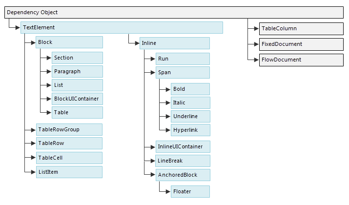
All FlowDocument elements are inherited from TextElement, except TableColumn element. You can specify Background, Foreground, and font-related configurations to all elements that inherit from TextElement. This means that you can can easily set these configuration at any element (except TableColumn) in FlowDocument.
FlowDocument elements are divided into two kind of types: Block and Inline elements. Elements that inherit from Block can be used to group elements under a common parent or to apply common attributes to a group, while elements that inherit from Inline are either contained within a Block element or another Inline element. Inline elements are often used as the direct container of content that is rendered to the screen. For example, a Paragraph (Block element) can contain a Run (Inline element) but the Run actually contains the text that is rendered on the screen.
The diagram below shows the element schema in FlowDocument.
All elements that inherit from Block, will have the following configuration:
Elements that inherit from Block are Section, Paragraph, List, BlockUIContainer, and Table.
Section is used to contain other Block elements. Section is useful for applying common attributes to a group of block elements, such as the same font attributes to multiple paragraphs. Section is used in a similar manner to the <DIV> tag in HTML.
| XAML |
Copy Code
|
|---|---|
<Intersoft:FlowDocument> <Intersoft:Section Foreground="Gray"> <Intersoft:Paragraph> Paragraph 1 </Intersoft:Paragraph> <Intersoft:Paragraph> Paragraph 2 </Intersoft:Paragraph> <Intersoft:Paragraph> Paragraph 3 </Intersoft:Paragraph> </Intersoft:Section> </Intersoft:FlowDocument> |
|
In the example code above, three paragraphs are defined under one section. The Section has a Foreground property value of Gray, therefore all paragraphs will use Gray as their foreground color.

Paragraph is typically used to group content into a paragraph. Paragraph can only contain Inline elements. The simplest and most common use of Paragraph is to create a paragraph of text. Paragraph is used in a similar manner to the <P> tag in HTML. You can use TextIndent property to specify text indent in Paragraph element.
| XAML |
Copy Code
|
|---|---|
<Intersoft:FlowDocument> <Intersoft:Paragraph TextIndent="50" TextAlignment="Justify" Foreground="Brown"> <Intersoft:Run> Lorem ipsum dolor sit amet, consectetur adipisicing elit, sed do eiusmod tempor incididunt ut labore et dolore magna aliqua. </Intersoft:Run> <Intersoft:Bold> <Intersoft:Run> Ut enim ad minim veniam, quis nostrud exercitation ullamco laboris nisi ut aliquip ex ea commodo consequat. Duis aute irure dolor in reprehenderit in voluptate velit esse cillum dolore eu fugiat nulla pariatur. </Intersoft:Run> </Intersoft:Bold> <Intersoft:Run> Excepteur sint occaecat cupidatat non proident, sunt in culpa qui officia deserunt mollit anim id est laborum. </Intersoft:Run> </Intersoft:Paragraph> </Intersoft:FlowDocument> |
|

List is used to create a bulleted or numeric list. List element can only contain ListItem element collection.
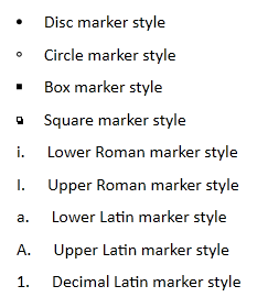
Set the MarkerStyle property to a TextMarkerStyle enumeration value to determine the style of the list. The built-in marker styles provided in FlowDocument are Disc, Circle, Square, Box, LowerRoman, UpperRoman, LowerLatin, UpperLatin, Decimal, and None.
| XAML |
Copy Code
|
|---|---|
<Intersoft:FlowDocument> <Intersoft:Paragraph FontSize="25"> <Intersoft:Underline> <Intersoft:Run> Employment Record </Intersoft:Run> </Intersoft:Underline> </Intersoft:Paragraph> <Intersoft:List MarkerStyle="Box" SpacingBefore="10"> <Intersoft:ListItem> <Intersoft:Paragraph> <Intersoft:Bold> <Intersoft:Run> Web Developer </Intersoft:Run> </Intersoft:Bold> <Intersoft:Run> , Paper Best Corp, USA, July 2010 - present </Intersoft:Run> </Intersoft:Paragraph> <Intersoft:List MarkerStyle="Circle"> <Intersoft:ListItem> <Intersoft:Paragraph> <Intersoft:Run> Develop and maintain database. </Intersoft:Run> </Intersoft:Paragraph> </Intersoft:ListItem> <Intersoft:ListItem> <Intersoft:Paragraph> <Intersoft:Run> Implement web-based internal CRM application. </Intersoft:Run> </Intersoft:Paragraph> </Intersoft:ListItem> </Intersoft:List> </Intersoft:ListItem> <Intersoft:ListItem> <Intersoft:Paragraph> <Intersoft:Bold> <Intersoft:Run> Junior Support Engineer </Intersoft:Run> </Intersoft:Bold> <Intersoft:Run> , MultiFront Corp, USA, April 2008 - June 2010 </Intersoft:Run> </Intersoft:Paragraph> <Intersoft:List MarkerStyle="Circle"> <Intersoft:ListItem> <Intersoft:Paragraph> <Intersoft:Run> Provide technical assistance for other departments. </Intersoft:Run> </Intersoft:Paragraph> </Intersoft:ListItem> <Intersoft:ListItem> <Intersoft:Paragraph> <Intersoft:Run> Perform unit testing on internal ERP application. </Intersoft:Run> </Intersoft:Paragraph> </Intersoft:ListItem> <Intersoft:ListItem> <Intersoft:Paragraph> <Intersoft:Run> Investigate bugs found during the QA process. </Intersoft:Run> </Intersoft:Paragraph> </Intersoft:ListItem> </Intersoft:List> </Intersoft:ListItem> </Intersoft:List> </Intersoft:FlowDocument> |
|
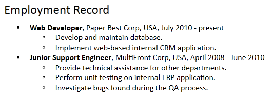
You can also specify custom image as the marker style by selecting Custom as the value of MarkerStyle property and specify the MarkerSource property to the selected image Uri.
| XAML |
Copy Code
|
|---|---|
<Intersoft:FlowDocument> <Intersoft:List MarkerStyle="Custom" Margin="10" MarkerSource="/TestProject;component/Assets/Images/FlowDocumentViewer/tick.png"> <Intersoft:ListItem> <Intersoft:Paragraph> <Intersoft:Run> Built on Silverlight 4 </Intersoft:Run> </Intersoft:Paragraph> </Intersoft:ListItem> <Intersoft:ListItem> <Intersoft:Paragraph> <Intersoft:Run> Rich and ready-to-use controls </Intersoft:Run> </Intersoft:Paragraph> </Intersoft:ListItem> <Intersoft:ListItem> <Intersoft:Paragraph> <Intersoft:Run> Enjoy the mature and comprehensive features </Intersoft:Run> </Intersoft:Paragraph> </Intersoft:ListItem> </Intersoft:List> </Intersoft:FlowDocument> |
|

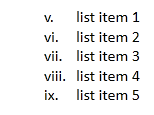
You can specify the start index of the list using StartIndex property. Note that this property will be used when the marker style is one of the following: LowerRoman, UpperRoman, LowerLatin, UpperLatin, and Decimal.
By default, a List element will be indented 25 pixel from its original offset. You can customize this configuration using Margin property. Additionally, you can set the space between the marker style and the content using MarkerOffset property. You can use the MarkerAlignment property to set the alignment of marker style. The default value is Right.
| XAML |
Copy Code
|
|---|---|
<Intersoft:FlowDocument> <Intersoft:List MarkerStyle="LowerRoman" StartIndex="5" MarkerOffset="10" Margin="30" MarkerAlignment="Left"> <Intersoft:ListItem> <Intersoft:Paragraph> <Intersoft:Run> list item 1 </Intersoft:Run> </Intersoft:Paragraph> </Intersoft:ListItem> <Intersoft:ListItem> <Intersoft:Paragraph> <Intersoft:Run> list item 2 </Intersoft:Run> </Intersoft:Paragraph> </Intersoft:ListItem> <Intersoft:ListItem> <Intersoft:Paragraph> <Intersoft:Run> list item 3 </Intersoft:Run> </Intersoft:Paragraph> </Intersoft:ListItem> <Intersoft:ListItem> <Intersoft:Paragraph> <Intersoft:Run> list item 4 </Intersoft:Run> </Intersoft:Paragraph> </Intersoft:ListItem> <Intersoft:ListItem> <Intersoft:Paragraph> <Intersoft:Run> list item 5 </Intersoft:Run> </Intersoft:Paragraph> </Intersoft:ListItem> </Intersoft:List> </Intersoft:FlowDocument> |
|
BlockUIContainer enables UIElement elements (i.e. a Button or Image) to be embedded in block elements. InlineUIContainer is used to embed UIElement elements in inline elements. For more information about InlineUIContainer, see InlineUIContainer. BlockUIContainer and InlineUIContainer are important because there is no other way to use a UIElement in flow content unless it is contained within one of these two elements. Note that the UIElement elements inside BlockUIContainer or InlineUIContainer will not flow if the space width is not enough. In that case, the UIElement elements will be clipped.
BlockUIContainer element may host no more than one top-level UIElement. However, other UIElement elements maybe nested within the UIElement contained by the BlockUIContainer element. For example, a StackPanel can be used to host multiple UIElement elements within a BlockUIContainer element.
| XAML |
Copy Code
|
|---|---|
<Intersoft:FlowDocument> <Intersoft:BlockUIContainer> <StackPanel> <Image Source="/Assets/Images/john.jpg"/> <TextBlock Text="My name is John Doe."/> </StackPanel> </Intersoft:BlockUIContainer> </Intersoft:FlowDocument> |
|
![]()
When FlowDocument is in page mode and the content inside BlockUIContainer is quite large, it will be shifted to the next page. If it still does not fit in the next page, the content will be clipped. However, if the BlockUIContainer element is the first element of FlowDocument and its content does not fit in the page, it will be clipped in the first page.
Table is a block level element that supports grid-based presentation. For further information about Table, see Working With Table Element.
All elements that inherits from Inline, will have the following configuration:

Note that BaselineAlignment only set the baseline alignment of the Inline element. If you use Subscript or Superscript options, it is recommended that you use smaller font size.
Elements that inherit from Inline are Run, Span, InlineUIContainer, LineBreak, and Floater.
Run is used to contain unformatted text. You might expect Run objects to be used extensively in flow content. However, in markup, Run elements are not required to be used explicitly. For example, in the markup below, the first Paragraph specifies the Run element explicitly while the second does not. Both paragraphs generate identical output.
| XAML |
Copy Code
|
|---|---|
<Intersoft:FlowDocument> <Intersoft:Paragraph> <Intersoft:Run> Paragraph that explicitly uses the Run element. </Intersoft:Run> </Intersoft:Paragraph> <Intersoft:Paragraph> This Paragraph omits the the Run element in markup. It renders the same as a Paragraph with Run used explicitly. </Intersoft:Paragraph> </Intersoft:FlowDocument> |
|

Despite the flexibility on whether or not to use Run element, you cannot combine implicit and explicit markup in a single Block element. Implicit markup is recommended if you only use text content in a Block element. Explicit markup is recommended if you need to use multiple Inline elements in a Block element.
By default, Silverlight will trim the space in front and end of the inline content. If you have multiple Inline elements and specify the content as inline content, the space at the beginning and ending of the content will be removed. This could cause the sentences to be combined without space. In this case, it is recommended that you use Text property to specify the content. If there are long words that does not fit in the available space, the word will be splitted and continued to the next line.
| XAML |
Copy Code
|
|---|---|
<Intersoft:FlowDocument> <Intersoft:Paragraph> <Intersoft:Run Text="Lorem ipsum dolor sit amet, "/> <Intersoft:Italic> <Intersoft:Run Text="consectetur adipisicing elit, "/> </Intersoft:Italic> <Intersoft:Run Text="sed do eiusmod tempor incididunt ut labore et dolore magna aliqua."/> </Intersoft:Paragraph> </Intersoft:FlowDocument> |
|
Note that when FlowDocument is in page mode and the textual content is rendered in the page intersection, the whole line will be shifted to the next page.
Span groups other inline content elements together. Span is useful for applying common attributes to a group of inline elements, such as the same font attributes to multiple Run elements. Span is used in a similar manner to the <SPAN> tag in HTML.
| XAML |
Copy Code
|
|---|---|
<Intersoft:FlowDocument> <Intersoft:Paragraph> <Intersoft:Span Foreground="DodgerBlue"> <Intersoft:Run Text="lorem ipsum dolor sit amet, "/> <Intersoft:Underline> <Intersoft:Run> consectetur adipisicing elit </Intersoft:Run> </Intersoft:Underline> <Intersoft:Run Text=", sed do eiusmod tempor incididunt ut labore et dolore magna aliqua."/> </Intersoft:Span> </Intersoft:Paragraph> </Intersoft:FlowDocument> |
|

The Inline elements that are inherited from Span are Bold, Italic, Underline, and Hyperlink.
Bold element automatically set its content to render with a bold font weight. Instead of using Span with FontWeight property specified, you can simply use Bold element. Since Bold is inherited from Span, it can also contain multiple Inline elements. Bold is used in a similar manner to the <STRONG> tag in HTML.
| XAML |
Copy Code
|
|---|---|
<Intersoft:FlowDocument> <Intersoft:Paragraph> <Intersoft:Bold> <Intersoft:Run> Hello World! </Intersoft:Run> </Intersoft:Bold> </Intersoft:Paragraph> </Intersoft:FlowDocument> |
|

Italic element automatically set its content to render with an italic font style. Instead of using Span with FontStyle property specified, you can simply use Italic element. Since Italic is inherited from Span, it can also contain multiple Inline elements. Italic is used in a similar manner to the <EM> tag in HTML.
| XAML |
Copy Code
|
|---|---|
<Intersoft:FlowDocument> <Intersoft:Paragraph> <Intersoft:Italic> <Intersoft:Run> Hello World! </Intersoft:Run> </Intersoft:Italic> </Intersoft:Paragraph> </Intersoft:FlowDocument> |
|

Underline element automatically set its content to render with an italic font style. Instead of using Span with TextDecorations property specified, you can simply use Underline element. Since Underlineis inherited from Span, it can also contain multiple Inline elements.
| XAML |
Copy Code
|
|---|---|
<Intersoft:FlowDocument> <Intersoft:Paragraph> <Intersoft:Underline> <Intersoft:Run> Hello World! </Intersoft:Run> </Intersoft:Underline> </Intersoft:Paragraph> </Intersoft:FlowDocument> |
|

Hyperlink element provides facilities for hosting hyperlinks within FlowDocument content. You can specify NavigateUri property to the Uri of the hyperlink where user will be navigated to when the Hyperlink is clicked. Hyperlink navigation can only occur, however, if either the direct or indirect parent of a Hyperlink is a navigation host, including NavigationWindow, Frame, or any browser that can host XBAPs (which includes Internet Explorer 7, Microsoft Internet Explorer 6, and Firefox 2.0+).
Hyperlink is used in a similar manner to the <A> tag in HTML. Similar to HTML link, you can specify the target name where the link should be opened. You can specify _blank, _self, or the name of the navigation host as the target name.
| XAML |
Copy Code
|
|---|---|
<Intersoft:FlowDocument> <Intersoft:Paragraph> <Intersoft:Hyperlink NavigateUri="http://www.intersoftpt.com" TargetName="_self"> <Intersoft:Run> Click the following link </Intersoft:Run> </Intersoft:Hyperlink> </Intersoft:Paragraph> </Intersoft:FlowDocument> |
|

You can specify several formatting that will be applied when the hyperlink is hovered and pressed. For more information, see Configuring Hyperlink Formatting.
InlineUIContainer enables UIElement elements (i.e. a control like Button or Image) to be embedded in an Inline content element. This element is the inline equivalent to BlockUIContainer described above.
InlineUIContainer element may host no more than one top-level UIElement. However, other UIElement elements maybe nested within the UIElement contained by the InlineUIContainer element.
| XAML |
Copy Code
|
|---|---|
<Intersoft:FlowDocument> <Intersoft:Paragraph> <Intersoft:InlineUIContainer> <Image Source="/TestFlowDoc2;component/Assets/Images/logo.png"/> </Intersoft:InlineUIContainer> </Intersoft:Paragraph> </Intersoft:FlowDocument> |
|
![]()
When FlowDocument is in page mode and the content inside InlineUIContainer is quite large, it will be shifted to the next page. If it still does not fit in the next page, the content will be clipped. However, if InlineUIContainer is the first element of FlowDocument and its content does not fit in the page, it will be clipped in the first page.
LineBreak causes a line break to occur in FlowDocument content.
| XAML |
Copy Code
|
|---|---|
<Intersoft:FlowDocument> <Intersoft:Paragraph> <Intersoft:Span> <Intersoft:Run> lorem ipsum dolor sit amet, </Intersoft:Run> <Intersoft:LineBreak/> <Intersoft:Italic> <Intersoft:Run> consectetur adipisicing elit, </Intersoft:Run> </Intersoft:Italic> <Intersoft:LineBreak/> <Intersoft:Run> sed do eiusmod tempor incididunt ut labore et dolore magna aliqua. </Intersoft:Run> </Intersoft:Span> </Intersoft:Paragraph> </Intersoft:FlowDocument> |
|
AnchoredBlock is an abstract class that provides a base for Inline elements that are used to anchor Block elements to flow content. In WPF, AnchoredBlock is inherited to Floater and Figure elements. Currently, Intersoft FlowDocument only supports Floater element.
Floater are used to embed content to FlowDocument with placement properties that can be customized independent of the primary content flow. Floater elements are often used to highlight or accentuate portions of content, to host supporting images or other content within the main content flow, or to inject loosely related content such as advertisements. Floater is a good place to put more free-flowing content that flows similar to the main page content, but is separated from it.
Floater can host multiple Block elements. You can specify a specific width to Floater element using Width property. Floater element can be horizontally aligned, either to the Left, Center, Right, or Stretch. The other content contained within the same Block element will flow around Floater element if the space is available.
As the child of AnchoredBlock, Floater inherits the behavior of AnchoredBlock class. You can specify several properties that are usually available in Block element, such as border and line spacing formatting, Margin, Padding, and TextAlignment. If Margin and Padding properties are not specified, Floater element will automatically use 10 pixel for each property.
| XAML |
Copy Code
|
|---|---|
<Intersoft:FlowDocument> <Intersoft:Paragraph SpacingBefore="20"> <Intersoft:Floater Width="190" HorizontalAlignment="Left" Padding="0" Margin="20"> <Intersoft:BlockUIContainer> <Image Source="/Assets/Images/screenshot.png" Stretch="None"/> </Intersoft:BlockUIContainer> </Intersoft:Floater> <Intersoft:Bold> <Intersoft:Run Text="SINGAPORE, "/> </Intersoft:Bold> <Intersoft:Run> Nov 16 (Reuters) - Gold prices fell as much as 1.1 percent on Wednesday, tracking the euro lower on fears the euro zone debt crisis could spread to France, the bloc's second-largest economy, while Greece and Italy battle to save their economies. </Intersoft:Run> <Intersoft:LineBreak/> <Intersoft:Run> People favour gold during economic and political turmoil because of its safe haven allure, although bullion has moved in close correlation with riskier assets recently, as harried investors liquidate gold positions to cover losses elsewhere. </Intersoft:Run> </Intersoft:Paragraph> </Intersoft:FlowDocument> |
|

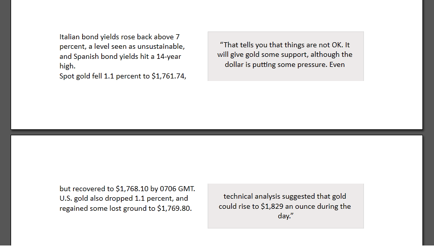
If the content of Floater element exceeds the page boundaries, it will paginates to the next page. When Floater element paginates to the next page, it will maintain the Margin and Padding configuration. The following screenshot shows how Floater element will paginate if the content exceeds the page boundaries.
All FlowDocument elements that inherit from TextElement class have default formatting properties, such as Background, FontFamily, FontSize, FontStretch, FontStyle, FontWeight, and Foreground. All Block elements have additional border-related and line spacing formatting capability. The font-related properties and Foreground property configuration can be seen in textual content. This section will discuss background, line spacing, border, and hyperlink formatting in detail.
Background property will result in different rendering for Block and Inline elements. FlowDocument will use the boundary of the element to render its background.
| XAML |
Copy Code
|
|---|---|
<Intersoft:FlowDocument> <Intersoft:Paragraph Background="BurlyWood" LineSpacingType="OneAndHalfLines" Padding="10"> <Intersoft:Run> Lorem ipsum dolor sit amet, consectetur adipisicing elit, sed do eiusmod tempor incididunt ut labore et dolore magna aliqua. Ut enim ad minim veniam, quis nostrud exercitation ullamco laboris nisi ut aliquip ex ea commodo consequat. </Intersoft:Run> <Intersoft:LineBreak/> <Intersoft:Run Background="Beige"> Duis aute irure dolor in reprehenderit in voluptate velit esse cillum dolore eu fugiat nulla pariatur. Excepteur sint occaecat cupidatat non proident, sunt in culpa qui officia deserunt mollit anim id est laborum </Intersoft:Run> </Intersoft:Paragraph> </Intersoft:FlowDocument> |
|

You can use LineSpacingType and LineSpacing properties to specify spacing between lines in FlowDocument elements. The following are the options of LineSpacingType property:
You can specify border formatting in Block elements. To specify global configuration for border, you can use BorderThickness, BorderBrush, and BorderStyle properties. BorderThickness property determines the border thickness of the element. BorderBrush property determines the Brush used to render the border.
BorderStyle property determines the line style of the border. Several predefined border style options are Single, Dot, DashDot, DashDotDot, DashLargeGap, and DashSmallGap.

| XAML |
Copy Code
|
|---|---|
<Intersoft:FlowDocument> <Intersoft:Paragraph LineSpacingType="OneAndHalfLines" Padding="10" BorderBrush="DarkGray" BorderThickness="2" BorderStyle="DashDotDot"> <Intersoft:Run> Lorem ipsum dolor sit amet, consectetur adipisicing elit, sed do eiusmod tempor incididunt ut labore et dolore magna aliqua. Ut enim ad minim veniam, quis nostrud exercitation ullamco laboris nisi ut aliquip ex ea commodo consequat. </Intersoft:Run> </Intersoft:Paragraph> </Intersoft:FlowDocument> |
|

Besides global formatting, you can specify border thickness, brush, and style in each side of the border. For the left side of the border, you can use LeftBorderBrush and LeftBorderStyle properties. For the top side of the border, you can use TopBorderBrush and TopBorderStyle properties. For the right side of the border, you can use RightBorderBrush and RightBorderStyle properties. For the bottom side of the border, you can use BottomBorderBrush and BottomBorderStyle properties. BorderThickness uses Thickness-typed value, so you can specify the thickness of each side easily. Note that the individual border configuration will override the global border configuration.
| XAML |
Copy Code
|
|---|---|
<Intersoft:FlowDocument> <Intersoft:Paragraph Padding="10" TopBorderBrush="DarkGray" LeftBorderBrush="OrangeRed" BottomBorderBrush="DarkMagenta" RightBorderBrush="Maroon" BorderThickness="4 2" BottomBorderStyle="Single" LeftBorderStyle="DashSmallGap" BorderStyle="DashDotDot"> <Intersoft:Run> Lorem ipsum dolor sit amet, consectetur adipisicing elit, sed do eiusmod tempor incididunt ut labore et dolore magna aliqua. Ut enim ad minim veniam, quis nostrud exercitation ullamco laboris nisi ut aliquip ex ea commodo consequat. </Intersoft:Run> </Intersoft:Paragraph> </Intersoft:FlowDocument> |
|

You can simplify the above configuration and use only one property, Borders, to specify the border configuration globally or individually. Borders property accepts comma and semicolon separated string. The pattern is [border width],[border line style],[border brush]. For example: Borders="1,Single,#FF000000" will set the border configuration to 1 pixel width, Single border line style, and black color brush. Note that the pattern cannot be swapped and you must use hexadecimal format to determine the border brush.
| XAML |
Copy Code
|
|---|---|
<Intersoft:FlowDocument> <Intersoft:Paragraph Padding="10" Borders="1,Single,#FFFF00FF"> <Intersoft:Run> Lorem ipsum dolor sit amet, consectetur adipisicing elit, sed do eiusmod tempor incididunt ut labore et dolore magna aliqua. Ut enim ad minim veniam, quis nostrud exercitation ullamco laboris nisi ut aliquip ex ea commodo consequat. </Intersoft:Run> </Intersoft:Paragraph> </Intersoft:FlowDocument> |
|

To use Borders property for individual border side configuration, repeat the pattern and separate them with semicolon. If there are two border definitions separated by semicolon, the first one will be applied to the left and right borders, and the second one will be applied to the top and bottom borders. If there are four border definitions separated by semicolon, the first one will be applied to the left border, the second one to the top border, the third one to the right border, and the last one to the bottom border. For example: Border="1,Single,#FF000000;2,Dot,#FFFF0000" will set the 1 pixel width, Single border line style, and black color brush to the left and right border, and 2 pixel width, Dot border line style, and red color brush to the top and bottom border.
| XAML |
Copy Code
|
|---|---|
<Intersoft:FlowDocument> <Intersoft:Paragraph Padding="10" Borders="1,Single,#FFFF00FF;1,DashDot,#FF0066FF"> <Intersoft:Run> Lorem ipsum dolor sit amet, consectetur adipisicing elit, sed do eiusmod tempor incididunt ut labore et dolore magna aliqua. Ut enim ad minim veniam, quis nostrud exercitation ullamco laboris nisi ut aliquip ex ea commodo consequat. </Intersoft:Run> </Intersoft:Paragraph> </Intersoft:FlowDocument> |
|

You can set the element to use round corner border. Simply set CornerRadius property to a double value.
| XAML |
Copy Code
|
|---|---|
<Intersoft:FlowDocument> <Intersoft:Paragraph Borders="1,DashLargeGap,#FFDBA621" Background="#FFFCF2C9" CornerRadius="6" Foreground="#FF483203" FontSize="30" Padding="5"> <Intersoft:Run> Gold Price Down 1 PCT on Euro Zone Debt Fears </Intersoft:Run> </Intersoft:Paragraph> </Intersoft:FlowDocument> |
|

Since Table is also a Block element, the same border configuration can be applied to it. However, there is more configuration that can be applied to Table element. For further information, see Working With Table Element.
As an inline element, you can specify formatting to Hyperlink element. By default, a Hyperlink element will have Underline text decoration, which will still be displayed when the element is hovered or pressed. You can use several properties to change the formatting when the hyperlink element is hovered and pressed. Simply use BackgroundMouseOver, BackgroundMousePress, ForegroundMouseOver, ForegroundMousePress, TextDecorationsMouseOver, and TextDecorationsMousePress properties.
| XAML |
Copy Code
|
|---|---|
<Intersoft:FlowDocument> <Intersoft:Paragraph> <Intersoft:Hyperlink NavigateUri="http://www.bmj.com/content/343/bmj.d4995" Foreground="#FF3ab0f2" BackgroundMouseOver="#FF88e6f2" BackgroundMousePress="#FF88e6f2" TextDecorations="None" TextDecorationsMouseOver="None" TextDecorationsMousePress="None"> <Intersoft:Run> British Medical Journal </Intersoft:Run> </Intersoft:Hyperlink> </Intersoft:Paragraph> </Intersoft:FlowDocument> |
|

You can specify predefined styles that can be applied to all elements in FlowDocument, using FlowDocumentStyle collection. In FlowDocumentStyle, you can specify the fundamental element formatting, such as background, foreground, font-related properties, and border. Each FlowDocumentStyle should have a name, which will be referred from the element.
| XAML |
Copy Code
|
|---|---|
<Intersoft:FlowDocument> <Intersoft:FlowDocument.Styles> <Intersoft:FlowDocumentStyle Name="HeadingStyle" Foreground="#FF632423" BorderBrush="#FF632423" BorderThickness="0 0 0 2" FontSize="30"/> <Intersoft:FlowDocumentStyle Name="ParagraphStyle" Foreground="Gray"/> </Intersoft:FlowDocument.Styles> <Intersoft:Paragraph Style="HeadingStyle" SpacingBefore="30"> <Intersoft:Run> BUNDLED APPS </Intersoft:Run> </Intersoft:Paragraph> <Intersoft:Paragraph SpacingBefore="30" Style="ParagraphStyle"> <Intersoft:Run> In addition to the tweaks in the OS, MIUI's also fiddled with some of the bundled apps as well as throwing in some handy tools. Let's look at the bundled apps first: the dialing pad does smart dialing and also supports quick dialing for your favorite buddies; whereas in texting the conversations are displayed in threads with customizable themes. For those who care, another special feature lies in the calendar app where you can also see the lunar calendar. Hey, it is a Chinese phone, after all. </Intersoft:Run> </Intersoft:Paragraph> </Intersoft:FlowDocument> |
|

FlowDocument should be contained within UXFlowDocumentViewer, UXFlowDocumentPageViewer, or UXFlowDocumentScrollViewer. All viewers have built-in printing capability which allows users to easily print the flow document. If you don't want to use the built-in capability, you can print a document programmatically.
| CS |
Copy Code
|
|---|---|
private void Print() { PrintDocument pd = new PrintDocument(); pd.Print(viewer1.Document.DocumentPaginator, "Employee Document"); } |
|
PrintDocument class will use the Print method to print the document. Print method needs two parameters, DocumentPaginator object and the document name. DocumentPaginator is an abstract base class that supports creation of multiple-page elements from a single document. By default, each FlowDocument has DocumentPaginator property that contain DocumentPaginator object for the flow document.
When FlowDocument is in page mode, the document content will flow according to the specified page configuration. If FlowDocument is in scroll mode, the document content will flow according to the available view port. In Silverlight application, you can choose a page size in the Print dialog window. In this case, the DocumentPaginator will create multiple page elements, despite of whether the FlowDocument is in page mode or scroll mode, for printing purpose with the selected page size. Unlike Silverlight application, the selected page size in the Print dialog window is not used in WPF application. If you need to specify different page size for printing purpose, it is recommended that you use custom paginator.
You can specify a custom paginator class to add custom elements for printing purpose only, such as header or footer. To learn more about how to implement custom paginator class for printing purpose, see How-to: Use Custom Paginator to Print FlowDocument.
Intersoft FlowDocument Framework provides a simple built-in HTML converter that can be used to convert HTML content to FlowDocument format. The built-in HTML converter can translate DIV, P, SPAN, H1, H2, H3, H4, H5, H6, A, BR, OL, UL, LI, TABLE, COL, TR, TD, STRONG, EM, IMG, SUP, and SUB HTML markup. These HTML markup will be converted to the suitable element in FlowDocument.
The built-in HTML converter does not support CSS class definition. It supports inline style definition only. The supported attributes and styles that can be converted are HREF, TARGET, FLOAT, FONT-FAMILY, FONT-SIZE, LIST-STYLE-TYPE, HEIGHT, WIDTH, SRC, MARGIN, PADDING, BORDER, BORDER-STYLE, BORDER-WIDTH, CELLSPACING, CELLPADDING, ROWSPAN, COLSPAN, BORDER-COLOR, COLOR, BACKGROUND-COLOR, and TEXT-ALIGN. Note that the attributes will be ignored if the converted element in FlowDocument does not support the attributes. For example, in the following HTML content, <div style="width: 100px;"/>, the width attribute will be ignored, because the converted element in FlowDocument, which is Section, does not support Width definition.
All colors specified in the HTML should use hexadecimal format. For example: #000000 should be used instead of Black.
The shorthand style format that is supported by the built-in HTML converter are BORDER, MARGIN, and PADDING styles. For example, border: 1px solid #000000, will be translated to Borders="1,Single,#FF000000" and margin: 1px 2px 3px 4px will be translated to Margin="4 3 2 1". The built-in HTML converter does not support individual side definition, thus margin-top, border-top, padding-top, etc are not supported.
Additionally, you can specify your own document converter which can be used to convert document content to FlowDocument format.