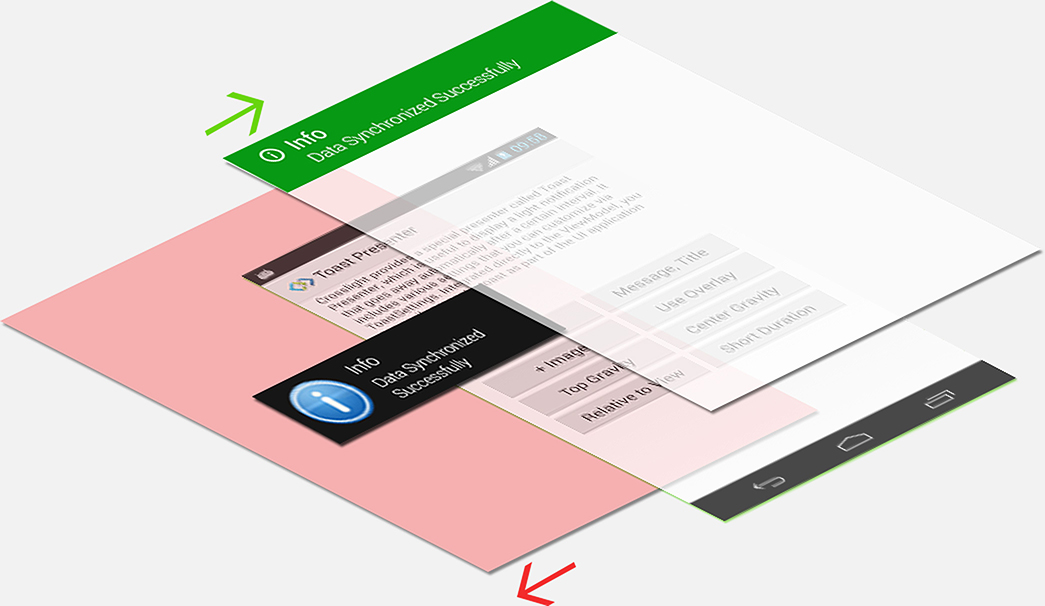
Now everyone can build great Android apps. Even without Android knowledge.

Crosslight for Android Material contains a comprehensive set of classes and API that provide Android-specific view components and services to support loosely-coupled data binding and MVVM pattern development. Consuming Crosslight Android is no different compared to standard .NET assembly and you can easily program it with C# using your favorite IDE such as Visual Studio – thanks to the integration with Xamarin* platforms.

Create complex Material Design apps, minus the complexity.

Creating beautiful and modern Android Material experience is no longer rocket science.

The Material Design Experience

Let’s take a look at some of the Material Design Experience offered in this release.

Vibrant Material Colors

Crosslight 5 adheres to the striking, vibrant color palettes Google defined for Material Design, which made Material Design apps easily distinguishable.

These colors are easily overridable just by changing the colors.xml inside the Resources/values folder.

Floating Action Buttons

These prominent buttons provide an easy access to primary actions in the screen. Crosslight 5 lets you add Floating Action Buttons very easily, with just simple API calls from the Fragment.

protected override void Initialize()
{
   base.Initialize();
   this.FloatingActionButtons.Add(new FloatingActionButton("AddButton")
   {
      Position = FloatingActionButtonPosition.BottomRight,
      CommandItemType = CommandItemType.Add
   });
}
                

Collapsing Toolbars

As an integral part of the Material Design, Collapsing Toolbars allow for more content to shine when user consumes content on mobile devices.

Crosslight Android Material offers several predefined Toolbar interactions that will delight Android developers, notably that the behavior can easily be enabled with just simple property sets.

Material Toolbar

To customize the Toolbar behavior, all you need to do is simply set the desired behavior in the Fragment level. Very convenient.

protected override void Initialize()
{
   base.Initialize();
   this.ToolbarSettings.Mode = ToolbarMode.Collapsing;
   this.ToolbarSettings.CollapsingToolbarSettings.EnableParallaxImage = true;
   this.ToolbarSettings.CollapsingToolbarSettings.ExpandedHeight = 240;
   this.ToolbarSettings.CollapsingToolbarSettings.ParallaxImageId =
   Resource.Drawable.contact;
   this.ToolbarSettings.CollapsingToolbarSettings.ScrollFlags =
   DesignWidget.AppBarLayout.LayoutParams.ScrollFlagScroll |
   DesignWidget.AppBarLayout.LayoutParams.ScrollFlagExitUntilCollapsed;
   this.IconId = Resource.Drawable.ic_toolbar;
}
                

Shared Element Transitions

One of the most interesting interactions in Material Design is the Shared Element Transitions, in which UI elements from the previous screen is persisted and transformed into the other screen.

With Crosslight 5, we’ve made it super easy for you to achieve this effect. No more dealing with tedious TransitionSets and XMLs, just simple property sets.

Then, in the target Fragment, specify the ID of the shared element.

In the source Fragment, specify the ID of the shared element.

protected override void Initialize()
{
   base.Initialize();
   this.InteractionMode = ListViewInteraction.Navigation;
   this.SourceSharedElementIds.Add(Resource.Id.Icon);
}
                

Then, in the target Fragment, specify the ID of the shared element.

protected override void Initialize()
{
   base.Initialize();
   this.TargetSharedElementIds.Add(Resource.Id.parallax_image);
}
                

Parallax Scrolling

The comprehensive Material Design specs defined by Google even covers user interactions such as scrolling. The scrolling techniques presented in the document highlights many of the interesting behaviors Material Design has to offer.

To achieve this effect in Crosslight Android Material, all you have to do is just override the Initialize method in the Fragment and specify the behavior settings as follows.

protected override void Initialize()
{
    base.Initialize();
 
    this.ToolbarSettings.Mode = ToolbarMode.Collapsing;
    this.ToolbarSettings.CollapsingToolbarSettings.EnableParallaxImage = true;
    this.ToolbarSettings.CollapsingToolbarSettings.ExpandedHeight = 240;
    this.ToolbarSettings.CollapsingToolbarSettings.ParallaxImageId = Resource.Drawable.contact;
 
    this.FloatingActionButtons.Add(new FloatingActionButton("FavoriteButton")
    {
        Position = FloatingActionButtonPosition.BottomRight,
        IconId = Resource.Drawable.favorite,
        AnchorId = Resource.Id.app_bar_layout
    });
}
                

Navigation Drawer

You can now take advantage of the immersive Navigation Drawer. Originally popularized by Google default apps such as Gmail, Play Store, Inbox, Maps, Google Now, etc, the Material navigation drawer is now implemented automatically when you use the new DrawerActivity. The Material navigation drawer follows the same design guidelines as imposed by the Material Design document.

Android Programming, Simplified.

Say goodbye to tedious lines of codes and boost your productivity with these simplified development experiences in Crosslight 5.
Modernized Project Structure

The new Crosslight Android Material development patterns are now more simplified and organized than ever. Right after a Material project is created with the Crosslight Project Wizard, you'll see a new and refreshed project structure.

Most of the unnecessary files are removed, Android class files are now logically grouped. Activity files inside the Activities folder, Fragment files inside the Fragments folders, infrastructural bootstrapper files inside the Infrastructure folder. Launcher icons now use the modern mipmap folders.

Resource Overrides

The new Crosslight Android Material is now loaded with customizations. Customizing different elements and colors for your Android app is now easier than ever.

What you need to do is simply override existing keys and values in your application and your it will immediately take effect across your entire application.

Automatic Back Button

In previous versions of Crosslight Android, you have to explicitly write a certain code to show the back button in the view. Well, all that has changed with the new Crosslight Android Material. The back button is now visible automatically when you perform push, modal or nested modal navigation. Less code to deal with.

Add Toolbar Items with Simple API

In traditional Android development patterns, to specify menu items for your Toolbar, you need to create an XML file and put them under the Resources/menu folder, then specify the layout Id in the Fragment or Activity. That's very tedious.

With Crosslight Android Material, all you need to do is simply override the Initialize method and add one line-of-code to add a toolbar item to the Toolbar.

protected override void Initialize()
{
   base.Initialize();
   this.BarItems.Add(new BarItem("SaveButton", CommandItemType.Done));
}
                
Smart Fragment Navigation

Crosslight Android Material takes the pain out of thinking which view context to use, Activity or Fragment. With the new library, Fragment is now the first-class view context with full navigation support. This means you can just create fragments for all your content views. Under the hood, Crosslight Android Material will seamlessly manage the Activity creation when needed.

This results in much simplified, rapid and maintainable Android development, where you can simply create views by focusing solely on Fragments. Note that Activity is needed only for the main container in the app, and in certain scenarios when different kind of container is desired.

Comprehensive Material Components

To achieve all the amazing Material Design experience with simplicity, the existing Crosslight Android needs to be re-engineered from the ground-up to achieve full Material Design compliance, resulting to a powerful Crosslight Android Material library.

Many tedious operations were streamlined into fragments such as smart TransitionDrawable orchestration needed for shared transitions, parallax effects, floating action buttons, data binding, navigation patterns, and so much more.

Let's explore many of the new Fragment classes available in Crosslight Android Material.

The RecyclerViewFragment

When working on a list of items, ListView was the popular choice for Android developers. In Material Design, the RecyclerView is now the more preferred component when dealing with large amount of data. With strong view holder pattern, the RecyclerView allows for efficient reuse of item cells without any performance degradation.

In order to fully support true Material Design experience, a new RecyclerViewFragment is introduced in Crosslight Android Material. This new fragment supports several new experiences, such as CardView, swipe gesture support, shared transitions and multiple selection.

CardView Support

Available from API 21 and above, modernize your Crosslight app right away with CardView support for RecyclerView. It is the perfect presentation technique to display items with rich visual display that fully complies with Material Design standards.

Swipe Gesture Support

Provide quick actions for an item with the swipe gesture support for RecyclerView. The quick actions now shares the same pattern with iOS development, allowing the actions to be defined at the Core level. Building on mature Crosslight Foundation, it comes with comprehensive data binding support allowing you to reuse the same UI logic and action commands in ViewModel.

Shared Transition Support

Navigate between the list screen to the item editor screen with Crosslight Form Builder with shared transition support.

To enable this feature, you only need to define the shared element and SharedImageIndex in the source Fragment and the target Fragment.

Multiple Selection Support

With the new RecyclerViewFragment, multiple selection action is also supported. Although the cells are being heavily reused, the RecyclerViewFragment is designed smart enough to remember the multiple selection state for each item when the user scrolls through the list of items.

Upon entering multiple selection mode, the existing Toolbar is overlaid by another Toolbar that shows contextual actions. During multiple selection mode, the RecyclerViewFragment's swipe gesture is automatically disabled as swipe gesture makes lesser sense in editing mode.

New Fragment Variants

In addition to RecyclerViewFragment, this release sports even greater and wider range of Fragment components to cater existing scenarios supported in Crosslight Android Classic and even newer scenarios.

SearchableRecyclerViewFragment

The new SearchableRecyclerViewFragment lets you implement search against your collection in the RecyclerView with the ViewModel.

Best of all, it works seamlessly with existing search architecture, so you don’t have to perform any additional effort.

GridViewFragment

Crosslight Android Material comes with an advanced GridViewFragment designed with intuitive API. For example, you can specify the number of GridView columns, item offset, paddings and interaction mode.

It also caters to common business scenarios such as displaying items in a horizontal manner, as shown in the following video. This is all made possible, thanks to the new GridViewFragment for Crosslight Android Material.

FormFragment

The new Material Design language introduced in Crosslight Android Material allows forms to shine on a new level. With clear design guidelines from Google, Material Design has also manifested in forms, effectively changing how Crosslight Form Builder should look and feel, therefore a new FormFragment is introduced.

The entire lineup consisting of 15+ form builder editors are now redesigned and refined for Material design, including its font size, margin, and paddings are now taken into account.

MasterDetailFragment

In this release, a new MasterDetailFragment is introduced for Material Design. This component was originally introduced back in Crosslight 2, which allows users to perform master detail navigation on tablets. With the new MasterDetailFragment, you can easily replicate the same user experience with Material Design look and feel.

NestedFragment

Similar to the MasterDetailFragment, the new NestedFragment allows users to perform two-level master detail navigation on tablets. This is useful for business scenarios in which the list may contain a sublist of items. Originally introduced in Crosslight 2, the new NestedFragment is now refined and redesigned to match Material Design standards

SplitFragment

If you prefer a iPad style split view, then this is the right Fragment for you.

Introducing the new SplitFragment, this Fragment allows you to have a completely two separate Fragments where the Fragment have their own Toolbars each with its own navigation.

SearchActivity

The new SearchActivity is a special Activity class which handles search performed by child views, for example, view pagers, centralized in just one parent SearchActivity. Inspired from the simplicity and elegant beauty of iOS, the new search activity also feature a translucent background in initial state, giving subtle transition effect and better user experience.

Gorgeous Material UI Components

The new and modern UI language introduced in Material Design also affects how Crosslight Android Material apps look and behave. Re-engineering was inevitable, and the end result is Android apps now looks even more stunning UI components that blends perfectly with Material Design.

MapFragment

Crosslight Maps are also compiled and tested against the new Xamarin support libraries, ensuring maximum compatibility with Lollipop.

ViewPagerFragment

Due to shared transitions framework introduced in Material Design, the existing ViewPagers also need to be revamped.

Now ViewPagers support the use of multiple floating action buttons, for each tab, which are smoothly animated during tab transition from one tab to another.

Material Activity Presenter

In older versions of Crosslight, Activity Presenters's designs were heavily influenced by the Holo theme, which looks very dark and black. In Crosslight 5, the Activity Presenter's UI is upgraded to use enhanced ProgressDialog so that it displays presenters Android users are familiar with.

It still retains three method overloads supported by Crosslight Activity Presenter in the ViewModel. It will be automatically applied when you migrate to Crosslight 5.

Material Buttons

The older Holo-themed buttons just won't cut it to Material Design. As a result, buttons are also upgraded to use the two variants of Material Design, the Raised and Flat buttons. The buttons feels modern and second nature to Material Design.

This will also be automatically applied when you migrate to Crosslight 5.

Upgrading Your Project to Material Design

Now can easily enjoy all these great features and start adopting Material Design right into your existing Crosslight apps.

Create Compelling Apps with Ease

Crosslight 3 adds even more compelling UI components that's ready to use in Crosslight Android apps. Now developers can easily leverage the MapView to display custom markers and placemarks, as well as guiding users with driving, walking, or public transport directions. The new carousel view will engage users by presenting images in a slideshow fashion, which is perfect for showing large images. Developers can also easily build chat apps similar to WhatsApp by leveraging the new message input views. Learn more.

Core Services Support

Crosslight Android provides comprehensive implementation to all core services required in Crosslight Foundation such as platform and view services for managing actions in both UI and background thread. In addition, Crosslight Android conforms to the interface and specification sets in the Foundation such as the application service and life cycle management, as well as navigation services, presenter services, form builder services and mobile services. All pre-built services are implemented according to the platform’s best practices which results in rock-solid reliability and unparalleled performance.
Learn more.

Phone and Tablet Support

Crosslight Android provides built-in components that make it easy to create Android apps that support both phone and tablet user interface using the same codebase. Crosslight Android ships with specialized version of tablet-aware Activity and Fragment classes that enables you to reuse the user interaction logic that reside in shared application layer – while providing thin constructors where you can easily specify the layout for the detail content. Learn more

MVVM-enabled Activities and Fragments

Crosslight Android ships with a comprehensive set of specialized activities and fragments that support MVVM pattern development including list activity, list activity fragment, detail activity to more advanced controllers such as form activity and master-detail activity.

Unlike the standard components, the MVVM-enabled activities and fragments include comprehensive time-saving features that automate the connection to the ViewModel. This lets you quickly create activities and views for your apps in very minimal code that typically contain only a thin constructor and a few property sets. You don’t need to write code related to data adapter or any Java/Android-specific semantics, thanks to the built-in data adapters that conform to the Crosslight Foundation’s universal data management.
Learn more

Extended UI Components with Data Binding Support

Crosslight Android includes a broad range of extended UI components with data binding support optimized for MVVM pattern development. With thoughtfully- designed architecture, Crosslight Android lets you use the same native UI controls available in Android while at the same time enables data binding support without require sub-classing. For instance, you can easily bind a DatePickerView component to a property in your ViewModel through a binding definition. Any changes in the particular property will be automatically reflected to the date picker, and vice versa. Some of the UI components include:

  • Android Advanced Master Detail
  • Android Drawer Navigation
  • Android Image Loader
  • Android Incremental Loading
  • Android Pull to Refresh
  • Android Report Viewer
  • MVVM-enabled Android View Components

Stunning Data Form with 20 Prebuilt Editors

Crosslight Android provides comprehensive form builder service that conforms to the common interface and metadata specified in the Crosslight Foundation. It supports four basic form layout styles such as left detail, right detail, and row detail – as well as advanced composite image field layout. The composite image layout arranges an image with several fields on the right side. The image picker includes built-in image management such as taking photo from camera, browse from gallery, edit and crop image, and automatic thumbnail generation.

In addition, Crosslight Android supports all predefined editing controls, from basic text view, auto-grow multi-line text, switch, and date picker to advanced selection controls and list picker components. All editor components are designed according to Android user experiences, for instances, date picker is shown in a modal activity instead of in-line popup. The screen navigation in the form editing is automatically handled, so you don’t have to write a single line-of-code related to the user experiences.
Learn more.

Optimized for Data-driven Business Apps

Crosslight Android ships with a vast array of components that make data-driven apps truly a breeze. The pre-built components such as list activity, tab activity and master-detail fragment just to name a few – include self-owned data source and adapters that support two-way data binding on collection. This means that any changes made to the collection in the ViewModel – either add, update or remove, will automatically reflect the views in real-time. Similarly, any user-initiated actions on the user interface – such as deleting an item from the list – will seamlessly synchronize the bound collection.

In addition, Crosslight Android makes it easy to leverage Android-specific features such as action bar and contextual menu – which can be activated with just simple property sets. Most list components include built-in support for command, selection and multiple selection binding which allow you to easily capture user input for further data processing or navigation. Combined with MVVM-enabled components, these time-saving features eliminate hundred line-of-code and enormous efforts typically required to get data management and synchronization to work in Android.
Learn more.

Google-standards User Experience Design

Crosslight Android delivers various pre-built user interface components and services implementation that were designed according to the Google’s design guidelines. Fonts, texts and layout are appropriately defined so they support automatic scaling in different screen density and resolutions. List editing is supported through long click, as well as the use of action bars and contextual actions. And by default, the form editor is tablet-aware which means that it will automatically pick large-screen form layout when the app is running on a tablet. This is all done without requiring additional code. Learn more.

Highly Customizable and Extensible Architecture

Crosslight Android is designed with extensible architecture right from the start. Every implementation in Crosslight Android conforms to specific service providers or interfaces defined in the Foundation. You can easily replace any built-in implementation by either extending the existing services or creating your own services, then register it with a single line-of-code.

In addition to the pre-built services, you can also create your own interfaces and services by using the guidance provided by the Crosslight Foundation. Crosslight Android also covers many key scenarios for extensible architecture such as plugging a custom editing control to the form builder service through custom XIB, creating binding adapters for third party controls to support two-way data binding, and creating custom view controllers by deriving from the existing base classes.
Learn more.

Previous Next