It's our biggest, most revolutionary release yet.

What's new in Premier Studio 2016 is everything. With major upgrades to all WebUI components, Crosslight and ClientUI, the new Studio has everything you need to build great modern apps on the web, mobile and desktop platforms.

WebUI Unified Theming

Introducing the all-new Unified Theming framework, you can now universally theme your WebUI-powered apps and give it a refreshed, yet consistent new look-and-feel. Advanced functionality wrapped in a beautiful design. What's there not to love? It's the WebUI you've never seen before, all rebuilt with latest web trends and technologies.

Leveraging Latest Web Technologies

All 40+ components are completely revamped from the ground up to comply with the latest and greatest web standards.
Bootstrap
SASS
HTML5
CSS3

Retina-sharp SVG icons

More than 250+ new retina sharp-icons are introduced in this release, all designed in SVG for the most eye-pleasing viewing experience on all kind of devices and screen resolutions.

Built with SASS

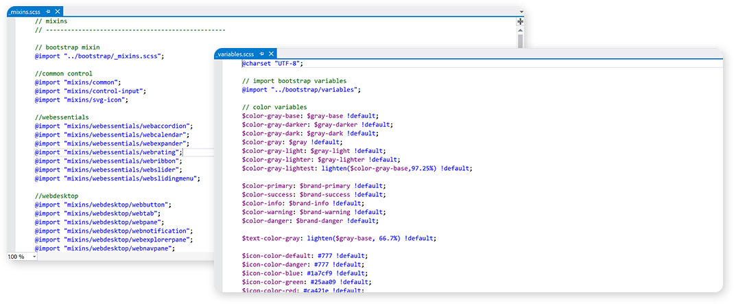
SCSS, the CSS on steroids, is now the first-class citizen in WebUI components. Featuring thousands of pre-defined variables and mixins, it dramatically changes the way you style WebUI components to achieve consistent look and feel in your apps.
Overview

Designed for extensibility, the WebUI theme source is completely written in SCSS language, a mature and powerful stylesheet preprocessor that provides more advanced and developer-friendly syntaxes.

It also provides convenient built-in functions to work with colors and styles, and also allows you to create your own functions or mixins which you can easily reuse in the styling definition. The SCSS source files will then be compiled to valid CSS files which are compatible with all versions of CSS.

Node SASS

A library that provides binding for Node.js to libsass, the C version of the popular stylesheet preprocessor, SASS. It allows you to natively compile .scss files to css at incredible speed and automatically via a connect middleware.
Learn more.

WebCompiler

It’s the most seamless extension for integrating SCSS experiences right in the Visual Studio environment.

Predefined Variables

Easily override default style variables and mixins to match your application theme.

All-new Gorgeous Modern Themes

Say hello to the new, gorgeous modern themes in WebUI 2016. Right when you apply the new unified theme, your existing WebUI apps will never look the same way anymore. Every user interface element is meticulously designed with natural colors, spacious layout, larger fonts and retina-sharp SVG icons.

WebGrid Enterprise 10

The industry's best enterprise data grid meets supercharged performance and a refreshed new look. Building on its advanced functionalities, WebGrid 10 leverages the latest web technologies and front-end trends optimized for modern browsers like Chrome, Safari, and Edge.

At A Glance

WebGrid has been significantly enhanced to fully support unified theming capability introduced in WebUI Framework 4. Inline styles are removed in favor of HTML5 and CSS3-compliant styles, instance-level styles and default stylesheets are stripped out to improve page loading times.

Hierarchical

Every user interface element has been improved when working with hierarchical data structure to make the most sense out of your complex data.

Batch Update

The Batch Update dialog box has been thoroughly refined and updated to match the aesthetics of the modern web applications.

Pivot Chart

The Pivot Chart is thoroughly enhanced to display your data in a more intuitive presentation style.

Editors

The built-in editors for WebGrid are now more accurately positioned to the cell's edge, taking account the intricate highlighted borders and shadow.

Column Set

The new modern aesthetics also work seamlessly and flawlessly with complex ColumnSets to fully cater enterprise-grade data and business scenarios.

ColumnSet Designer

WebGrid 10 now brings ColumnSet Designer to the WebGrid component editor for Visual Studio 2012 or higher which works perfectly with high-resolution displays.

Improved User Experience

In addition to many runtime enhancements, WebGrid 10 also includes a redesigned filter bar that is more responsive and works identically across major modern browsers.

WebCombo 7

The most powerful and flexible combo box for ASP.NET is now enhanced with the design language on par with modern web applications. Meet WebCombo 7, the new and sleekest combo box now enhanced with WebUI Unified Theming technology.

Entry Mode

Performing a selection in WebCombo is effortless. Just type in a few words, then WebCombo will automatically suggest suitable choices based on your input.

Multiple Selection

As a true selection control, WebCombo also supports multiple selection mode. To enter multiple entries onto the WebCombo, you can choose between typing mode or checkbox mode.

Size Class

Enlarge of shrink the WebCombo with the new size classes introduced in WebCombo 7.

Form Group

You can also adjust the WebCombo size when using the form group class.

Contextual Classes

On par with modern CSS frameworks, WebCombo now various validation states to indicate the validity of user input.

Validation State

On par with modern CSS frameworks, WebCombo now various validation states to indicate the validity of user input.

WebInput 5

Completely redesigned with the new modern theme, WebInput 5 offers ultimate data entry functionality from simple input to advanced masked input. Every little detail of the input element has been revamped to match the latest presentation trends conforming to modern web standards.

Calendar Editor

Calendar Editor provides a feature that allows users to easily populate a date value through a beautiful, built-in contextual popup box.

Calculator Editor

With full keyboard support, the Calculator Editor allows user to perform quick calculations in a stylish popup that consists a set of intuitively-sized keys.

Size Class

The new and improved WebInput will always fit into your existing business applications with new flexible size classes.

Contextual Classes

Bootstrap-inspired color palettes provides useful information for the user on the validity of the input values.

Watermark

The watermark text allows for a clearer form entry with placeholder instructions. The icons are now in SVG, meaning that no matter what your screen sizes are, WebInput will always look super sharp.

Masking

WebInput supports masking which allows for custom format entry. The evenly-spaced paddings between the container and the text makes up for neater web forms.

WebDesktop 5

WebDesktop 5 is a revolutionary release that transforms traditional web apps into gorgeous, ultra-sleek multiple document interface. The new release sports unified modern theme for all 15 user interface components included in WebDesktop, reimagined with timeless industrial-standards design and equipped with scalable SVG icons.

WebButton

WebButton component is included as a perfect complement for the WebDesktop. It’s the perfect button for modern web applications.

WebCallOut

WebCallOut is a superior replacement for the standard tooltip. With its beautifully designed styles, appealing visual effects, and customizable elements, WebCallOut has everything you need to build the perfect tooltip to complement your web applications.

WebDesktopManager

WebDesktopManager employs an object-based approach to give you granular control over every visual aspect of its elements. Offering a rich set of properties to control shortcut, icons, taskbar, and window elements, it enables you to create the precise appearance your desktop requires with a minimum of effort.

WebDialogBox

WebDialogBox is a powerful dialog box that provides a true desktop experience. Offering multitudes of customizable modern styles, WebDialogBox is the best dialog box ever made for the web.

WebDragDropExtender

Adding drag-and-drop functionality to your applications is no longer a hassle with the improved WebDragDropExtender. It is redesigned beautifully that complements the modern style of WebDesktop.

WebExplorerPane

WebExplorerPane is a sleek-looking panel that provides the user with easy access to quick actions. It offers a true file explorer look with sleek visual styles and advanced features.

WebMenu

With WebMenu, your menu bar will never look the same. The neutral and subtle colors allows WebMenu to fit in just any business applications with various scenarios

WebNavPane

WebNavPane is a beautiful of control pane and navigation menu wrapped up in a single, powerful component. Packed with tons of customizations, WebNavPane is designed to integrate seamlessly into your existing applications.

WebNotification

Sending interactive, real-time notifications to your ASP.NET applications is never this easy with WebNotification. Its broad and rich feature set supports all types of web applications regardless of their size and complexity. A few of the notable advanced features include a built-in context menu, clickable notification, and audio visual notification effects.

WebPaneManager

WebPaneManager puts you in control how the components in your screen will be laid out, providing all the tools you need to develop professional layouts that organizes your application content and give it a consistent and elegant appearance.

WebTab

WebTab offers all-new modern container layouts to make your web application more appealing, such as line tabs, pill tabs and frameless tabs.

WebScheduler 5

WebScheduler 5 is the most significant release since its inception, featuring a completely re-engineered user interface for the most sophisticated scheduling experience. Over hundreds of elements and interaction styles – from the header, toolbar, events to callout and editing form – have been redesigned with clean and spacious layout, and modern appearance.

Building on the state-of-the-art WebUI modern theme, every scheduler view now leverages SVG icons for the most sharp, pixel-identical interface. A new version of editing form is also available which leverages HTML5, Bootstrap, and WebUI modern theme, which provides an ultimate editing experience


Unified Theming Support

WebScheduler has been significantly enhanced to fully support unified theming capability introduced in WebUI Framework 4. Inline styles are removed in favor of HTML5 and CSS3-compliant styles, instance-level styles and default stylesheets are stripped out to improve page loading times

New Scheduling Experience

The new WebScheduler is completely redesigned from the bottom-up with modern and clean user interface, taking scheduling experience to a whole new level. Building on the WebUI unified theming, WebScheduler's new modern theme leverages the popular CSS framework, Bootstrap.

Unlike previous versions, WebScheduler automatically uses shared/common styles when the unified theming feature is enabled. When the common styles are modified, WebScheduler and the other WebUI components that present similar semantic will be automatically updated.

Redesigned Editing Form

The new WebScheduler editing experience is now thoroughly enhanced with a new editing experience. Notice the modal dialog box containing the form now looks sleeker than ever. The entire set of icons are now displayed using SVG to ensure maximum consistency across various screen sizes.

Improved Performance

In previous versions, when the page containing WebScheduler has a lot of stylesheet classes, interaction such as cell selection will become slower as more stylesheets are included.

This release includes major re-engineering to the interaction core, resulting in real-time interaction regardless of the stylesheet size. This improvement is critical in creating responsive user experience for large-scale WebUI application.

Latest Browser Support

WebScheduler is now improved and optimized for the following modern browsers: Internet Explorer 11, Edge, Safari 9.0, Chrome 47 and Firefox 42.

WebEssentials 4

Power-packed with essential components for modern web development, WebEssentials 4 joined the UI revolution along with the rest of WebUI components released in 2016 release. The WebListBox now supports clean and professional look such as those featured in modern navigation apps, while WebSlidingMenu has been remodeled with iOS-style navigation menu.

In addition, WebRibbon has been reimagined with modern styles which is beautifully aligned with the entire WebUI unified visual semantics. All WebEssential components are now leveraging SVG icons for pixel-perfect and scalable design, taking web user interface to the next level.

WebAccordion

WebAccordion is a collapsible content panel featuring a modern minimalist style and silky-smooth expand/collapse animation. With tight integration to the Visual Studio IDE, you can easily add new items and set their content directly, or use iframe mode to host external pages.

WebCalendar

WebCalendar provides a fast, convenient way to navigate by date and select dates and date ranges with modern look and feel. You can also jump to specific year of your choice with built-in intuitive navigation.

WebExpander

WebExpander eases the burden of managing lengthy content by dividing it into multiple smaller sections. Use its customizable layout and diverse expansion modes to create a unique and personalized user experience.

WebListBox

Using text, images, or both, WebListBox unleashes your inner creativity, allowing you to build eye-popping vertical navigators. A rich set of predefined themes provides an endless variety of choices bound to suit every website.

WebProgressBar

Whether your preference is vertical or horizontal, WebProgressBar provides an elegant progress indicator for your Web application. Available in various rich Bootstrap-themed colors and animations, plug it in, and display progress bars in style.

WebTextEditor 3

WebTextEditor 3 comes fueled with beautiful aesthetics conforming to the new WebUI unified modern theme. Every user interface element has been meticulously redesigned to create the most sophisticated editing experience which naturally integrates a built-in spell checker and real-time file uploading.

Joining the UI revolution in this release, the new WebTextEditor also sports modern styles applied to all elements, from the toolbars, text editors, task panes to popovers and status bars. That's not all, the media gallery, table designer, and image editors have been dramatically improved for faster performance and built for latest browsers including Edge, Safari and Chrome.

Unified Theming Support

WebTextEditor has been significantly enhanced to fully support unified theming capability introduced in WebUI Framework 4. Inline styles are removed in favor of HTML5 and CSS3-compliant styles, instance-level styles and default stylesheets are stripped out to improve page loading times

New Unified Modern Theme

Every single component consisted in WebTextEditor are now redesigned with unified modern theme that matches the new design language in this release. Whether you’re using WebTextEditor with spell checking feature, mail merge, or just simple text editing, it’s now an all-around unified experience.

Latest Browser Support

WebTextEditor now supports and fully tested against all modern browsers that are compatible with HTML5 and CSS3.

WebTreeView 2

WebTreeView 2 combines already powerful hierarchical data functionality with the new WebUI unified theme – perfect for today's modern web applications. Every glyph and control resource have been updated with SVG icons for the sharpest, pixel-perfect presentation on any screen resolutions. Joining the rest of WebUI members in this release, WebTreeView 2 comes with improved performance, stability and reliability as well as support for latest browsers.

Unified Theming Support

WebTreeView has been significantly enhanced to fully support unified theming capability introduced in WebUI Framework 4. Inline styles are removed in favor of HTML5 and CSS3-compliant styles, instance-level styles and default stylesheets are stripped out to improve page loading times

New Unified Modern Theme

Every single component consisted in WebTreeView are now redesigned with unified modern theme that matches the new design language in this release. Whether you’re using WebTextEditor with spell checking feature, mail merge, or just simple text editing, it’s now an all-around unified experience.

Introducing WebUI Developer Center

Now you have access to hundreds of WebUI documentation resources online. Getting started with WebUI has never been easier with the new WebUI Developer Center.

Moving the documentation online has slashed Premier Studio’s installer size in half and allow us to provide more contextual and up-to-date best practices for modern web development with WebUI.

Visual Studio 2015 and Windows 10 Support

WebUI Studio 2016 includes improved IDE integration and tooling support with enhanced support for Visual Studio 2015. In the previous releases, you are required to run Visual Studio 2015 with administrator privilege when using WebUI components.

In this release, administrator is no longer required, allowing you to use WebUI components with standard user privilege. In addition, this release also adds improved support for Windows 10.

Latest Browsers Support

WebUI Studio 2016 is strongly focused to provide high-performing UI components that work and look great in the latest version of major browsers. With the new modern theme and supercharged frameworks, WebUI components now render pixel-identical design across various browsers. It's also building on advanced capabilities available in modern browsers today such as SVG.

WebUI Studio 2016 supports latest major browsers such as Internet Explorer 9, 10 and 11, Edge, Safari 9, Chrome 48 and Firefox 44.

New WebUI Unified Theme Template

This release sports a new WebUI Unified Theme template that lets you get started with a new WebUI application with the unified theme enabled, integrated with Visual Studio.

The project template features:

  • Pre-configured theming configuration with unified theming enabled.
  • Pre-compiled CSS files for Bootstrap and WebUI modern theme.
  • A sample page that shows a combination of WebUI components in unified theme.

The Holy Grail of Modern Android Development

Creating beautiful and modern Android Material experience is no longer rocket science.

With Crosslight 5, you can now build Material Design experiences such as Floating Action Button, Material Toolbar, Shared Element Transitions, Parallax Scrolling, Material Navigation Drawer, and more with just simple property sets from Crosslight Fragments.

The Material Design Experience

Let’s take a look at some of the Material Design Experience offered in this release.

Vibrant Material Colors

Crosslight 5 adheres to the striking, vibrant color palettes Google defined for Material Design, which made Material Design apps easily distinguishable.

These colors are easily overridable just by changing the colors.xml inside the Resources/values folder.

Floating Action Buttons

These prominent buttons provide an easy access to primary actions in the screen. Crosslight 5 lets you add Floating Action Buttons very easily, with just simple API calls from the Fragment.

protected override void Initialize()
{
   base.Initialize();
   this.FloatingActionButtons.Add(new FloatingActionButton("AddButton")
   {
      Position = FloatingActionButtonPosition.BottomRight,
      CommandItemType = CommandItemType.Add
   });
}
                

Collapsing Toolbars

As an integral part of the Material Design, Collapsing Toolbars allow for more content to shine when user consumes content on mobile devices.

Crosslight Android Material offers several predefined Toolbar interactions that will delight Android developers, notably that the behavior can easily be enabled with just simple property sets.

Material Toolbar

To customize the Toolbar behavior, all you need to do is simply set the desired behavior in the Fragment level. Very convenient.

protected override void Initialize()
{
   base.Initialize();
   this.ToolbarSettings.Mode = ToolbarMode.Collapsing;
   this.ToolbarSettings.CollapsingToolbarSettings.EnableParallaxImage = true;
   this.ToolbarSettings.CollapsingToolbarSettings.ExpandedHeight = 240;
   this.ToolbarSettings.CollapsingToolbarSettings.ParallaxImageId =
   Resource.Drawable.contact;
   this.ToolbarSettings.CollapsingToolbarSettings.ScrollFlags =
   DesignWidget.AppBarLayout.LayoutParams.ScrollFlagScroll |
   DesignWidget.AppBarLayout.LayoutParams.ScrollFlagExitUntilCollapsed;
   this.IconId = Resource.Drawable.ic_toolbar;
}
                

Shared Element Transitions

One of the most interesting interactions in Material Design is the Shared Element Transitions, in which UI elements from the previous screen is persisted and transformed into the other screen.

With Crosslight 5, we’ve made it super easy for you to achieve this effect. No more dealing with tedious TransitionSets and XMLs, just simple property sets.

Then, in the target Fragment, specify the ID of the shared element.

In the source Fragment, specify the ID of the shared element.

protected override void Initialize()
{
   base.Initialize();
   this.InteractionMode = ListViewInteraction.Navigation;
   this.SourceSharedElementIds.Add(Resource.Id.Icon);
}
                

Then, in the target Fragment, specify the ID of the shared element.

protected override void Initialize()
{
   base.Initialize();
   this.TargetSharedElementIds.Add(Resource.Id.parallax_image);
}
                

Parallax Scrolling

The comprehensive Material Design specs defined by Google even covers user interactions such as scrolling. The scrolling techniques presented in the document highlights many of the interesting behaviors Material Design has to offer.

To achieve this effect in Crosslight Android Material, all you have to do is just override the Initialize method in the Fragment and specify the behavior settings as follows.

protected override void Initialize()
{
    base.Initialize();
 
    this.ToolbarSettings.Mode = ToolbarMode.Collapsing;
    this.ToolbarSettings.CollapsingToolbarSettings.EnableParallaxImage = true;
    this.ToolbarSettings.CollapsingToolbarSettings.ExpandedHeight = 240;
    this.ToolbarSettings.CollapsingToolbarSettings.ParallaxImageId = Resource.Drawable.contact;
 
    this.FloatingActionButtons.Add(new FloatingActionButton("FavoriteButton")
    {
        Position = FloatingActionButtonPosition.BottomRight,
        IconId = Resource.Drawable.favorite,
        AnchorId = Resource.Id.app_bar_layout
    });
}
                

Navigation Drawer

You can now take advantage of the immersive Navigation Drawer. Originally popularized by Google default apps such as Gmail, Play Store, Inbox, Maps, Google Now, etc, the Material navigation drawer is now implemented automatically when you use the new DrawerActivity. The Material navigation drawer follows the same design guidelines as imposed by the Material Design document.

Android Programming, Simplified.

Say goodbye to tedious lines of codes and boost your productivity with these simplified development experiences in Crosslight 5.
Modernized Project Structure

The new Crosslight Android Material development patterns are now more simplified and organized than ever. Right after a Material project is created with the Crosslight Project Wizard, you'll see a new and refreshed project structure.

Most of the unnecessary files are removed, Android class files are now logically grouped. Activity files inside the Activities folder, Fragment files inside the Fragments folders, infrastructural bootstrapper files inside the Infrastructure folder. Launcher icons now use the modern mipmap folders.

Resource Overrides

The new Crosslight Android Material is now loaded with customizations. Customizing different elements and colors for your Android app is now easier than ever.

What you need to do is simply override existing keys and values in your application and your it will immediately take effect across your entire application.

Automatic Back Button

In previous versions of Crosslight Android, you have to explicitly write a certain code to show the back button in the view. Well, all that has changed with the new Crosslight Android Material. The back button is now visible automatically when you perform push, modal or nested modal navigation. Less code to deal with.

Add Toolbar Items with Simple API

In traditional Android development patterns, to specify menu items for your Toolbar, you need to create an XML file and put them under the Resources/menu folder, then specify the layout Id in the Fragment or Activity. That's very tedious.

With Crosslight Android Material, all you need to do is simply override the Initialize method and add one line-of-code to add a toolbar item to the Toolbar.

protected override void Initialize()
{
   base.Initialize();
   this.BarItems.Add(new BarItem("SaveButton", CommandItemType.Done));
}
                
Smart Fragment Navigation

Crosslight Android Material takes the pain out of thinking which view context to use, Activity or Fragment. With the new library, Fragment is now the first-class view context with full navigation support. This means you can just create fragments for all your content views. Under the hood, Crosslight Android Material will seamlessly manage the Activity creation when needed.

This results in much simplified, rapid and maintainable Android development, where you can simply create views by focusing solely on Fragments. Note that Activity is needed only for the main container in the app, and in certain scenarios when different kind of container is desired.

Comprehensive Material Components

To achieve all the amazing Material Design experience with simplicity, the existing Crosslight Android needs to be re-engineered from the ground-up to achieve full Material Design compliance, resulting to a powerful Crosslight Android Material library.

Many tedious operations were streamlined into fragments such as smart TransitionDrawable orchestration needed for shared transitions, parallax effects, floating action buttons, data binding, navigation patterns, and so much more.

Let's explore many of the new Fragment classes available in Crosslight Android Material.

The RecyclerViewFragment

When working on a list of items, ListView was the popular choice for Android developers. In Material Design, the RecyclerView is now the more preferred component when dealing with large amount of data. With strong view holder pattern, the RecyclerView allows for efficient reuse of item cells without any performance degradation.

In order to fully support true Material Design experience, a new RecyclerViewFragment is introduced in Crosslight Android Material. This new fragment supports several new experiences, such as CardView, swipe gesture support, shared transitions and multiple selection.

CardView Support

Available from API 21 and above, modernize your Crosslight app right away with CardView support for RecyclerView. It is the perfect presentation technique to display items with rich visual display that fully complies with Material Design standards.

Swipe Gesture Support

Provide quick actions for an item with the swipe gesture support for RecyclerView. The quick actions now shares the same pattern with iOS development, allowing the actions to be defined at the Core level. Building on mature Crosslight Foundation, it comes with comprehensive data binding support allowing you to reuse the same UI logic and action commands in ViewModel.

Shared Transition Support

Navigate between the list screen to the item editor screen with Crosslight Form Builder with shared transition support.

To enable this feature, you only need to define the shared element and SharedImageIndex in the source Fragment and the target Fragment.

Multiple Selection Support

With the new RecyclerViewFragment, multiple selection action is also supported. Although the cells are being heavily reused, the RecyclerViewFragment is designed smart enough to remember the multiple selection state for each item when the user scrolls through the list of items.

Upon entering multiple selection mode, the existing Toolbar is overlaid by another Toolbar that shows contextual actions. During multiple selection mode, the RecyclerViewFragment's swipe gesture is automatically disabled as swipe gesture makes lesser sense in editing mode.

New Fragment Variants

In addition to RecyclerViewFragment, this release sports even greater and wider range of Fragment components to cater existing scenarios supported in Crosslight Android Classic and even newer scenarios.

SearchableRecyclerViewFragment

The new SearchableRecyclerViewFragment lets you implement search against your collection in the RecyclerView with the ViewModel.

Best of all, it works seamlessly with existing search architecture, so you don’t have to perform any additional effort.

GridViewFragment

Crosslight Android Material comes with an advanced GridViewFragment designed with intuitive API. For example, you can specify the number of GridView columns, item offset, paddings and interaction mode.

It also caters to common business scenarios such as displaying items in a horizontal manner, as shown in the following video. This is all made possible, thanks to the new GridViewFragment for Crosslight Android Material.

FormFragment

The new Material Design language introduced in Crosslight Android Material allows forms to shine on a new level. With clear design guidelines from Google, Material Design has also manifested in forms, effectively changing how Crosslight Form Builder should look and feel, therefore a new FormFragment is introduced.

The entire lineup consisting of 15+ form builder editors are now redesigned and refined for Material design, including its font size, margin, and paddings are now taken into account.

MasterDetailFragment

In this release, a new MasterDetailFragment is introduced for Material Design. This component was originally introduced back in Crosslight 2, which allows users to perform master detail navigation on tablets. With the new MasterDetailFragment, you can easily replicate the same user experience with Material Design look and feel.

NestedFragment

Similar to the MasterDetailFragment, the new NestedFragment allows users to perform two-level master detail navigation on tablets. This is useful for business scenarios in which the list may contain a sublist of items. Originally introduced in Crosslight 2, the new NestedFragment is now refined and redesigned to match Material Design standards

SplitFragment

If you prefer a iPad style split view, then this is the right Fragment for you.

Introducing the new SplitFragment, this Fragment allows you to have a completely two separate Fragments where the Fragment have their own Toolbars each with its own navigation.

SearchActivity

The new SearchActivity is a special Activity class which handles search performed by child views, for example, view pagers, centralized in just one parent SearchActivity. Inspired from the simplicity and elegant beauty of iOS, the new search activity also feature a translucent background in initial state, giving subtle transition effect and better user experience.

Gorgeous Material UI Components

The new and modern UI language introduced in Material Design also affects how Crosslight Android Material apps look and behave. Re-engineering was inevitable, and the end result is Android apps now looks even more stunning UI components that blends perfectly with Material Design.

MapFragment

Crosslight Maps are also compiled and tested against the new Xamarin support libraries, ensuring maximum compatibility with Lollipop.

ViewPagerFragment

Due to shared transitions framework introduced in Material Design, the existing ViewPagers also need to be revamped.

Now ViewPagers support the use of multiple floating action buttons, for each tab, which are smoothly animated during tab transition from one tab to another.

Material Activity Presenter

In older versions of Crosslight, Activity Presenters's designs were heavily influenced by the Holo theme, which looks very dark and black. In Crosslight 5, the Activity Presenter's UI is upgraded to use enhanced ProgressDialog so that it displays presenters Android users are familiar with.

It still retains three method overloads supported by Crosslight Activity Presenter in the ViewModel. It will be automatically applied when you migrate to Crosslight 5.

Material Buttons

The older Holo-themed buttons just won't cut it to Material Design. As a result, buttons are also upgraded to use the two variants of Material Design, the Raised and Flat buttons. The buttons feels modern and second nature to Material Design.

This will also be automatically applied when you migrate to Crosslight 5.

Upgrading Your Project to Material Design

Now can easily enjoy all these great features and start adopting Material Design right into your existing Crosslight apps.

Crosslight Core Improvements

In addition to sweet Material designs, Crosslight 5 also sports several API improvements when working with the the Core project.

New Action Toast Presenter

With the new Action Toast Presenter, you'll be able to present new possibilities to your users once they have performed an action, for example, undoing the previous action.

Easily Set Title from the ViewModel

The new Crosslight 5 lets you set the Title for each screen straight from the ViewModel, instead of having to manually set each view Title for each platform. Small, yet notable improvement.

Supercharged Development with NuGet Packages

It’s as simple as 1, 2, 3. Crosslight now fully takes advantage the power of NuGet Package Manager to install, restore and update Crosslight packages.

Installing Crosslight on Mac

1. Open your project using Xamarin Studio

2. Open Intersoft Package Console Extension

3. Run this command

Install-Package Intersoft Crosslight -allPackages

You've successfully installed Crosslight on Mac.
Say goodbye to tedious packages reference management.

Installing Crosslight on Windows

1. Open your solution in Visual Studio

2. Right click-on your solution and select Manage NuGet Packages for Solution.

3. Search for Intersoft.Crosslight and install to all products.

You've successfully installed Crosslight on Windows.

For a more comprehensive information on additional commands, updating and restoring NuGet packages, visit the documentation.

Revolutionary Crosslight UI Components

In addition to Material Support, Crosslight 5 also adds a variety of new UI components to help you build apps faster than ever.

Gauge and Circular Chart

With full MVVM compatibility and supporting 20+ types of charts, the new circular gauge lets you display real-time data with customizable chart elements. The charts are designed to load quickly in seconds with lightweight footprint.

Signature Pad

Capturing signatures with Crosslight is no longer a hassle with the new Signature Pad. Fully built from the ground up, it lets you take signatures with no lag and full MVVM compatibility with the ViewModel and integrates beautifully with Crosslight Form Builder.

Calendar 2.0

Display your custom events using Crosslight Calendar 2.0. The reintroduced Calendar View now renders more consistently and neater on smaller devices such as phones.

Crosslight.iOS Improvements

In addition to the very focused improvements towards Material Design, Crosslight.iOS also receives some nice upgrades in this release. These upgrades will surely help you take advantage of the latest and greatest SDKs available for your Crosslight app.

iOS 9 Support

With full MVVM compatibility and supporting 20+ types of charts, the new circular gauge lets you display real-time data with customizable chart elements. The charts are designed to load quickly in seconds with lightweight footprint.

Full Storyboard Support

With Crosslight 5, now you can use UICollectionViewController, UIMasterDetailViewController, and UITabBarController with full storyboard support. With Storyboards, you no longer need to specify multiple XIBs for content-based views. Simply use one storyboard for your entire iOS projects and adapt to various screen sizes and orientations using full Auto Layout support

Form Builder Improvements

Display your custom events using Crosslight Calendar 2.0. The reintroduced Calendar View now renders more consistently and neater on smaller devices such as phones.

Prior to Crosslight 5, when you use the ImageView editor with Form Builder, it can only be contained inside a section that has its layout specified to ImageWithFields. Now you can use ImageView independently regardless of its container's section layout.

Modern Transparency API

With Crosslight 5, now you can take advantage of the new modern transparency transition API for UINavigationControllers. Take a look at the video. Notice how the NavigationController's status bar is fully transparent while performing navigation.

Typically, achieving this effect is very hard, as common implementations require reengineering of the NavigationControllers, which may lead to a loss of native user experiences, such as the left-edge swipe gesture to return to previous screen. This new API retains the originality and native functionalities of the UINavigationControllers, while still achieving the transparency effect elegantly.

Deeper and Better IDE Integrations

As software development world is constantly evolving, so do Crosslight. Adding deeper integration your favorite IDEs, Visual and Xamarin Studio, this release focuses on development productivity while achieving a frictionless getting started experience.

Crosslight Project Wizard

Creating Crosslight projects have never been easier, thanks to Crosslight Project Wizard. In our biggest release ever, the Project Wizard is now revamped and further refined.

  • Projects created using the Project Wizard now uses simplified and modernized project structure, with removal of unnecessary files.
  • The generated Core project now uses the standard Profile78 instead of Profile158 for greater compatibility with other third-party components such as Microsoft BCL.
  • WYSIWYG experience when choosing primary colors in creating Material projects. Android files are now logically grouped in respective folders, also adding support for mipmap icons.
  • Created iOS projects now uses full storyboard support, revised Info.plist files to add support for iOS 9 features, such as the use of StackView in Storyboards. Icons and launch screens now use AssetCatalog for centralized assets management.
  • Created projects now reference to Crosslight NuGet packages which greatly simplify cross-platform development workflow.
Visual Studio F1 Help Integration

Want to know more information about a particular class, method or property? Simply put your cursor over and press F1 on your keyboard and you'll be taken to the reference documentation. Works for Visual Studio 2012 and above.

NuGet Package Extension for Mac

After you've successfully installed Crosslight onto your Mac, you'll be able to take advantage of the new NuGet package extension for Mac. Resolving Crosslight assemblies are no longer a chore. Just execute this code in the Intersoft Package Manager Extension and Crosslight will be installed automatically to all of your projects.

Install-Package Intersoft.Crosslight -allPackages
Material Item Templates

This release adds new Android Material item templates targeting Crosslight Android Material project enabling you to get started quickly with the new Material classes available in Crosslight 5. Simply install the latest Mobile Studio to enjoy this feature on Xamarin Studio and Visual Studio.

Improved Documentation with New Starter Walkthroughs

To help you get started with Crosslight even faster and easier, we've created an entire new, walkthrough-style documentation which guide you through detailed, step-by-step instructions in various development aspects.

Note that the new walkthrough documentation is not meant to replace the existing conceptual documentation, but rather a supplementary to the current documentation. New starter walkthroughs will be added periodically.

Frictionless Crosslight Samples Experience

In this release, getting started with Crosslight samples is now a frictionless experience. All you have to do is just open up the sample, restore NuGet packages and run. Here’s a 2-minute video that shows the new getting started experience:

In addition, these samples also receive these great updates:

  • All samples are now directly runnable using NuGet packages, so you don't have to deal with tedious hassles to fix your references. It's as simple as three steps: download the sample, restore the NuGet packages, and run the sample.
  • Added Android.Material project — building on the new Crosslight.Android.v7 library.
  • Dropped classic Android project.
  • iOS project is now redesigned with universal storyboard instead of XIB.
  • Core project has been much improved to comply with best practices and API introduced in Crosslight 5. For instance, setting Title can be simply done in ViewModel. The associated view in iOS and Android will automatically take that. This means less code to concern in the view.
  • Core project now uses Profile78 as our new PCL standards. This will allow you to consume most BCL packages from Microsoft.
  • Crosslight samples that use WebAPI can now run directly – no Windows required. By default, all WebAPI samples are now pointing to Intersoft’s public WebAPI endpoint. If you wish to change it to your local WebAPI, that’s just one property value to set.

Cleaner and Modular Samples Repository

As Crosslight matures, more samples are being added to the repository, resulting in a humongous download size. This poses a problem when you need to download and try out a single sample. In this release, we’ve separated each sample into its own repostiory, resulting in a cleaner and modular samples.

In addition, the samples are now categorized into basic, data, app, services, and ui samples. If you just starting out with Crosslight, checking out basic samples are highly recommended.

ClientUI Reporting for WPF

Everything you love about ClientUI Reporting for Silverlight, now available on the desktop. Full WYSIWYG report designer, pixel-perfect report rendering, desktop-class experience. Author and build gorgeous enterprise reports like never before. Now comes with full charting support!

Reporting Controls

ClientUI 12 brings reporting controls entirely available to WPF which allow you to view reports from desktop application. All reports you have previously authored in Silverlight will continue to work exactly the same way and manner in WPF.

Report Converter

Got an existing app with Microsoft Crystal Reports? No worries. Now you can easily convert all of your Crystal reports to work with ClientUI Reporting with the new Crystal Reports Converter. Simply import your reports and start using ClientUI Reporting today!

Charting Support

Supporting over more than 20+ types of charts, ClientUI Reporting lets you integrate various charts inside your reports. Available for Silverlight and WPF, you can now simply drag and drop charts onto the designer surface, simply bind your data, and voila, your reports have never looked this gorgeous.

Chart Designer

The new charting feature also comes with comprehensive chart designer that allows you to customize various parts of the chart, including the chart’s title, axis, series, and so much more.

In addition, the samples are now categorized into basic, data, app, services, and ui samples. If you just starting out with Crosslight, checking out basic samples are highly recommended.

New ClientUI Samples

ClientUI 12 introduces new redesigned technical samples strongly focused on each product's feature. It's designed to help you discover the features quickly and implement them in your application. Check out some of these feature-packed samples below.

Control Samples

This sample showcases various controls available in Silverlight and WPF platforms, such as UXQueryBuilder, UXPropertyGrid and UXBreadCrumb with various common use cases.

Data Samples

Previously known as UXGridView.Samples, this sample showcases various data-related controls such as UXItemsControl, UXListBox, UXTreeView, and much more. The sample also demonstrates how ClientUI data controls interact with other technologies, such as WCF RIA Services and DevForce Services.

Data Visualization Samples

Visualize your data in more than 25+ types of charts available exclusively for ClientUI Reporting. The new rendering engine allows your data to shine with pixel-perfect clarity. Best of all, it works for both Silverlight and WPF.

Reporting Samples

Visualize your data in various gorgeous charts available in ClientUI Reporting Suite. Pie, line, bar, area, range, scatter, feel free to display any type of charts, in any way you like. All with high performance.

Previous Next