

| Intersoft ClientUI 8 > ClientUI Controls > Control Library > Advanced Input Controls Overview > UXFileUpload |
UXFileUpload is a high-performance file upload control conforming to RFC 1867 form-based data submission. Sports a professional and business-oriented styles, UXFileUpload delivers intuitive user interface with predefined toolbars, scrollable file list, progress bar and status bar which adheres to ISO usability standards.
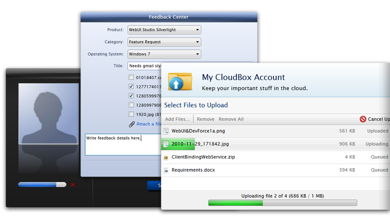
UXFileUpload includes all standard features you expected in a file upload control, plus a multitude of innovative features that unique to UXFileUpload such as multiple upload worker process, comprehensive MVVM and commanding support, smart file chunk algorithm, very large file upload support, file-level cancellation, drag-and-drop files from operating system, and more.
The UXFileUpload control is designed with the key objectives described in the following list.
UXFileUpload is a feature-rich file upload control supporting Silverlight 3, Silverlight 4 and WPF. Despite of the large number of features, UXFileUpload is designed for an ultimate ease-of-use. It comes with a compelling user interface design that conforms to ISO usability standards, making it quick and easy for you to add rich file upload capability to your Silverlight or WPF applications.
The simplest UXFileUpload control can be defined with only two properties set, the ServiceUrl and the TargetFolder property. You set the ServiceUrl property to a value that determines the absolute web address where the server-side handler is configured to accept the file upload requests. The TargetFolder determines where the files should be stored in the server.
ClientUI includes a built-in ASP.NET server-side handler that you can use to accept the file upload requests from the UXFileUpload control. When using the built-in server-side handler, you can set the TargetFolder to a relative path in your web server, for an instance, ~/Upload.
 |
You need to register the server-side upload handler in your ASP.NET web project in order for the UXFileUpload control to work properly. For more information configuring the server-side handler for the upload control, see How-to: Configure ASP.NET Server-side Handler for UXFileUpload. |
The following code shows the most basic configuration of a UXFileUpload control.
| XAML |
Copy Code
|
|---|---|
<Intersoft:UXFileUpload ServiceUrl="http://localhost:1825/UXFileUploadHandler.ashx" TargetFolder="~/Upload"/> |
|
When viewing the control in either design or runtime, you will find the results similar to the illustration in the following:
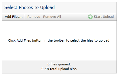
With the upload control shown above, users can start to add files immediately by clicking the Add Files command in the toolbar and click on the Start Upload command to start uploading the selected files.
The UXFileUpload control comes with a lot of customizable behaviors and settings, which allows you to completely customize the user interface, appearance and the look & feel aspects. These subjects will be discussed latter in this topic.
UXFileUpload can operate in two mode, deferred upload which is the default mode, or automatic upload mode. In deferred mode, selected files will be uploaded only when users initiate the upload command, such as by clicking the Start Upload button in the toolbar. With automatic mode, selected files are immediately uploaded without further user interaction. In such case, the upload progress is started as soon as users select the files and close the dialog box.
To enable automatic upload mode, you set the IsAutomaticUpload property to true, such as illustrated in the following example.
| XAML |
Copy Code
|
|---|---|
<Intersoft:UXFileUpload ServiceUrl="http://localhost:1825/UXFileUploadHandler.ashx" TargetFolder="~/Upload" IsAutomaticUpload="true"/> |
|
You can allow users to select multiple files in the Open File dialog box, which is enabled by default. In certain cases, you may want to use single file selection instead of multiple selection such as in photo upload scenario. To use single file selection, you set the CanSelectMultiple property to false.
You can restrict the Open File dialog box to show only certain file types, which is useful to help users focusing on the file types that the application can accept. For instance, a photo upload application may restrict the selected files to only image file types such as PNG, JPG and BMP.
You configure the file types filter by setting the FileTypeFilter property. The value of the property uses a pattern that contains description and file mask separated by the vertical bar (|).
The following is an example of a filter string:
Text files (*.txt)|*.txt
You can add several filter patterns to a filter by separating the file types with semicolons, for example:
Image Files(*.BMP;*.JPG;*.GIF)|*.BMP;*.JPG;*.GIF|All files (*.*)|*.*
You use the FileTypeFilterIndex property to set which filtering option is initially applied in the Open File dialog box.
The following example shows how to configure filtering options for image and document types, and set the active filtering option to the document types.
| XAML |
Copy Code
|
|---|---|
<Intersoft:UXFileUpload ServiceUrl="http://localhost:1825/UXFileUploadHandler.ashx" TargetFolder="~/Upload" FileTypeFilter="Image Files (*.png;*.jpg)|*.png;*.jpg|Document Files (*.doc;*.docx;*.pdf)|*.doc;*.docx;*.pdf" FileTypeFilterIndex="2"/> |
|
Although you may have applied the file types filter such as explained in the previous section, the filter applies only to the Open File dialog box. This means that the upload control can still upload any file types if the users forcibly select a file by specifying different file mask in the Open File dialog box.
You can enforce the upload control to validate the file types on every file selection by setting the EnforceFileTypeValidation property to true. Note that the file type validation uses the file types filter and the active filter index as specified in the FileTypeFilter and FileTypeFilterIndex property respectively.
In addition to file types, UXFileUpload also offers a number of upload and files constraints such as maximum files count, maximum allowed upload size, and maximum file size.
Please refer to the following properties for the upload and file-level constraints:
The following example shows how to configure the upload and files constraints to the upload control.
| XAML |
Copy Code
|
|---|---|
<Intersoft:UXFileUpload ServiceUrl="http://localhost:1825/UXFileUploadHandler.ashx" TargetFolder="~/Upload" MaxFilesCount="5" MaxFileSize="256000" MaxUploadSize="1024000"/> |
|
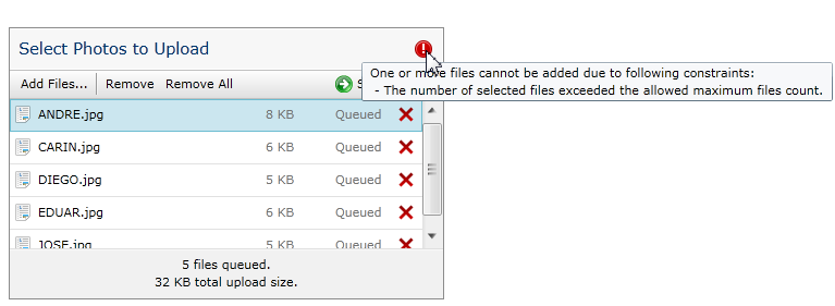
When one of the above constraints are encountered in the runtime, UXFileUpload shows a warning message in the user interface. The visual hint and message is a built-in feature of the upload control, which is shown in the following illustration.
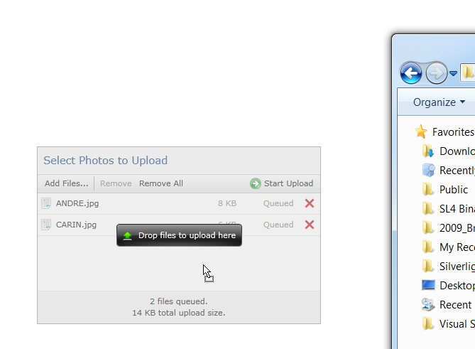
UXFileUpload includes an innovative feature that allows users to drag and drop files from the operating system, such as Windows Explorer in Windows 7, or Finder in Mac OS.
You can enable this feature by simply setting the AllowDrop property to true. Note that this feature is only supported in Silverlight 4 or higher, and WPF platform.
UXFileUpload implements a user-friendly visual hint when files drop are detected within the upload control region, such as shown in the following illustration.
UXFileUpload also allows you to drag and drop a folder to add the files existed in the folder, including all the sub folders within. However, this feature requires a special security configuration in the Silverlight application which is explained in UXFileUpload Advanced Features.
In addition to pre-upload configuration such as described in the previous section, UXFileUpload also introduces a number of advanced features that control the behaviors and interactions during the upload progress, such as the setting that indicate whether users are allowed to cancel an existing upload progress. These behaviors are explained in more details below.
By default, the UXFileUpload control is pre-configured to allow users to cancel the upload progress. You can disable this feature by setting the CanCancel property to false.
When this feature is enabled, users can cancel the uploading progress in one of the following ways:
UXFileUpload control offers an intuitive user interface that provides a clear distinct on the aforementioned cancel operations. Please refer to the following illustration for more details.
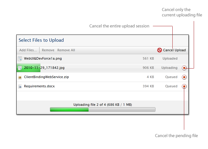
In most traditional upload control, the file upload session is locked once the upload progress is started. This means that users are not allowed to add more files while the upload is in progress. UXFileUpload implements a unique feature that allows users to keep adding new files even though the upload is in progress.
To allow users to add files during upload progress, you set the CanAppendFiles property to true. Thanks to the solid architecture that takes advantage of commanding architecture, UXFileUpload delivers reliable and consistent upload experiences in many possible combined settings. In this case, the Add Files command will continue to be enabled when upload is in progress. In addition, all other non-visual commands that may trigger file addition will be consistently enabled, for instance, users can also add files by drag and drop files from Windows Explorer.
The following code shows how to enable files addition during upload progress.
| XAML |
Copy Code
|
|---|---|
<Intersoft:UXFileUpload ServiceUrl="http://localhost:1825/UXFileUploadHandler.ashx" TargetFolder="~/Upload" CanAppendFiles="true"/> |
|
By default, UXFileUpload does not overwrite files that are already existed in the server. In such case, UXFileUpload will mark the particular file upload as failed, which can be easily noticed in the upload control interface such as shown in the following illustration.
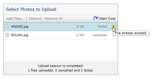
In the case that overwriting existing files is desirable in your application, you can set the OverwriteExistingFiles property of the upload control to true.
In the previous sections, you have learned the basics of UXFileUpload control, such as configuring the pre-upload settings and customizing the uploading behaviors. Once the files are uploaded to server, you may want to display the results to the users, such as displaying the list of uploaded files to a ListBox, or showing the uploaded photo in an Image control.
UXFileUpload makes it easy for developers to obtain the uploaded files by leveraging the data binding and MVVM design pattern. The following sections discuss a number of techniques to work with the uploaded files.
You use the UploadedFiles property to obtain the list of uploaded files. The UploadedFiles property implements ObservableCollection type, which allows you to bind it to a control that supports ItemsSource such as UXListBox.
The following code example shows how to bind the uploaded files to a UXListBox control and show the target file name as the content of the list box item.
| XAML |
Copy Code
|
|---|---|
<Intersoft:UXFileUpload x:Name="fileUpload" ServiceUrl="http://localhost:1825/UXFileUploadHandler.ashx" TargetFolder="~/Upload"/> <Intersoft:UXListBox ItemsSource="{Binding ElementName=fileUpload, Path=UploadedFiles}" DisplayMemberPath="TargetFileName" Height="200" Width="300" /> |
|
The result looks like the following illustration.
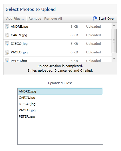
In addition, you can also use UploadedFile property for single file upload configuration.
The type of UploadedFile property and the item of UploadedFiles refers to the FileUploadInfo class, which is classified as the model in an MVVM design pattern. The FileUploadInfo class represents each file entry in the UXFileUpload control and implements INotifyPropertyChanged interface to support data binding usage in several common scenarios such as in data template.
In the above example, the UXListBox displays the file name of the FileUploadInfo object, which refers to its TargetFileName property as specified in the DisplayMemberPath property. There are a number of other properties that you may be interested in, such as Size, State, Extension, and Message. To learn more about other properties, see FileUploadInfo Class.
UXFileUpload also makes it easy for you to show the uploaded Url, which is particularly useful in image and photo application scenario. Consider that you want to show the uploaded photo in an Image control when the file upload completes, you can elegantly achieve this task by simply binding the UploadedFileUrl to an Image control. This approach allows you to use simple XAML declaration and eliminates the need to write code to achieve this particular task.
Before you can obtain a value from UploadedFileUrl, you first need to configure the TargetWebUrl property, which determines the absolute web address that used as the base address for the TargetFileName. You can specify a static web address for the target result address such as http://www.contoso.com/Uploads.
Alternatively, you can also specify a dynamic web address by including the {host} placeholder in the value, a unique feature available only in UXFileUpload control. The {host} placeholder will be automatically resolved at runtime by the built-in server-side handler, which is significantly useful in load balanced server scenario, or in complex applications where the server web address may change dynamically. An example of the dynamic web address is http://{host}/Uploads.
The following code shows how to use the dynamic target web address, and bind the uploaded photo to an Image inside the ContentReflector control.
| XAML |
Copy Code
|
|---|---|
<Intersoft:UXFileUpload x:Name="fileUpload" ServiceUrl="http://localhost:1825/UXFileUploadHandler.ashx" TargetFolder="~/Upload" CanSelectMultiple="False" TargetWebUrl="http://{host}/Upload"/> <Intersoft:ContentReflector Width="200" Height="450" VerticalContentAlignment="Bottom" Margin="20,0"> <Image Source="{Binding ElementName=fileUpload, Path=UploadedFileUrl}"/> </Intersoft:ContentReflector> |
|
The results look like the following illustration.
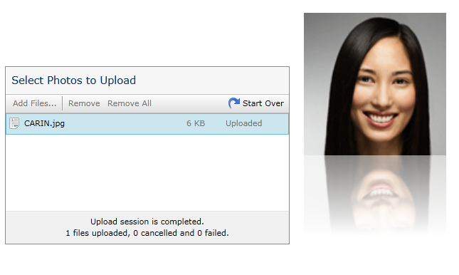
In multiple file upload scenario, you can obtain the result address of each uploaded file by querying the ResultUrl property of the FileUploadInfo object.
In addition to binding the upload results directly to an UI element, it is also a common approach to bind the results to a property in the ViewModel using MVVM design pattern. This allows you to streamline the user interaction logic in the ViewModel along with other properties, such as document details in a document submission application.
Built with architecture that is optimized for MVVM design pattern, UXFileUpload allows you to use your own entity as the model, such as a Document class, or a File class. Since the upload results might be different with the data stored in the persistence database, it is best practice to separate the raw files input and the final collection that attached to the model by providing the interaction logic in the ViewModel. For more information, see How-to: Bind Uploaded Files using MVVM Pattern.
In addition to the properties mentioned in the previous sections, UXFileUpload also exposes more dependency properties that you can bind to ViewModel or to any UI elements through the means of data binding.
The following list describes all bindable properties in the UXFileUpload control.
Note that even though these properties are designed with property setter for data binding purpose, you should not assign a new value to these properties. As the best practice, always use two-way data binding mode when binding these properties to the ViewModel to ensure the value is valid and as expected by the UXFileUpload control.
The UXFileUpload control is built around the commanding semantics which allows certain features of the upload to be executed through declarative definition in the XAML markup. The commanding semantics is also an ideal approach for MVVM pattern development. To learn more about using MVVM pattern in your application, see MVVM Pattern Overview.
UXFileUpload includes several predefined UploadCommands that you can use in your application. The following commands are implemented in the UXFileUpload class and can be used directly in your application.
One of the key benefits in building the UXFileUpload control with commanding architecture is the loosely-coupled UI architecture that separates the logic of an action from the command object. As the results, you can completely revamp the user interface elements without breaking the functionality of the controls. You can also invoke the commands from external UI elements that behave exactly the same as they were invoked through the internal UI elements. For more information about commanding pattern, see Commanding Overview.
The following example shows how to use AddFiles command in an external button control.
| XAML |
Copy Code
|
|---|---|
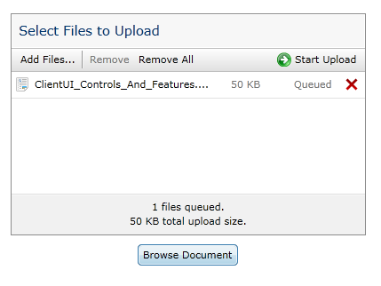
<Intersoft:UXFileUpload x:Name="fileUpload" ServiceUrl="http://localhost:1825/UXFileUploadHandler.ashx" TargetFolder="~/Upload"/> <Intersoft:UXButton Content="Browse Document" HorizontalAlignment="Center" Margin="10" Command="Intersoft:UploadCommands.AddFiles" CommandTarget="{Binding ElementName=fileUpload}"/> |
|
When clicked, the Open File dialog box will be displayed, and the selected files will be added to the UXFileUpload control such as described in the following illustration.
UXFileUpload control is built upon routed events architecture for consistency with other controls and class library available in ClientUI framework. This enables you to easily handle the upload events from anywhere in the visual tree node, or using the static class handler to register the routed events. For more information on routed events, see Routed Events Overview.
The routed events for UXFileUpload can be categorized into two major groups, explained in the following sections.
The following list describes the upload events that are raised by UXFileUpload control.
The following list describes the files-related events that are raised by UXFileUpload control.
In addition to the features described in the previous sections, UXFileUpload exposes a number of advanced features such as:
To learn more about these advanced features, see UXFileUpload Advanced Features.
For the list of ClientUI walkthroughs, see Walkthroughs and How-to Topics.
For the list of ClientUI samples available in local installation, see Locating the Samples in Local Installation.